The Evolution of a Book Cover Illustration
filed in Book Cover Illustrations and Artwork on Aug.07, 2010
A few months back, I had the honor of creating a book cover for Douglas E. Richards‘ The Devil’s Sword. (For those unfamiliar with Richards, suffice to say he’s the proverbial “up and coming author.” He was recently selected to co-panel a discussion group at the 2010 San Diego Comic-Con International. To give you some idea of his standing, the other members of the panel included Ray Bradbury and Stan Lee. Yes, we’re talking big time here.)
Needless to say, I was honored to be able to create a book cover illustration for a new book Richards had just completed.
The project was pretty straightforward. The story had military elements with a central character who was a fencer. Richards (a bit of an artist in his own right) had the cover pretty well plotted out when he contacted me: Helicopters over a desert in the background with some fencers in the foreground, using regulation equipment on a regulation strip. About halfway through the project I suggested we simplify things with a solid black cover. This eventually led to the cover shown here.
It was dramatic.
It worked for the story.
Project finished.
Or so we both thought.
At the 2010 San Diego Comic-Con, Richards gave the title its first real public exposure, spending over 10 hours signing copies of his books. In the process he got a lot of feedback on the cover for The Devil’s Sword.

A lot of that feedback was a shock.
The problem: Most readers were unfamiliar with modern fencing strip as well as regulation masks. Thus they perceived the strip as some sort of metal or icy thing, and the masks as space helmets. And the black background added to the confusion.
So many “saw” two fencers in space, standing on a flat sheet of ice, with helicopters somehow flying in the airless environment, and an explosion behind them.
Utter confusion.
The same sort of remarks were made by B&N reps and key distributors that Richards approached.
Not surprisingly, Paragon Press was anxious to get a new book cover illustration going ASAP and thankfully, Richards insisted that I do the rework of the illustration, since he had loved the original cover (and had been taken by surprise by the concerns of others).
The new project progressed through several ideas.
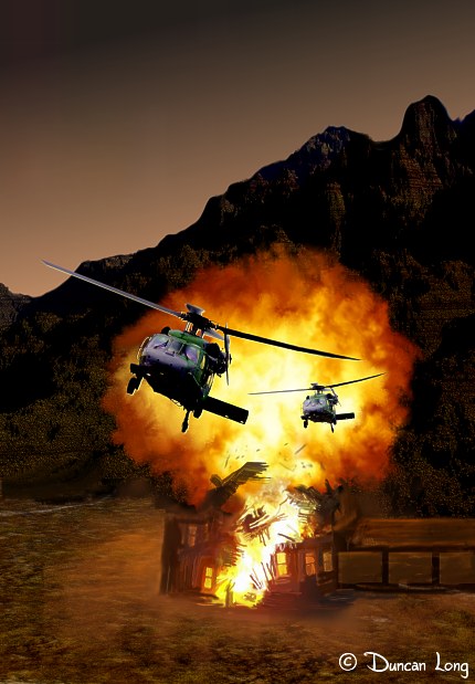
One was a return to the original desert scene having helicopters over an exploding building, dropping the fencers from the illustration since the title conveyed the idea that one or more swords must be involved in the story somewhere.
Sounded like an ideal cover scene. But getting the house explosion to look like something other than a campfire in the dirt proved hard; deserts (and snow) offer no easy way for the viewer to grasp the scale of things without trees or human forms in the scene. Thus it proved to be less than ideal for the cover subject. The best I could come up with was the somewhat claustrophobic scene below.
We also tried covers with swords, including several of a modern fencing foils, a more traditional one with a mask, and an old-style idealized sword.
Again sometimes (and sometimes not) “close but no cigar.”
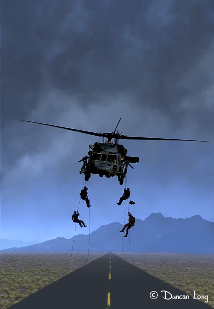
Finally Richards asked me to try a different scene from the book; it had a group of commandos rappelling down to a blacktop road, dropping from a helicopter hovering in the night. It was dramatic. And (I think) the final illustration worked.
Now we’re crossing our fingers to see if the powers that be will sign off on the new book cover illustration.
In the meantime, The Devil’s Sword which Richards believes may be the world’s first fencing thriller, is set for an October release from Paragon Press.
=====================
Duncan Long is a freelance book cover illustrator for HarperCollins, PS Publishing, Pocket Books, Solomon Press, Fort Ross, and many other publishers and self-publishing authors. See his cover illustrations at: http://DuncanLong.com/art.html
=====================


