The Perfect Book Cover Art
filed in Book Cover Illustrations and Artwork on Sep.11, 2009
I recently came across an article that claimed a good book cover design could increase sales by a factor of ten. That’s a rather amazing increase (imagine a book selling one hundred thousand copies instead of ten thousand and you’re talking about some real money for a book publisher as well as the author).
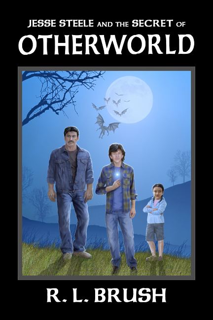
Creating a book cover can be easy or hard, and there’s no predicting how it will go entering into a project. Recently I worked on a cover for author Robin Brush, and the project just seemed to click right along. The author knew what he wanted, and he was willing to let me guide the project for the best artistic look I could achieve. The result is a cover that’s beautiful, gives the buyer a good idea of what the book is going to be about, and (I suspect) is likely to sell a lot of books for Robin. Be on the lookout for Jesse Steele and the Secret of Otherworld.
After trying several different typefaces, we finally settled on a conservative “Celtic” style that didn’t call too much attention to itself, but still gave a magical flavor to the cover. I think it works well and ties into magical aspects of the story.
We actually created two versions of the cover. The one shown here is for the hardback version. For the paperback version, the picture filled the entire front, bleeding off the edge of the page (rather than being framed as I did with the hardback version). The big plus of doing two covers at once is that the author can save some money on the second cover since the artist/cover designer is set up to do both so there’s no time wasted in getting back to speed (as can be the case when one re-starts work on artwork a year or so after it was first created). By using the same artwork and typeface, it was just a matter of framing and resizing things to create the hardback version.
It is always a joy to work on a project like this. Now I’ll cross my fingers and hope future book cover design projects go as well as this one did.
