5 Book Cover Illustrations — Getting There from Here
filed in Book Cover Illustrations and Artwork on May.09, 2011

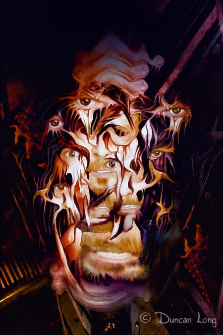
The picture above is the final book cover illustration I created last week for movie-maker Stephen Biro’s upcoming horror novel Hellucination. (And, yes, I am finally getting work finished and hope to get back to my schedule this week — thankfully most of my customers are patient people.)
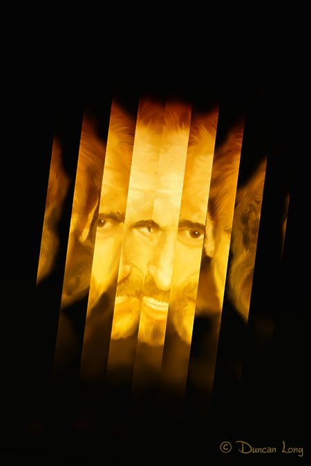
This series of pictures below shows the weird progression made toward the final book cover artwork. The vast difference between the illustration above and the steps below resulted because I was working toward the wrong target. That is, while Stephen told me the right title of the picture he wanted to use as the starting place for the final book cover illustration, I thought he meant a different piece of artwork I’d done.
So I started with a painting from a picture he’d sent:

Good enough start. But from there, I headed in the wrong direction. My first step was “splintering” the picture in several ways:
And…

And…

I then sent Biro pictures for consideration — all very unlike the book cover illustration he had in mind. Fortunately for me, Biro is a patient man (and perhaps used to dealing with the criminally insane, judging from the movies he makes). He called time and again, very patiently explaining what to change. And I kept wondering why in the world he wanted something totally different from what the original had (I thought) looked like.
Finally I realized the mix-up, explained what had happened (giving him a good laugh), and started over. Knowing where I was headed made it possible to finally deliver the cover artwork Biro wanted (memo to self).
A few changes in style and layout and he had the monstrous face wanted for his book cover.
By way of peace offering, I gave Stephen the extra — and totally unrelated — versions I’d created (he’s currently using one on his FaceBook page), so hopefully his patience with an artist that was clueless about what was needed for the book cover illustration paid off for him.
Me? I learned an important lesson about not spinning my wheels before I know what direction I was headed.
Oh… And sorry about the numbers thing in the title (I hate that technique) but I’m told it helps positioning with search engines. So ever mindful of bringing more book cover illustration work my way — with most new customers coming to me via my web site — I’ve succumbed to the number-in-the-title temptation of many bloggers. Hopefully a few more people wanting book cover illustrations will be heading my way now.
=====================
When not busily painting a book cover illustration unlike what his client wants, Duncan Long works to create the book cover artwork his clients do want. More of his book illustrations can be viewed at Duncan’s Book Cover Artwork Portfolio
=====================

May 9th, 2011 on 5:23 pm
Really cool book cover… Love the eyes. The picture as a whole reminds me of a mouth swallowing up souls or some other sinister thing.
The numbers thing in the title does work good with the search engines… and on Digg… For some reason people like to click on things with a number in it.
May 9th, 2011 on 5:35 pm
Thanks Austin… My next blog will have to be, “10 Reasons to Visit This Site, Digg it, Share It With Friends, and Hire This Book Cover Artist.
Or maybe not :o)
May 10th, 2011 on 7:19 am
Surely a perfect book cover illustration. And the strange path you took to get to the final book cover, and the amazing artwork you created along the way, are very interesting. Hopefully your next book cover artwork will go more smoothly. But if not, let it produce as much wondering spin-off illustrations as this one did. thank you very much!
May 10th, 2011 on 11:35 am
Super cool book cover Duncan!
One can see alot of halucinations with that many eyes! LOL
I always love when you share your art work…cuz your such an amazingly talented artist :)
May 11th, 2011 on 2:22 am
Came across this while trying to promote you on Facebook since you were so wonderful and fast! I love the extra artwork you did for me. I know you didn’t mean too and it was an honest mistake that I benefited from but patience is a virtue and sometimes it does pay off, at least in my respect.
This happened so fast when we first talked. We gave you a deadline of thirty days and you sent me the above illustrations in less then a day. I thought I was in hog heaven because I do work with the criminally insane while dead lines that are usually just dead and missed.
This work was actually done in three days and I am thrilled with the final product. Finding someone as talented as yourself and coming up with the final product in three days took any worry away from me with deadlines and submissions. That’s hard to find in this day and age. I’ll probably come back for more for the movies I release and send you to friends in the industry.
Keep it up Duncan and you might end up with a reputation that proceeds you.