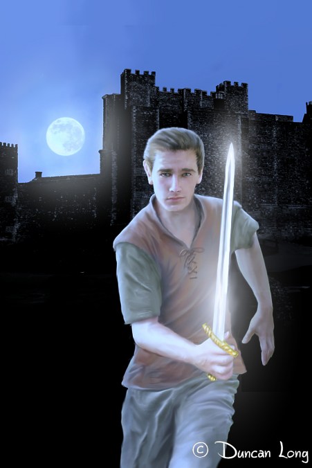
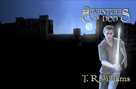
The Adventures of Dod Book Cover
filed in Book Cover Illustrations and Artwork on May.16, 2011

Here’s the book cover illustration I recently finished for The Adventures of Dod by Thomas R. Williams. One of the key features we aimed for from the start was to have a sword glistening in the moonlight. Toward that end the positioning of the castle, figure, sword, and moon became very critical, especially if the moon were to show without being covered by the rather long title.
Our other important goal was to create a YA book cover that hopefully will attract both boy and girl readers, while also hinting at the genre (in this case, fantasy). Girls are generally more apt to read a book with a boy on it than are guys to read a book with a gal, so we opted for a cute-looking fellow that female readers in this age group will hopefully find attractive. And of course running with a sharp object will always appeal to anyone having a Y chromosome.
To compliment the stark appearance of the cover we used a rather flowery typeface that hopefully reinforced the genre while not making the cover too difficult to read. (I am always a little worried about using anything other that a simple sans because potential buyers often give a book only a glance — so it has to convey its message quickly and easily to get a sale). But with genre novels it’s sometimes necessary to convey the feel of the book with the typeface. And this seems to be such a case.
Here’s the progression of the title from an early white lettering design (that while interesting as a graphic design experiment, didn’t work as well as hoped), to a version that worked but was a bit too flowery (the client felt) for boy readers, and on to the final version which had the A and S de-looped a bit.

The final “typeface” is actually comprised of three different faces, one for the A and S of “adventures” and the T, R, and W of the author’s name, another for the other text within these, and then an italic from a third typeface for “The” and “of.”
Normally this sort of mash-up would be a big no-no, but it seems to work well with this title and the fantasy genre.
Finally, after the front cover was in hand, I painted the castle on around the spine and the back of the cover for a “wrap-around” design. One trick here was that since the publisher didn’t have the page count yet making the spine width unknown, I extended the illustration an extra inch or so off the left of the picture thereby giving the cover designer enough extra to trim it to the proper dimensions during layout.
And there you have it.
UPDATE: The typefaces on the final version of this cover will be changed. I’ll post the updated cover later.
====================
When he’s not fussing with typefaces and fretting over conveying the genre through his book cover illustration, Duncan Long can be found during most of his waking hours slaving over a hot digital tablet with a crazed grin on his face. More of his book cover illustrations can be found in Duncan’s Portfolio
=====================
