Creating Artwork for the US CSLP (2013): Part II
filed in Book Illustrator and Book Illustrations on Apr.10, 2012

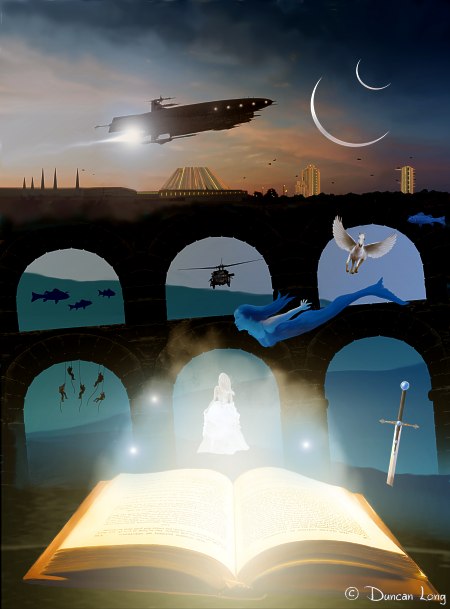
As noted in last week’s blog, I wrapped up the illustrations I created for the 2013 US Collaborative Summer Library Program (CSLP). In last week’s post, I showed the work that went into the poster. But there was a bit of other artwork for the project including spot art (for t-shirts, coffee mugs, and other items for promoting the program) and also a book mark.
Originally, the plans called for a simple reduction of the poster illustration for use as the bookmark. But as the poster became more and more complex, it quickly became apparent that it wouldn’t work as a bookmark.

So I was soon working on a new design that would employ at least the book/smoke/magic lights from the original. As it turned out, the book/smoke/magic lights proved to be all that was needed, and thus the final book mark is just that (as seen in the illustration at the top of this blog).
But sadly it took me a while to realize this truth, and thus I spent a little time wandering in the design wilderness that illustration can become. (On the plus side, digital artwork lends itself to recycling. So elements that failed to be of use in this project will likely be pressed into service in future projects.)
So here are some of the “runners up” that resulted in my search for a suitable design for the US CSLP (2013) bookmark:


In the end, I dropped the pirate, pharaoh, spaceman, horse, fairy, and sword — and went with the simpler design of just the book/smoke/and magic lights. Often simpler is better, and that was certainly the case this time.

Final version of the bookmark created for the US CSLP (2013).
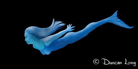
Finally, as noted in a previous blog, the fate of the mermaid was up in the air with some on the committee opposed to her and others okay with her. I have word now that she failed to make the cut and won’t appear on the poster. Which is fine. It’s been my experience that when there’s doubt about whether or not an element should be in a painting, it should be removed. “When in doubt, throw it out” is a good rule of thumb for most creative work, and this poster is no exception.
And, as noted above, she’ll very likely appear in some other future project where she’ll be more at home. Until then, she’ll swim quietly and peacefully in my mind.

======================
Knowing the joys of a simple bookmark design, Duncan Long works as a professional book illustrator. Enjoy more of his book artwork at: DuncanLong.com.