How Werewolves of New Idria Got Its Cover
filed in Book Cover Illustrations and Artwork on Aug.27, 2012
I’ve posted these illustrations before, but thought they might bear repeating now that our graphic novel Werewolves of New Idria is in print (and available from Moonstone Books).
Generally a cover project doesn’t go through so many renditions – but sometimes it does. And often these can be enlightening and perhaps serve as a cautionary note for those working on book covers of any sort. This graphic novel proved a challenge and generated many different versions for the cover illustration. While I’ll only show the eight major concepts here, in fact there were quite a few more with various changes within each cover idea,
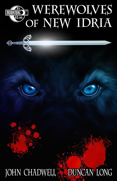
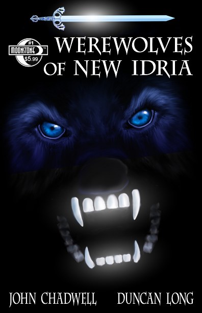
Here’s the FINAL version that appears as the actual cover for Werewolves of New Idria:
And here’s the first concept illustration for the cover:
It was too static and there was some disagreement as to whether the werewolf should be wearing combat boots (I know their mothers do, but that’s a tired joke, right). The wolf’s head was too “warm and fuzzy” as well — a problem I would have throughout the drawing of werewolves for the inner illustrations of this graphic novel. Part of the problem is that real wolves have a natural grin, so it’s hard to make them look like real wolves while still having an ominous disposition. Little wonder then that most movie and graphic novel werewolves tend toward a monstrous look rather than portray a realistic wolf.
My next version:
And this was also a bit dull (and I left the combat boots on as well); while anything is better with a pretty gal, this one still didn’t quite work for a cover.
This was a sad attempt and I never even submitted this idea to the author or publisher. It is included here to show how desperately wrong an artist can go with concept artwork
Next:
This was closer to what was needed. However the wolf was almost smiling again and also has that “guy in a mask” look, so we went on to:
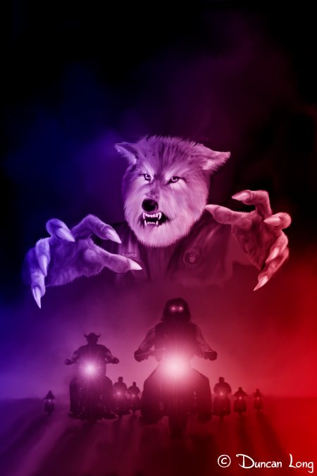
Which is basically from the reach-out-and-grab-you school of illustration. For me this failed so another try:
This time the eyes and sword looked pretty decent, so they were eventually part of the cover layout. I would have loved to go with this illustration for the cover, but it didn’t get a majority vote from those in the loop.
The next attempt lost some ground:
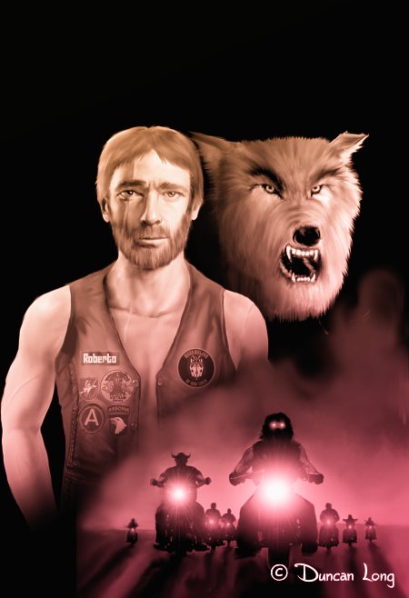
So:
For a time the illustration above was the “final” cover with a few variations in color including green, red, and a combo with a gradient of red to blue. This one would have worked and perhaps is a toss up with the final cover that was generated from the poster. This picture did get modified to a B&W illustration, however, and eventually made its way to the title page.
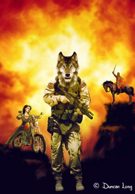
It was decided a bit more “fire” was needed — reds and yellow — for the cover. So next came this concept:
And that’s the one that stuck.
=====================
Duncan Long is a book illustrator who has created cover artwork for HarperCollins, Pocket Books, Solomon Press, ILEX, PS Publishing, ISFiC Press, and many self-publishing authors. You can see more illustrations from Werewolves of New Idria at Duncan Long’s Werewolves of New Idria Gallery
=====================




September 18th, 2012 on 8:05 am
Awesome covers. Can’t wait to see the graphic novel.
September 18th, 2012 on 8:53 am
An amazing collection of comic book cover designs. Really nice to see the progression of ideas — and as usual your illustration work is amazing.
September 18th, 2012 on 8:56 am
What beautiful drawings. Can’t wait to get my hands on this comic book — if for no other reason than to see your illustrations in it.
September 18th, 2012 on 9:28 am
Thanks for the kind words. Werewolves of New Idria is now available at a number of stores including Amazon.com: http://www.amazon.com/Werewolves-New-Idria-John-Chadwell/dp/193681403X/ref=sr_1_1?ie=UTF8&qid=1347978508&sr=8-1&keywords=werewolves+of+New+Idria