David Gelber’s Novel Minotaur Revisited Now Available
filed in Book Cover Illustrations and Artwork on Feb.17, 2013

A few months ago I had the pleasure of creating the cover illustration as well as the layout for David Gelber’s novel Minotaur Revisited (now available from Ruffian Press).
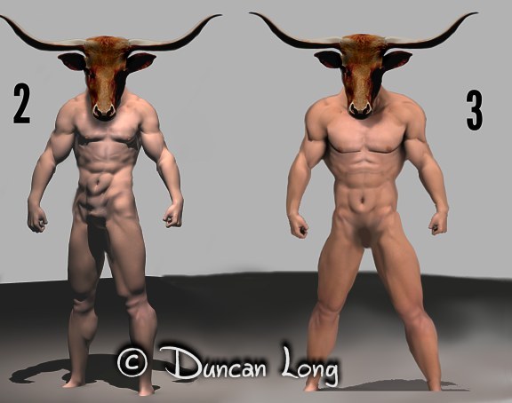
After David had explained that he wanted a maze and the traditional Minotaur for the cover of his book, I started with some concept drawings/paintings (I’m never sure what these such be called — they’re basically digital artwork) so we’d be on the same page as to what the Minotaur should look like.

Once we settled on the look for the creature, I next painted the background maze and a Minotaur to inhabit it, with what I would generously call a “close but no cigar” result that was more cartoonish than menacing:

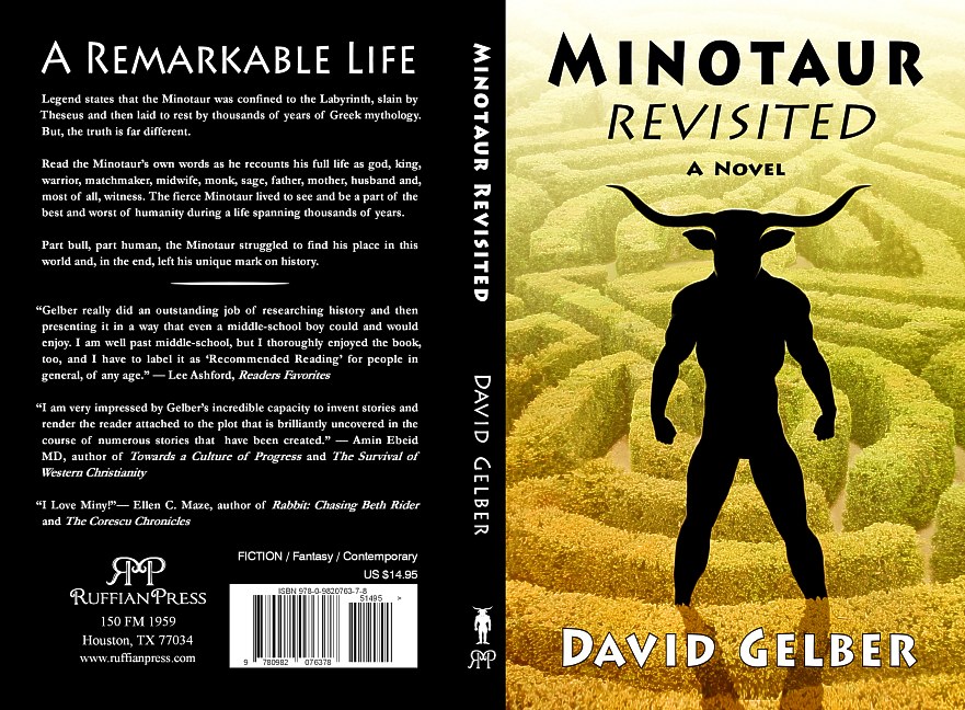
Now in theory, a less symmetrical picture is supposed to be more interesting to the eye: Hence the different hand poses and the leg stepping over one of the short hedges. And obviously this theory is full of holes, at least in this case. So both the stance as well as the cartoonish version of the creature were scrapped and replaced with a more robust and symmetrical version. And I also put him into silhouette (with the theory that sometimes letting a viewer imagine the details producing more tension than painting in all the details).

This version worked well. From there I completed the cover layout to the publisher’s specs… And a new cover — and Minotaur — were born.

David Gelber’s novel Minotaur Revisited is available from Ruffian Press).
February 18th, 2013 on 12:42 am
Super artwork, and a great explanation of the process. The final product is very good, the menace of the Minotaur comes across beautifully.
February 21st, 2013 on 10:23 am
You always do great work, Duncan. There is a review and blog tour in progress now. Check out the schedule at http://www.davidgelber.com
February 24th, 2013 on 6:03 pm
Very good and cool,you captured by an ancient look and a modern layout that works well. thank you for your sharing….