Off With Their Heads
filed in Book Cover Illustrations and Artwork on Aug.10, 2009
I don’t know about anyone else, but I find the current trend of cropping off the heads of characters in book cover illustrations a bit disconcerting. I suspect it’s being done to avoid having to pay models, and to avoid those “look alike” covers that result when stock art is used with few modifications – which in these days of budget cuts, perhaps speaks to the desperate condition of the industry or at least some publishers.
Or maybe it is just one of those trends like bell-bottoms or polyester suits that we will all ridicule once the “fad” wears off.
Sometimes these beheadings are only lobotomies (only the top of the head removed). These I really can’t quite fathom, but it does at least save the face for the enjoyment of the viewing audience. (Peanuts’ Linus avoided drawing hands not because of deep psychological problems but simply because he had trouble drawing hands; perhaps artists shun all the labor of creating convincing hairdos.)

Female figures in low-cut (often period piece) dresses seem especially problematic for decapitated book covers. I can almost imagine each woman screaming at male viewers, “Hey, my eyes are up here, buster!”
Maybe the decapitated lady book covers are just a blatant ploy on the part of art directors to sell books to male readers. But I doubt it.
At any rate, I for one will be glad to see this fad pass into that graveyard where all thoughtful designers have placed the Comic Sans and Papyrus typefaces.
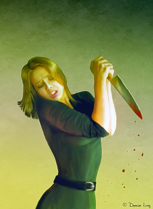
Decapitation covers also make a lot of “action” impossible on a cover. With this violent number, it’s obvious that the arm would be lost and the picture negated. Lowering the arm to accommodate the headman would also greatly reduce the action. And this picture also shows how much emotion can be lost when facial features are removed. (The model welding the knife is the lovely “Bobbistock” — who offers a wealth of stock photos for artists – and is almost never this violent.)

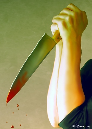
All this said… On the flip side of things, the old “close up” remains viable, I think. A close-up shot of, say, a hand with an object, an eye (though this, too, has become somewhat of a cliché), or an object like a pocket watch, can make a very captivating cover. As such, these may create the feel that graphic designers seem to be trying for when lopping off heads, but the close-up is a much more artistic and satisfying solution, I think. (By the way, this picture is not displaying the method art director’s employ for creating a headless book cover illustration.)
Here’s an example of a “close up” that is cropped from the book cover illustration above. I think it works well, though in many ways I still prefer the whole picture version. Removing the face of the character does add an element of mystery, however. That might be a big plus with some story lines like a mystery where the publisher might prefer not to give away the fact that “the blond did it.”

Here’s my bottom line. When it’s all said and done, please… Think long and hard before decapitating anyone on your cover. The life you save may be your book’s.