What Elements Make the Best Cover Illustrations?
filed in Book Cover Illustrations and Artwork on Sep.06, 2013
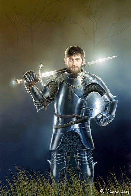
Although eventually used as an inner book illustration, this painting would have been an ideal book cover picture since it has the character making eye contract with the viewer.
How do you decide what the front illustration should be on your book cover?
There’s a tendency for the writer to want to have “everything but the kitchen sink” on the front of the book. Every important plot element and every character… But that’s a mistake. Such attempts just become a jumble of “stuff” to the eye. Effective cover designs are almost always simple.
Remember: The text tells the story. You’re not making a movie. You’re just using the cover illustration to set the tone. The real purpose of the illustration is to “lure” the reader to the book. To do that, you must keep the cover illustration simple. It must create an element of mystery. It must make a reader say, “That looks interesting” and want to learn more.
For fiction, having the main character on the cover is a generally a good idea. People connect with people on a subconscious level, so there’s an “instant connection” if you have a human being on the cover. An even more powerful way to use a character on a cover is to have a “close up” on the face, with your character looking out of the cover at the viewer (as is often done with portraits). People make an emotional connection with such a cover, and that connection pays off with more readers.
While a non-fiction books can have a the main character on it, there’s currently a tendency to have objects on the cover: A compass, jewelry, or something else that’s key to the subject matter (and this even carriers over to some fiction these days, especially fantasy books). Again, keeping the cover illustration simple is key, especially with the reduced resolution of ebook covers as well as catalog and book review cover reproductions.
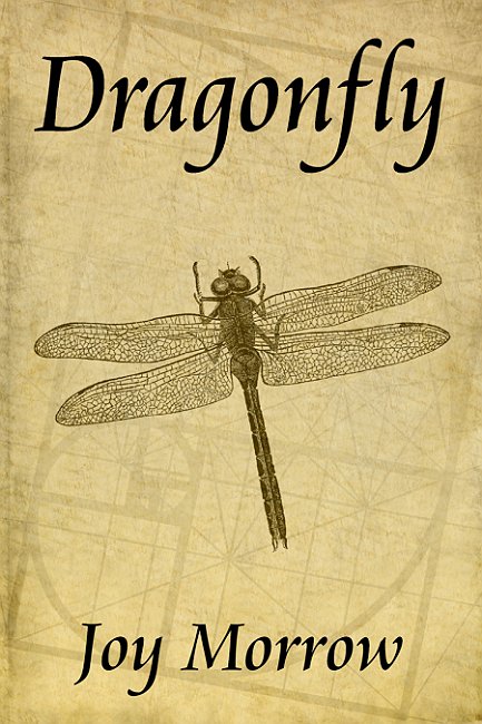
For non-fiction and some fiction, an object of some sort often proves effective for a cover illustration. This dragonfly with an ancient-looking background is simple yet eye-catching.
Wrap around cover pictures are often recommended, but I think these tend to create more expense for the buyer than is necessary. For starters, readers generally go to the back of the book not to see more cover but rather to read what the book is about. And lettering over a picture is often hard to read (less legible at best) which can dictate “boxing” the text — basically covering up the picture and putting text in the box. Worse the picture covering the spine REALLY can degrade reading the text. Given that some books will be displayed on bookstore and library shelves with only the spine showing, the harder to read title and author name can really hurt the lettering’s potential to attract readers to the book. Finally, ebooks currently only display the front of a book cover, so the work done on the spine and back are basically wasted effort and expense with this book format.
The wrap around cover (for the Wælcyrie Murders by Anthony Pacheco) works because the subject matter is simple, and the light colors allow for effective lettering on the spine and back.
While I wouldn’t say, “Never have a wrap around cover,” you do need to give careful thought before going to the added expense of buying a wrap around. Often a front illustration will be more effective and will better use the money you’ve budgeted for your book cover.
September 8th, 2013 on 12:28 am
I always appreciate your insights and advice. you are a fantastic and very knowledgeable science fiction / fantasy artist and it is always great to see your thoughts about the various odds and ends involved in getting a book cover up and running.
September 9th, 2013 on 6:48 pm
Excellent advice — and going through your site, I am amazed at some of the fantasy and science fiction book cover pictures you’ve created (and horror too). Thanks for sharing them online like this and for this helpful advice for indie authors.
September 17th, 2013 on 3:50 pm
Great tips. You’re a master illustrator and it is good to have your insights.
September 18th, 2013 on 11:05 pm
Great tips!!!
September 26th, 2013 on 9:19 am
I am so amazed at your work. It feels like a different world I should come around once in a while.
September 28th, 2013 on 12:09 pm
Its like you read my mind! You seem to know so much about this, like you wrote the book in it or something.
I think that you can do with some book pictures really drives the message home. This is fantastic blog. An excellent read. I’ll certainly be back.
September 28th, 2013 on 3:43 pm
Just found your web site — what a treasure house of useful information about book covers, illustrations, and stuff. I am so glad you’ve taken the time to put this info online. I’m going to stop by your webpage regularly from now on.