Creating the Cover for Patricia Little’s The Blue Between
filed in Book Cover Illustrations and Artwork on Sep.09, 2013
I got word today that Patricia Little’s fantasy novel is now in print. Creating the cover for The Blue Between went through a number of steps — with several false starts — before arrived at the final illustration for the book.
First, here’s a short blurb about the story:
Sixteen-year-old Heather Lucas is the freak girl who got hit by lightning, and she has a scar on her palm to prove it. Since then, everything has gotten weird. Her mother left them, which makes no sense. Her Dad thinks she’s a liar, because she won’t explain why she keeps running away.The thing is, she can’t explain it. She just disappears and then reappears miles away, with the scar on her palm tingling. In between, she drifts in a sparkling blue void outside of time and space, where indistinct forms of people float by, lost in the blue. Is she going crazy?
Odd things are even happening at school. Why would the new boy, Alex, be interested in her? He shows her a paper he’s written about a place called Alanar. The make-believe city from Mom’s old bedtime stories? What does he know about her mother? Heather is determined to find out, especially after she sees the scar on his palm, identical to her own.
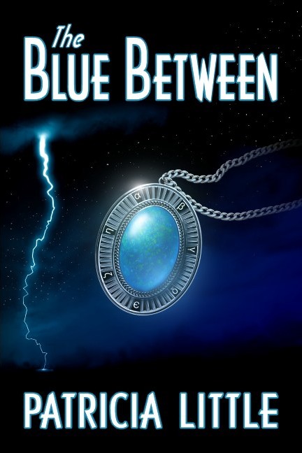
There are several key elements for the novel that we wanted on the cover: The lightning, the magic pendant that figures in the plot, and the character Heather.
That was the plan.
So the first task was to create Heather. I created several sketches, with these coming closest to what Patricia thought the character in her book should look like:
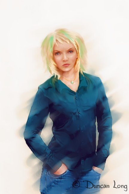
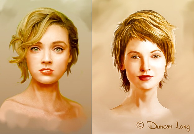
While these seemed to be coming close to what had been envisioned for the character, as Patricia and I talked it became more and more apparent that the emphasis in the story might better be placed on the pendant the character wore rather than on the character. Since Patricia had seen some of the other “jewelry” covers I’d created for other fantasy novels, we decided to drop having the character on the cover and instead go with a large version of the pendant (which originally we’d planned on having the character wear, but which would have been very small on the cover).
This was one of several early pendant designs.
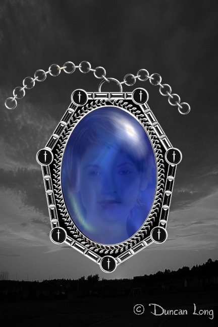
As you can see, I tried placing the character’s reflection over the jewel (sort of the gem wearing the gal rather than the character wearing the pendant). While this seemed a great idea on paper, it proved less viable than had be hoped so we abandoned the idea of having the gal’s reflection on the cover picture.
The pendant design also seemed a little too angular and masculine, so I set about creating a new design and drawing in a chain that was a bit more dynamic and capable of counterbalancing the lightning strike that would go down one side of the front cover of the book.
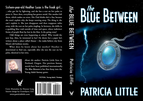
Eventually it all came together for an attractive book cover. To help unite the various elements, I used a color gradient over the entire picture and then painted in reflections that corresponded (more or less) to the lightning flash, with the curve of the pendant being duplicated by part of the lightning bolt. Finally, the chain was arranged so that it appeared the pendant had been thrown or was flying toward the lightning strike.
Here’s the final layout for the wrap-around cover:
You can learn more about The Blue Between and read sample chapters from the novel at Amazon.com; the book is available in both Kindle and print formats.
===========================
Artist Duncan Long illustrates book covers on fantasy, science fiction, and other genre novels. You can see more of his book cover designs and illustrations at Duncan Long’s Book Cover Art Portfolio.
September 24th, 2013 on 11:21 pm
I love this beautiful book cover illustration.