The Making of Ming (the Cover)
filed in Book Cover Illustrations and Artwork on Dec.09, 2014
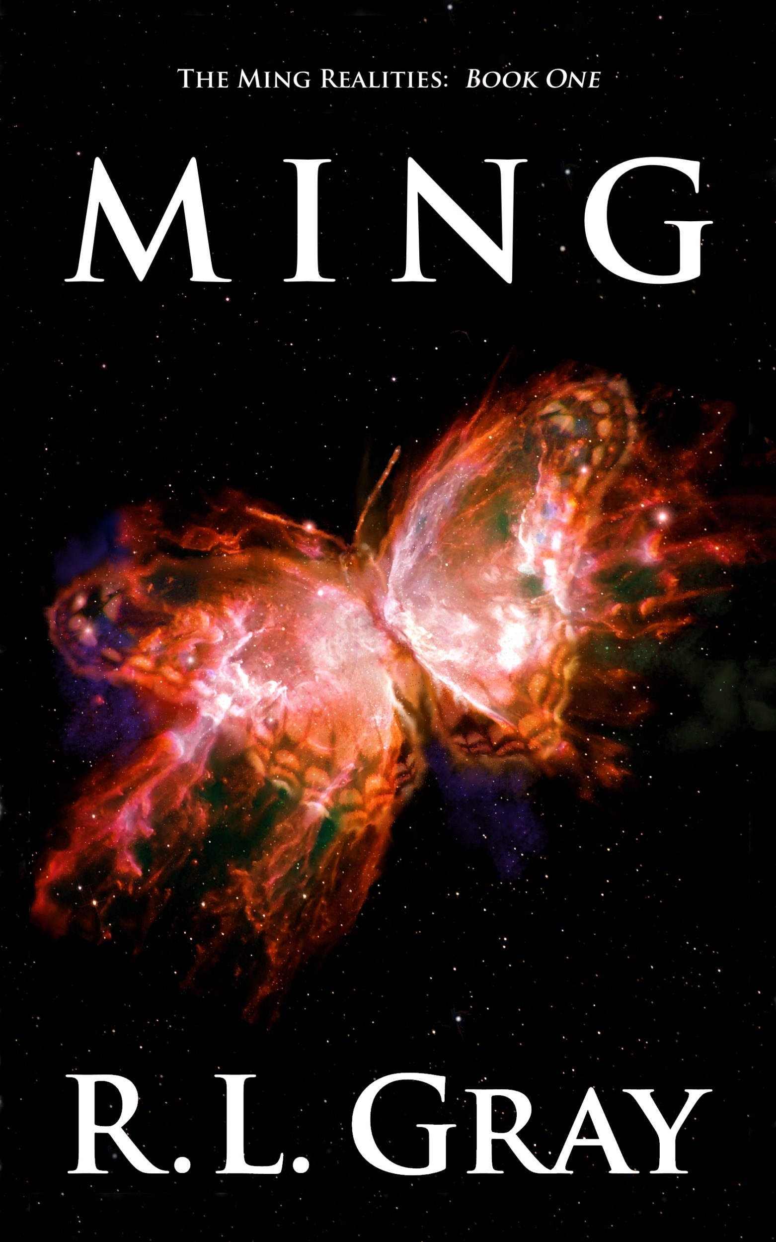
I had the pleasure of recently finishing the book cover illustration and layout for book one in the new science fiction series Ming by R. L. Gray.
The design work was pretty straight forward with this project. I studied the “butterfly nebula” (via the Hubble telescope), then painted my own version with a few nebula dust and star enhancements to bring out the butterfly in it. We then adjusted the colors for a bright reddish/yellow hue, and we set to go.
For the layout, I chose the classic Trajan typeface for the front lettering, adding extra space between the title lettering to permit filling the large space the letters needed to occupy (which is always more satisfactory than widening the letters themselves and destroying the proportions of these beautiful, classic characters).
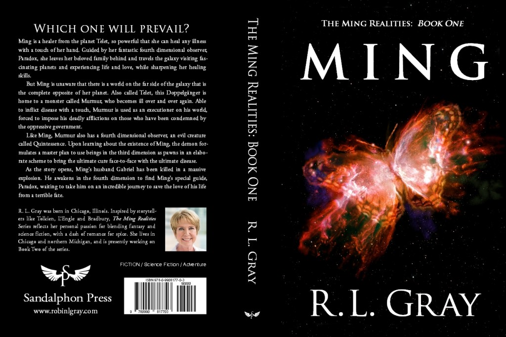
On the back cover, I used Trajan for the headline, then Garamond for the other text, the latter being another classic typeface that fits well with Trajan (at least to my eye).
I also created a small icon for the fledgling publisher to use as a trademark. This was designed around the “S” and “P” from Sandalphon Press with the addition of a pair of stylized wings I created for the project. Several variations were made, and the one everyone liked the best was chosen for the final version.
The result is a distinctive icon that can be displayed on the spine as well as the back of the books in the series. I packaged the final design into a TrueType font so it can be employed by the publisher in a variety of ways in-house as needed.
![]()
You can preview several chapters and buy a copy at Amazon.com.
R. L. Gray’s website also gives a nice synopsis and other information about the book.
===========================
You can see more of Duncan Long’s book cover design work and book illustrations at Duncan Long’s Portfolio.
December 21st, 2014 on 1:29 am
These are actually impressive illustrations and perfect for selling books. Anyway keep up the great artwork.