Now You See It, Now You Don’t
filed in Book Cover Illustrations and Artwork on Jun.10, 2015
Over the years, I’ve found that sometimes clients can’t get a good idea of what an illustration will look like because their monitors aren’t properly calibrated. While today’s monitors generally do a pretty good job of reproducing the correct color ranges that will appear in a print picture, they don’t do so well with the brightness and contrast “out of the box.” And often users compound the problem by jacking up the brightness and contrast to produce more vibrant colors.
This can cause serious problems when a book cover illustration goes to press. It generally will come back darker than the client expected due to a screen being too bright.
Sometimes this isn’t too bad a surprise. Other times the client is devastated.
And the artist (me) can be left puzzled. After all, his monitor is properly calibrated so the cover is pretty close to what appeared on his monitor all along — and he has been modifying the illustration to suit the client’s dictates. The catch is that what the artist saw and what the client gave the okay on are two different pictures.
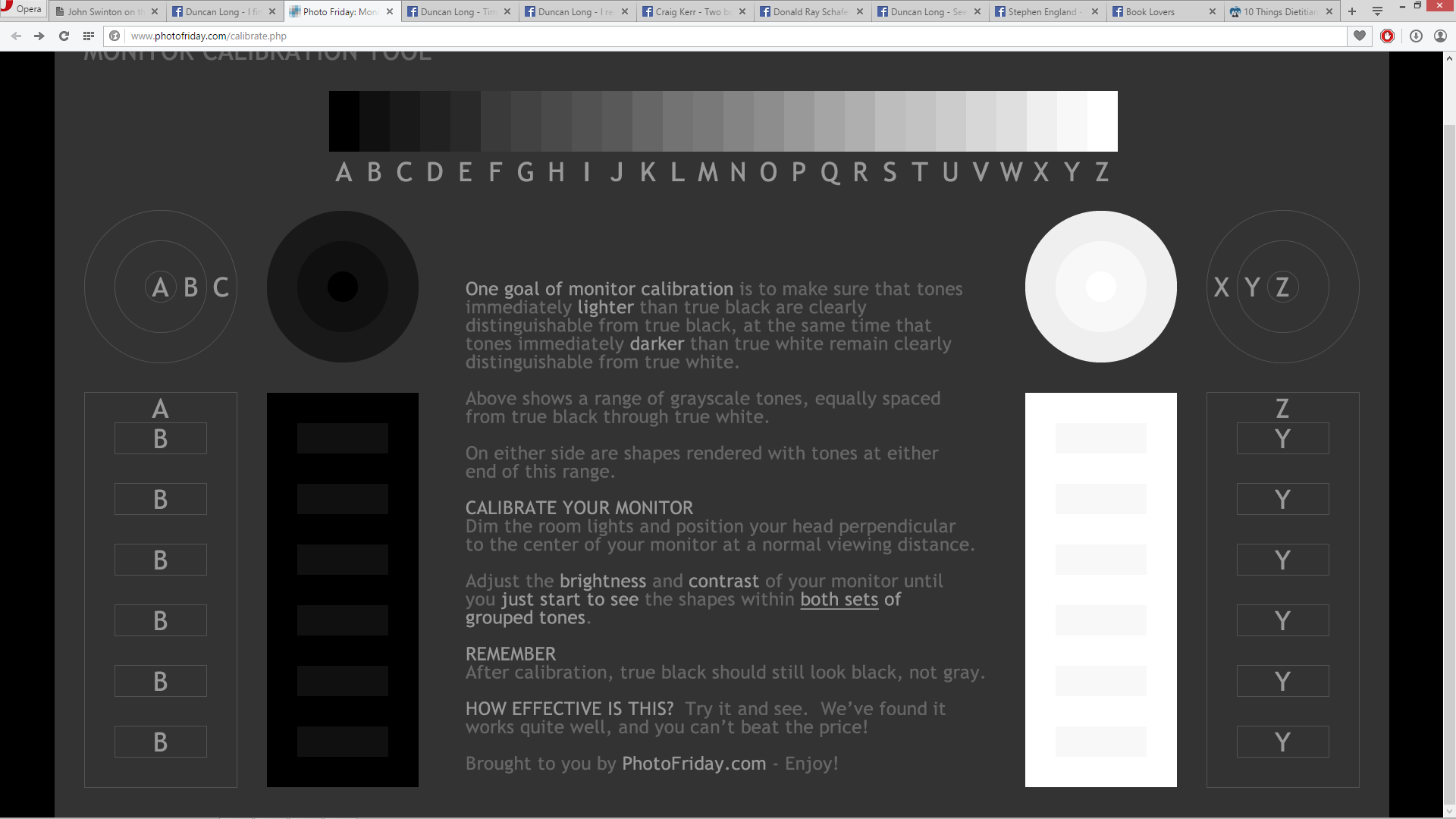
Fortunately there’s a way to quickly for a client to get a monitor into the proper ballpark of brightness and contrast.
Simply go to these online sites and tinker a little bit, and a monitor should be set to give a pretty close approximation to what will appear in print. PhotoFriday.com will generally be all that’s needed. But sometimes DisplayCalibration.com will help. Here are the links:
PhotoFriday.com and DisplayCalibration.com
One final caution: Because monitors produce colors with light and print, with inks, some of the colors you see on a monitor just can never be quite the same in print with the four color inks most presses use. That means monitors will generally give you more vibrant colors, and the bright red, green, and blue hues of a monitor will be impossible to precisely reproduce with the CMYK (cyan, magenta, yellow, and black) pigments most presses employ.
The approximations can be very close in most cases. But they just can not be perfect. There are limitations to the colors that can be achieved with inks. (This changes with presses using additional pigments — but these are not yet common in the publishing industry and this situation isn’t likely to change any time soon due to the expense of such presses.)
For a more detailed look at the color systems in print and monitors, see “Color Systems – RGB & CMYK.”
======================
Duncan Long is a freelance Illustrator whose work has appeared on book and magazine covers including those marketed by HarperCollins, Pocket Books, Asimov’s Science Fiction, Moonstone Books, and those of many other presses and self-publishing authors. See more of his artwork at his book and magazine illustration portfolio.