Creating the Cover for Gunfight on the Alpha Centauri Express
filed in Book Cover Illustrations and Artwork on Sep.03, 2015

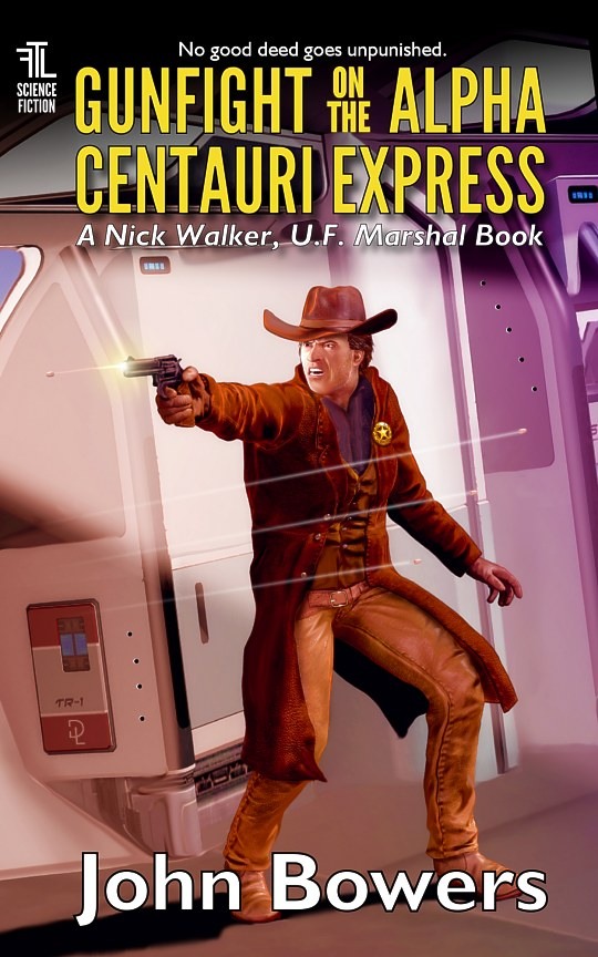
I recently had the pleasure of creating the book cover art and layout for Gunfight on the Alpha Centauri Express by John Bowers. This is book five of the Nick Walker, U.F. Marshal series, and now is available in the Kindle format at Amazon.com.
The novel features a lawman who is charged with keeping the peace in various planets he roams through. Here’s a brief description of this installment of the series:
Nick Walker is suddenly sucked into another situation so bizarre it almost defies belief. His reputation as a two-fisted lawman has spread throughout the settled galaxy… and billions are grateful for what he does. But not everybody.
Just as he is about to take on the most dangerous adversary he has yet faced — a terrorist organization intent on the overthrow of the Federation — Nick gets sucker-punched by a “legal-eagle” tinhorn in a $4,000 business suit who thinks Nick’s law enforcement methods are just too violent. Assistant U.F. Attorney Brian Godney seeks an injunction against Nick, and a court hearing to determine if excessive-force charges can be filed.
If that isn’t enough, Godney’s assistant is U.F. Attorney Victoria Cross, a former Star Marine with whom Nick was once involved… and his fiancée, Suzanne Norgaard, isn’t going to be happy about that. Nick finds himself juggling terror attacks, the media, and courtroom antics as he struggles to make sense of it all — and if the U.F. Attorney doesn’t get his head… the terrorist leader wants him dead.
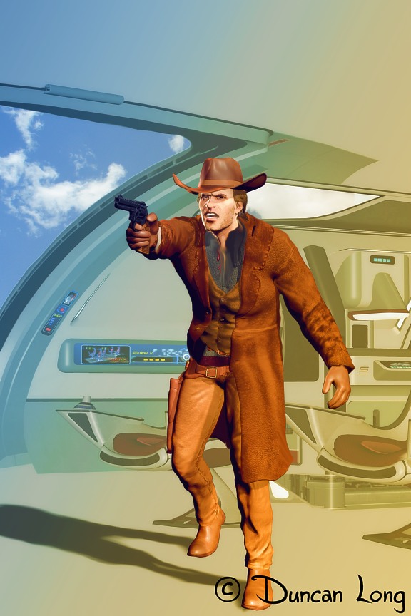
Going into the project, I knew there needed to be some “action” in the cover illustration and implied threat. So here’s the first concept render/drawing I created (working with a 3D character of Nick Walker that I’d put together for the previous book cover art in the series).

This seemed to be “on track” as it were (inside the futuristic Alpha Centauri Express, a two tiered, train-like vehicle). The trick was to capture both the old “lawman” feel while conveying that this was a science fiction story. To do the latter, I decided to make the train as futuristic in appearance as possible (even though the lettering on the cover also captures the science fiction flavor).
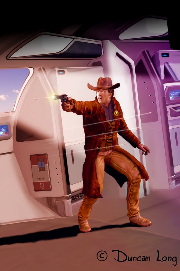
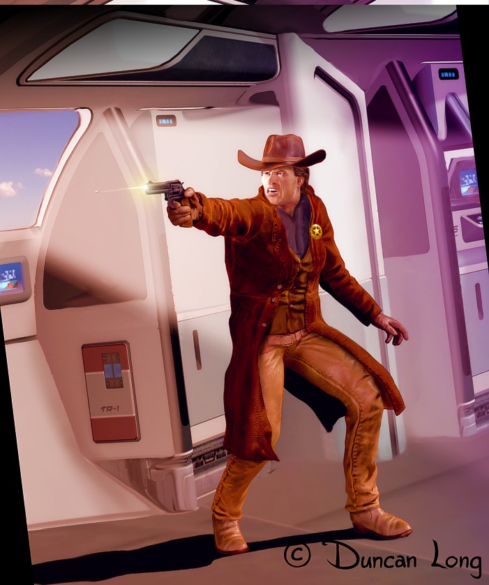
When the John had given the OK to the basic concept, I then played around with the pose of the character to make it a a bit more dynamic. I also decided to leave out the passenger chairs that I’d originally considered since they added too much visual clutter. Most trains have sections without seating, so this worked visually. To add just a bit more tension, I rotated the scene slightly.

John suggested some return fire from some off-screen foes, so I added some bullet holes to the scenery along with three bullets zinging past the hero. Bullets are always tricky to paint as the eye normally doesn’t see bullets in flight. However so many comics have employed the “you can see the bullets” notion that most viewers can understand the concept and what it is they’re seeing.
This next version of the illustration worked for John, so the lettering was added for the final version of the book cover.

You can read excepts of this science fiction novel and purchase it at Amazon.com. If you like action and science fiction, you’ll like this book.
———————-
Duncan Long is a book cover illustrator who has created artwork for many indie publishers and small presses as well as for HarperCollins, Pocket Books, Asimov’s Science Fiction Magazine, Amazing Stories, and many other publishers. See his illustration portfolio for more samples of his book cover art.