A Sneak Peek at the Cover of William Scott Morrison’s New Novel — and the Wild Journey Getting There
filed in Book Cover Illustrations and Artwork on Nov.12, 2015

I had the pleasure of creating a cover illustration and layout for William Scott Morrison’s new novel Luck of the Draw. Morrison has been writing short stories and songs for many years. His second novel, Luck of the Draw, is a story about the 1960s.
Based on two men who have a much different experience in the 1960s, we see their experiences all stem from either having a high draft number, or a low number. One one with a low number goes to Vietnam to fight, while the other stays in the US, pretty much free to do as he pleases.
For those unfamiliar with how the draft worked during the Vietnam War era, large “pills” had numbers in them. These numbers were selected more or less randomly to match up with calender days. Those young men of draft age who had a low number associated with their birthday were the first to be drafted into service and, since the nation was at war, the often found themselves on the front lines in combat. Those with higher numbers were less apt to be drafted, with those on the highest end of the scale living basically a worry free existence during this time of free love, hippies, and drugs that comprised much of the 1960s for those of college age.
Obviously since the story revolved around the notion of the draft numbers the two main characters of the novel had, it (seemingly) made perfect sense to all involved in this book cover project to have the cover illustration be of the big plastic bowl of numbers, with the arm of Uncle Sam reaching in to pick a capsule with a number inside, perhaps with some icons of the war and the 1960s such as Huey helicopters, an electric guitar, etc.
That sounded like the way to go.
And after a number of sketches here’s the cover artwork and layout that I had to present to the author:

As is often the case, this “everything but the kitchen sink” approach proved less than satisfactory. We tried moving this element there, that one here… adding and subtrating… nothing seemed to work.
Eventually, we parred down the picture by removing many of the nonessential elements, leaving only the hand, jar, and capsules.
Here’s that result:

It was not a very compelling picture. But even worse — much worse — those unfamiliar with the process of selecting draft numbers during the 1960s mistook the capsules for some sort of pill that would choke a horse. Yikes! This definitely was not what the author wanted would-be readers to “see.”
At this point, I think everyone was about ready to throw in the towel. In my experience, it’s usually best when a dead end is reached, to start over rather than try to save the original concept. A turkey will never soar like an eagle, no matter how much more time you spend on him. A new concept, or even a new artist, needs to be trotted out and everything in the original book cover concept either tossed or greatly modified.
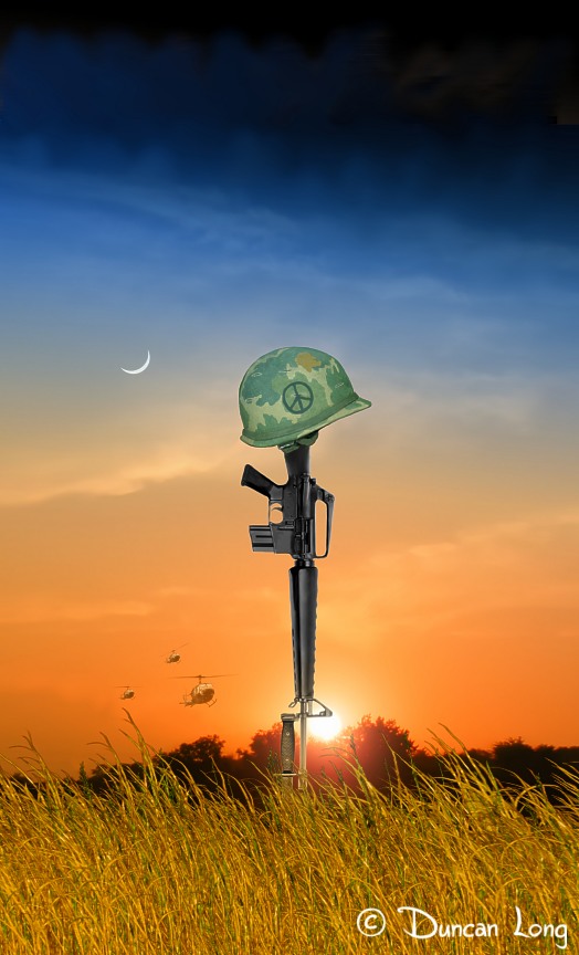
I’d been kicking around an idea of a Vietnam War vintage helmet on an M16 rifle from the start of the project, and had even suggested maybe that was the way to go before we finally launched into the picture of the bowl and capsules. I felt a vintage helmet and rifle symbolized the loss of brave soldiers in this war, as well as what the antiwar movement was centered around (with — let’s face it — many not wanting to go to war because they expected to be maimed or killed). Additionally, many of the troops in Vietnam actually drew peace signs on the camouflage covers of their helmets, making it possible to remain historically correct while connecting both the peace movement and the war in one picture.
So I went back to the drawing board, created this picture, and sent it to the author. “Would something like this work?”

This time, the basic concept met with favor. So we were back in the game.
Traditionally green covers are avoided in the publishing industry. Even though I’ve never seen an actually study, many think that green covers don’t sell well, so you almost never see a green cover on a book. So we needed to head a different way with the color.
Additionally, Scott wanted a more realistic sky in the background (these were pretty easy to modify since I was “painting” digitally with the various elements on separate layers of the picture. After a bit of tinkering, we eventually arrived at a picture that had a more realistic sky plus some “Huey” helicopters and other elements.
Here’s the book cover picture we finally arrived at:
So, after a very circuitous journey, we finally arrived at the proper cover illustration for a novel about the 1960s in America.
===================================
Duncan Long creates book cover illustrations for a number of small presses, indie publishers, and major imprints with HarperCollins, Pocket Books, and others. You can explore more of the covers he’s created for novel and non-fiction books at Duncan Long’s Online Gallery.