Artwork and Book Cover Design of Sci-Fi Novel, Paradox
filed in Book Cover Illustrations and Artwork on Nov.12, 2015
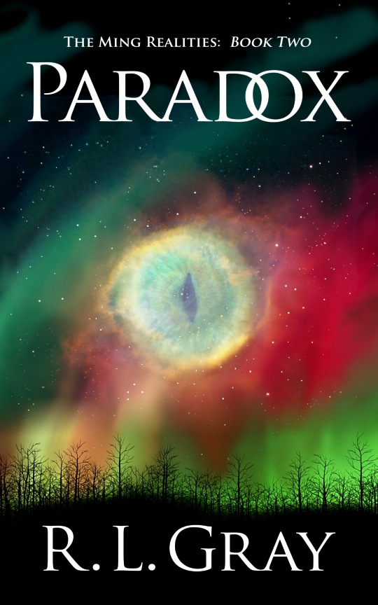
I recently had the priveledge of designing the layout and creating the cover illustration for R. L. Gray’s science fiction novel, Paradox, which is book two in the author’s Ming Realities series. Like the first book, the art for this one features a stylized star nebula. The trick with such a picture is to make it realistic, yet allow the viewer to recognize some element in the picture which wouldn’t be there in real life.
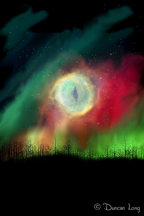
In this case, we used the “Cat’s Eye Nebula” (NGC 6543) as a starting point. After painting the starfield and dust to pretty much match the real thing, I then took the name to its logical extreme, painting a cat’s eye right in the center of the nebula.
The author also wanted an aurora borealis effect blending into the starfield; this is tricky because of the colors generally seen in the Northern Lights: red and green. These don’t readily blend with either real paint or its digital paint without problems. Also, there’s the danger of viewer confusing the aurora borealis with the nebula itself rather than seeing it as an effect within a planet’s skies.
The first problem was dealt with by being very careful to avoid blending the reds and greens in the aurora borealis area. Bringing the effect to the planet’s atmosphere was accomplished by adding tree silhouettes at the ground level, which had the added plus of permitting a black background on the lower portion of the picture for letting to appear over, while still giving the illusion that the view was from the surface of a planet.
Here’s the result of all this:
Since this is the second book in the Ming series, the next hurtle was to make the general layout match that of the first book. Here’s that first cover that the second had to match up to:
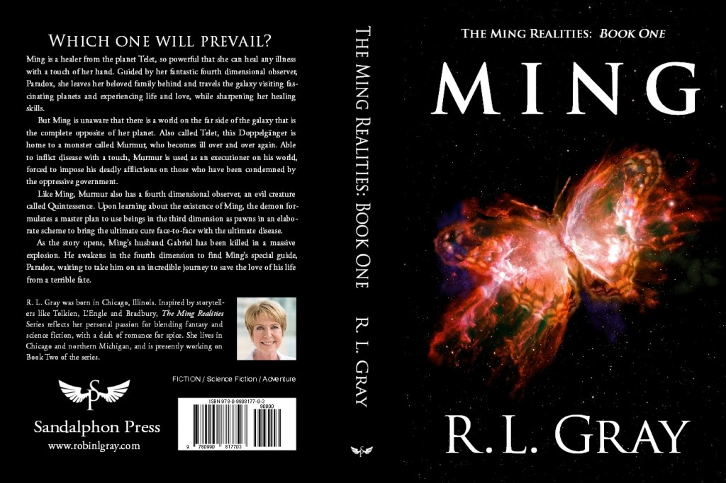
As first glance, it would seem simple to make the second cover layout match the first: Just replace the picture, change the names, and voila, mission accomplished.
Only…
The title of the new book is much longer than the very short “MING” of the first. So things rapidly get complicated if the front lettering of each book is to remain close to the same size.
One fortunate happenstance was that when working on the first book, I had put extra space between the lettering of the title so it didn’t become extremely large/tall on that first cover. So simply having regular spacing with the second got things into the neighborhood. I bought a little more space by using lower-case capitals after the initial full-size letter of “Paradox.” This matched the same effect used for the author’s name so it didn’t look out of place, while also giving the illusion of taller letters thanks to the height of the “P” (had I to do over, I probably would have used a capital “X” at the end of the title for a little more height illusion — especially since the “O” and “X” nestle together so well).
Since a “paradox” suggests things that aren’t quite normal, I played on that idea a little and narrowed the title a bit more by overlapping the “D” and “O.”
All these tricks bought me just enough space; while the second title lettering is still shorter than that of book one, it’s close enough that the two don’t seem at odds with each other.
The text on the back cover was also a bit of a problem since the word counts weren’t identical, even though the author came close. Fortunately, modern layout software permits “fudging” with the vertical spacing (leading) between lines as well as the width of letters and the space between them. The author’s photo was cropped/sized to make it nearly identical in the space it occupies to the original photo on book one, with a little juggling of the “about the author” blurb to make things fit. Finally, the logo, press info, and bar code box all were the same on each book, thereby helping make the entire back covers appear more identical at a quick glance.
And so… the final layout of book two in the Ming Realities series:
You can learn more about R. L. Gray and the Ming Realities at RobinGray.com.
===================================
Duncan Long is a graphic artist and illustrator who creates covers for many science fiction and fantasy novels. You can see more of his book cover designs and art in his Book Artwork Portfolio.
November 12th, 2015 on 8:33 pm
That a great cover!