Real Paintings or Digital?

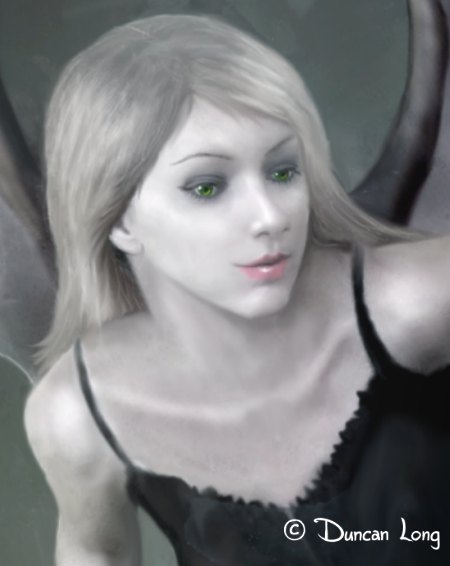
Book Cover Illustration - Tooth Fairy - Detail

While I have tended to plaster information about my painting techniques throughout my web site, every once in a while someone sill writes to ask if I actually paint my pictures with oils or acrylics or if they are digital paintings (which is fine – sifting through the website for one single answer is likely a waste of time).

So, the short answer: My work is digital from beginning to end, for the most part. No paper, scanning, or sketches were harmed during the making of my artwork. I’m just pushing electrons across the screen.

My background in illustration was mostly a pen-and-ink work before switching to digital (I started illustrating some of the books I was writing). That said, I strive for a painterly look which I feel builds upon recent historic trends, with Wyeth and Rockwell being strong influences on my thought and the direction I take.

My reason for taking this route is that I find these realistic styles the most powerful for illustration while also delivering something that many publishers want to buy.

Most importantly, however, the style is what I most want to see when I work. I enjoy what I do and that propels me to keep doing more.

I do most of my work is done with an old 1996-vintage version of Corel Photo-Paint, using the “oil” and watercolor brushes as well as blending/smear brushes and some brushes I’ve created myself. Currently I have a memory-and-hard-drive-crammed PC running on the very stable XP Pro OS. A Wacom graphics tablet completes the hardware.

Since I seem to experiment as I go along, the undo button is also a key tool (ha).

=====================
Duncan Long is a freelance book cover illustrator for HarperCollins, PS Publishing, Pocket Books, Solomon Press, Fort Ross, and many other publishers and self-publishing authors. See his cover illustrations at: http://DuncanLong.com/art.html
=====================

Tags: , , , ,

Comments Off on Real Paintings or Digital?
E-Book Signings

I recently saw a writer asking, “So how do you have book signings with ebooks?”

Good question. You can only get so many signatures on an iPad, right?

But that got me to wondering if an author might produce a different version of their book with “value added” features such as deleted scenes, alternate endings, etc. — sort of a “director’s cut” for ebooks. This could then become “only available” through the book signing – perhaps on a CD or other format that could be sold to a fan.

That said, given the poor sales most book signings see, this might be better as a marketing ploy for a second sale rather than as a book signing gimmick. Unless an author is really famous (as in, “made a movie of my book” famous), chances are there will be meager numbers at a book signing.

That said, there appear to be ways to enhance these numbers: One is to give a lecture or be on a panel before the signing. Another is to be at a convention where thousands of potential fans will be wandering from booth to booth looking for gifts and things to buy. One saw has suggested signing books while the author is naked – but for some of us that likely would lower the number of sales rather than enhance them.

=====================
Duncan Long is a freelance book cover illustrator for HarperCollins, PS Publishing, Pocket Books, Solomon Press, Fort Ross, and many other publishers and self-publishing authors. See his cover illustrations at: http://DuncanLong.com/art.html
=====================

Tags: , , ,

Comments Off on E-Book Signings

Two More Book Illustrations

science fiction novel cover illustration

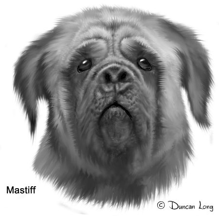
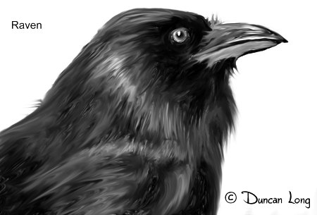
Another pair of book illustrations. Each created as a part of the cover artwork for John Phillip Backus’ science fiction novel The Gathering – After The Fall (book two in this series). The crow eventually was employed on the cover (with its mirror image self) while the dog didn’t make the final cut because if failed to blend into the final scheme.

So anyone needed a mastiff illustration? This one’s looking for a home.

=====================
Duncan Long is a freelance book cover illustrator for HarperCollins, PS Publishing, Pocket Books, Solomon Press, Fort Ross, and many other publishers and self-publishing authors. See his cover illustrations at: http://DuncanLong.com/art.html
=====================

Tags: , , , ,

Comments Off on Two More Book Illustrations

“Back In the USSR” Typeface

As some readers may know, I often alter typefaces, and sometimes even design new fonts.

I’ve made one of these typefaces available (free for personal use) at dafont.com. I named it “Back In the USSR” due to its Russian influence on its design (and as a backhanded salute to the Beatles’ song by that title). There’s no sign-up necessary to download and use this font; just go to the link and download the free font.

The typeface was originally created for Issue 4 of Critica Grafica magazine and I added a number of “extras” to the letter set for use in graphic design, including the faces of well-known Soviet leaders, hammer/sickle, star, and an AK-47. Oh, and a stylized “DL” monogram with a bit of vanity.

Back In the USSR typeface font by Duncan Long

I never expected many people would have a need for a font like this, but according to dafont.com’s count, last time I checked the typeface had been downloaded 50,250 times, currently at the rate of 40-some downloads a day. I guess my next question is what people are using it for.

I do know that at least one rock band is using it for lettering their logo and so forth. Perhaps with a bit of ironic twist, they perform “Back In the USSR” in their sets.
=====================
When not designing typefaces and fonts for customers and fans to use, Duncan Long is a freelance book cover illustrator for HarperCollins, PS Publishing, Pocket Books, Solomon Press, Fort Ross, and many other publishers and self-publishing authors. See his cover illustrations at: http://DuncanLong.com/art.html
=====================

Tags: , , , ,

Comments Off on “Back In the USSR” Typeface

Sketch of the Day

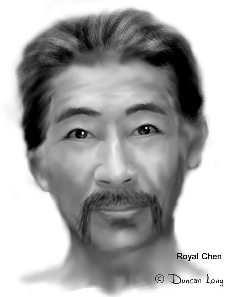
Book cover illustration by Duncan Long

A character concept sketch which will become a part of the book cover illustration for John Phillip Backus’ science fiction novel The Gathering – After The Fall (book two in this series). The final cover will employ a number of faces, “sliced and diced” into a somewhat surreal design.

=====================
Duncan Long is a freelance book cover illustrator for HarperCollins, PS Publishing, Pocket Books, Solomon Press, Fort Ross, and many other publishers and self-publishing authors. See his cover illustrations at: http://DuncanLong.com/art.html
=====================

Tags: , , , ,

Comments Off on Sketch of the Day

For You, a Rose

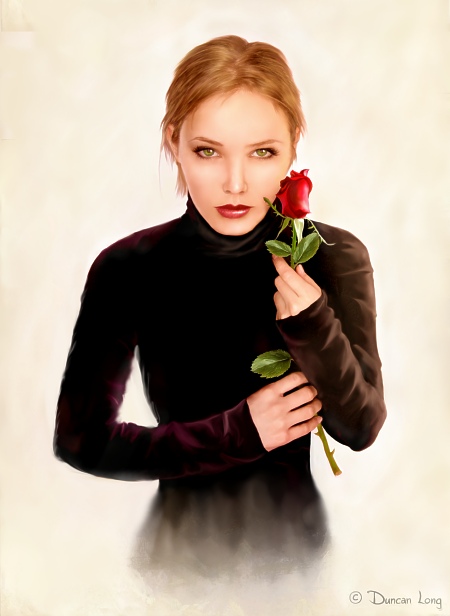
Book Illustration by Duncan Long

Another book illustration that does not yet have a home: “For You, a Rose.”

=====================
Duncan Long is a freelance book illustrator for HarperCollins, PS Publishing, Pocket Books, Solomon Press, Fort Ross, and many other publishers and self-publishing authors. See his cover illustrations at: http://DuncanLong.com/art.html
=====================

Tags: , ,

Comments Off on For You, a Rose

Craftsmanship Trumps Talent

Some folks get discouraged from becoming artists because they don’t have much natural talent at drawing.

As a one-time T-square and triangle-aholic, I can tell you that many fine illustrators can’t draw worth beans. They just know how to use their tools to make lines, shadows, and what-have-you.

Craftsmanship not talent. Over time, craftsmanship will trump talent. And if you take a little talent and add years of craftsmanship, you start creating some serious work.

Practice. And remember the undo button is there for a reason. Take chances. You can always go back and start over if the idea falls on its face. And sometimes it will soar to heights you didn’t imagine you might fly.

For me, and many others I would bet, the beauty of digital creations is that I no longer produce work with erasures through the paper or eight layers of Whiteout and glued-in sections, like I was doing not that long ago in the Dark Ages before computer art was even slightly practical.

If you can’t draw, work on the skill until it is yours.

=====================
Duncan Long is a freelance book cover illustrator for HarperCollins, PS Publishing, Pocket Books, Solomon Press, Fort Ross, and many other publishers and self-publishing authors. See his cover illustrations at: http://DuncanLong.com/art.html
=====================

Comments Off on Craftsmanship Trumps Talent

Trauma and Creativity

We’ve all heard about the suffering artist. Edgar Allan Poe drinks himself nuts, scribing poems and stories that seem to relate to the early loss of a young woman he loved. Vincent Van Gogh lopped off an ear and then painted a picture of his one-eared self. These aren’t unique artistic tales. There really is a higher incidence of drug abuse, bipolar problems, etc., among creative people.

Many people assume that creativity causes the artist to suffer. “His art drove him mad.”

It now appears things are the other way around.

While the creative process might sometimes worsen an artist or writer’s emotional state, as far as the proclivity toward being in that state is concerned, that tendency was there first and might also be the source of the creativity.

Of course there’s no one “cause” of creativity. A wide range of events are necessary for an individual to become creative. Among those discovered are encouragement of parents and mentors, birth order, and even genetics.

However it’s interesting to note that many creative people seem to have suffered childhood trauma of one sort or another. (Robert J. Sternberg, Handbook of Creativity, p. 175).

And there is a wealth of studies linking childhood and adolescent trauma of one sort or another to later emotional issues in later life – including depression.

So what may spark or encourage creativity may also be the catalyst for emotional problems in an individual.

Psychiatrist Kay Redfield Jamison wrote (in Touched with Fire) that while the majority of people suffering from mood disorders aren’t creative, “It seems that these diseases can sometimes enhance or otherwise contribute to creativity in some people. Biographical studies of earlier generations of artists and writers also show consistently high rates of suicide, depression, and manic-depression.”

Further, there’s some evidence that an individual’s creative endeavors are a sort of therapy for depression and other mental problems an artist or writer might suffer. In other words, creativity is a way to cope or recover from emotional trauma.

As Maureen Neihart, Psy.D. (in Creativity, the Arts, and Madness) wrote, “A basic premise of the expressive therapies (e.g. art, music, and dance therapy, etc.) is that writing, composing, or drawing, etc., is a means to self-understanding, emotional stability and resolution of conflict. Creativity provides a way to structure or reframe pain.”

=====================
When not feeling traumatized, Duncan Long works as a writer/illustrator. His writing and artwork have appeared in publications from HarperCollins, PS Publishing, Pocket Books, Solomon Press, Fort Ross, and many other publishers. See his cover illustrations at: http://DuncanLong.com/art.html
=====================

Tags: , , , , , ,

Comments Off on Trauma and Creativity

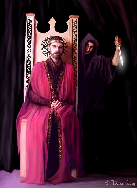
To Kill the King: Assassin

Another book illustration that does not yet have a home: “To Kill the King: Assassin.”

All rights available including book cover rights.

=====================
Duncan Long is a freelance book illustrator for HarperCollins, PS Publishing, Pocket Books, Solomon Press, Fort Ross, and many other publishers and self-publishing authors. See his cover illustrations at: http://DuncanLong.com/art.html
=====================

Comments Off on To Kill the King: Assassin

When Is a Photo Better Than an Illustration?

Believe it or not, occasionally I turn down work (no small thing perhaps for a guy with a bit of Scottish blood in his veins). The reason is that sometimes I’ll decide my style will not fit what the client needs, or that the client might be better served with a stock photo or the like. (And this latter may be about the only viable alternative for those with a limited budget for putting a book or magazine into print.)

There are some serious downsides to stock photos, however, and there are times when an illustration proves a better choice than a photo.

One of these times is when the only alternative is a cobbled-together “Photoshopped” picture created from elements of several original photos. While this process can be very good when done by a real pro, there are times when photos combine into a monstrosity confusing to the eye and often downright ugly (my favorites are those where the photo artist got confused, creating a “photo” with an extra hand on a shoulder or even an entire arm or leg with no apparent owner in sight).

Another time an illustration can be superior to a photo is when a more simplified view of things is needed. In such a situation, a good painting or drawing will stylistically remove detail for a more unified look throughout. This is why drawings are often employed in manuals where a precise but uncluttered view of something is needed.

The illustrator can also excise or censor sections of his picture even when drawing from an actual scene. He can remove a tree, take out the garbage can next to the house, etc. He can even shift elements in the scene this way or that or create combinations of objects that were never actually present.

An illustration can also “take a photo of the impossible.” If, for example, a publisher needs a picture of a man standing on the moon, an aircraft crashing into a mountain, or a gal that is the spitting image of the impossibly glamorous heroine in a title, then it’s often considerably easier (if not the only realistic option) to create these scenes through illustration.

Another plus of an illustration is that it can help avoid becoming the victim of the “mockbuster” or other confusion that results when using public domain photos or those purchased with non-exclusive rights. If all the rights are not available for purchase, there’s nothing to keep a competitor, either by accident or through design, from purchasing and using the same picture on its publication. (With titles not being copyrightable at least in the US, it would be possible for the less than scrupulous to produce a title and photo cover identical to that of a best seller — hence the “blockbuster” idea which is already seen with US hit movies from time to time with cheat movie producers getting covers and titles so similar to a blockbuster that consumers accidentally purchase or rent it).

If the exclusive rights to a photo can be purchased, often the cost may make an illustration an attractive alternative. In such a case the illustration may offer some of the better points above while being nearly as competitive in price.

When no quality photo is available of a historic scene or object, then an illustration may be the only option. An illustrator can work with marginal or damaged photos to create an illustration of the scene or object.

Sometimes a photo is the best choice for a publication. But sometimes an illustration will be a better or perhaps even the only viable choice for a book or magazine.
=====================
Duncan Long is a freelance book cover illustrator for HarperCollins, PS Publishing, Pocket Books, Solomon Press, Fort Ross, and many other publishers and self-publishing authors. See his cover illustrations at: http://DuncanLong.com/art.html
=====================

Tags: , , , , ,

Comments Off on When Is a Photo Better Than an Illustration?