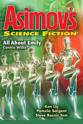
Two years ago, I created the illustration for the “Christmas” cover for Asimov’s Science Fiction Magazine. That was pretty exciting but it was one battle to get the cover right. Part of the problem was the colors selected for the cover: The traditional red/green for the Christmas issue. Red and green sort of war with each other; put a red dot over a green background and it sort of “floats” over the green.
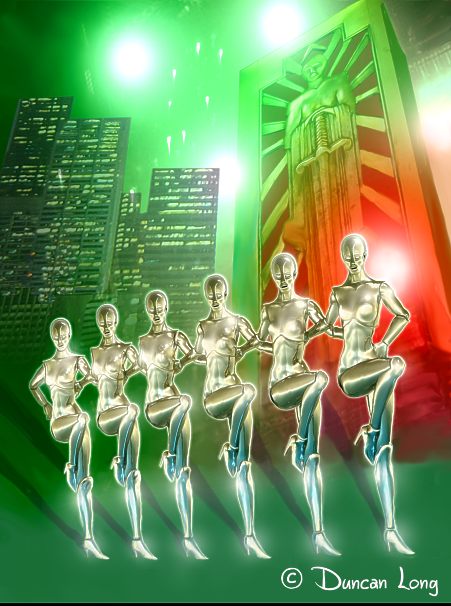
And try to blend red and green and you have a hideous dark mess. So creating red/green gradients required for this cover artwork required a lot of “cheating,” agony, and consulting of entrails to make it look like it was actually happening, even though it’s impossible with ink and print.
My other problem (really a mistake) was monkeying with the perspective. I wanted to create a dizzying effect of looking at high buildings, bright lights, and dancers. So I skewed the perspectives so nothing really matches up properly. But instead of getting a dizzying effect, to my eye at least two years later, it looks incredibly amateurish. If I had that to do over… Yes, that “if factor.”
Anyway, here’s the final magazine illustration I sent to Asimov’s art director.

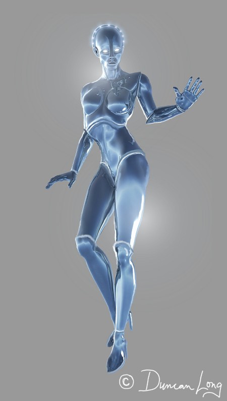
Oh, to have worked with blue and green or blue and red instead of red and green. Blue would have blended. But alas… That said, the original sketch I submitted to the art director was blue — possibly a last ditch effort to convince her that blue might be an option.
It was not (ha).

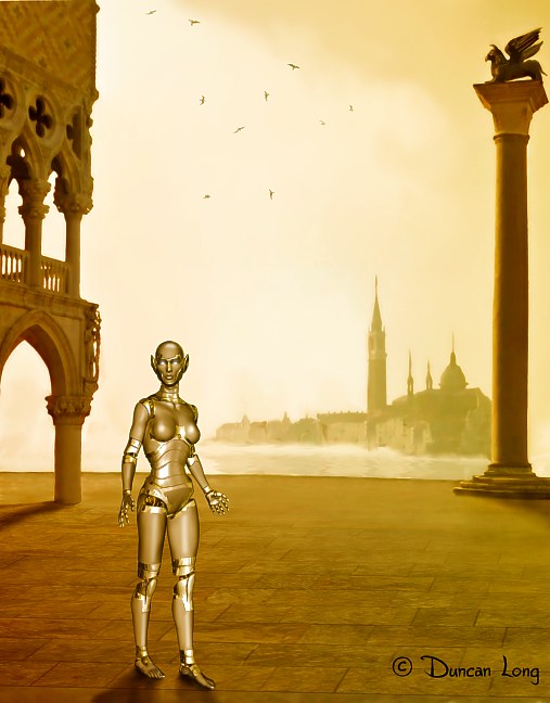
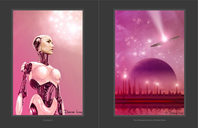
Those with an astute eye will realize that like Dr. Who‘s Cybermen and Star Wars‘ C3PO, my robots for the Asimov’s Science Fiction Magazine cover were greatly influenced by Fritz Lang’s 1927 movie Metropolis. That expressionist science-fiction film was way ahead of its time, and seems to have set the design standards in the SF community for the next 100 years.

Unlike the movie robot, my design had high heels — dictated by the story. (Truth be known, I prefer robots without high heels — that type of shoe is tough to draw from various perspectives.)
The story the illustration was for… “All About Emily” by Connie Willis. And
what a fine story it is. You can read it online at Asimov’s web site.
Nor was that the only fantastic story in that issue. Looking through the index, you’ll discover a lot of greats:
NOVELETTES:
Surf by Suzanne Palmer
Strawberry Birdies by Pamela Sargent
Ephemera by Steve Rasnic Tem
SHORT STORIES
“The List” by Tim McDaniel
“The Countable” by Ken Liu
“’Run,’ Bakri Says” by Ferrett Steinmetz
With editorials by Sheila Williams, Robert Silverberg, and James Gunn
It was a great Asimov’s issue to be a part of. Even with its red and green front cover colors.
================================
Duncan Long has worked in the publishing industry for over three decades, creating over a thousand illustrations for book and magazine publishers including HarperCollins, Amazing Stories, Pocket Books, Asimov’s Science Fiction Magazine, American Media, Ilex Press, Moonstone Books, Enslow Publishers, and many small presses and self-publishing authors. He was also selected by the US Collaborative Summer Library Program as a featured illustrator for 2013. See more of his artwork at Duncan Long’s Online Gallery.


