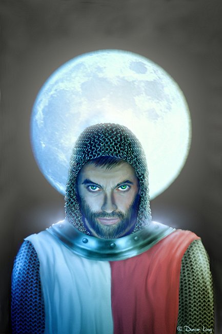
White Ink on White Paper – In the Sunlight
filed in Book Cover Illustrations and Artwork on Aug.05, 2010

Some very amazing book cover artwork owes a lot of its magic to the very subtle glow from metal or other flat surfaces. And more than one UFO or ghost has become a bit more frightening due to the glimmer emanating from its surface.
Translating this magic to book or magazine artwork can be tricky however. That’s because luminosity — in print — lies at the opposite end of the scale from the old “what does a black cat look like in a coal cellar in the dark?” If care isn’t taken in the planning so that an appropriate layout is used in the book artwork, the glow in the illustration can easily be lost.
The reason?
It’s sort of a “what does white ink look like on a white sheet in the sunlight?” thing.
While the eye can adjust to a very wide range of brightness and thus see glowing effects even in daylight, the camera, monitor, and printed page are much more limited in their abilities.
For example, when you watch a sunset, you have no problem seeing both the ground and sky. But take a digital picture of a sunset, and you’ll either have a washed out sky or ground that is nearly pitch black. The camera doesn’t have the wide range abilities of the eye.
Printed magazine or book artwork offers even less contrast in brightness.
Another landmine for glow effects in print occurs with book cover artwork created around the author’s mental image of a scene in the story, because the mind can imagine things that just aren’t physically possible. What the author imagines proves impossible to create for the book artwork
One of my most aggravating book cover cover projects early in my illustration career involved a creating a picture with a glowing UFO — in broad daylight. Sounded easy enough. But in fact, there was just no way to create such a book cover picture, even though it was completely possible to imagine it, write about it in the book, and so forth.
The solution?
Take a page from Hollywood which has dealt with such problems for many decades. Directors know that for a glow to work, you need a dark background. Yes, there’s a reason UFO’s, ghosts, and other glow-in-the-dark effects take place in darkened environments in movies. Yes, it’s scarier. But mostly its about technique. Glows show up much better over a dark background.
So if you’re an author creating a scene that will appear as your book cover artwork, be sure you haven’t created a word picture that seems possible in your mind while being impossible to create in print.
Otherwise the book cover artwork may have a white-ink-on-white-paper-in-the-bright-sunlight look to it.
=====================
When not brow-beating authors to adopt darker background in their stories so his glow effects can work, Duncan Long is a freelance book cover artist for HarperCollins, PS Publishing, Pocket Books, Solomon Press, Fort Ross, ILEX, and many other publishers and self-publishing authors. See his book cover artwork at: http://DuncanLong.com/art.html
=====================