The Yearn to Kern
filed in Book Graphic Design, Publishing Industry on Sep.06, 2010
Kerning is becoming a lost art for many segments of the publishing industry. Kerning refers to the adjustment of space between letters so they look balanced and spaced. It’s more art than science, and good kerning often goes unnoticed.
Generally kerning is reserved for titles, mastheads, or other display type. Quality electronic typefaces (fonts) have tables included with them to kern problem letter combinations automatically. These usually work well – though not always. (For example, many versions of Microsoft’s popular Arial font seems to have a tad too little space after the lower-case “r.”) Consequently many presses will actually adjust various letters in a font table ever so slightly so the kerning looks better throughout the text of the publication.
The rule of thumb for kerning is to make each letter appear to have an equal amount of space on either side of it. Of course this is very subjective and I suspect that any two skilled kerners would have slightly different takes on the kerning needed for any given word and typeface.
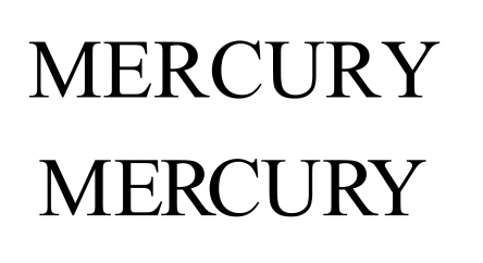
[Above] The top “Mercury” lacks kerning while the lower “Mercury” has been hand kerned.
The main point is that even moderately good kerning is better than no kerning. And skilled kerning can make letters flow and typefaces seem even more beautiful than they already is. (And most of the classic typefaces are quite beautiful when studied with a fresh, open mind.)
Back in the old days, lead type often had to be tortured into properly kerned spacing. It was a job that took a good eye and a little brute strength with lots of patience thrown in. Thus it seems more than a little ironic that when kerning was horribly hard to execute it was common, and now that digital typesetting allows easy kerning, it’s becoming a lost art.
This latter point was recently brought home when I noticed the masthead of a local newspaper (that will remain nameless). At least two of the letters were in dire need of adjustment, and several more could have been nudged this way or that to great advantage. How much more professional the paper would have appeared. And just a little work one time would pay off day after day since the masthead is most likely reused on a regular basis (or could be once it was properly kerned).
I suppose too many publishers figure that since not everyone knows what kerning is, or even notices when letters are a tad out of whack, lack of kerning makes little difference.
I suspect that’s wrong. I would bet that on a subconscious level it makes a difference. Kerned lettering makes titles and mastheads “look better” even to an untrained eye, even if the reader can’t quite place their finger on the reason why things look better.
And conversely, lack of kerning leaves the reader with the impression that they’re viewing a sloppy, amateurish publication.
My advice for those laying out a publication: Spend a little extra time kerning larger type. This will help make your publication look like it was produced by a pro, rather than handled by the lowest bidder in the cheapest labor market the publisher could find.
=====================
A lover of kerning, Duncan Long works as a book cover designer and illustrator. He’s done work for HarperCollins, PS Publishing, Pocket Books, Solomon Press, Fort Ross, Ilex, and many other publishers and self-publishing authors. See his book cover designs – and kerning – at: http://duncanlong.com/illustration/book_illustration.html
=====================
