Clutter, Destroyer of Make Believe
filed in Book Cover Illustrations and Artwork on Apr.18, 2011

Over the weekend I had a short discussion with a friend about how very often a movie, article, or book can be improved by lopping off the first few paragraphs, pages, or minutes of film (depending on the medium). This is an old trick professional editors often employ to jump start an otherwise worthy creation.
At the time of my discussion, I was a bit perplexed as to how this might apply to non-linear art like the illustration business. Then upon awaking this morning and looking at the progression of a piece I’d created yesterday, I realized how this idea of lopping off excess baggage applies to an illustration or other artwork.
The difference is in the number of features appearing within the single frame of the picture. Each element in a painting competes for the eye, and like the too-long introduction to a story, too many elements tire the brain so that the focus no longer goes as easily to where it needs to be.
In a painting, the sum of the parts can be far less than the whole one wants to see. All the little elements detract rather than add to the “gee whiz” factor of the book illustration.
I think this is why book covers being created by committee often become derailed. Everyone has a pet element they want in the final product, and the result too often is a hideous clutter of an illustration that an artist with any talent wishes he’d never been involved in.
Much the same thing can happen with a self-publishing author; he wants all sorts of key elements to appear in the book cover illustration and the result can be a terrible clutter that might sound good on paper, but just doesn’t work as an illustration. Fortunately most authors will listen to their cover artist and allow the clutter to be cleared away with the resulting book cover illustration helping sell the book rather than being an eyesore on the bookstore shelf (and apt to be displayed with only its spine showing).
Now my example.
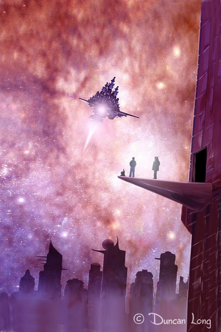
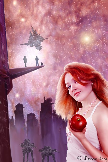
“Eve at Empire’s End” started with the picture above. It works pretty well by itself (and eventually may be sold as a book or magazine cover illustration as such). However it proved too busy when the foreground figure was added:

I rearranged the distant flying city or starship (take your pick) and fiddled with the stars and buildings. But there were too many elements. But no matter how things were arranged, the picture was cluttered and somewhat claustrophobic even though it was a space scene. Furthermore, the focus wasn’t on the gal and apple for the most part.
My solution?
Get rid of the hi-rise with the two guys and robot, simplify the distant buildings, and redo the stars. The flying city was reduced and made more of a background element.
I also wanted a more exotic look for the gal so she got a new hairdo — which then shifted the focus toward the red apple in her hand.
I generally work “oversize” so I could enlarge the picture a bit as well, bringing the gal to the forefront instead of having her dwelling in one corner of the painting.
The result:
Hopefully the reduction of needless clutter has made it a better illustration.
Perhaps a good motto to have when creating a short story, movie, or book cover illustration is “When in doubt, throw it out.”
=====================
When not contemplating the clutter in his studio, Duncan Long often improves his book cover artwork by removing needless material in them. See more of his book cover illustrations (including science fiction, horror, fantasy, mystery and other categories) at his Duncan’s Book Cover Illustration Portfolio
=====================

April 18th, 2011 on 1:26 pm
You are the guy. Simply the best illustrations around!