Book Artwork: To beard, or not to beard…
filed in Book Cover Illustrations and Artwork on Mar.21, 2012

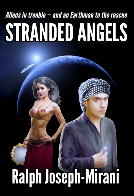
Last week we completed the cover illustration for Ralph Joseph-Mirani’s science fiction epic Stranded Angels. This book cover turned out well with a nice flowing line from the sun rising at the rim of the earth with an orbiting spaceship — both pointing first to the dancing girl, then to the hero of the story, and finally to the diamond he’s holding — which in turn mirrors the idea of the star at the upper left of the picture.
So from a compositional standpoint, it worked out well. Better yet, it wasn’t one of those dry academic exercises in composition that are theoretically good but don’t look too great to the eye. The lighting turned out well, too. From the glowing sun to diamond, with a bit of light filtering through the tambourine. Lots of nice highlights and all contrasting with the jet black background.
No doubt about it, this one’s a keeper.
(And, of course, one might argue it’s hard to miss with a cover design when you have a dancing girl in it — nine out of ten flying monkeys agree.)
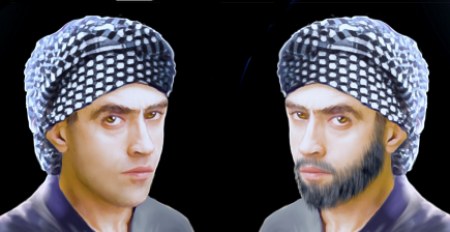
There was one odd turn in the process of creating the cover (and as of this writing, I’m not sure how this story will turn out). The hero might — or might not — have a beard. It’s never actually detailed in the novel, and the setting is in a time and place where beards were common, but so were clean-shaven faces. I created two versions of the picture, one with the guy having a bare face, and the other with him sporting a nicely trimmed beard; this will allow the publisher to see both and then decide from there.

In situations like this, sometimes a writer and/or publisher will agonize over which version of a book illustration to choose. It’s been my experience that when you get to the point where it is hard to decide, there’s really no wrong decision to make. Either will work almost equally well, so even flipping a coin delivers the right “answer” (though I’ve yet to hear of a client flipping a coin — perhaps one day).
Currently the publisher appears to be leaning toward the clean-shaven look. Thus, the version above to introduce the cover.
For those wondering how the alternate book cover illustration might appear, here’s the artwork, sans type:

====================
Duncan Long and his band of flying monkeys create book illustrations and book designs for large and small presses as well as many self publishing authors. You can see more of Long’s illustrations and graphic design work at Duncan Long’s Art Portfolio
=====================
March 22nd, 2012 on 6:05 am
Tough question – I could go either way on this one, with/without the beard.
March 22nd, 2012 on 10:12 am
I prefer the bearded version. I might be biased.