Cover Illustration: Troy A. Rutter’s Science Fiction Novel
filed in Book Cover Illustrations and Artwork on Oct.12, 2012
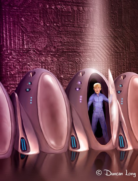
“Journey of Phaedra” science fiction book cover artwork by illustrator Duncan Long
I recently had the pleasure of creating the illustration above for Troy A. Rutter’s upcoming, young adult science fiction novel Journey to Phaedra. The author approached me about creating a cover illustration with possibly hundreds of suspended animation pods on the inside of a large spaceship bay, with one large one that had opened to reveal a human being inside up front.
The proposal seemed a daunting project given the amount of work involved in creating and arranging all the pods from different angles.
Like many complex “shots” the idea was probably better suited to a movie where a camera could pan and zoom to cover the area and let the “eye” know what it was seeing without too confusion. (I’ve found that often “illustration” concepts don’t work because of our tendency to see things the way they’d be in a movie with varying camera shots within a scene).
Unfortunately complex scenes often became a confusing jumble on the cover of a book, especially given the lower resolution of today’s ebooks. Additionally, such pictures are also expensive to create due to the time needed to paint the various bits and pieces that comprise the visual mosaic.
So my solution was to “zoom in” on just a line of the pods. This had the added plus of making it possible to create just a single detailed pod and then digitally duplicate it to create a line of the devices, thereby keeping the costs for the project down.
Once we’d agreed on this approach, I took a stab at creating a row of the suspension pods:
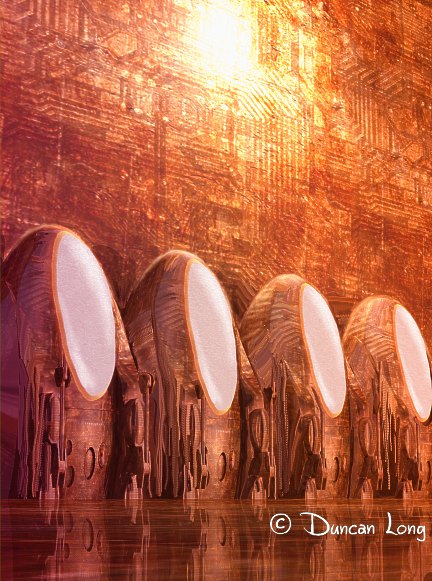
Concept artwork for Troy A. Rutter science fiction novel by illustrator Duncan Long
Since the hero in the novel eventually had to be standing inside (and one would assume, easily step out of) a pod, the base of this first concept artwork was a bit too high. Rather than redo the design, I simply “lowered” the units into the floor (the plus of working with a 3D model at that point) so the glass covers of the pods would be closer to the floor. This yielded another bit of concept artwork for the book cover:
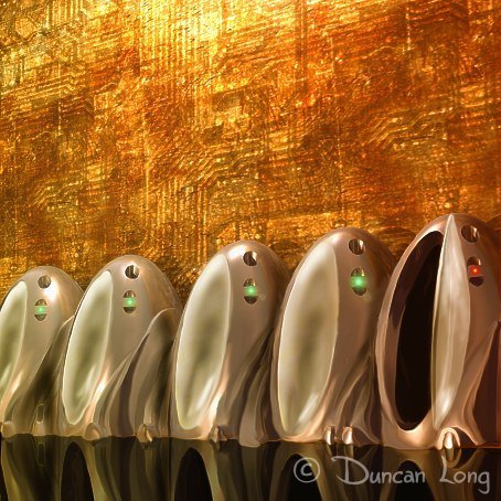
Concept artwork (for Troy A. Rutter’s science fiction novel) by artist Duncan Long
After bouncing the idea off the author and a few friends, the general consensus was that the design was working.
The next step was to create a single pod with more detail, along with the translucent cover (shown here half open), first generating a single unit from 3D software and then switching to my digital paint program to add details and make it less “computer art” looking to the eye:
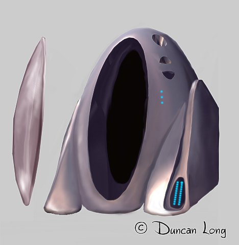
A single pod with an open hatch cover. This single pod could be easily duplicated to create a row of pods. A closed hatch (not shown) was then added over each of the closed pods with the open hatch going alongside the pod containing the hero.
This basic model was then detailed and duplicated along with a duplicated cover that covered the opening of each pod. The half open cover (shown) then went on the pod where the young man would be standing.
Once this was done, the young hero was created; this was pretty straight forward except for his expression. Eventually I created three different “faces” for the author to choose from, with the third variation seeming best suited to the concept of the scene from the science fiction story. (I enlarged the mouth slightly on the final version for the cover as this one seemed a bit too small to my eye.)
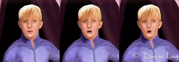
The three expressions created for the cover illustration. Eventually the one on the right was employed for the cover.
Once all the elements were in place, I created a science fictionish textured background (sort of a cross between a circuit board/conduits and stone).
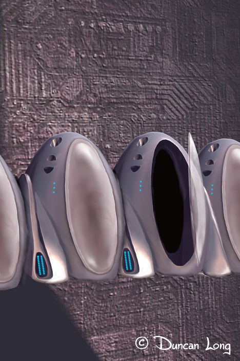
Line of pods sans floor which was painted in after the arrangement of pods was in place.
I then added a polished floor with pod reflections, and a variety of lights to glow on the pods (with a slight variation in colors for the open pod). Finally a beam of light singled out the open pod to draw the viewer’s eye to it, and to show something special was going on with that particular suspended animation unit.
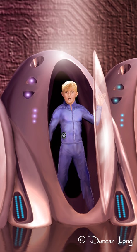
Closeup of completed illustration by artist Duncan Long
So….
Here’s the mockup with the lettering of the final cover for this science fiction novel:

Final “Journey of Phaedra” science fiction book cover by illustrator Duncan Long
==============
Artist / illustrator Duncan Long has created a number of science fiction illustrations for novels and magazines, including Asimov’s Science Fiction Magazine. You can find more of his science fiction artwork at: Duncan Long’s Portfolio of Science Fiction Artwork and Illustrations
October 13th, 2012 on 6:12 am
This is so interesting to “watch.” I would have a hard time picking just one of these pieces. Even with the expressions on the boy’s face, each different expression tells a bit of the story. Very cool, Duncan. Troy – best wishes with your novel!
October 13th, 2012 on 9:05 am
Thanks, Karen.
My hope is that when folks see how book cover illustrations are created, they’ll understand the process a bit better and know what to ask for from the artist or illustrator who’s helping to create their cover.
Hopefully the process is of interest and not like the guy who goes on at length about his work until the eyes of those around him glaze over and they discreetly slink away when he’s not watching.
October 20th, 2012 on 2:09 am
What a beautiful science fiction book cover illustration. And seeing the process you used to arrive it is nothing if not amazing. Thanks for sharing your artwork and giving such insights.
October 25th, 2012 on 9:05 pm
What fantastic book cover artwork. Seeing the progression from the initial illustration to the final cover painting is interesting, too.
October 28th, 2012 on 3:47 pm
What amazing illustrations. Great concepts. Ultimately a beautiful attention-getting illustration.