Stuart Jaffe’s Southern Belle In Print (& Electrons)
filed in Book Cover Illustrations and Artwork on Sep.15, 2013
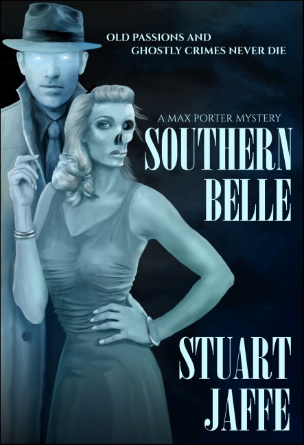
The third book in Stuart Jaffe’s Max Porter paranormal mystery series is now out. The mystery Southern Belle can be found at Amazon in both Kindle and print formats.
There were several interesting challenges in creating this book cover illustration. Foremost was the need to make it appear similar to the previous two book illustrations in the series. In this case, that meant keeping most if not all of the picture on the left side of the front cover and making the color and main character consistent with the previous covers, yet making it all enough different so that a casual observer wouldn’t mistake this new book as one of the previous titles.
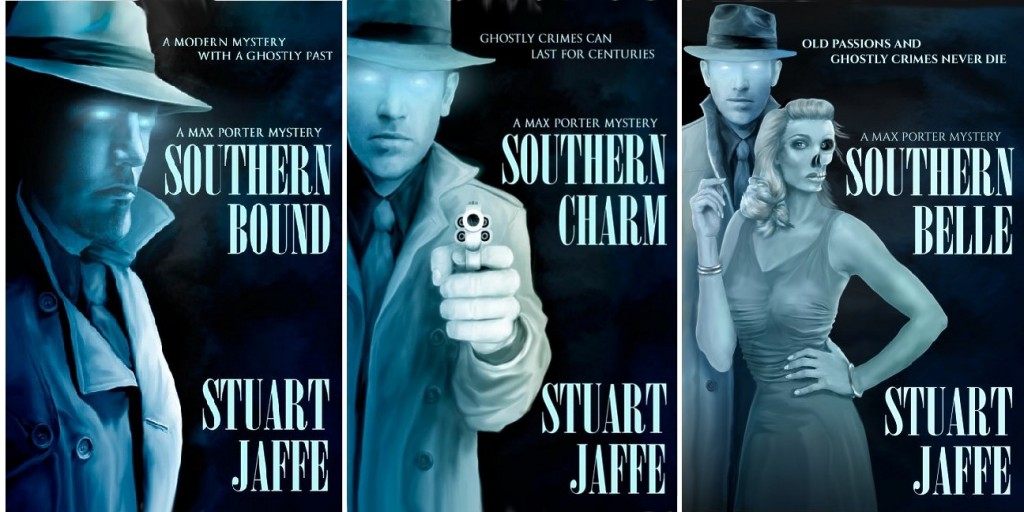
So basically, we had the design equivalent of walking a tight rope. Only with a delete key in case we fell into the lions’ cage below.
Fortunately keeping things different was fairly simple this go around because there would be a ghostly lady to go with the detective specter who had appeared on the previous two books. That proved true — except for the “fairly simple” part.
Here was the first stab at the task:
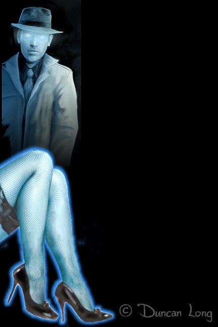
Our first idea was a “Hello, Mrs. Robinson” shot (for those who remember The Graduate movie poster). It was a good idea, but didn’t work perfectly for two reasons: First, a bright glow was needed to make the legs stand out, and that drew too much attention away from the detective. And without the glow and because of the “everything on the left” layout limitation, the legs looked as if they might be growing from the detective in some horrible resurrection gone wrong — not the look we were aiming for.
Back to the drawing board.
Next came:
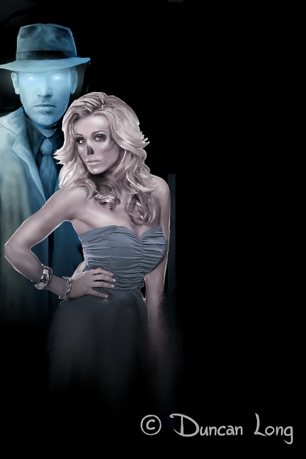
While the gal in this sketch had too much color for the palette we were working with, this experiment suggested the idea would work. The only catch was that there was no real interaction between the characters. So…
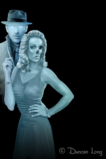
As can be seen, I flipped the picture over and then painted in a hand/arm to reach up toward the detective. Originally she held his tie, but space limitations proved too small for her to grasp his tie. Fortunately the painting was digital, so it was a snap to move the gal over a tad to play with the detectives right coat collar instead of his tie. By adjusting the gal’s apparent height, we were able to put her elbow into the space in the lettering — almost as if that had been the plan from book one. One of those happy little coincidences that one is sometimes blessed with during layout. The interplay of her holding his collar not only brought the characters together but also hinted at the intimacy that would be part of the storyline.
A little comparison between the two versions of the gal also shows how I revamped her jewelry, hair, and dress for a closer match to the story (which had her based in the 1940s).
At this point we were almost finished. The author felt our lady needed to look a bit more decayed on the left side of her face (the viewer’s right) as well as having her hair on that side appear like she’d been in the grave for some time.
These last changes led to the final version of the Southern Belle cover illustration:
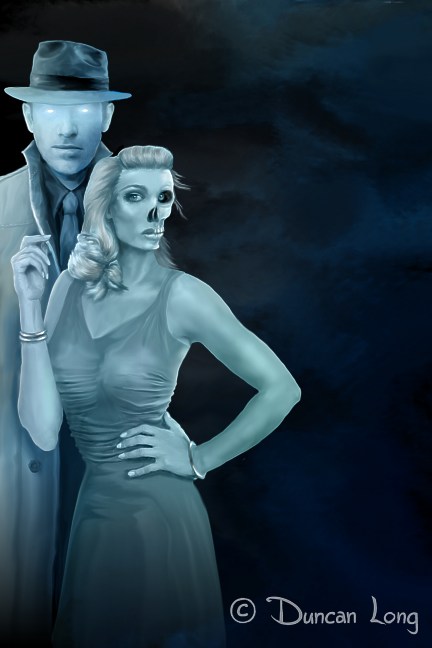
As this illustration suggests, Jaffe’s Southern Belle is a very different story.
Here’s a quote to give you a feel for just how strange (and intriguing) the story concept is:
Max thought he had enough trouble dealing with one witch in Winston-Salem. But a new case brings to light an entire coven of witches.
Angry, cursed, dead witches.
Lucky for Max he has the aid of his partner, the ghost of 1940s detective Marshall Drummond, and his sharp-witted wife, Sandra. Together, they’ll face enemies at every turn, and things only get worse when the mysterious Hull family and the FBI start poking into Max’s life. He’ll need all his team can give with a case that involves the theft of a cursed bell, dark magic, spirit possession, and ghastly murders.
All in all, just another day at the office for Max Porter.
You can read more from Southern Belle with the “look inside” feature at Amazon.
Or, better yet, take a look and buy the book. It’s a good read and if you want a mystery with a twist, this is it.
======================
Duncan Long is a writer/illustrator who loves the challenge of creating book cover artwork to match the plots of novels. You can see more of his artwork and illustrations at Duncan Long’s Portfolio.
September 18th, 2013 on 3:24 pm
What cover illustrations. Wow – -just wow!
September 26th, 2013 on 9:34 pm
I appreciate your site. This is an amazing concept for a novel, and you’ve really captured the feel for the book with your illustrations. Many thanks!
October 3rd, 2013 on 8:55 pm
These make fantastic covers for a mystery involving ghost characters. Really a neat idea with book covers that convey the unique story idea.
October 8th, 2013 on 12:53 pm
Cannot believe how fantastic these book covers are. You have done amazing work with these illustrations.