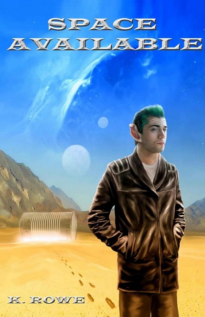
K. Rowe’s Sci-Fi Adventure Space Available Now Available
filed in Book Cover Illustrations and Artwork on Sep.15, 2013

K. Rowe’s Sci-Fi Adventure Space Available in a Kindle version as well as print.
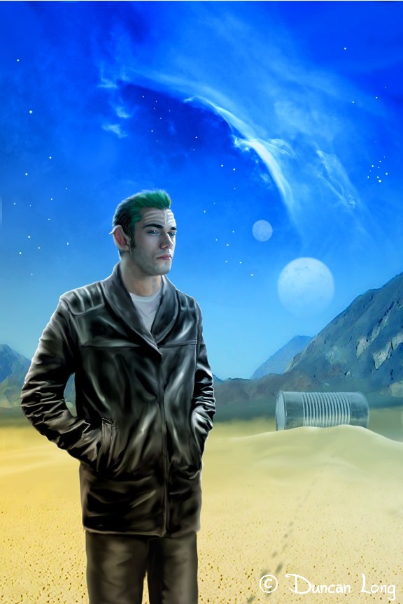
As I prepared to create this book cover illustration, it presented a rather odd problem; one of the central elements for the cover (and one of the running jokes in the plot line) is an alien artifact that looks like a giant tin can. One might think having a common thing like that to illustrate would be a breeze. And in some ways it was. But the catch is that it is supposed to be bus-sized. So if care isn’t taken, the results can either look like the perspective is horribly wrong or that a human-sized character is the proverbial knee-high to a grasshopper.
Worse, during the first draft of the cover artwork, the artist (me) didn’t realize the “can” was huge rather than a regular-sized tin can. So my first stab at the book cover produced an alien artifact that was out of scale by about a factor of about 100.

After this ooopppsss moment (which likely either rewarded my client with screams of fear or laughter upon seeing the results — hopefully the latter), I went back to the drawing board and put the “can” into the distance so its size would allow it to be seen in its totality, and also allow for the landscape to give a feel that it was distant (rather than close with a tiny ant-sized guy in the foreground). To give the eye another clue to size, I added some tracks in the sand leading off toward it. At this point the character was also turned slightly to offer more of a profile view. Additionally his leather jacket was painted in at this point, with the design having a subtle “sci-fi” look to it.

Now we were in the ballpark with the cover layout and character, though things weren’t quite there just yet.
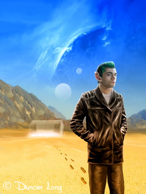
To give the idea that the distant object was more than just some alien Quonset hut, we decided to add a “power surge” glow (which occurs in the story) at the base of the artifact and also reduce the size of the sand dune around it. Additionally, I moved the guy to the front right of the illustration to put him in the spot where the eye tends to settle when looking at the picture.
The trick here was flipping the background but keeping the character in the same orientation and moving him to the right so his injured droopy ear could remain facing the viewer (his other ear according to the story being upright like a Vulcan’s). I also made the footprints more noticeable to further cue the eye to the size of the distant artifact.
The result was what became the final cover illustration:

Adding the tracks also told a little “story”: The character had been visiting the artifact, and now was walking away. The sky with twin moons helps complete the science fiction feel so a reader can instantly identify the genre of the story when glancing at the book cover illustration.
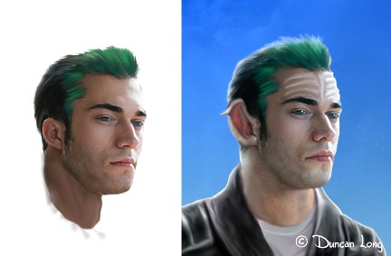
The only other hurtle in this project was matching the character’s face to pictures of him in the previous novels in the series, as well as making him conform to the text descriptions in this and previous books in the series. So during the process of creating the cover, the original character sketch I made (shown below on the left) was gradually modified into its final configuration (on the right). Fortunately such work is pretty straightforward with digital paintings like this where the character is in a layer by himself so he could be easily modified without changing the sky or other features around him.

And that’s the cover illustration. The client cropped the illustration slightly, added lettering, and the cover was good to go.
The story is pretty amazing and most science fiction fans will love this book.
Here’s the “blurb” about it:
Book Three of Dar’s Adventures in Space. Captain Dar Meltom sets his sights on a mission of utmost importance. With the stolen Plexus in the cargo bay of the Marsuian, he heads to Satiris, the planet of his ancestors. Once there, he encounters dangerous creatures, and Lukxia, the last purebred Satiren female on the planet. Dar deploys the Plexus, hoping it will bring Satiris back to life. Rather than keeping Lukxia as a second mate, he presents this most precious gift to Krodus, his long-time worst enemy, now friend. But that’s not enough adventure for Dar.
Lurking not far from Erotis is a wormhole. It’s the very one that brought his father Edward Meltom, Earthling astronaut, to the Ontarrin Galaxy. The explorer in Dar wants to find his father. So together with his mate, Parnela, and Schmuff his Nouian engineer, they tempt fate and enter the wormhole.
What awaits them is anything but a warm Earthling welcome.
If you’re a science fiction fan wanting a “good read,” check out Rowe’s novel. You can read a couple of chapters for free with the “look inside” feature at Amazon. Just be forewarned: Once you start reading, you’re going to be hooked — and entertained for the next few hours as you read the rest of the story.
———————————
Duncan Long is a book cover artist who sometimes has trouble deciding what the apparent size of alien artifacts should be. You can find more of his science fiction book cover illustrations at Duncan Long’s Online Portfolio.
October 8th, 2013 on 2:12 am
An awesome cover. This is just what’s needed to sell a book. Thanks for sharing what went into the creation of this book cover illustration.
October 9th, 2013 on 4:26 am
Wow! fantastic artwork.