Creating the Cover Art and Layout for Prisoners of Eroak
filed in Book Cover Design, Book Cover Illustrations and Artwork, science fiction book covers on Apr.30, 2015
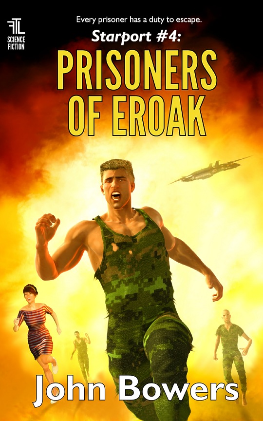
Another of the new cover illustrations for John Bowers’ science fiction “Starport” series of novels. As the title shows, this is for Prisoners of Eroak.
This cover presented a problem that is often encountered in creating book covers: A title that takes up two lines, thereby dictating that the illustration have more “real estate” at its top, and also something not too important at the bottom where the author’s name usually takes up residence. This isn’t much of a problem provided it’s dealt with up front. To smooth the process in creating this cover art, I laid out the text first, then used that template to guide the placement of the various elements of the picture. I also took pains to make the top section of the illustration dark so the title would show up well).
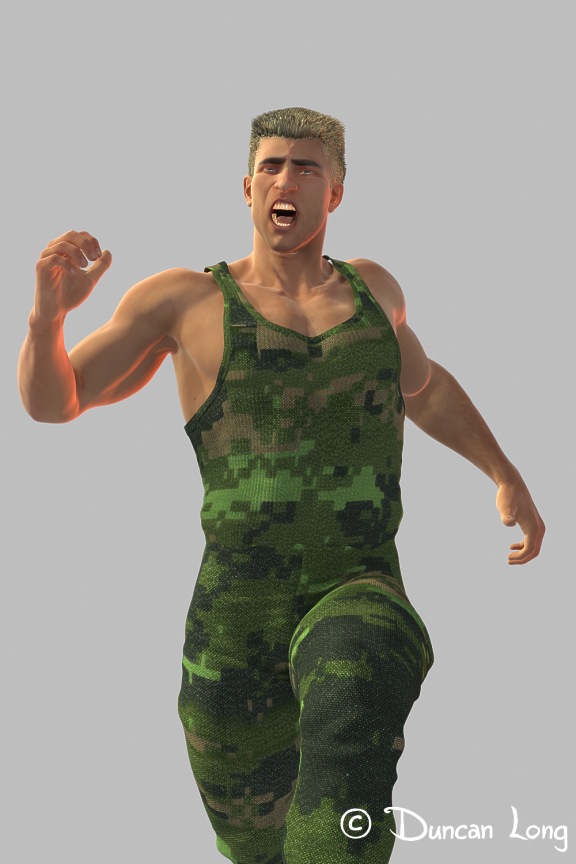
Since we needed to have a number of people running from a large explosion/fire, and since I paint everything digitally, I decided to create the various figures using 3D software. So toward this end, I created a 3D figure of one of the soldiers, and then used that figure to render three slightly modified “people” to create three cover elements “for the price of one” as it were.
To make these guys look like individuals instead of clones, I then painted over each render, giving them slightly different sleeves (or lack thereof), different hair colors (or no hair), and so forth. Here’s the basic model with the original shirt and hair for the “up front” character. (I rotated him slightly in the cover picture to make the cover layout a bit more dynamic and less “squared” on the horizontal/vertical plains.)
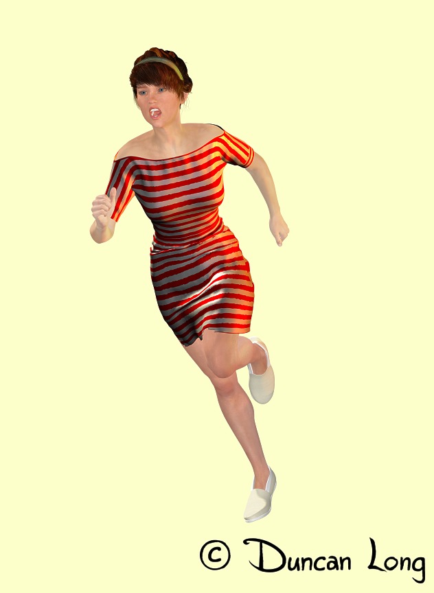
I also used a 3D model for the female character, who (in the story) was a secretary captured and held in same prison the soldiers were in — and who made her escape with them. One of the pluses of a 3D model in this case was that the computer “painted” the strips I painted and loaded into the model as a UV tile — which was fortunate as my first attempt had the stripes running the wrong direction (vertically) for the story. Fortunately rotating my tile 90 degrees and re-rendering the gal and her dress was a very quick and simply fix for the final layout of the cover illustration.
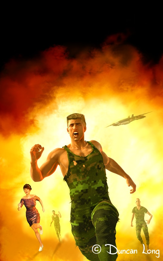
These four characters and a distant space craft (to help establish that it is a science fiction story) were then layered over the explosive background I’d painted. I then painted shadows into the whole thing and did some touch-up work on the characters here and there.
Once the digital painting was flattened, I then dropped it into the text layout I’d done at the first of the project, and it was basically done.
John like the cover illustration and layout so it was practically done after the “first draft” (after I changed the stripes on the dress).
Here’s the cover illustration sans lettering.
As the cover suggests, this is an action-packed science fiction story. You can read sample chapters and find out more about Prisoners of Eroak at Amazon.com.
=====================
Book illustrator Duncan Long has created covers for HarperCollins, Amazing Stories, Pocket Books, Asimov’s Science Fiction, Mermaid Press, and many other publishers, small presses, and indie/self-publishing authors. Find more of his book cover art and designs at Duncan Long’s Book Cover Portfolio.