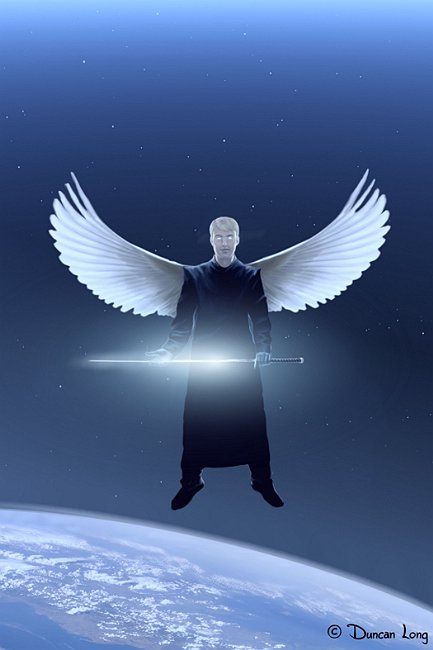
Another Angel Illustration
filed in Book Cover Illustrations and Artwork on May.03, 2010

Another illustration that does not yet have a home… Needless to say, all book cover, magazine, CD, poster, and other rights are available for this illustration (on a first-come, first-served basis).
Art critics and teachers often claim that good artwork should avoid being symmetrical and that off-balanced pictures are more interesting to the eye. I suppose that’s generally true, but there are whole schools of art based on symmetry (Art Deco, for example) and the artwork produced is often powerful and beautiful.
I feel that a figure like this, when balanced, becomes more powerful and somewhat magical/iconic. As such, a supernatural subject like this a symmetrical viewpoint works quite well.
Yes, I am biased.
Yet I would argue that perhaps the conventional thinking that good artwork must be non-symmetrical and off-balanced is a rule that, at least on some occasions, is better broken.
Of course I’ve hedged my bets a little by putting the world on a tilt. Something some might argue is how it is in reality these days.
=====================
Duncan Long is a freelance illustrator whose work has appeared in publications from HarperCollins, PS Publishing, Pocket Books, Solomon Press, Fort Ross, Asimov’s Science Fiction Magazine, and many other publishers and self-publishing authors. See his cover illustrations at: http://DuncanLong.com/art.html
=====================