Chainmail and Book Cover Artwork

book cover illustration by illustrator Duncan Long

Texture can be important in achieving realism in artwork. It can also be a bear to paint if it has a regular, repeating surface. Chainmail is a good example of this. The rings of iron were meticulously made, often with each being riveted into place. And the pattern in which the links of chain were woven has a very distinctive look.

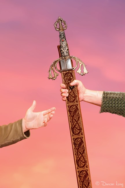
Early medieval knights had armor that was mostly chainmail, augmented with helmet, breast plate, and various other bits and pieces. Yet even armor of the late middle ages often employed chainmail to plug up the chinks between plates as well as give added protection. That means any time an artist paints a knight, regardless of the period, there is going to be some chainmail patterns to paint in.

In the past some artists have simply hinted at the pattern. But often this fails to gain the realism needed, and at worst can look like a high school play where the drama department improvised with heavy knit gray underwear.

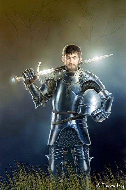
This week I realized there might be an easier way to do things. So I decided to tackle the problem with computer assistance. First I located some chainmail photos, studied the linking system a bit (appreciating the work that goes into making the real thing), and then painted a “seamless tile” of chainmail. This picture can then be “poured’ into sections where chainmail is needed, creating an instant sheet of mail.

Of course the catch is that the picture is “flat.” There are ways to map an image to a surface, but in a 2D paint program these are limited.

Unless…

Part of my idea had been to add perspective over the complex shapes mail might cover by next employing a “Goo” plugin (an old version from KPT Power Tools – am I showing my age?). So I popped up the plugin and started shoving mail sections around to get the links of steel into the proper perspective around the curved areas they would occupy were the painting real.

The process worked like a charm. I painted in some shading and there it was. Chainmail. In just a few minutes instead of hours.

So now I don’t dread painting knights.

The first bit I used the pouring chainmail for was in a scene from John Chadwell’s upcoming Werewolves of New Idria (below). The storyline dictated that one arm needed a chainmail sleeve. (By the way, you can read Chadwell’s book online at: www.werewolvesofnewidria.com.)

Artwork by book cover illustrator Duncan Long

As I got ready to laboriously paint the pattern, I had the brainstorm of making a tiling painting — and the rest is history. (For many readers, this likely is no great revelation – but for me it was.)

The success of the system inspired me to do a second picture today with more mail (and armor) which — since it doesn’t have a “home” yet — has the working title of “The Good Knight” (shown at the top of this article).

Hopefully I’ll be doing more knights in the future as drawing these guys was a childhood love and it is nice to finally be able to do them justice after all these years.

============
Duncan Long is a freelance magazine and book cover illustrator for HarperCollins, PS Publishing, Pocket Books, Solomon Press, American Media, Fort Ross, Asimov’s Science Fiction Magazine, and many other publishers. See more of Duncan’s book cover illustrations — including a few with chainmail — at: DuncanLong.com

Tags: , ,

Comments Off on Chainmail and Book Cover Artwork
When the Sleeper Awakes

Sometimes a dream will inspire an illustration. But for me, more often than not, my artwork starts as a waking idea that is pursued, sometimes sparked by another painting, something seen, or the suggestion of a client.

That said, the most powerful images often key into the emotions, taping into the subconscious where dreams happen. An illustration that can convey fear, love, or loneliness takes on added impact to the viewer.

One fear that combines with the dream state is sleepwalking. We’ve all heard tales of people driving cars, getting into fights, or even committing murder while in dream state – a waking nightmare, if you would. And some mental disorders leave the brain in a dream state while the victim is awake, creating hallucinations and often disastrous results.

From time to time I like to just create an illustration with no real market to sell it to (though often a buyer will eventually appear). This is one of those pictures. It builds on the idea of the sleepwalker; the character awakens to find herself precariously (even impossibly) balanced on a stone handrail, high above city streets, in grave danger of toppling to her death.

I was tempted to paint her with a horrified face, but instead opted for a neutral expression, hoping to convey that moment before awareness sets in that she’s stranded in reality, not dreaming – but not yet quite aware of the danger she’s in.

I laid out the scene in Vue to get the proper perspective and lighting, then almost completely repainted everything for realistic textures, sky, and so forth in Photo-Paint.

And, yes, all the rights are available for purchase :)

============
Duncan Long is a freelance magazine and book cover illustrator for HarperCollins, PS Publishing, Pocket Books, Solomon Press, American Media, Fort Ross, Asimov’s Science Fiction Magazine, and many other publishers. See more of Duncan’s book cover illustrations at: DuncanLong.com

Comments Off on When the Sleeper Awakes

“Drawing Style” Book Artwork

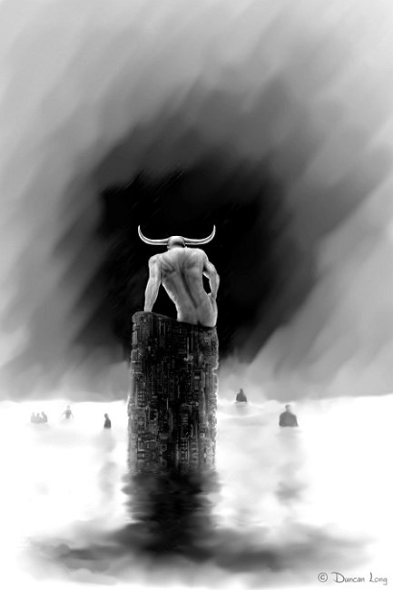
Color illustrations on the inner pages of books can be expensive. Consequently, many inner illustrations for books are black and white (actually “gray scale” the two terms are interchangeable for most users today). Black and white pictures can be tricky because there are no longer colors to separate objects in the picture from the background and so forth.

While working on Richard Thieme’s new book Mind Games, I tried a process that I’d pioneered in one of my previous books (Lightning Wars).

Basically each entails creating a digitally painted illustration and then processing it to look somewhat like a pencil sketch or (in some cases) a cross between a pencil sketch and an inked drawing (perhaps what would result if the artist first penciled in his design and then inked over it — something I did for illustrations not that long ago). And then — this part is the work — touching up and reworking the whole picture so it looks right.

Anyway… Both the author and I were very happy with the results, and I thought I’d give a few sneak previews here of what’s in store with Thieme’s new book.

============
Duncan Long is a freelance magazine and book cover illustrator for HarperCollins, PS Publishing, Pocket Books, Solomon Press, American Media, Fort Ross, Asimov’s Science Fiction, and many other publishers. See more of Duncan’s book cover illustrations at: DuncanLong.com

Tags: , , , , ,

Comments Off on “Drawing Style” Book Artwork

Book / Movie Concept Art Characters

Several more characters created for for John Chadwell’s book Werewolves of New Idria (which is also becoming a screenplay that Chadwell is coauthoring with Ron Shusett, the writer/creator of the Alien franchise as well as Total Recall).

Book / Movie Concept Art by Duncan Long

"Tank" Book / Movie Concept Art by Duncan Long

============
Duncan Long is a freelance magazine and book cover illustrator for HarperCollins, PS Publishing, Pocket Books, Solomon Press, American Media, Fort Ross, Asimov’s Science Fiction, and many other publishers. See more of Duncan’s book cover illustrations at: DuncanLong.com

Comments Off on Book / Movie Concept Art Characters

Book Cover Sneak Peek

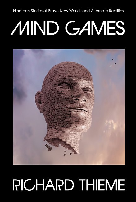
Preliminary design for Richard Thieme’s upcoming Mind Games.

In laying out this book, I employed a playful typeface I’d designed for Critica Grafica magazine and coupled that with a floating statue head as the cover illustration.

"Mind Games" book cover illustration.
=====================

Duncan Long is a freelance magazine and book cover illustrator for HarperCollins, PS Publishing, Pocket Books, Solomon Press, American Media, Fort Ross, Asimov’s Science Fiction, and many other publishers. See more of Duncan’s book cover illustrations at: DuncanLong.com

Comments Off on Book Cover Sneak Peek

Another Werewolf

Roberta-DuncanLong z5-002

Mariah Aceves, another concept illustration for John Chadwell’s book Werewolves of New Idria (which is also becoming a screenplay that Chadwell is coauthoring with Ron Shusett, the writer/creator of the Alien franchise as well as Total Recall).

============
Duncan Long is a freelance magazine and book cover illustrator for HarperCollins, PS Publishing, Pocket Books, Solomon Press, American Media, Fort Ross, Asimov’s Science Fiction, and many other publishers. See more of Duncan’s book cover illustrations at: DuncanLong.com

Tags: , , , ,

Comments Off on Another Werewolf

Concept Art Sketches

Isabella 1e

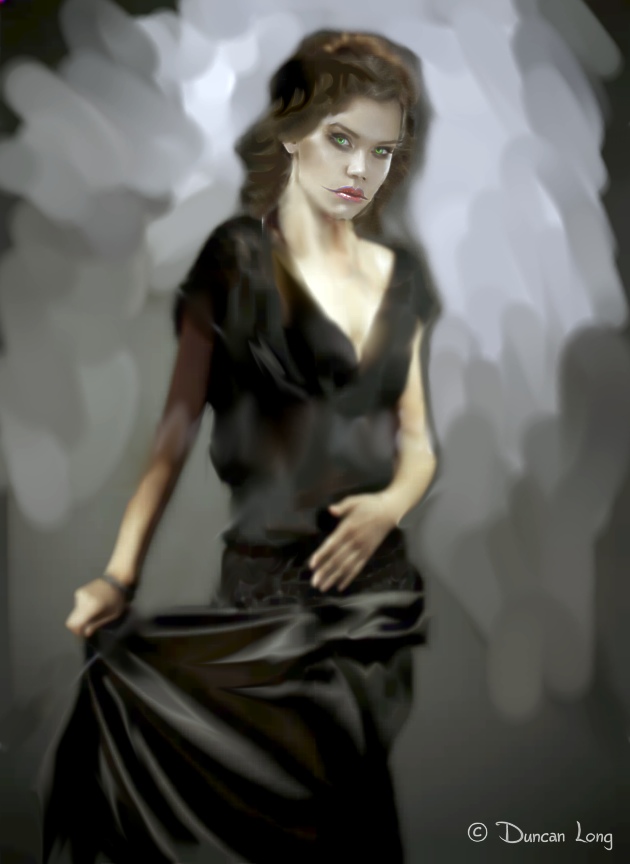
Often it’s necessary to create concept sketches for a book cover design (or game, movie, or other art project). The basic purpose of concept art is to assure that everything is on the right track before it speeds toward completion.

Concept art generally lacks the refinements to be found on the final project. Quick and dirty. The artist spends less time on it and thereby avoids wasting a lot of time if he’s on the wrong tangent.

That said, concept artwork can be quite attractive in its own right, perhaps in part because it demands the viewer add details within their own mind.

A good example of this is in my recent character concept shown above (produced for Mindy MacKay’s Peacebreakers). The figure has more detail in her face, yet lacks refinements especially in the hair, fingers, dress, and so forth. And the background is basically missing.

Yet the picture works. The mind does a wonderful job of bringing such a sketch to life, and this magic is one reason that art has survived despite photography and its ability to capture precise details. And as a special category of painting, concept art basically paves the way for the refinements that will be added later as this book cover artwork is completed.

Now… Back to work.

============
Duncan Long is a freelance magazine and book cover artist for HarperCollins, PS Publishing, Pocket Books, Solomon Press, American Media, Fort Ross, Asimov’s Science Fiction, and many other publishers. See more of Duncan’s book cover artwork at: DuncanLong.com

Tags: , , ,

Comments Off on Concept Art Sketches

The Eye and Book Cover Artwork

Monsters Down Mapple Street z2-DuncanLong-022

The human eye is a very sensitive organ. Coupled with our brains, the human “optical system” is capable of perceiving amazing changes and differences between objects.

And the eye/brain is quick to spot a “mistake” in terms of line or light. I have often been amazed that just the change of a single degree in the rotation of an object can be spotted. And we all know about crooked picture frames hanging on walls; if it is even a little off level, it bothers most people.

When creating a book cover illustration, the eye’s ability to “spot a fake” can create problems for the artist. Perhaps problems are most acute when it comes to the light/dark contrasts.

Complications can be heaped upon the potential problems when an author writes a scene that seems perfectly logical and which can even be “pictured” in the mind’s eye – yet is totally impossible in the real world – or on a book cover. When that picture goes from the imagination to a book cover illustration, the eye becomes involved and can spot the impossibilities of physics. The writer basically word paints the artist into a corner.

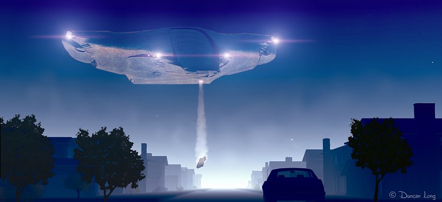
One such case occurred when an author had a novel in which a UFO with bright lights lands during the day and levitates objects from the ground into the ship with a bright beam of light.

Sound okay?

To most people it does. And oddly most of can “picture” it in our minds.

Yet as the unwary artist starts to create create such a picture, he quickly discovers that bright lights don’t show up in the daylight when you’re working with a video screen. And the situation is even worse when the picture is printed (the light/dark contrast with ink and paper being even less than on a video screen).

The eye wants to see something very bright and somewhat yellow if it is going to believe it is looking at daylight. And if that is achieved, then nothing can be brighter, not even those “bright lights” on the saucer in the daylight. If they are, the eye perceives the daylight as being at dusk rather than noon. The picture can’t be true to the word pictures. It is impossible. (We finally solved the program by having the scene at night, perhaps proving that no problem is too big not to run away from.)

This same thing applies to UFOs in movies. The really effective flying saucers arrive at night. Close Encounters of the Third Kind would not have been nearly as impressive had the mother ship or any of the smaller UFOs been spotted during the day. But at night… Ah… Then things were much different with glowing lights and otherworldly, magical effects that makes the movie breath-taking to see.

I recently ran into a similar problem with a cover sketch that needed a green glowing sphere being played with by a cat. When I made the first sketch, the editor said, “Looks good, only no white in the center of the globe. The ball is all green.”

I was surprised because that sphere was green. Then I realized what had happened. There are about a million or so shades of green between almost black to a green that is light. And those light greens will appear to be white if you can’t put something white right next to them for comparison. (Basically the eye settles on the lightest color and our brain perceives that as “white” even when it is not.)

That’s the artistic dilemma with a green glowing sphere: Without the very light green center, it isn’t likely to be perceived as glowing. Instead most folks “see” it as a greenish cloud or as a round splotch between the viewer and the object behind it. It’s only when those light shades of green – nearly white and perhaps even perceived as white without any other white in the illustration – are added to the sphere does it give the illusion of glowing. Add some very dark greens to give the illusion of shadows and refracted light along the edge of a spherical shape and at that point what is really just a shaded flat circle becomes the glowing green sphere to most people’s eyes.

Now if I can convince my editor.

============
Duncan Long is a freelance magazine and book cover artist for HarperCollins, PS Publishing, Pocket Books, Solomon Press, American Media, Fort Ross, Asimov’s Science Fiction, and many other publishers. See more of Duncan’s book cover artwork at: DuncanLong.com

Comments Off on The Eye and Book Cover Artwork

Werewolves of New Idria

Roberto Aceves - El Cid 1z-033

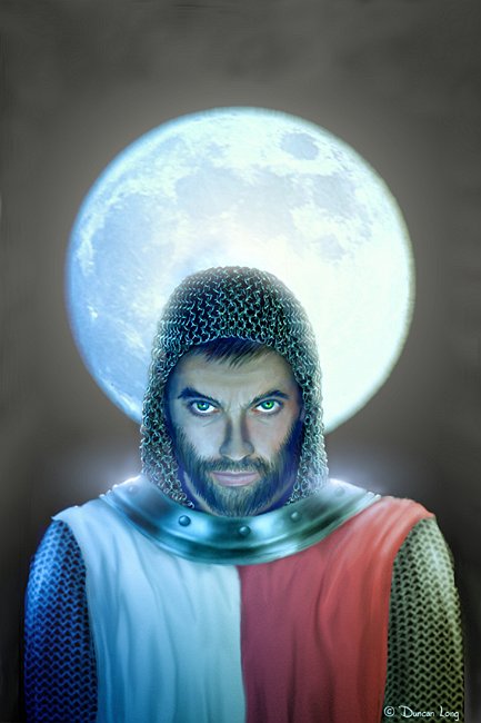
I’ve recently started an illustration project that will create character portraits and other artwork for John Chadwell’s book Werewolves of New Idria (which is also becoming a screenplay that Chadwell is coauthoring with Ron Shusett, the writer/creator of the Alien franchise as well as Total Recall).

The basic plot follows several characters through history, from the Crusades to modern times. As such, it has a nice mix of adventure, moral quandaries, and scenery – perfect material for both a book as well as a movie. My initial take has been “it can’t miss.” And the characters and plot have proven to be inspiring as I create illustrations to help bring characters to life at the web site.

The picture above is of one of the key characters Roberto Aceves.

You can learn more about this story as well as read the chapters of the book as they’re placed online at this site:  Werewolves of New Idria.

============

Duncan Long is a freelance illustrator for HarperCollins, PS Publishing, Pocket Books, Solomon Press, American Media, Fort Ross, Asimov’s Science Fiction, and many other publishers. See more of Long’s book illustrations at: DuncanLong.com

Tags: , , , , , ,

Comments Off on Werewolves of New Idria

Book Cover: Standing Up to Experts and Authorities

PresleyStandingUp

I recently had the privilege of creating a cover for Dr. Sharon Presley’s new book Standing Up to Experts and Authorities (The Solomon Press). Presley received her Ph.D. in social psychology from the City University of New York Graduate Center where her mentor was Stanley Milgram. (Milgram who created the classic experiment which shows that a large percentage of the population will administer potentially lethal doses of electrical current to a test subject if an authority figure orders them to do so.)

For the overall cover design, the author asked for the typeface employed in the original The Prisioner TV series (created by Patrick McGoohan and George Markstein). This typeface is basically Albertus with the lower case “e” right loop cut away and the dots left off the lower case “i”.

For the back cover I employed a condensed sans typeface since there was a lot of information to pack into the small area, and also because Albertus doesn’t lend itself to easy reading at a smaller size. Finally I created a vector version of the Solomon Press logo to help avoid having a “fuzzy” look to it. A black background gave the cover a somewhat ominous feel, yet also permits a very rich looking cover as well.

One challenges was creating archetypical “authority figures” which reflected the diversity of the various “little tyrants” one might encounter these days. I finally settled on three figures for the illustration, one representing science/medicine, the second a businessman/politician, and the third a “man in uniform” – in this case, a policeman. (We had originally thought about an abstract lone figure standing in a crowd that was seated, but this proved too nebulous and never even got to the rough sketch point in the project.)

The other challenge was creating expressions on the characters that projected a feeling of disdain and/or superiority. Obviously an artist needs to know a lot about micro-expressions and body language to convey such emotions. (Interestingly enough, while many people can’t read such facial expressions on a conscious level, they do perceive the messages on the subconscious, causing them to feel uneasy or have “intuitive” feelings about those displaying these small facial expressions.) Capturing such facial expressions in artwork can thus deliver a somewhat disquieting message to those who don’t directly read facial expressions. Hopefully this cover achieves that.

After finishing this cover, I realized that those in authority often have “costumes” or uniforms that make them distinctive from the general population: Expensive suits, white lab coats, flag pins or ties, or even actual uniforms. Each bit adds a little bit of intimidation.

So can there be an authority figure in a nudist colony? Sadly, I expect the answer is “yes.”

=====================
Duncan Long has a wide range of clients he does cover artwork for including HarperCollins, PS Publishing, Pocket Books, American Media, Fort Ross, Asimov’s, Solomon Press, and many other publishers. See more of his book illustrations at DuncanLong.com.

Comments Off on Book Cover: Standing Up to Experts and Authorities