8 Book Cover Illustrations for Joan of Arc
filed in Book Cover Design, Book Cover Illustrations and Artwork on Jun.09, 2011
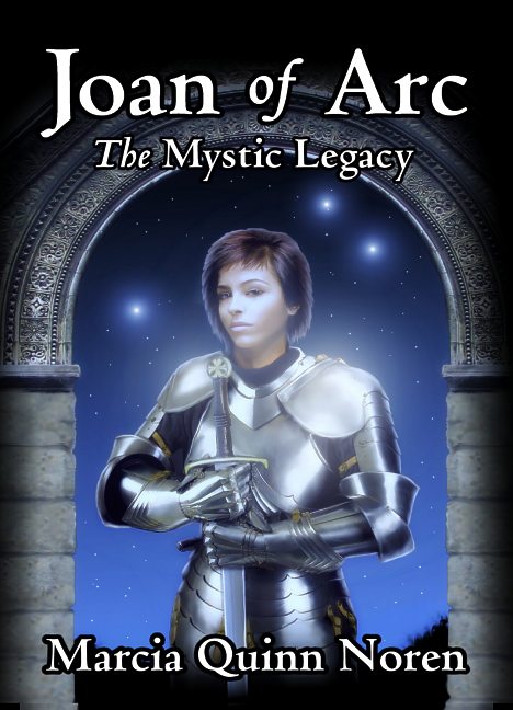
Over the last week one of my book cover projects has been creating the cover for Joan of Arc: The Mystic Legacy by Marcia Quinn Noren. This carefully documented non-fiction book takes a new look at some of the history and experiences behind Joan of Arc.
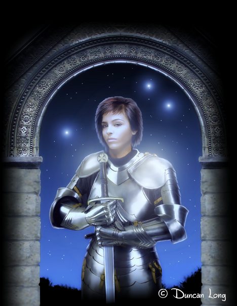
As such, it was important to take pains in getting the sword and armor as accurate as possible for the cover. The other consideration was to capture the almost magical feel that some of the historic stories about Joan contain.
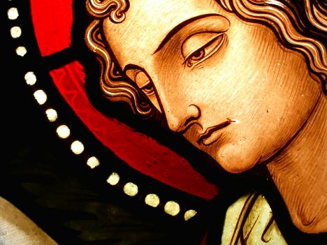
In an effort to give if a bit of a supernatural feel as well as connect it to her Christian roots, I boosted the outlining in the picture just a tad and used a black outline around the lettering to give things (I hope) somewhat of a stained glass window look that can often be seen in older European church windows.
(Here’s close up of a stained glass window in the Chappel of Eyneburg, Belgium that shows the “black outline” of the leading. |Photo by Lusitana].)
I choose the typeface for the cover with an eye toward making it close to the historic period as possible while also being easily read by a modern audience. I also wanted a typeface that wasn’t too obtrusive, capable of giving a flavor but then “vanishing” as the viewer read the text. The best choice proved to be the “Centaur” typeface, modeled after Venetian typefaces from the late 1400s.
My first attempt at the book cover illustration created the face and armor that would eventually find its way to the final version. I used blue “night view” coloring plus some blur/glowing to make it appear as if her armor glistens in the moonlight.
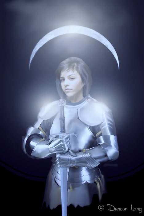
One problem. As anyone with a little physics or astronomy under their belt can see, unless Joan is standing on her head, or is dwelling on a large satellite circling our Moon, I painted the Lunar landscape upside down. Flipping the image of the moon didn’t work, looking quite awkward.
And a full moon hinted at a vampire or werewolf story. So the moon had to go.
But the arch idea worked, so I replaced the moon with a stone archway, making it very ornate to offset the plain finish of her “White Armor.”
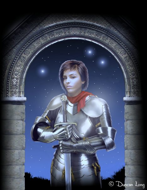
The archway worked. The scarf (despite the notion that a splash of red should work) did not. It would vanish from here on during the next few updates.
At this point the expression on the face needed to be modified. Fortunately a digital painting allows for a wide range of expressions so I created f few possibilities — the picture on the lower right was the final version (however we may still make some changes with the lips and hair as there’s some concern she’s looks too contemporary).
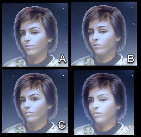
Once the facial expression was settled on, I put things together, painted in the stars, and added the metallic “moon glow” that seems to capture the spirit of the book so well. Additionally everything was shifted toward the blue end of the spectrum for a moonlight effect, even though the moon is no longer in sight.
We may still make more changes. But for now, this is the final version of the illustration:
=====================
When he’s not fussing with historic typefaces and armor for his book covers, or posing as Joan of Arc’s horse, Duncan Long generally can be found painting book illustrations for presses and self-publishing authors. You can see more of his book cover designs and illustrations at Duncan’s Portfolio
=====================
June 9th, 2011 on 2:46 pm
Amazing artwork! You’ve really caught the spirit of Joan with this.
June 9th, 2011 on 4:41 pm
Amazing book cover. I hope you announce when this is in print so I can buy a copy.
June 9th, 2011 on 8:27 pm
Super cover picture. Well done.
June 9th, 2011 on 9:23 pm
Nice work, Duncan. Amazing how the subtle change in facial expression makes a difference. Version ‘B’ would definitley have been Joan’s sulky teenage phase.
I’d agree about the hair looking a bit too modern.
June 9th, 2011 on 11:21 pm
I’m not sure I agree with your complaint about the moon (unless I misunderstood). I think your depiction is reasonable, but she’d have to be close to the equator. See http://www.greetingsamerica.net/MoonPhases/. I agree that the final is better though.
June 10th, 2011 on 8:57 am
Beautiful cover, but why isn’t your name on the final version?
June 10th, 2011 on 9:08 am
Appreciate the kind words.
Greg, never even considered that. Too much time in the Northern Hemisphere, I guess.
Jane, generally the book illustrator gets credit for a book cover on the copyright page with the author’s name and the book title (perhaps with a blurb) being all that’s on the front cover. Sometimes an illustrator will hide his initials in the cover — or have a special icon in the picture, but that’s not the case with this one.
June 10th, 2011 on 12:05 pm
This is certainly a outstanding post. Thanks a lot for bothering to detail all of this out for us. It is a great help!
June 11th, 2011 on 6:10 am
HMMM Duncan it’s no wonder you get awarded such lovely projects, you are obviously an expert and you deserve great jobs.
I’m still the Luddite stuck with pens and pencils and have never made the digital journey but when I read how you have so skilfully manipulated the facilities of digital, I must say I am tempted to give it a try.
That’s a very skilled piece of work and I appreciate the lesson you’ve given me.
June 11th, 2011 on 7:35 am
Janet:
I was a pen and pencil man not that long ago. That changed when a scanner I bought came with a free art program (the name of which I’ve now forgotten — it sadly fell by the wayside as Photoshop, Photo Paint, and Paintshop Pro took over).
After playing around with the program, I realized I could do more with that then I could with pen and ink. Shortly after that I packed up all my draftsman tools and have never opened the box again. Today I can’t imagine tackling a book cover illustration with the old tools I used. It’s like a whole different world.
June 11th, 2011 on 10:19 am
Legend has it – I think – that Joan gave herself a boyish haircut before she led the army onward. You made her facial features quite French, exquisite!, so perhaps an altar-boy haircut with a few jagged edges would look right. She should not look too well-fed.
June 11th, 2011 on 7:30 pm
Hi there,
was browsing your site and followed the link to this blog and man oh man what a beautiful painting. An author must be proud to have a cover like this. It will sell a lot of copies with artwork like this. Thanx for sharing.
June 12th, 2011 on 6:07 pm
Duncan,
Once again you’ve outdone yourself! Amazing artwork. she’s beautiful and strong at the same time. I love it. The book will fly off the shelves with your art being the first thing people see! What a smart Author to have chosen you.
Patricia
June 12th, 2011 on 6:13 pm
@ Patricia: Thank you (your payment for boosting my image is in the mail — but don’t hold your breath until it gets there….). Seriously, appreciate the kind words. Much appreciated.
June 13th, 2011 on 8:18 am
[…] Now we were in the ballpark. About the only problem with that the story is set in a sort of Middle Ages type environment and the kid’s clothing looked like a contemporary t-shirt. So the final task was to paint a heavy robe over his arms and torso, yielding the final cover (at the top of this post). Also, the archway would get into the way of the title lettering, so it was decided we should drop that (it did get used for another project, as those with a keen eye will notice in the Joan of Arc blog post). […]
June 13th, 2011 on 8:17 pm
An awesome cover illustration Duncan!