3 Book Cover Proposals for The Brightworking
filed in Book Cover Illustrations and Artwork on Jun.13, 2011

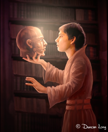
I recently landed a contract to do the book cover illustrations for a YA trilogy from Enslow Publishers, Inc. Written by Paul B. Thompson, the series is “The Brightstone Saga,” with the first book titled The Brightworking.
The final cover is shown above.
But it took three stabs before we arrived at it.
The basic elements were set: The young hero of the story was to be in a dark library where he discovers a bronze magical/robotic head with ivory and jeweled eyes and a hinged jaw. The two would be bathed in light to create a high contrast with the background.
My first try at the picture placed the head on a shelf with the young man reaching toward it:

The catch here was that this arrangement placed the “focus” of the illustration in the center of the book cover — and that center was basically empty space.
The solution was to bring them together (in what struck me as a “Hamlet Pose” — “Alas, poor robot…”):

Now we were in the ballpark. About the only problem with that the story is set in a sort of Middle Ages type environment and the kid’s clothing looked like a contemporary t-shirt. So the final task was to paint a heavy robe over his arms and torso, yielding the final cover (at the top of this post). Also, the archway would get into the way of the title lettering, so it was decided we should drop that (it did get used for another project, as those with a keen eye will notice in the Joan of Arc blog post).
The publisher wanted to use the library background for the back cover; fortunately I was working with layers, so it was relatively easy to remove the characters from the foreground and add a color gradient to the books so they matched the final front cover illustration. That yielded the darkened books that would serve as a background for the blurb lettering on the back cover.
Once again it is easy to see the pluses of digital painting; moving the arms and heads about the composition, or removing the foreground from the background, is relatively easy with a digital painting. With actual paint, it would dictate a complete repainting of the work. And of course “shipping” the digital file to the publisher as an email attachment beats packing and shipping it any day of the week.
So pushing electrons is much easier than pushing pigments when it comes to book illustrations.
But I do miss the smell of linseed oil.
====================
Duncan Long is a book cover artist who paints with electrons. See more of his book cover artwork at: Duncan’s Book Illustration Portfolio
=====================
June 13th, 2011 on 2:01 pm
I love these series of “how the cover evolved”. In this particular one, I like both the preliminary pieces better than the final. I know you had to add the robe to put it in the right era–but in doing so, the boy got way skinnier (maybe because ancient monks don’t eat well?), and the angle of his left arm changed. It makes the upper arm look too short. I do like it better without the archway, though. Still great work, I drool over some of your back catalog.
June 13th, 2011 on 4:05 pm
What an amazing cover picture. I’ll be watching for this book when it comes out and plan to buy it just so I can own the cover print. The author is lucky to have you for the artist.
June 14th, 2011 on 1:15 pm
Hi,
My name is Koko and I like your illustrations.They are full of atmosphere and very attractive…. I like your illustrations and I wish you all the best in your work
June 14th, 2011 on 7:16 pm
The most I liked is the first one, inspiring, magical, keep up the good work!