6 Excellent Articles About Book Layout and Text Design
filed in Book Design and Layout on Jan.29, 2012
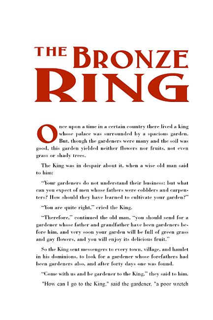
Good book layout is partly an art but mostly a craft. This is especially true of the inner pages where things have been done pretty much the same way since Gutenberg cranked out his first books. If a designer knows and applies the rules, the reward is book text that “looks right.” If the rules are ignored, the result is an amateurish layout that can be painful to see, and which reflects poorly on the author and his book.
Fortunately, the rules aren’t too hard to learn.
I recently discovered a site that has the rules spelled out for the reader in a very enjoyable and admirable manner (reflecting in large part not only the knowledge of the writer, but also his ability to properly sling text onto the page).
Author/designer Dave Bricker has written six excellent articles in regard to the basics (and beyond) involved in laying out the text in a book. Those engaged in such work would do well to study these articles and apply the rules to their own work. Rather than parrot and rework the material in these articles, I decided it best to simply direct readers to the original articles:
Book Design Basics Part 1: Margins and Leading
Book Design Basics Part 2: Optical Margins, Indents and Periods
Book Design Basics Part 3: Running The Numbers
Book Design Basics Part 4: Dashes, Hyphens and Dots
Book Design Basics Part 5: Small Capitals – Avoiding Capital Offenses
Book Design Basics Part 6: Drop Caps and Initial Impressions
Finally, I should note that while one often hears the old say that rules are made to be broken. In this case, a designer ignore the rules only if he hopes his work appears to have been laid out by a yokel.
A graphic designer Ignore the rules of good book design at his own risk.
====================
Although best know for his book illustration work, Duncan Long also lays outs book cover text and occasionally whole books including the text. View samples of his book layouts — as well as his illustrations — at Duncan Long’s Book Cover Portfolio
=====================

January 29th, 2012 on 3:54 pm
Hello! I’m at work surfing around for information about book layouts, and these articles are perfect. Just wanted to say I love reading through your blog and that I am looking forward to more of your posts! Keep up the great work (and artwork)!
January 29th, 2012 on 6:05 pm
Wow I found these articles on book design very insightful, thanks for sharing them! Your blogs are excellent and I can’t wait to read more (and see more of your artwork)!
January 29th, 2012 on 9:09 pm
Fantastic links — I’m surprised this is the first time I’ve come across some of these suggestions. Now to apply all I’ve learn to my book design efforts.
January 30th, 2012 on 3:18 am
You continue putting up well written articles just like this, and each is a pleasant surprise. I will always keep coming back to your blog. Magnificent artwork and illustrations, too.
January 30th, 2012 on 6:30 am
Excellent, Duncan. Have tweeted!
February 2nd, 2012 on 10:54 am
freakin fantastic work.. i’m a fan forever now.
February 10th, 2012 on 3:41 pm
Hey,I appreciate you taking the time to write this blog. i want to tell you that you have a very nice website and such beautiful illustrations you are making, I also enjoy the style and design of your book designs.