Giving Your Book the Cover Art It Deserves
filed in Book Cover Design on Apr.15, 2012

Author Mary Maddox recently wrote of her experience in choosing an effective cover for her novel Talion. Originally she’d selected a very attractive, abstract photo for the cover — yet it failed to sell the book. At a book signing, one blunt person who told her, “I’m not buying your book because I don’t like the cover. It tells me nothing. I have no idea what the book is about.”
Ouch.
Fortunately, the author thought over the rude comment and realized there was an element of truth to it. The abstract cover was attractive, yet failed to convey any insight as to the genre and subject of the book. The story encompasses horror, mystery, and the supernatural, yet the cover art reflected none of this.
So, Maddox set out to find a new cover illustration. (Rather than write more about how Maddox went about finding and choosing her cover artist and her thoughts about the importance of selecting a suitable book cover, I’ll direct readers to her blog when she offers some tips about choosing the right cover art for your book.)
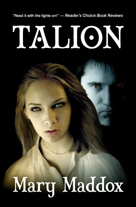
Cutting to the chase, I was called upon to create a new cover illustration that would display two characters from her story. My cover illustration wasn’t nearly as beautiful as the first, yet it will likely serve the book much better because the faces on the cover will help the book connect with potential buyers, and the lighting, colors, and expressions reflect the horror, suspense, and mystery genres the tale encompasses.
To tack down the feel of the story and genre just a tad more, I selected a typeface that was a little misshapen and ominous, giving the lettering a sinister feel that complemented the tone of the story.
When we’d finished, we had a cover that conveys the ominous tones of the book (which a reviewer at the Charleston Times-Courier described as “Silence of the Lambs meets The Turn of the Screw…. The story is propelled by suspense, and made delicious by Maddox’s Ray Bradbury-like gift for deft, deep-shadowed description.”)
And, yes, it’s the book is the proverbial “good read.” You can read samples from the book (as well as buy a copy) at Amazon.com.
====================
Duncan Long illustrates book and magazine covers including those needing new cover art. His artwork has appeared on a number of books from self-publishing authors, small publishing houses, as well as large presses. Find other samples of Long’s book art at: Duncan’s Book Art Portfolio
=====================
April 15th, 2012 on 12:53 pm
People can be so darned cruel and unfeeling sometimes Duncan. The eyes of the two characters are haunting, was that the intention? If so, it works. :)
April 15th, 2012 on 3:08 pm
That was the intention… And in fairness, a few of the covers I’ve done have been replaced by work by other illustrators, so I guess perhaps it eventually all evens out. As for uncouth comments… They are with us always.
April 15th, 2012 on 4:58 pm
Well, I think you cannot always win.
That said, I think that when a cover does not fit the book, the fault belongs to the author as much as the illustrator. I have already commented in other articles that some literary genres have kindda strict rules that must be followed. The author should know it and now when to tell the illustrator: “Man, this romantic-like illustration has nothing to do with my sword and sorcery novel!”
The same goes for CD and videogames.
The cover is likely the first (and last) contact a potential costumer has with the book, so it must be damn great in order to tell the people what it is inside of the book. The first cover or “Talion” seems more proper for a “self help” book or something, and that is no good indeed.
Sad to say, marketing is everything nowadays, and quality does not sell by itself. No matter how good your book is: if it has not a good cover, it will take ages to get all items sold.
That’s why the biggest investment in the edition of my books was the cover :-)
April 15th, 2012 on 10:21 pm
Thanks, Richard — appreciate your input. Yes, the cover artwork (whether for book, CD, or game) can be key in attracting potential buyers. And often these folks visually search by the style of various covers, using the art they see to home in on the products they’re wanting to buy.
The right cover on a book, game, or CD attracts potential buyers. The wrong illustration — no matter how artfully done — can become an economic disaster for the marketer.