Book Cover Artwork… and the Kitchen Sink
filed in Book Cover Illustrations and Artwork, Ebook Covers on Jan.23, 2013

I recently completed the cover and inner illustrations for my novel Lesser Gods (which is a free download from Jan. 23-26, 2013 along with software/apps to read it on about any computer, tablet, or smartphone made — as well as a Kindle at Amazon.com).
I’ve been writing, revising, and reworking this science fiction novel on and off for nearly a decade, and as is often the case with authors, I also spent time dreaming about having a cover for it that was to my liking. Possibly the first thing to note is the title change; the book originally sported Wrong Side In which seemed a clever title to me, a notion not shared by any other soul on the planet. Thus, an eventual title change as well.
Here are two of my early (and painfully poor) efforts:


During this time I also created a cyborg cover illustration that I think would have worked well as a book cover. However it didn’t really hint at the humor and moral issues covered in the novel, and so will live to fight another day on some other book cover:

The years passed and eventually the final draft of the story was ready to go to print. At this point, I created a series of illustrations that held the pearl of the final cover illustration — surrounded by a cloud of distractions. I’m often bothered when working with authors on their book covers by what I’ve come to call KSE (“Kitchen Sink Effect”). Basically the KSE happens when an author tries to tell the whole story of the novel on the cover illustration, throwing in (as the old cliche goes) everything but the kitchen sink. The result of the KSE is a hodgepodge at best, and generally an eyesore. A quality cover can result only after the author is convince to allow me to cut away unneeded elements.
What was alarming to me in working on my own cover was that even being aware of the KSE, as an author I was unable to resist the siren calls and guided my ship toward the rocky shore. Without considering what I did, I added cyborgs, pretty gals, a dragon, court jester dummy, aircraft, spaceships, and other odds and ends. I tried to juggle, move, nudge everything into place as KSE took over.
So here are just a few of perhaps a dozen of the KSE versions of the cover I created:

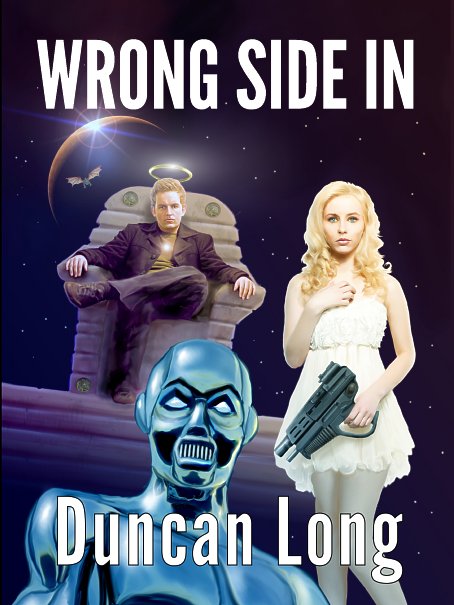

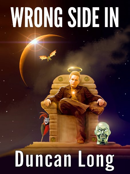
Eventually I had an “aha” moment and cut away everything but the hero and his hallo along with his throne and distant planet. No, this scene never actually appears in the book (though there are spots where a reader might imagine it), and, yes, major characters and elements in the book are missing from the illustration. Yet this illustration, free of the KSE, proves the most effective solution for marketing the book.
And in the end, that’s what a good book cover is all about: Capturing a potential reader’s attention and giving him a feel for what the book will be like, and doing that with just his first casual glance at the cover.
I’m offering Lesser Gods as a free ebook from Jan. 23-26, 2013 via Amazon.com. You do NOT need a Kindle reader to read this novel; you can download free software and apps to read Kindle books on smartphones, tablets, Macs, PCs, etc., from Amazon.com.
January 23rd, 2013 on 7:37 pm
Really enjoyed this behind the scenes look at book cover design. Now to run over to Amazon.com to capture my free copy of your science fiction novel. If it’s half as good as these illustrations, it will be fantastic.
January 23rd, 2013 on 11:00 pm
I was sooo curious to know how all those disparate elements could possible end up on one cover. You were your own worst client nightmare! You did the right thing in the end. Edit, edit, edit. Distill, distill, distill. Thanks for sharing!
January 24th, 2013 on 11:04 am
Thanks Robert and Tamian. It is sort of amazing how we tend to change our thought patterns as we wear different creative hats.
January 25th, 2013 on 8:53 am
What beautiful work you’re doing. Any of these would have made a great cover, but the final one is definitely the best.
January 26th, 2013 on 11:59 am
Thanks for this insight, Duncan. And you are so right– ‘wearing different hats’ feels conflicting when you are at once writer, illustrator, publisher and client. (This is what makes being a member of a writers’ cooperative a little easier– there are many heads within ‘we’ and we all wear different hats.) Your end result is perfectly fine. I was a little concerned when you got to showing the girl holding a weapon in her left hand– is she really a lefty? –because this has traditional connotations of latent evil within (watch the original ‘Star Wars’ trilogy to see an example). So your choice to not over-complicate the images is probably the sanest one overall.
January 27th, 2013 on 6:21 am
Amazing to see how this cover progressed by small changes — and by major reworking. The creative mind is fantastic. Downloaded the book as well and it is also fantastic.
January 31st, 2013 on 3:29 am
Great advice on book cover design and cover artwork . And you’re doing some great Book Cover Illustrations, too…