Is Duncan Long the Inventor of Graphic Design?

I was a bit perplexed yesterday when I stumbled upon a new “answer” site called ChaCha that attempts to answer questions put to it (I’d been searching for info about a client and was searching with my name as part of the search parameters, and ended at this page).

Here’s the question posed to the site:

“Q: Who is the first artist that turned fine art into graphic design?”

Well that sounds straight forward enough.

But the answer made me feel like someone had pulled a late April Fools day trick on me.

So who was the artist who turned fine art into graphic design?

ChaCha’s answer: “Although not exact, Duncan Long is often credited with the earliest use of graphic design.”

Well, a nice honor but… Seriously???

Now I suppose my illustration borders on fine art. And I do graphic design work for logos and book covers. So I might (and that’s a mighty “might”) conceivably be in the running.

Or perhaps it is just another April Fools Day escapade gone wrong from someone that has not yet sprung the final trap on me. After all, a few friends have vowed revenge for being mislead by my Inaugural Illustrator Announcement.

History will decide. I am honored by ChaCha’s claim, but I’m not sure the whole jury has come to a decision on this just yet.

I’ll cross my fingers.

Tags: , , ,

Comments (4)

Illustrators, Contracts, and Book Covers

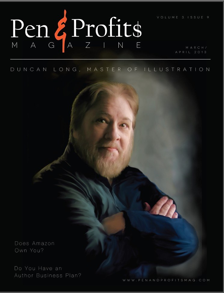
A quality book illustration and cover design can greatly improve book sales. Consequently publishers as well as self-publishing authors often find themselves searching for an artist who help produce a quality book cover.

One of the key tools in nailing down the book cover rights as well as getting a handle on a project is a contract (or “agreement”) between the illustrator and the author or press. As with most other things, there are good contracts and bad ones. The good can protect your rights and make the work progress smoothly; a bad contract can quickly become a nightmare.

I’ve been in the publishing business for several decades, and a whole lot of contracts have come my way for one project or another. That said, I’m no lawyer, so keep that in mind. But that said, there are a few things I’d like to share with new small presses and self-publishing authors that I hope will send them in the right direction as they work on their book cover designs.

1) If you’re hiring a cover artist, you need a good contract. Here’s a good sample contract for hiring an Illustrator. There are samples you can find online that will get you started. Here’s a pretty good one at Illustration Castle and for those wanting to get into the real nitty gritty of contracts, here’s a nice PDF Booklet from AIGA

2) Remember that like a writer, an artist owns the copyright to anything he owns. That means you purchase the rights (or, in legalese, he “assigns the rights” to you). But technically you will never own the rights to the picture (except in a “work for hire” contract which is generally valid only with large corporations — more on this in a moment). You can negotiate for various rights, but remember you can use only the rights you pay for. If you buy the book cover rights, that doesn’t mean you can then print up t-shirts using the artwork, sell copies of the illustration to other parties, etc. (There are exceptions; for example be if you were creating t-shirts of the cover illustration with lettering to promote your book, then with many contracts, that would be a legitimate use.)

3) Because of how rights to an illustration can be divided in a variety of ways, a contract is a must. If you don’t have a contract, most courts side with the artist and give the buyer the absolute minimum possible in a deal. So if you’re buying rights, a contract will be a big plus for you. Most legit illustrators and graphic designers have a contract; steer clear of anyone who doesn’t want to use a contract.

4) If  you’re using your own contract, the phrase “work for hire” is in it, and you’re not someone like Marvel Comics or Disney, one of two things will happen if you’re working for a pro: A) He’ll leave the room never to be seen again or B) he’ll immediately double or triple his prices.

Why?

Because the phrase “work for hire” transfers ALL rights to the artwork to the buyer and allows the buyer to claim the work as his own.

Lawyers unfamiliar with the publishing industry may suggest adding “work for hire,” but it’s generally a mistake because A) most artists want credit for their work and find other revenue streams when they retain the rights and B) many crooks and fly-by-night folks exploit “work for hire” as a  way to trick inexperienced artists into giving away all the rights to artwork without realizing they’re doing so.

(And if you like tricking people this way, then there’s a special room for you in the Hell Suite.)

5) If you want more than just cover rights, don’t use the “work for hire” as a catch all to achieve that. Instead, negotiate for the rights and put the understanding in the contract. This is much cheaper than “work for hire” (because you’ll never need most rights if you’re publishing a book, other than the EXCLUSIVE cover rights). Additionally, there is some doubt about the legality of most “work for hire” clauses (which may make lawyers rub their hands together gleefully, but likely won’t be a big plus for you should you have the misfortune to be in the middle of a legal battle over rights).

6) Traditionally you buy only the rights to ONE edition of a book; if you want to use the illustration on your ebook, second edition, audio book, or whatever — that should be spelled out in the contract (I’ve started doing this in my contracts since it this fact is generally misunderstood by small presses and self-publishers, but a lot of illustrators do not so be careful).

7) Pricing: This varies greatly but generally if you are hiring a professional, the cover rights for an illustration will likely run from $900 to $2,000 (and up) depending on the name of the artist and how complex the artwork is. For example an artist asked to create an illustration of a battle unfolding in the distance on a snowy countryside with storm clouds above might charge $2,000 for the work, while the same artist asked to create a portrait of the character might charge $900. (So for the author wishing to have an ebook version of his book, the simpler cover illustration is best — and will also present a savings in expenses.)

8) When you hire an illustrator to work for you, listen to his ideas with the understanding that they have the best feel for both their talent and what will work for a cover. If you have an art director, listen to them and let the art director work with the illustrator.

9) Don’t hire an artist whose style you don’t like and then ask him to do something he doesn’t normally do (I know that sounds too obvious to mention — but it seems to happen from time to time — a word to the wise).

10) Almost anything in a contract is negotiable. Don’t be afraid to make a proposal, and don’t be huffy if the artist makes a counter proposal. A good contract should be satisfactory and fair for both sides.

11) A professional illustrator will expect half up front and half upon completion. If your project falls through, he’ll expect to keep the first payment as a “kill fee.” That’s how it is done by the pros and it is wise to conform if you want to be a pro yourself.

12) Sadly today has a few scam artists posing as illustrators, graphic designers, and publishers. You should be cautious and expect your illustrator to be cautious as well when you first contact him. A contract and business relationship is about trust, and it takes time to build trust.

And a good contract can be the first step in establishing this trust.

13) If an alarm bell goes off in the back of your mind when you’re first contacting someone to do work for you, listen to your gut instinct. Ninety nine times out of a hundred it will be right.

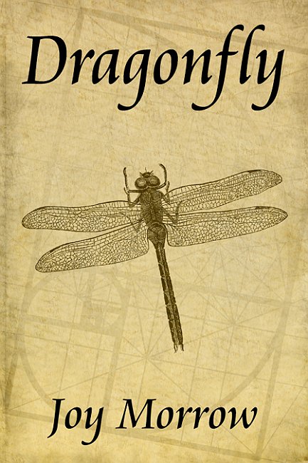
14) The old saw “too good to be true” often applies. If the prices for the art are WAY too low, the artwork probably isn’t exclusive or (worse) is stolen. The exception is when an artist sells older work from other projects which the client decided they didn’t want. Often these can be real bargains IF they fit your needs.

Speaking of which… Check out my Premade Art Page if you want to shop for bargains.

And if you don’t find anything there that works for your cover, then please take a look at my Portfolio and if you like what you see, contact me to discuss the specific illustration you need for your book.

Comments (2)

White House: Duncan Long Is New Inaugural Book Illustrator

You can probably imagine my surprise. And since it was April 1st, I thought I was being pranked. But then the President came on the line to chat for a few minutes.

Here’s: The Story

Comments (3)

Of Smart Quotes, Dashes, and Double Spaces…

Many authors are going the self-publishing route these days (and for many, it makes good sense). Others are going so far as to create their own small presses. The result is an explosion of new books and a wealth of quality writing for readers to choose from.

As I’ve noted previously (perhaps the phrase “ad nauseam” comes to mind for some readers of this blog), the new gate-keeper that determines whether a reader buys and reads a self-published title is the quality of the layout and illustration on the book cover, and after that, the quality of the layout inside the book. In other words, no matter how good the writing may be, many readers will never take the time to check it out if the cover and layout screams “amateur.”

Here are four important layout “tricks” that often separate the pros from the wannabes:

1) Use of a single space after a period, exclamation point, colon, or question mark.
2) Use of an emdash (a dash the width of an “m”) or endash (dash the width of an “n”) in the proper places rather than a single or repeated hyphen.(Here’s a nice overview on these.)
3) Use of smart quotes and hyphens.
4) Proper capitalization of letters in titles.

Do these right and you’ll make your book look more attractive to a potential buyer. The reader may not realize why your books looks professional; but subconsciously, these little flourishes to the layout have a positive effect.

Of course you still need to be a good writer to succeed. The best cover and layout won’t save your bacon if you’re a poor story teller. That means rewriting, proofing, polishing, and editing are also keys for success. But a good cover illustration and quality layout on the cover and inside text will do a lot to give your book the professional appearance it deserves and gain you the positive attention you want.

Finally, I would be remiss if I didn’t point out that none of the “good layout” rules listed above are set in stone. For example, the single space after punctuation rule has changed over time, as noted in this fascinating article by Dave Bricker: “How Many Spaces After a Period? Ending the Debate.”

Styles change. The key is to use the styles most often seen in the work of professionals.

Comments (2)

The Spider Magus and The Bunny Lord

The Last Druid Apocalypse - Book Cover artwork picture

I recently had the pleasure of seeing my artwork chosen for the front cover picture for Blake Patterson’s action/fantasy novel The Spider Magus and The Bunny Lord.

This is one of my illustrations that I sold through my “PreMade Book Cover Artwork” page, which offers bargains on illustrations I’ve created for my own amusement without a client in mind, as well as spin-off concepts from projects where the idea didn’t work out — but is so good I am pretty sure someone else will likely buy it. As an added incentive, I offer low prices with these pieces of artwork so those needing a book cover can afford to buy those rights and be set to go.

That said, the author purchased the book cover rights to this artwork and then laid out the cover himself, to produce this:

Blake Patterson book cover picture by Duncan Long

It is always a joy to have my artwork used on a book like this, as it is one entertaining tale. Here’s the blurb for this delightful story:

“Joshua is invited to join The Guard…a group that protects all the human worlds they can find from the orcs, except he’s not allowed to leave. Ever. And it wasn’t exactly an invitation.”

If you crossed Alice In Wonderland with a Die Hard movie — this is pretty much what you’d get. Excitement, thought, and some very interesting characters that are well developed as the story unfolds — and characters which a reader is going to care about (if not fall in love with).

The Spider Magus and The Bunny Lord is available both in print as well as Kindle formats — with a “sneak peek” of the text at the Amazon site.

In the meantime (shameless plug alert), if you’re a self-publishing author with a limited budget and in need of a cover, you’d do well to check out my Premade Book Cover Pages to see if there’s a picture there that would be just right for you book. And if not, you can bet that I’d be happy to create a new picture for you.

Comments Off on The Spider Magus and The Bunny Lord

Some More Useful Links for Authors

Into all blogs some miscellany must fall…  So a few links to articles I suspect will be of help and interest to those working in the publishing industry — and especially authors.

First, a publishing horror story — and just one more reason more and more authors are self-publishing: O’Reilly Media Has Lost Its Soul

Some useful tools for Book Promotion: Ten Tips For Self-Published Authors

Five Tips for Improving Your Writing

Four Big Lessons for Authors

Gutenberg and How Typography Is Like Music

Book Cover Typefaces and Cover Design Horror Stories

And finally, some thoughts about the pitfalls of designing your own book cover: Sewing Your Own Parachute.

Comments (1)

The Best Typefaces for Your Book Layouts

What typeface is best for laying out the text in a book?

Like spices, the ideal typeface for text adds a little flavor but not so much as to overwhelm. Some of the best picks are older types that have stood the test of time: Baskerville, some flavor of Garamond, or a modern version of Janson are all good choices for text.

Some of my other favorites are Caslon, Bodoni, and Bembo. I love Palatino, even though it seems to be used a lot, perhaps making it less of a first choice than it once was. (And, sadly MS Word ran the beautiful New Times Roman right into the ground, making it less than ideal for any project needing to feel a little different from the run of the mill).

In theory Verdana, Georgia, and Trebuchet were designed for the screen, not print, and therefore aren’t good choices for a layout headed for ink and paper. But I’ve seen folks using them for print with pretty good results so perhaps that’s a rule made to be broken (though I am not yet this adventurous as of yet).

Another rule that can be broken is that you must never use a sans typeface for text. Although for years folks have claimed serif type guides the eye from one letter to the next, in reality science has found our eyes bump along, often taking in whole words as a single unit, so the notion that the little curls and additions to serif type somehow aids the eye is pretty much bogus. And actual testing shows that modern readers have no trouble reading text laid out with a clean sans typeface, and do so at the same speed as they do with serif text.

So if you’re wanting a very modern look to a science fiction tome or a trendy magazine, a sans font like Frutiger or Century Gothic might work quite well.

Finally, if you’ve purchased Word or any of a number of art software programs, or even have an OS from Apple or Microsoft, chances are you already own some or perhaps all of these typefaces mentioned above — or a cloned version of them. Because typefaces can’t be copyrighted in many nations (including the US), that means there are many “cloned” versions of typefaces that are nearly identical to the originals except for the name of the typeface.

So even if you don’t happen to have, say, Palatino in your typeface collection, you may have Bitstream’s “Zapf Calligraphic 801 BT” which is nearly identical. Of course finding what typeface is what other one is no easy task since companies making clones of their rivals’ products don’t advertise these borrowed ideas too openly.

Fortunately there are web sites that can tell you what the various cloned typefaces are. One excellent list is at Lookalike Fonts. (One caveat here: Arial, while often described as being very similar to Hevetica, is a poor substitute with some of its kerning out of wack especially in print — so I would advise to avoid it for print projects.)

Also, be sure you actually own the rights to the typefaces you employ for your layout projects. A lot of the fonts that can be freely downloaded from the web are stolen and posted without the permission of the companies owning the rights to them (and US and other courts have ruled that fonts are like software and can not be pirated or shared without legal ramifications).

And another trap comes from “free” fonts are free only for non-commercial use; that means once you get even a penny for your work, or your book or magazine is sold (or even given away free for promotional purposes), you’ve opened yourself to a lawsuit if you’ve used a “free for noncommercial use” typeface.

Yes, lawsuits by type foundries is rare. But do you want to be one of those rare cases? Best to play it safe and use only a typeface you’ve purchased or which came with some software or an OS you’ve bought. (Such lawsuits can run into the millions of dollars as with the case recently brought against NBC Univeral for misuse of a typeface.)

If you want to build up a collection of quality typefaces, my advice is to buy a “family” of one of those mentioned above and then employ them for most of your print projects. While it is possible to build up a collection of thousands of typefaces (been there, done that), I have found that I generally only use a handful for almost all my graphic design projects. (Just be sure before purchasing fonts you don’t already have the clones of the classics you need in the font collections that come with OSs and software. Often there’s a wealth of gems in the dross if you sort through them and double check for the various clones in the collections.)

In theory you can employ a decorative typeface for the title and headlines of a project, in practice fancy, weird, or stressed types tend to call too much attention to themselves (the possible exception being with genre cover layouts where these can sometimes set the tone and reflect the genre of the book).

Consequently the old trick of using a clean sans for titles, picture captions, and headlines with a classic serif for your text is not only a safe practice, but will generally yield the most professional results. Another excellent route is to get a family of serifs which includes “Black,” thin, and condensed versions; this allows you to use the heavier/lighter versions for contrasting headings or titling, the condensed with photo captions, and the standard version as the text.

Pairing sans/serif types is an art in itself and space doesn’t permit launching into that here. Some of the “tried and true” pairings are Hevetica and Geramond; Univers and Caslon; Futura/Bodoni; Franklin Gothic/Baskerville. I’d direct readers to: Combining Fonts, Mastering Font Combinations; and — of course — articles Type Pairig Articles Via Google.

======================
Duncan Long is a book cover designer and illustrator. You can see samples of his work in his Online Gallery.

Tags: , , ,

Comments (9)

How to deal with piracy of your work

Pirate Flag for piracy sites illegally sharing music art and books

People who lack knowledge of the copyright law, and who fail to realize how hard it is to earn a living as a writer, artist, or musician, often pirate the fruit of a creative person’s hard work. These pirates often claim the material as their own or post it for people to download for free.

Either practice makes it all the harder for creative people to make a living (and the theory that the added publicity will help them sell more products just isn’t true — many of us have the facts and figures to prove this). Sadly pirates are often misguided or self-deluded into thinking they’re battle large corporations, when in fact they’re injuring the very folks producing the books, artwork, and music they love. With many creative people barely making ends meet, piracy is a career destroying force that forces productive people out of the publishing and entertainment business before they ever have a chance to make a living at it.

So while piracy may not hurt the big corporations much, it most certainly takes money out of the pockets of creative people, the majority of whom are already struggling just to pay their bills.

Unfortunately many creative people fail to realize how easy it is to protect their work these days.

Today, international copyright laws actually make it pretty easy to get stolen material removed from web pages (the exception being some torrent sites which now are owned and operated by criminals operating from nations that ignore copyright laws — though government agencies are doing better at shutting these sites down).

First, you must find where your stolen work is being given away or posted. You can do with a keyword search for your name, the name of the work, or a brief quote from the text at the beginning of the work; graphic artists can also use Tineye.com to locate artwork that has been posted.

When you’ve found a page where your work is being posted without your permission, go to a WhoIs site and type in the URL of the offending page. This will give you information about the page including the hosting service for that page.

Next, you then an email DMCA take-down notice to the hosting company. You can find sample take-down notices with a quick Google search. (And here’s a page that gives more information about the process.)

With these simple steps, you can generally get pirated material removed from the web. Of course there will always be a few sites operated by hardcore criminals that won’t comply. But there aren’t many (and the law enforcement agencies of various nations are taking a more active role in closing these sites down).

If you’re a creative person, take steps to protect your hard work so it can continue to earn money for you and your loved ones — instead of putting money into the pocket of criminals. Life is hard enough when you’re creating work for people’s enjoyment without having pirates ruin any chances you might have for making a living.

Comments (1)

“Duncan Long — Master of Illustration”?

Duncan Long - master of illustration

Well, every once in a while a serious ego-stroke comes down the pike. And this cover article of the March Pen & Profit$ magazine has to be one of those. Just the “Master of Illustration” part of the title does the trick without reading another word, right?

On the flip side, it is a tad hard to maintain even a smidgen of decorum or pretend humbleness when posting this news. Yet how could I ever resist?

Aimed at authors wanting to make money in the writing game, the magazine is surprisingly graphic and enjoyable to leaf through — unlike the majority of literary magazines that are for the most part columns of text with a drab cover tacked on. So this is a welcome change.

Likewise the layout is playful and eye-appealing — it’s obvious no little effort went into it and there are some nice embellishments that are a pleasure to see for an old layout guy like me (I’ve displayed low-resolution versions of the pages below, even though they don’t really do the print version justice in this case). Even the reproductions of my paintings have been thoughtfully positioned (and in some cases with just a hint of floral design and shadows to set them off — beautiful layout).

But the magazine is more than eye appeal. Pen & Profit$ is chuck full of interesting and insightful articles. If you’re a writer wanting to get serious about your craft, you’d do well to subscribe to this magazine to learn some new as well as the old essentials for getting into print. You can learn more about this publication at the magazine’s website: Pen & Profit$ web site.

Duncan Long - Master of Illustration 2

Duncan Long - Master of Illustration 3

Duncan Long - Master of Illustration 4

Duncan Long - Master of Illustration 5

Tags: , , ,

Comments (2)

New eBook Markets In Developing Nations?

Ebooks are starting to outstrip print sales for smaller presses. And the beauty of the eBook sold over the Internet that there is only a small cost if selling the product to a buyer almost anywhere on the planet. And there’s no storage or printing costs. Once the eBook is laid out and the cover made, the works can be uploaded to the distributor and sales made from there on with little or no upkeep or worry for the seller.

Since these books can be delivered so easily to almost anywhere on the globe, the next question is what sort of markets are there outside of the hi-tech Western nations?

And the answer is: Potentially very, very large.

China and India — both English speaking nations — seem posed to become major buyers in the near future. According to The Times (India), in 2010 the Chinese read 613 million electronic books. Likely the numbers are even higher today.

Right now a lot of those eBooks are produced Chinese companies. And many of those from outside China may be pirated or public domain titles whose copyright has run out. But imagine the potential market that is waiting if only a fraction of the market can be tapped into by US writers.

Readers in India also download a lot of pirated eBooks. But again this market has a huge number of potential buyers should the piracy be brought into check. Amazon and others are tapping into that market with Kindle eBook sales as well as POD (print on demand) book titles.

Already India is one of the five nations that has been a major adopter of eBooks (along with Australia, the USA, and Britain according to Bowker.) By way of perspective, Bowker has found there were 60 million eBooks bought by US readers in 2012; during that time there were nearly 25 million Indian eBook buyers (in February 2012).

Here’s the kicker: Only two percent of the Indian population is now reading eBooks. That means even if fewer than 10 percent of the population were to become eBook buyers, they could easily outstrip the number of sales in the US (which is currently the largest market for selling eBooks).

Now you might have noticed I wrote there were five early adopters of eBooks and never mentioned the fifth. That’s because it will come as a surprise to many: Brazil. Somewhere around 15 million Brazilian eBook purchases were made in 2012. That put it ahead of every nation but the US. And as with India, only a small percentage of Brazilians are now buying eBooks; seven percent at last count.

So there are some huge potential markets out there for folks selling eBooks to a world market.

Of course many of the new books for these markets will undoubtedly be written by those living in their native lands. And there’s that nagging problem of piracy.

However, the piracy situation may slowly come under control, and if it does, sales of eBooks may explode in ways the print industry has only dreamed of in the past.

Of course the trick is getting there from here, with the caveat that history doesn’t always unfold the way self-proclaimed “futurists” like me think it will.

Tags: , ,

Comments (2)