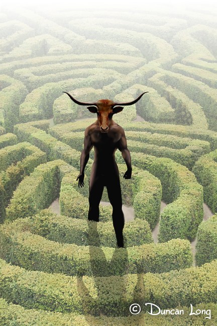
The Making of The Wolf Tattoo Book Cover

Wolf Tattoo Final Painting for book cover

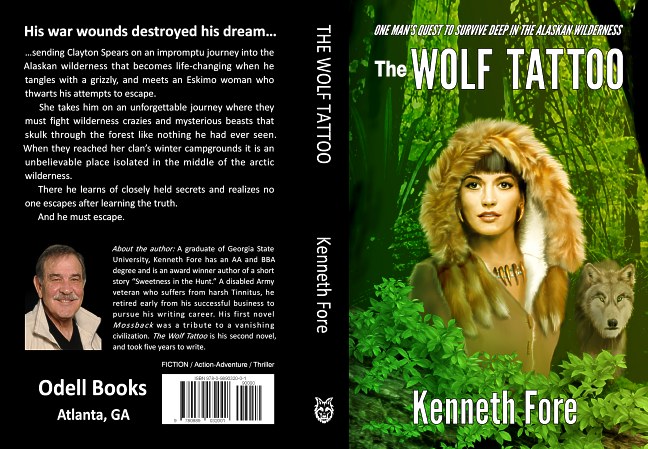
We recently completed the cover for Kenneth Fore’s action adventure novel The Wolf Tattoo.

The Synopsis: A man’s impromptu journey into the Alaskan wilderness is life changing when he tangles with a grizzly and an Eskimo woman who thwarts his attempts to escape. She takes him on an unforgettable journey where they must fight wilderness crazies and mysterious beasts that skulk through the forest like nothing you have ever seen. When they reached her clan’s winter campgrounds it is an unbelievable place isolated in the middle of the arctic wilderness and it is protected by huge wolves called Saluuettes. He realizes no one escapes after learning the truth about her clan and he must escape or become anything, but ordinary.

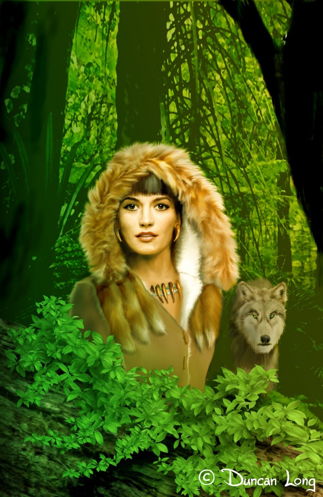
So this cover illustration had some challenges going into the project since the story places an Eskimo woman in the middle of a jungle with a wolf, something that would have to appear natural to the viewer, yet which is unlike any environment we normally associate with these Native Americans.

Originally the author had hoped we might have a wolf in the picture which I wasn’t sure I could work into the layout — so that remained option at the start.

The first task was to work out the gal, so first I made a digital painting/sketch of how I pictured her (after talking at length to the author and exchanging a flurry of emails):

1 Wolf Tattoo gal preliminary sketch

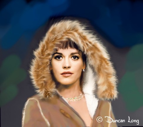
The proved close to the mark. So the next tasks were to refine her face a bit, reducing her jaw and lengthening her bangs among other things. I then added some “fox tails” to the collar area and some bear-claw earrings and necklace since these all figure in the story. I also painted/extended her body down just a bit (but didn’t bother painting in more of her as I was planning on having her behind vegetation).

To make the fur and outfit appear a bit more real, I also “fluffed” the fur a bit with a rough brush and added some wooden peg buttons and button slits to the fur running down the front of the coat:

Wolf Tattoo book cover - gal with fur and jewelry

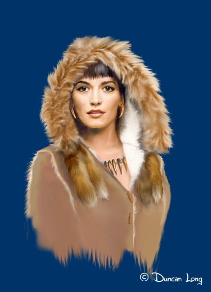
A few more minor changes to the character (including lengthening her bangs just a little more and reducing the “thickness” of the coat) and it was time to work the wolf into the design if that was practical before painting in the jungle in front of and behind the characters. So… a big bad wolf (who had to be back in the distance a bit to allow room for him in the picture — he’s placed too high in the next sketch and a little mangy, but basically arrived in his final form at this point in the project):

Wolf tattoo cover with wolf

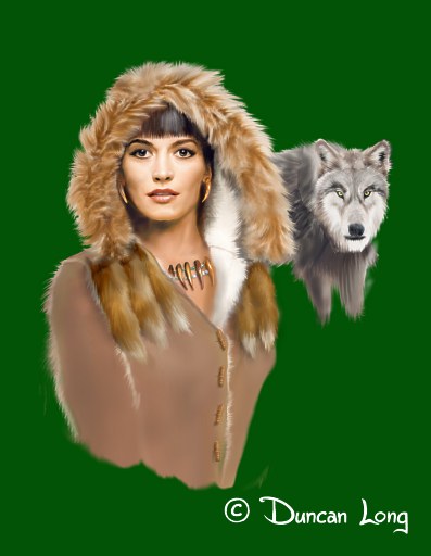
Once the two characters were finished, we needed a jungle around them. First, I made a background layer that the characters would float over, painting it a bit “out of focus” and vague so the eye would be drawn toward the gal and wolf. (I also muted the color of the wolf at this point to help keep the focus on the gal.)

Care has to be exercised with a background like this; otherwise it’s easy to have branches appear to be growing out of the character’s head or some such visual disaster. To help avoid this, I painted the background considerably larger than needed and then slid it around behind the characters until it looked best to my eye.

I then painted in more “black” tree trucks on the sides of the illustration both to frame the characters better (and to mimic the triangular pattern they formed), and also to make the left side of the illustration dark enough to transition into the black spine that we had planned for the book.

In front of the gal, I placed a large fallen log to frame things a bit more (eventually the log become pretty well hidden in the greenery). I then “sprayed” detailed leaves in a layer in front of everything, working from large to smaller leaves so they would look like some sort of spreading vine.

This high level of detail in front of the Eskimo helped the illusion that the foreground was “in focus” while the background was farther away and a little out of focus (much as it is with the human eye).

Finally I added a gradient yellow/green over everything so it would appear the gal and wolf were part of the scene with light reflecting through and off of the vegetation.

And the book cover illustration was pretty much finished:

Kenneth Wolf Tattoo Amazon Catalog

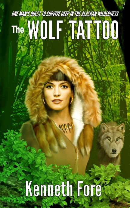
Once the lettering was finished, we had the front cover ready for the eBook version of The Wolf Tattoo.

Next the wrap around cover for the print version of the novel.

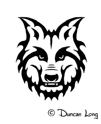
I like to create a spine icon when publishers don’t have their own logo for the spine, and since it had proved impossible to work the gal’s tattoo into the main illustration, I decided to create a wolf tattoo icon for the spine. I studied some Eskimo artwork and then did my best to split the difference between that style and modern tattoos — hopefully with something that at least looked like it might have been a part of the story.

Wolf Tattoo spine detail icon

From there the layout work was pretty much a matter of plugging in the various elements, adjusting sizes, and making it look right to the eye. Before long we had it:

Kenneth Fore Wolf Tattoo wraparound book cover layout

Now that you’ve seen the cover, I’d recommend you read the book because Kenneth Fore’s The Wolf Tattoo is a nice read, and those who like action-adventure novels should check out the sample chapters at Amazon.com.

===========================
Duncan Long creates book cover pictures, paintings, and illustrations for small and large publishers as well as self-publishing authors. You can see more of his book cover artwork at Duncan Long’s Book Cover Gallery.

Tags: , , , , , , , , ,

Comments (3)

Creating the Book Cover for the Wælcyrie Murders

Murders - Science Fiction Book Cover Art

I recently had the pleasure of creating the book cover illustration and layout for Anthony Pacheco’s novel Wælcyrie Murders, the second book in the Lexus Toulouse science fiction mystery series.

Here’s the blurb that sets up the story: “Out of the Gifford-Pinchot Forest stumbles a wælcyrie, shot with irradiated bullets, and radiation poisoned unto death. To kill a wælcyrie, a slowly dying species engineered by humans in the war to help them fight is an unforgivable, vile crime. Investigator and Princess Lexus Toulouse vows to bring the killer to justice, even if she has to go undercover in one of the worst places she can imagine: High school.”

Nice.

The process of creating this cover illustration was a little tricky since the first book cover established the appearance of the main character Investigator Lexus Nancy Toulouse, ex-soldier and princess who’s regularly on the warpath. The second cover had to preserve her appearance while still being enough different to let readers see it was a new book with the same character.

The author had seen my “Lost Dreams on the Kansas Plains” painting and initially wanted to purchase it for a wrap around cover for the book, perhaps adding the character to the scene.

Lost Dreams on the Kansas Plains by Duncan Long

After talking to Anthony about the cover, I suggested a new, similar picture that would better fit his story. He opted for this suggestion and I was off to the drawing tablet.

The first step was to create a narrower abandoned farmhouse, thereby allowing for a larger main character on the front. That was followed by a contemporary model car that by its rusted out appearance would suggest the story is taking place sometime in the future (as this science fiction story does).

Once these were established and grass and sky painted behind, in front, and around everything, it was time to tackle Investigator Lexus Nancy Toulouse.

And at that point I ran down a few dead ends since she basically had to share the front cover with the house — ideally without either of them having to be too reduced in size. I made several false starts with stances that were too wide (like this one):

Murders - pose that's wrong for a book cover picture

Eventually I created a profile pose that worked and allowed her alongside the house without the loss of depth. To tie her to the background, I painted her dress a color that matched some of the clouds in the sky (as well as some of the rust in the car).

Since the layout dictated leaving out her sword (which in turn had dictated a flowing skirt to mirror it), we instead added a sheathed combat knife she often carried on her thigh; I opted for a modified K-bar knife since in the story she uses a Japanese sword, and I reasoned her fighting style would lend itself to a single-edged knife (I know, obsessive compulsive details).

After adding the cherry blossom tattoos that cover her body, she was ready to go.

Which led to the final picture layout:

WÆLCYRIE MURDERS wrap-around book cover painting

Next came the lettering, always tricky on a cover that tends to be in the center of the contrast spectrum: Not too light, and not too dark. It’s easy to lose lettering in the background with these mid-tone colors. My solution for the front was to add a thin black outline to white lettering.

Waecyrie Murders book cover picture by Duncan Long

For the back, I added a box behind the small text, using one of the darker colors from the clouds. The result was text that was easy to read while only covering sky which really wasn’t too essential for the “story” of the picture.

And so the final layout:

Waelcryie Murders-final book-cover-art-Duncan-Long

You can learn more about Anthony Pacheco’s novel Wælcyrie Murders as well as his other books at the author’s website.

======================
Duncan Long is a book illustrator and graphic designer. You can see more of his work in Duncan Long’s Book Illustration Portfolio.

Tags: , , , , , , ,

Comments (7)

Authors: Study This and Improve Your Writing Style

I think the best English writing of the last 150 years is easily Ray Bradbury’s Dandelion Wine. I wish I’d found and studied this book about 30 years ago when I was starting my writing/illustration career.

Bradbury crafts sentences in a way that makes each a little gem; paragraphs absolutely glitter and shine with refracted ideas. About the only downside to the pleasure of reading what he writes is that I often find myself re-reading and musing over sentences to the point that it takes about twice as long to read his books. (But perhaps I should look at that as getting twice the reading for my money.)

One thing’s for sure: A beginning author could learn a lot by analyzing what Bradbury does with his writing.

My advice? If you want to be a great writer, get a copy of Dandelion Wine and study what Bradbury has done. You can buy a copy from Amazon.com or about any bookstore.

Tags: , ,

Comments (1)

Childhood’s End and Creativity

The Royal Guard - fantasy book cover artwork

“Optimally, childhood ends, and adults develop a mature, tragic acceptance of limitations. They come to terms with differences of talent; some are more intelligent, better athletes, better mathematicians, more creative. Accepting this is, paradoxically, a necessary step toward real achievement because it allows discovery of one’s own unique talents.” — Stephen Rittenberg, MD

Childlike qualities are good, childishness, not so much. Unfortunately many would-be creative people confuse the two.

I was struck by how similar this “tragic acceptance of limitations” is to overcoming a traumatic experience in which you go through anger, denial, and so forth before (hopefully) becoming accepting of the damage and finally overcoming it by realizing how it has molded and changed you and then going from their to rebuild and perhaps even emerge scarred yet stronger than before. It’s interesting how the human spirit if it struggles long enough can triumph over what at first appears to be damage that can’t be overcome. Part of achievement is understanding limitations and working within these handicaps.

Recognizing shortcomings and handicaps can be important. I remember reading years ago about a composer working digitally who couldn’t afford to buy some good sound samples. His solution was simply to avoid writing anything that would need such samples, instead employing the quality sound samples he owned. The listener only heard wonderful sounds and great compositions, unaware that the composer didn’t own everything he would liked to have had at his fingertips. If you only have red and yellow paints in your inventory — paint red and yellow pictures. If you can’t write a good fight scene, write comedies and romances… on it goes. Work toward your strength knowing your handicaps of the moment (perhaps with an eye toward buying the materials you need and gaining new skills in the future).

As Dirty Harry noted, “A man’s got to know his limitations.”

In the world of book cover illustrations, there’s one more important point to this if you’re hiring an artist to create a book cover for you: Let him work toward his strengths, not his weaknesses. Unfortunately some self-publishers pick out a book cover artist and then ask him to work in a different style, make changes to ideas that he feels aren’t the best, and so forth — basically causing the artist to leave what he does best to what he doesn’t do well. Sometimes the result can work — artists like everyone else need to grow and expand their abilities. But often the result is less satisfactory because the artist has left his strengths and has produced a second-best offering.

If you hire an artist to work for you, give him as free a hand as you can in how the work is designed and executed. Then your money will be well spent.

Comments Off on Childhood’s End and Creativity

The Future of the eBook

Book illustrator Duncan Long reads an old-fashioned book instead of the eBooks he prefers

I’ve been in the publishing industry several decades now (and had a love for books and writing for many decades before that). I’ve followed with interest the appearance of the eBook.

I was an “early adopter” of the eBook in idea if not name, reading text in 2002 on a Dell Axim PDA (personal digital assistant — a forerunner of the smart phone, sans ability to make phone calls) before anyone was actually talking seriously about eBooks (and perhaps even calling anything an “eBook”). Books in Doc and Txt formats were available from the Gutenberg Project and elsewhere for free, so rather than shelling out cash for print books, reading them on the PDA seemed a viable money saver to me. Later (and long before the Kindle and other modern readers had appeared), I graduated to an eBookwise reader (that I still use on occasion — though loading books into it is iffy since the company making them went out of business and I am now using Window 8); the eBookwise reader has a lot of nice features with a liquid crystal display that allows for lots of reading before recharging the battery.

The PDA and eBookwise reader were crude compared to the modern Nook and Kindles, but they got the job done, and I soon discovered I preferred reading text on one of these devices more than I did reading print (the exception being technical or art books with charts and illustrations). They could be held and read at all angles, were lit in a darkened room, and allowed adjusting font size to ease the reading task. So, yes, I’m pretty much sold on eBooks.

With any new medium, there’s always the question of whether it will prove economically viable and where how it will change in the future. Such changes can be profound — who would have thought in 2000 BC that scrolls would ever evolve into a book with pages?

So the most caveat: I have no crystal ball that reveals the future. And neither does anyone else.

The first question about eBooks has been answered, however. They are economically viable. In fact, some of the small publishers I’ve talked to are now making more money with their eBooks than with the print version of the same title. At first this seems a rather amazing given there’s still a large segment of the public that doesn’t even own a Nook, Kindle, or other discrete eBook reading device, and these folks have no plan to start reading eBooks any time soon.

So why the large sales figures for eBooks? I think the secret is eBook readers have a bigger appetite for reading, and possibly also have more disposable income to buy books. Additionally, the Kindle books can be read (via the right app) on smart phones, tablets, PCs, or any of a number of other devices. So even though there may not be a lot of Kindles and Nooks out there just yet, that doesn’t mean folks aren’t using other devices to read eBooks.

What about the future of eBook formats?

I’m betting that the text-only eBook is going to be a viable proposition for the foreseeable future, just as text-only print books have been popular since Gutenberg inked up his first plate. There’s usually room for another medium; the radio has been able to coexist with TV, and movies with both. I have little doubt there’ll always be a niche for text-only eBooks.

Print books and magazines have expanded past the text-only format, sometimes encompassing color photos and layouts Gutenberg could never have dreamed of: “Coffee table” books full of illustrations, comic books, graphic novels, pop-up books, children’s books… There’s a wealth of variation out there. You can bet the eBook will expand into some new territory as well, with some publishers already producing eBooks with bits of video and background music to go along with the text.

Of course there may be some journeys in directions that turn out to be economic dead ends, oddities that never catch on — the publishing counterpart to the 3D B&W movies of the 1960s. What makes things interesting is that you never know what might catch on and what will fall to the wayside. (And sometimes what didn’t work in the past becomes viable later on — like the 3D movies that are appearing in theaters today.)

One possible direction eBooks could take can be found in some of the books by Mark Z. Danielewski (with an overview of these here in “The Revolution Will Be Digitized: A look at the eBook”). Danielewski has produced eBooks with a fixed layout, pictures, and even a soundtrack. Other publishers are producing books with hotlinks to the web, some with video sections, and other add-ons.

Will any of these become a form that proves to be a money maker? Or will these become oddities that fail to inspire a following? No one will know until the bottom line is totaled and the format proves to be a money maker or a money pit.

One thing for sure, it’s going to be a fun, and perhaps a bit terrifying, roller coaster ride for those in the publishing industry over the next decade or two.

For those self-publishing eBooks, my best advice: Don’t be an early adopter of new formats. Let the big publishers and cutting-edge folks spend the money with videos, original music, and who-knows-what to test the markets. Wait and see which critter is still standing when the dust of the stampede clears, and then saddle up on the winning horse.

In the meantime, if you’re writing novels or other text-heavy book formats, don’t be afraid to stick with what has worked since the 1400s: Text and good story telling.

=======================
Duncan Long is a writer/illustrator who has had over one hundred books published with HarperCollins, Avon, Paladin Press, Delta Press, and other publishers. He also recently started his own publishing company Duncan Long Publications.

Tags: , ,

Comments (2)

Kerry D. King’s HIM

Kerry-HIM final cover painting by illustrator Duncan Long

Creating the cover for Kerry D. King’s novel HIM was one of those journeys that seemed to take those involved into several different worlds, each prettier than the last.

Based on actual events that happened in 1974, the book has a magical view of the world and, as such, needed a somewhat mystical or even surreal, dreamlike cover. Key elements were a grassy field, a mansion with glowing elements, and a woman walking toward the house.

Here’s my first stab at the idea:

HIM Kerry- ghost version of painting by illustrator Duncan Long

As can be seen, the above painting would have been ideal had the story been slanted toward a horror or ghost story. However, it was not. So… while the elements were in the ballpark, the green glow and heavy vegetation were not.

Next came:

HIM Kerry- lake version of painting by illustrator Duncan Long

This was closer, however it lacked the dream quality of the story. So I got rid of the lake and replaced it with a “sea” of grass.

The publisher had mentioned that we needed an almost neon look to the colors, so I next increased the saturation on the grass (easy to do with a digital painting), then color shifted it into several bands of grass to create a blue, purple, and pink sections. Then I added some “glow” to the sky and mansion and boosted the blues in these areas.

And the final book cover picture emerged:

Kerry-HIM final cover painting by illustrator Duncan Long

This, like Goldilocks porridge, proved to be “Just right!” So I next did the lettering, spine and back layout, producing the final wrap-around cover:

HIM final wrap around Kerry D King layout and cover painting by Duncan Long

You can learn more about the book (as well as purchase a copy of this fascinating novel) at the author’s web site: Kerry D. King’s novel HIM

==============================
Duncan Long is a digital artist who loves creating book cover pictures for presses and self-publishing authors. You can see more of his work at his online gallery.

Tags: , , , ,

Comments (3)

Book Design Basics for Self Publishers

Waiting for the Ark - Book cover picture by illustrator Duncan Long

Here are a few articles that may be of help to those wanting to self-publish their books:

Do you want to self-publish or go with a vanity press — and what are the differences? Self-Publishing & Vanity Publishing: Confuse Them and Pay the Price

Type Size and Leading, White Space and Page Color

Book Design Basics Part 1: Margins and Leading

Book Design Basics Part 2: Optical Margins, Indents and Periods

Book Design Basics Part 3: Running The Numbers

Book Design Basics Part 4: Dashes, Hyphens and Dots

Book Design Basics Part 5: Small Capitals – Avoiding Capital Offenses

And perhaps a little inspiration for writers:

Tips On Writing a Trilogy

==========================
Duncan Long is a book designer and writer/illustrator whose books (and illustrations) have been published by HarperCollins, Paladin Press, Moonstone Books, Enslow Publishers, and others. You can see more of his work at DuncanLong.com

Tags: , , , ,

Comments (2)

David Gelber’s Novel Minotaur Revisited Now Available

Minotaur front book cover illustration with lettering

A few months ago I had the pleasure of creating the cover illustration as well as the layout for David Gelber’s novel Minotaur Revisited (now available from Ruffian Press).

After David had explained that he wanted a maze and the traditional Minotaur for the cover of his book, I started with some concept drawings/paintings (I’m never sure what these such be called — they’re basically digital artwork) so we’d be on the same page as to what the Minotaur should look like.

Minotaur 2b and 3 concept models for book cover

Once we settled on the look for the creature, I next painted the background maze and a Minotaur to inhabit it, with what I would generously call a “close but no cigar” result that was more cartoonish than menacing:

minotaur close but no cigar

Now in theory, a less symmetrical picture is supposed to be more interesting to the eye: Hence the different hand poses and the leg stepping over one of the short hedges. And obviously this theory is full of holes, at least in this case. So both the stance as well as the cartoonish version of the creature were scrapped and replaced with a more robust and symmetrical version. And I also put him into silhouette (with the theory that sometimes letting a viewer imagine the details producing more tension than painting in all the details).

final minotaur book cover design sans lettering

This version worked well. From there I completed the cover layout to the publisher’s specs… And a new cover — and Minotaur — were born.

Minotaur-full cover art and layout

David Gelber’s novel Minotaur Revisited is available from Ruffian Press).

Comments (3)

J. S. Morin’s Fantasy Novel Firehurler Now Available

Firehurler fantasy book cover art and lettering

J. S. Morin’s fantasy novel Firehurler (with a free sample chapters preview via the “look inside” feature) is now available at Amazon.

Part of the Twinborn Trilogy, the book offers everything fantasy readers might hope for: Knights, magic, goblins, and (one can bet) at least one beautiful damsel in distress. If you like fantasy, check out this book. Here’s the book blurb:

“Kyrus Hinterdale has never dreamed. Neither has Brannis Solaran. What they once thought were dreams were really windows into another world. Linked by fate, and a mystical connection that they do not fully understand, each of them watches the events of the other’s life when they close their eyes to sleep. Kyrus’ world is ruled by reason and bustling trade, while Brannis lives in a world of magic and fabulous creatures.

“When they cross paths with another pair with knowledge from both worlds, it becomes a battle of wits – each must try to outmaneuver the other, with the fate of kingdoms, and their own lives, at stake.”

Yes, I like the sound of that plot, too.

While the book first appears as in the eBook format, I created the cover illustration with a lot of extra detail so the printed version of the book would be a treat; additionally the cover illustration for the print version is a wrap-around picture covering the front, spine, and back. Hopefully a little of that detail can be seen here in this cutout of the character’s face:

Firehurler book cover art detail illustrator by Duncan Long

My advice: If you like fantasy stories, check out Firehurler.

J S Morin - Firehurler book cover art by artist DuncanLong

Comments Off on J. S. Morin’s Fantasy Novel Firehurler Now Available

The Birthday Telescope

BirthdayTelescope by book artist Duncan Long

Many years ago, I received a beautiful telescope from my parents on my birthday; it brought many wonderful hours of learning as I explored the skies in the weeks and years to come. A few years ago, I penned a poem about this gift, and thought I’d share it (and the artwork I created to go with it) here as I celebrate another birthday and look back to the treasured memories each birthday has brought with family and friends.

The Birthday Telescope

In the frosty winter,
The boy stands alone, watching
Orion’s belt burning brighter
Than it ever will on any summer night yet to come.
Through acclimatized lens
Of a birthday telescope he peers at
Jupiter’s moons, and sees them dance silently
On celestial clockwork.
Soon he spies Saturn’s ethereal rings,
With colors so pale they almost hurt his eye.
Lost in dreams,
Far away, spring slumbers patiently,
Not yet ready to break the bonds of
Winter’s crisp chains.
Soon she’ll emerge, loosing waves of
Lightning bugs
Who’ll twinkle the stars to shame.
She’ll arrive, announced only by chirp and coo.
Dressed in new green,
Offering her solace from the pitiless
Chill of winter.
Spring tenders hope for flowering life,
And the promise of resurrected love.

– Duncan Long

Comments (4)