Free, Illustrated Version of Edgar Allan Poe’s “Eleonora”

Free ebook downloads Edgar Allan Poe Eleonora and Raven

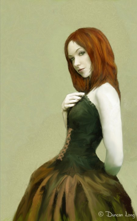
To celebrate the Halloween season, I’m offering a free ebook of Edgar Allan Poe’s “Eleonora” (which I did the cover and inner illustrations for as well as the layout).

Please feel free to share the ebook or the link to it with your friends. And if you want to offer it for free from your website to help celebrate Halloween, that’s fine, too.

And if you missed it last year, you can also download my illustrated version of Poe’s “The Raven”. (And feel free to share it as well.)

Finally, for you folks that like spooky coincidences, the address for this blog is “http://duncanlong.com/blog/?p=1842” — with 1842 just happening to be the year that “Eleonora” was first printed… I made no effort to post with this number. Simply happened (cue frightening background music, please).

=====================

Duncan Long is a freelance book cover illustrator for HarperCollins, PS Publishing, Pocket Books, Solomon Press, Fort Ross, and many other publishers and self-publishing authors. See his cover illustrations at: http://DuncanLong.com/art.html
=====================
Tags: , , , ,

Comments Off on Free, Illustrated Version of Edgar Allan Poe’s “Eleonora”

Collectible Books

Niche markets can prove profitable to a publisher, especially today when the Net makes it practical to connect to customers worldwide.

One niche market system that might be extended to new markets can be found in limited edition horror novels. These capture a tiny segment of the book buyer market — and milk it for all it’s worth.

There are several such publishers who specialize in printing horror books. These presses offer titles with foil covers, embossing, handmade covers (leather or paper), signed and numbered books, etc., etc. Basically they offer not only a reading experience, but an objet d’art to be collected and cherished for a long time.

I think this is a system that publishers of other types of books would find worth exploring, especially self-publishers and small presses. It offers a way to make a lot of money without printing huge numbers of books.

The easiest of these gimmicks to bring into play is the limited edition of perhaps only hundreds of copies, after which — no more will be printed. Such a system creates “instant rarities” and ideally these are signed and numbered by the author and perhaps the cover artist to give an additional bit of value to the package. (The small numbers of books printed allows the publisher to ship the books to the author and artist so they need not be living too close to the publisher for this to work.)

If a leather cover, embossing, foil, or whatever can be added to the package, all the better — and the price can be raised accordingly.

This system transforms a standard-sized book that might command only a few dollars and have to be sold by the thousands to make a profit into a title that can demand a huge cover price ($100 or more). That price means the publisher can print only a few hundred books yet make a tidy profit for himself and the author.

Once a customer buys one book, he becomes a potential buyer for more, so even a modest client list can supply the publisher with potential buyers for future titles.

Perhaps the most “limited edition” books are those created by some artists. These folks create a “book” of their drawings and sketches, often leaving the pictures loose in a cover or envelope (often heavily decorated or otherwise customized). These are limited editions in the extreme – only one copy. But here again there seems to be a tiny market of ready buyers that some artists have successfully tapped into. Might a small publisher tap into this market as well, offering a variety of books to its list of book collectors?

Here’s the fifty-thousand-dollar question: Might other genres of books capitalize on this sort of arrangement? For example fantasy, Western, and science fiction fans seem willing to shell out big bucks for all sorts of memorabilia and collectibles. Might not handmade covers on limited editions in the science fiction or fantasy markets have an even greater potential than the horror book market?

And the beauty of the limited edition book is that it shifts the advantage into the court of the small press or self-publisher, doing away with dealing with distributors (since the marketing is via the net or direct mail) and greatly reducing the number of copies produced and shipped to make a profit.

Making books collectible maximizes the amount earned on each book printed. It becomes possible to earn a lot of money with a very small print run.

=====================
When not scheming about new ways to make money in the publishing industry, Duncan Long works as a freelance book cover illustrator for HarperCollins, PS Publishing, Pocket Books, Solomon Press, Fort Ross, and many other publishers and self-publishing authors. See his cover illustrations at: http://DuncanLong.com/art.html
=====================
Tags: , , , , , , ,

Comments (1)

No, They’re Not Like That In Real Life

Life may imitate art, but it can’t copy it very precisely. Human beings can strive for perfect in their appearance, but as the old saying goes, in the physical world we are seen “warts and all.” People aren’t like artwork where major and minor flaws can be removed with a few flicks of a paintbrush or digital pen.

Unfortunately people can become warped in their viewpoint of what is normal in appearance; a steady diet of viewing idealized people via TV, illustrations, or wherever can cause us to see people in the real world as more imperfect than they would normally appear. The body image we expect to see can vary greatly with the amount of exposure we have to the silver screen where digital artists and plastic surgeons have worked their magic to undo the normal and replace if with artifice.

These days most fashion and entertainment magazines have upward to 90 percent of their pictures art-brushed and tweaked. Politicians and stars appear wrinkle free and 20 pounds lighter. Today not only do children dream of looking like the stars and models in these publications, even the stars and models dream of looking like they do in the publications.

Most people are aware of what’s being done with still photos. Many don’t realize much the same thing is now possible with movies. Actors can be “adjusted” digitally in height, have their waists thinned down, and have muscles built up. You can no longer believe anything you see if it has gone through a digital process at any point between when it was snapped and when you see it.

Here’s a little clip that gives some idea of what can be done on a massive scale.

=====================
Duncan Long is a freelance book cover illustrator for HarperCollins, PS Publishing, Pocket Books, Solomon Press, Fort Ross, and many other publishers and self-publishing authors. See his cover illustrations at: http://DuncanLong.com/art.html
=====================
Tags: , ,

Comments Off on No, They’re Not Like That In Real Life

The Book Cover Illustrations Just Keep Coming

Graphic Novel Illustration artwork by graphic novel illustrator Duncan Long

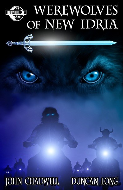
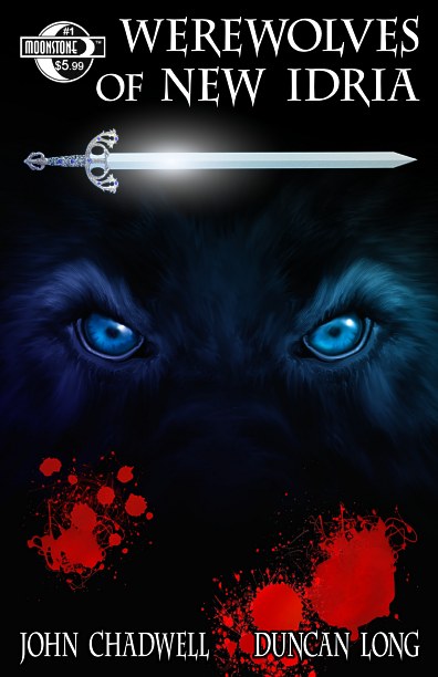
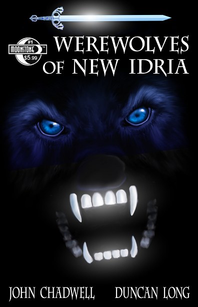
OK… these have to bring the total cover concepts I’ve created for the graphic novel Werewolves of New Idria (written by John Chadwell and soon to be released by Moonstone Books) up to something like eight different versions.

The good news is that they seem to be getting better along the way. And each rejected cover brings us closer to that final one (and often proves a “learning experience” in terms of what does – and does not – work).

Right now the cover above appears to be the front runner, though I think the two below have their pluses as well.

Graphic Novel Illustration artwork by graphic novel illustrator Duncan Long

Graphic Novel Illustration artwork by graphic novel illustrator Duncan Long

My (around 80) black and white illustrations for the graphic novel are almost completed… Almost because, going through them yesterday, I discovered we are one shy, apparently “jumped over” as I worked my way through the book. Tentative release date for the graphic novel remains March 2011. Better to discover I’m short one graphic novel illustration now than when facing a looming deadline.

This isn’t the first “page numbering disaster.” Early on I inadvertently worked from an old manuscript with more pages than the final edit would have. The results were about eight extra illustrations. Right now these may make it into the final book, so my mistake may result in eight “bonus illustrations” for readers.

I am anxious to get this one finished; it has been a major task and I’m not sure I would have tackled it had I realized how time-consuming producing artwork for a graphic novel can be. But not much further to go; the finish line is in sight.

=====================
Duncan Long is a freelance book cover illustrator for HarperCollins, PS Publishing, Pocket Books, Solomon Press, Fort Ross, and many other publishers and self-publishing authors. See his cover illustrations at: http://DuncanLong.com/art.html
=====================

Tags: , , , , , , , , , , , , , ,

Comments Off on The Book Cover Illustrations Just Keep Coming

The Creative Drive

Being creative means facing a lot of rejections. Editors, clients, critics all can draw blood with remarks that often fail to acknowledge the human frailties of the artist, that maximize his shortcomings, and which generally minimize his achievements. (And artists don’t help matters by often being moody and aloof, hiding behind an I-could-care-less facade.)

Those writing reviews often seem intent on destroying. At their worst they are happy only when jealously belittling those with talent. (One old saw has noted that, “Those who cannot, become critics.”)

So here’s a fact of life: No matter how talented a person may be, some people won’t like their style, will be jealous, or will be hypercritical. Sadly these critics will then deride the work and dismiss it as worthless.

To continue creating in the face of these slings requires a lot of drive and belief in ones self. No doubt the path an artist must tread is lined with the corpses of those ambushed by thoughtless critics who lie in wait for unsuspecting victims.

Fortunately a few creative hearts may have the gumption to dodge these barbs and continue on.

My advice to critics of all stripes is to try to remember that the person you write about has feelings, and perhaps is not nearly as thick skinned as you have become. And that you can do untold harm with just one or two ill-conceived words.

And if you’re a creative person, learn to pay attention to criticism that is valid but also discover ways to disregard useless, thoughtless, or even malicious criticism, learning to let it run off your back like water from a duck.

One friend who is an author developed an interesting strategy for dealing with critics. When he gets a bad review or someone bad-mouths his work, he goes to Amazon.com, looks up a book by his favorite author, and reads the worst reviews people have given the book. Invariably some ignorant clod will spew his venom over a beautifully written piece of literature.

My friend then tells himself, “See how well this critic judges the value of good work? Much the same thing has happened to me.”

If my friend is feeling really bad, he recalls the most poorly written book he’s read, locates it on Amazon.com, and reads the most glowing reviews he can find there. “See how people overvalue poor writing?” he tells himself.

While many critics are on the mark, sometimes they are horribly wrong. And any creative person who pays attention to the snakes in this latter group will be steered in the wrong direction by their venom.

Creative people must learn to listen to their own criticism and not be swayed by those slaves to the conventional who remain clueless as to what constitutes exceptional work.

=====================
When not sniping at critics, Duncan Long works as a freelance book cover illustrator for HarperCollins, PS Publishing, Pocket Books, Solomon Press, Fort Ross, and many other publishers and self-publishing authors. See his cover illustrations at: http://DuncanLong.com/art.html
=====================
Comments Off on The Creative Drive

The Right Typeface for Titles

Finding the right typeface for a title is never as easy as it at first seems. There’s often a temptation to choose a font that calls too much attention to itself. Instead the titling should be both easy to read and pretty much “invisible” as far as style — while (somewhat paradoxically) conveying some “flavor” as to what the book is about.

Checking some of the typefaces used for recent popular films can be instructive.

Interestingly type on titling can also be modified ever so slightly to achieve the emotional impact needed for a story. The altered “spike” on the lower-case “p” of Eclipse is a nice demonstration of how just a small change delivers a big impact.

Dinging up and “grunging” type is a quick way to alter its personality for a title. Nightmare on Elm Street opted to use the tried and sometimes true Trajan, using some very subtle grunge for a subtle alteration that works. Ditto for The Karate Kid where ho-hum Helvetica Compressed is transformed to look as if it has been ink-stamped onto the poster. And Knight and Day did much the same thing with the venerable Akzidenz-Grotesk.

A book cover design could do worse than use one of these typeface/alterations.
=====================
While occasionally designing movie posters, Duncan Long mostly works as a freelance book cover illustrator for HarperCollins, PS Publishing, Pocket Books, Solomon Press, Fort Ross, and many other publishers and self-publishing authors. See his cover illustrations at: http://DuncanLong.com/art.html
=====================

Comments Off on The Right Typeface for Titles

Book Cover: John Phillip Backus The Gathering: After the Fall

Book illustration for cover of The Gathering

Sneak peek at the illustration that will appear on John Phillip Backus’ new book The Gathering: After the Fall (book two in the series).

This is considerably more complex than what you’d normally expect on a book cover, however in its complexity it demands attention and thus should serve the author well in terms of pulling in reader’s interest.

Yes, it was complex to do, painting in all the little organic looking bits and pieces to create a surreal overall feel to the illustration. I find it fascinating how little of the human face can be painted while still give the essential human element to the picture. While little more than eyes, nose, mouth and chin appear, each character is readily identifiable with those in the book, and even a feel for their emotional state of mind and personality.

Sadly this web version (at 72 dpi) doesn’t give a complete feel for the complexity of the piece. Imagine four times as much detail and you’ll have an idea of what will appear on the cover.

=====================
Duncan Long is a freelance book cover illustrator for HarperCollins, PS Publishing, Pocket Books, Solomon Press, Fort Ross, and many other publishers and self-publishing authors. See his cover illustrations at: http://DuncanLong.com/art.html
=====================

Tags: , , , , , ,

Comments Off on Book Cover: John Phillip Backus The Gathering: After the Fall

Sneak Peek: Werewolves of New Idria.

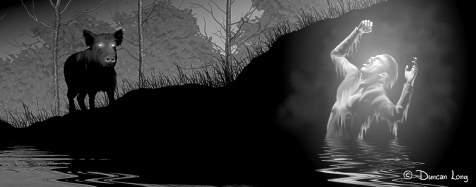
Devil Boar book illustration by book illustrator Duncan Long

The next to last illustration in the graphic novel version of John Chadwell’s Werewolves of New Idria (Moonstone Books). The illustrations have been a bear to get finished due to the number of pictures and complexity of each one (the one shown above was also a boar to get done – but far from boring).

The project has also been a whole lot of fun, and now I’m at home with black and white illustrations, much more than when I started the project. Best of all, I have seventy-some illustrations I’m quite proud of.

What more could a book illustrator ask for?

=====================
Duncan Long is a freelance book illustrator for Moonstone Books, HarperCollins, PS Publishing, Pocket Books, Solomon Press, Fort Ross, and many other publishers and self-publishing authors. See his cover illustrations at: http://DuncanLong.com/art.html
=====================

Tags: , , , , , , , , , , ,

Comments Off on Sneak Peek: Werewolves of New Idria.

Good Design, Bad Design

Our lives are often made much easier, or much harder, by the quality of design work in the various objects and software we use.

Sadly when it comes to the design of electronic devices, the art of logical layout and design appear to have vanished from the design landscape.

It was not always so.

During the 1950s, everyone from the US Military to car manufacturers did research to see what the most convenient and comfortable layout was for everything from a power switch to the car seat or jet cockpit. This made it possible to pick up something like a radio and knowing that pushing a button or throwing a switch would turn it on, and that clockwise raised the loudness with a volume control, and turning the tuner clockwise took it to higher bandwidths.

If a friend asked you to turn his radio up and you’d never even seen the device before, you could do so without having to read the owner’s manual. It was obvious just by looking which knob controlled the volume, and you knew innately that turning that knob clockwise should raise the volume.

Today, too often their are layers of menus, multi-use buttons, and all the various buttons are often identical regardless of what they do. Perhaps even a tiny poorly lit screen to squint at as obtuse icons appear to confuse things. (In ancient times alchemists wrote incantations in lost tongues; today they apparently design icons and control interfaces.)

Most TV remotes demonstrate amazingly obtuse design. Or, more accurately, demonstrate the worst of design and lack of forethought: On/off buttons where they’re easily hit by mistake, color schemes that defy the eye (especially in low-light conditions), and layout that is done to “look pretty” with no concept of what buttons are most often used. Styling seems aimed at allowing the device to travel comfortably at 200 MPH in a wind tunnel — while not properly fitting the human hand.

My current TV remote is a fine example of inferior design. Even after years of using it, for hours and hours of time, I often inadvertently change channels when trying to mute it, or mute when trying to toggle between channels.

The reason?

The channel select buttons have the mute button below them, and the volume controls have the toggle between stations button below them. This of course makes about every stab at one or the other controls wrong since the mind associates the volume with the mute and the channel select with the channel toggle. It’s as if the designer said, “What’s the worse, most illogical placement for these controls – we’ll go with that.”

On this remote, the most often used buttons are the same size as the seldom used ones, and labeling is dark gray over a slightly less dark gray. The play/stop/pause/fast forward/reserve buttons instead of being placed in a logical line, are spread over two rows with no apparent rhyme or reason in their layout. And they’re toward the lower half of the body of the controller so you have scrunch up your hand to use them, while the rarely if ever used buttons are handily placed at the top of the unit.

I could go on and on about this remote. It should be the first thing a university design class would trot out for what not to do. Instead, I can imagine a professor lecturing his class about how elegant and simple its design is.

Unfortunately this remote is the norm rather than the exception with today’s technology.

In the 1950s, form followed function. Technology was a joy to use because it just worked without the need to read a manual to see how to run a tool.

Today, more likely than not, there may be no hint as to what this or that control does. And upon reading the manual (often written in a foreign land where encrypted English is the second language) you’re just as likely as not to discover that something simple like raising the volume can only be accomplished by pressing button two while holding button three and four and clicking your heels three times.

With too much of today’s design work, form no longer follows function. Rather, form dictates malfunction.

=====================
When not cursing the remote for his TV, Duncan Long works as a freelance book cover illustrator for HarperCollins, PS Publishing, Pocket Books, Solomon Press, Fort Ross, and many other publishers and self-publishing authors. See his cover illustrations at: http://DuncanLong.com/art.html
=====================

Tags: , , ,

Comments Off on Good Design, Bad Design

Creative? Don’t Expect to Fit In.

I’ve been at the publishing game for more years than I care to admit, coming into illustrating through the back door, first working as a writer/illustrator, creating my own artwork for my technical books.

I’ve gone from painting and pen-and-ink stuff to digital and have no regrets. I don’t miss the ink blots on clothing and furniture, nor the fumes and mixing of oils. Or cleaning clogged nibs and paint-clogged brushes. (I do miss the smell of turpentine and linseed oil.)

From time to time I meet fellow artists and writers who mourn the fact that they don’t seem to fit in anywhere.

My take on this? Perhaps it’s part of the the price the creative must pay, because (after all) one of the things that makes a person creative is the ability to to see things from new angles. That doesn’t always help you fit in when the crowd wants to believe in the latest fashion, or take part in groupthink.

Feeling alone or of having folks not “get it” when we present an idea is part of that price that has to be paid, especially if we’re to get that moment when at least a few people start to appreciate what we’re doing.

Do I feel sorry for these lonesome souls?

Well, sure. In part because of the “been there done that” routine.

But I also sometimes feel a little like kicking these young writers and artists in their virtual behinds. Keep working, “hang in there,” and try not to worry so much about what other people think. Attempt to embrace your differences, channeling them into creative energy.

=====================
Duncan Long is a freelance book cover illustrator for HarperCollins, PS Publishing, Pocket Books, Solomon Press, Fort Ross, and many other publishers and self-publishing authors. See his cover illustrations at: http://DuncanLong.com/art.html
=====================

Comments Off on Creative? Don’t Expect to Fit In.