Choosing the Right Typeface for a Graphic Design
filed in Book Graphic Design on Sep.15, 2010
Choosing the right typeface (aka “font”) for a book cover or other publication is not as easy as it may seem. Part of the problem is the huge wealth of choices most of us have today.
Back just a few decades ago, a designer might have access to a dozen typefaces on a good day. Today, tens of thousands. (Like many other illustrators and graphic designers, I have a collection of thousands of typefaces on my hard drive — something that would have been impossible to own just a few decades ago.)
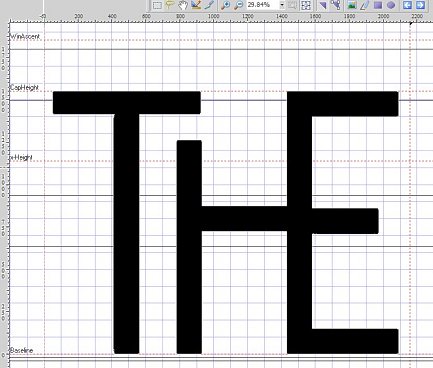
On occasion I will design a typeface for a project – though these tend to be more vanity (on my part) work that necessary. But on occasion they prove worthwhile (the typeface used for the masthead of many of my web pages being a prime example — “the” is shown above).
All that said, like the graphic designers of old, my work tends to employ a handful of favorite/classic types for the majority of my work.
The exception to this rule comes with genre books which tend to use typefaces to convey the genre itself; horror books tend toward sharp points and grunge; science fiction toward futuristic appearance; and fantasy toward a Medieval look; at such times, all those typefaces I have squirreled away, ready for searching through, can pay off.
My collection can also prove useful when a client specifies a typeface they want to use on a project. I can usually find the type in my collection and then can see how good the kerning is and so forth is. If found wanting, I can then suggest a better alternative.
There are two mistake many beginners make in picking typefaces for a project. One is placing too many different fonts in a layout (ideally one or, at the most, two contrasting typefaces is a good rule of thumb).
The other mistake is selecting a weird typeface that distracts from, rather than helping, a layout. It’s important that a typeface is nearly invisible to the casual viewer. Like a fine seasoning, it should add flavor without calling attention to itself.
Generally, if the first thing you notice on a book cover or other layout is the typeface, then the type isn’t working for that project.
=====================
Duncan Long is a graphic designer and illustrator whose work has appeared with HarperCollins, PS Publishing, Pocket Books, Solomon Press, Fort Ross, and many other publishers and self-publishing authors. See his graphic design and illustrations at: http://DuncanLong.com/art.html
=====================
