Book Cover Artwork for The Silent Call
filed in Book Cover Illustrations and Artwork on Mar.19, 2012

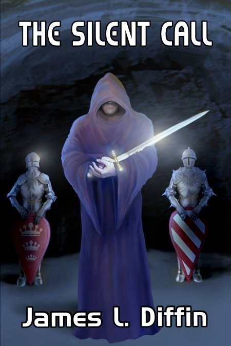
Here’s the cover illustration I created for James Diffin’s new science fiction/fantasy/action-adventure novel The Silent Call.
The author wanted to picture a pivotal scene in the novel where the hero (John Ryder, a young American chess grand master) discovers there may be a modern-day Merlin in his life, with the magician taking the hero to an underground chamber where a mysterious figure appears holding Excaliber.
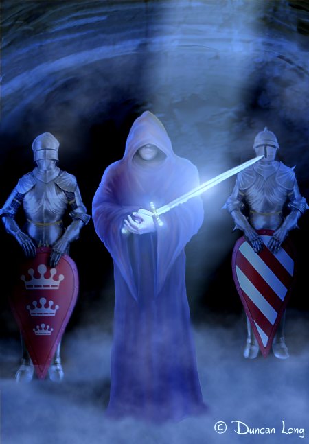
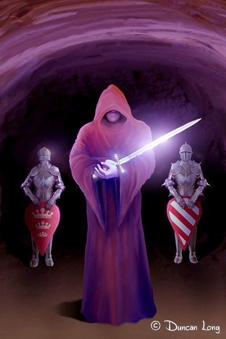
Several concept illustrations were created. One of the first, though in the ballpark, didn’t quite work due to the stream of light coming from overhead.

This was followed by an illustration that lacked the sunlight but retained the light reflecting off the sword.

The colors seemed a bit too intense in this version so they were shifted a bit and toned down to create the final cover shown at the top of this post. In order to establish that the story has science fiction elements as well as fantasy, we employed a futuristic-looking typeface (a slightly modified version of Bitstream’s Handel Gothic).
James Diffin’s Silent Call is available at Amazon.com.
====================
Duncan Long creates book cover artwork and book illulstrations for self publishing authors as well as large presses including HarperCollins, Asimov’s, PS Publishing, Enslow Publishers, Pocket Books, etc. See more of Long’s artwork and graphic design work at Duncan Long’s Book Cover Portfolio
=====================
March 19th, 2012 on 9:59 am
If it was me Duncan, I would have chosen the third, far more vivid, thereby eye catching. :)
March 19th, 2012 on 10:36 am
And I would likely have gone with the sunlight streaming onto the blade version. I generally see this divergence of choices during the last of the design process.
I like to tell my clients (well, when it is true :o) that they don’t really have a wrong choice to make since all are looking good. Rather it becomes a matter of which one strikes the client as the best and that’s the one we go with.
March 19th, 2012 on 3:32 pm
While all three versions are great, and if it were not for fitting a specific scene within the book, the second and third might have been a better choice. For purposes of depicting a cavern with no natural sunlight and a person holding a non-magical sword, the first suited our needs the best. The first also provided better context that the suits of armor were lined up against the cavern wall.
“The cavern was hung with tapestries and brightly colored pennants and banners. Suits of armor, shields, and lances were arranged along the walls. Evenly spaced racks of swords, maces, battle-axes, and morning stars marched across the floor. At the back of the cavern, lighted candles were on what appeared to be an altar.”
March 19th, 2012 on 4:25 pm
@Peter: And that, of course, is the whole purpose of hiring someone to create the cover: To produce a book illustration that actually fits the story. I appreciate your sharing the excerpt so readers can see how the final cover illustration fit the story.
March 19th, 2012 on 5:19 pm
I must say I agree with the author’s decision. The first cover seems more appropriate for a fantasy novel.
The second picture, while acceptable, seems too dusty. It is also kinda bi-chromatic, it would not catch the aye of the buyer as well as any of the others.
The third is nice, but it seems too screaming and too pink for my tastes. I have always thought that a cover for a fantasy book must be like the cover of a good Epic Metal album. When you see the cover of “Warriors of the World”, with a barbarian with a bloody sword and such, you KNOW what kind of music is in the CD. When you see a book cover of a bunch of orcs gathering on a knight of shining armor, you KNOW what is the book. Making super-bright covers with pink-like clothing somehow breaks the rules, in my opinion.
March 19th, 2012 on 5:33 pm
Good points, Richard. I hadn’t considered the color angle, but you’re right.