Creating the book cover for My Odyssey
filed in Book Cover Illustrations and Artwork on Oct.13, 2012

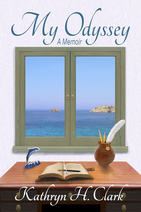
Kathryn H Clark My Odyssey front book cover layout by graphic artist and designer Duncan Long
I recently had the pleasure of creating the book cover illustration as well as the graphic design and layout for the cover of Kathryn H. Clark’s memoir My Odyssey. After several false starts, a friend of the author sat down with her and created a sketch which we then followed greatly simplifying the process as well as getting the artist (me) up to speed. The author also had a photo of the ocean around Greece (where much of her story takes place) which I employed as a reference for my painting for the back cover as well as the window inset of the ocean in the front illustration.
The author had some key objects (which were central to her story), and I tried to incorporate as many of these as possible into the final artwork. These included a vase, a writing quill, a feather, a leather bound notebook, a dolphin figurine, and the moon. I created a larger digital painting of each of these, then placed them on the background I’d painted, keeping each in a separate layer so they were easily positioned on the surface of the background. With a little tinkering, moving, and resizing, all the objects made it onto the cover layout (most on the front with the moon eventually appearing on the back cover).
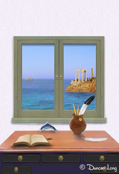
Here’s how things appeared on an early version of the front illustration:

Early cover illustration with various elements the author wanted appearing (illustrator Duncan Long).
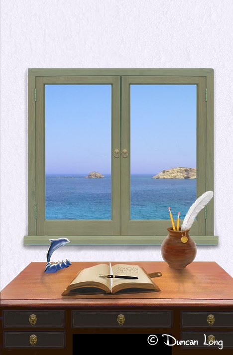
It worked, but was a little busy, so we decided to get rid of the Greek ruins on the island, move the notebook to the center of the table, give the dolphin a base to sit on, and move the feather onto the notebook. These changes resulted in a more satisfactory arrangement (and also made me thankful I’d maintained each object on its own layer which made shifting them around a lot easier):

The book cover illustration with some of the various elements shifted into new positions (illustrator Duncan Long).
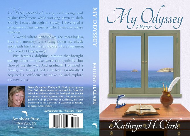
Once the front illustration was settled on, the layout of the entire cover began. At first I tried a sans typeface, but that didn’t really reflect the personality of the author well, so I changed to a more ornate script-style type with a tried-and-proven classic serif for the text. After jugging things around a bit and changing out several different photos of the author (and adding the moon over the ocean) we came to this final wraparound design:

The final book cover graphic design and layout for the memoir (graphic artist Duncan Long)
That was about a week ago.
Now… Let me wander from the subject just a tad to note that I continue to be amazed at how rapidly books go into print these days. Even though I’d just put the finishing touches on this cover a week earlier — today I found it available for purchase at Amazon. (By way of comparison, the first novel I wrote back in the mid-1980s took four YEARS from submission until it was in print with a major press. Yes, that slow even for back when, but not unheard of and the time lag is instructive, I think.)
This is a great time to be an author.
If you want to read a very moving story, I’d encourage you to read this book. You can purchase the ebook from Amazon.com here or the print version via Amazon.com here.
==================
Writer / illustrator Duncan Long concentrates mostly on creating book and magazine cover artwork. You can explore his illustrations and graphic designs at his Graphic Art and Illustration Portfolio
October 14th, 2012 on 6:41 am
It’s nice to see some covers without the blood (I love the blood, don’t get me wrong). Shows how versatile your talents, Duncan. It feels three-dimensional. Well done!
October 14th, 2012 on 9:52 am
Ditto… the “32 Days of Halloween” sounded like a great idea, but got a bit dull. Possible decisions are best made when one is sober :o)
However I will be posting a few more horror pictures throughout the rest of the month.