Another Sneak Peek

Book covers often take very different routes before getting into print. Sometimes an editor will see an illustration, purchases the book cover rights, and the artwork goes directly from the illustrator’s conception  to the cover of the book with few modifications in between other than added title, blurb, and author’s name.

Moonlight Madness

Moonlight Madness

Other times, there are modifications suggested by any of a number of people from the editor to the  art director on down to the author (especially in the case of well-known authors, and not so much in the case of lesser-known). The input from these sources hopefully, and generally do, improve the book cover artwork. On less fortunate occasions the changes dictated  may seem detrimental, at least from the book cover artist’s biased point of view.

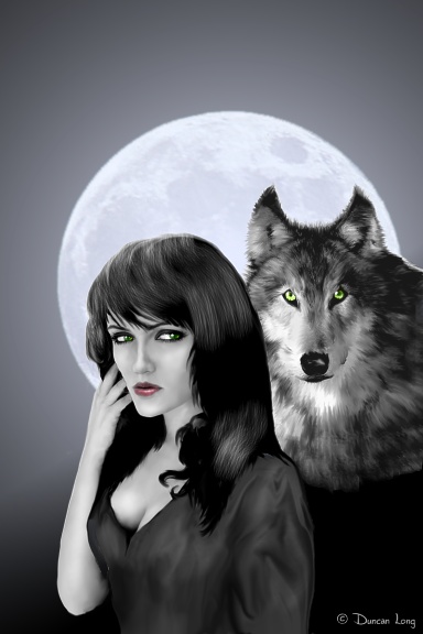
DuncanLong-NightWolf2f

The third route for the cover is for an editor to ask an artist for a book cover picture, at which point the illustrator does his best to produce what’s needed, sometimes working under many design constraints and at other times being very free to create an illustration for the book cover in question. Once that illustration is completed, it can then be accepted or go through the process of revisions outlined above.

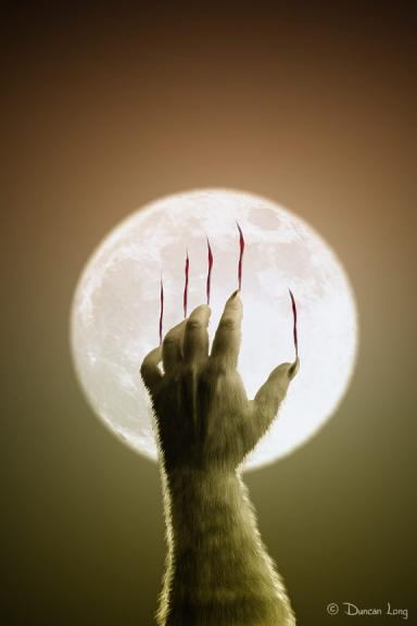
DuncanLongHand2

With Halloween only a few months away (right on the horizon in the publishing industry given the lag time of printing, distribution, and so forth), it’s not too surprising that book cover needs have turned toward vampires, werewolves, and things that go bump in the night.

One recent book cover project led me to produce the series of illustrations shown above (plus a few more). Whether or not any of these illustrations will become actual book covers remains to be seen, and is what keeps the illustration business “interesting.” (I should also note that the lovely “Showmesara” offered the reference photo for the second illustration shown above.)

While I’m waiting for word from the publisher, I’ll work on my rubber monster mask. After all, it is almost Halloween for those of us in publishing land.

So let me be the first: Happy Halloween.

(You can see more book cover artwork at my main gallery.)

Comments Off on Another Sneak Peek

Shoving Electrons With a Digital Tablet

I know some digital artists do excellent work using a mouse. But I have found that a quality graphics tablets can be a great asset to some types of artwork, especially paint programs. And I can’t imagine trying to tackle some of my book illustrations without a graphics tablet.

I had to do a lot of soul searching years ago before shelling out all my cold, hard cash for my first graphics tablet about ten years ago. I tried a lot of cheap substitutes before finally shelling out for a quality product: Pens with tiny trackballs built in, various pointing devices, and other odds and ends. Then I finally broke down and bout a Wacom tablet which had (and still does have) the best reputation among digital artists.

That first Wacom tablet was purchased for several hundred bucks less than list price because it was a factory refurbished unit. It worked perfectly, and continue to work without a hit for the next ten years, with the help of packing tape around the occasionally shorting cord where it went into the tablet, and the finish on the plastic drawing area which wore into grooves (a little sandpaper fixed that). I’d still be using that tablet today if my computer upgrade had had a serial port to accommodate it, or a free slot to plug a serial port card into. Alas, even though it is one super-duper system, no extra cards (hey, Hewlett Packard, how about cutting power users a break?).

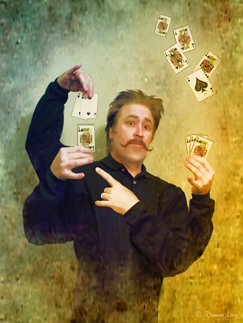
Mad Magican - Card Tricks j-016

When I first started using that first tablet, I had some second thoughts. And it took a few calls to customer support to get it up and running (my new unit plugged into a USB slot and was running right from the start). Finally my Windows 95 system accepted it and after a little awkward practice that seemed to say, “not much better than a mouse” there was a moment when the drawing became more natural and less stressful and then things clicked and – I would never go back to trying to draw with a mouse.

In fact, I’d rather go to a slower computer than give up my tablet, and that’s saying a lot because I am not a patient man when it comes time to process an illustration or render a landscape. (Hopefully the culture Nazis won’t break down the door and torture me with this decision of which I must give up.)

My old Wacom continued to work through upgrades to W98 and XP. It has outlasted my other hardware, going through three different computers before I got my new system six months ago. I’ve kept it and an old computer as my “emergency spares” in case I need to get up and running after a disaster with my current system.

Some graphics programs aren’t suited for a tablet. Photo-Paint 8 (which has been my main paint program for about ten years as well) never has worked well with the pressure-sensitive features of the tablet. That has not been a big loss; when I’ve had that with other paint programs I’ve found I didn’t need it that much. Once a pen and ink man, always a pen and ink man, perhaps.

Generally 3D program designers seem never to have heard of a digital tablet, near as I can tell. Z-Brush works well with a digital tablet, but Poser, Vue, and the others can go into a tailspin when you try to run them with a pen. But paint programs… Here the tablet shines and becomes more of a digital paint brush or spray can than pen and tablet.

I keep thinking perhaps some competitor will come along and give Wacom a run for its money. But that hasn’t happened. There are other digital tablets out there, but they really don’t seem designed, as of yet, for serious artwork.

Wacom also offers a tablet system that works directly on a screen. Marketed as the Wacom Cintiq Pen Display, it has a display that the user works on – very much like working on a canvas or sketch pad.

I suspect that this is great for some artists, and it probably makes the transition from real sketching to working in a digital environment a lot faster. Personally, but after working on a tablet PC for several years, I wouldn’t care to give up my tablet and large monitor for the Cintiq Pen Display (though if anyone were giving them away, I’m sure I’d take one). For one thing, putting a tablet where you want it is a lot easier than moving an entire screen/tablet system around. And if something goes wrong with my monitor, it is a lot cheaper to replace than is a one-piece tablet/monitor system.

Beyond that, however, there is the fact that a hand drawing on the monitor blocks out a large section of the screen. It sort of turns you into a lefty who has trouble writing because his hand is blocking the line. A tablet gives you an “invisible hand” on the screen and I much prefer that to covering up part of the screen with my hand.

If you’re an artist serious about your digital artwork and use a paint program (Photoshop, Photo-Paint, Paint, etc.) then my advice is to run, not walk, to the nearest retailer and buy a Wacom tablet. The Wacom Intuos4 Medium Pen Tablet is a good choice. (Wacom also offers the Bamboo Fun Tablet, but I would advise going for the Intus line as they’re better suited to graphics work.)

After you’ve worked with a tablet a bit, I’m betting you’ll discover it has given you a big leap forward in your technical skills.

Publishers interested in purchasing the rights to this illustration for use as a book cover, magazine illustration, etc., (or anyone with suggestions, or whatever, please contact me).

Comments Off on Shoving Electrons With a Digital Tablet

Book Cover Artwork – A Sneak Peek

The summer is always a little slow in the publishing industry; everyone catches their breath as they prepare for the fall run up to Christmas when things often become fast and frantic. I like to take this time to create potential book covers “on a whim” since I can’t be assured they will sell.

The good news is that eventually many do. So the time spent creating them is sort of like money in the bank. But most of all, it’s fun to create and doing it on your gives you time to stretch wings and perfect new techniques.

Aladdin- Princess Bulbul Longstock-002

As usual for my work these days, everything was done in Corel Photo-Paint 8, working with a digital tablet and HP PC. The reference photo that I employed in painting this picture came from the lovely LongStock.

The picture’s subject (in my mind – often illustrations take on a new meaning when they become book cover artwork) was taken from the original tale of Aladdin, this character being Princess Bulbul.

Publishers interested in purchasing the rights to this picture (or anyone with suggestions, or whatever, please contact me).

Comments Off on Book Cover Artwork – A Sneak Peek

Wearing My Typographer’s Hat

Sometimes I do more than just a book cover illustration for a client, tackling the lettering and graphic design/layout of the cover as well. This calls for some different software tools (most of my illustration work is done with an elderly Corel Photo-Paint 8).

Work often gets down to the level of not just kerning type (kerning being the adjustment of spacing between letters), but also altering the letters. Sometimes this can be done in the graphics editor, but if the letters are repeated a lot – like in the text on the back cover – then it’s easier to alter the typeface letter itself (so it will be repeated in its altered form).

I’ve tried a number of different typeface editors and finally settled on the Pro edition of FontCreator from High-Logic. Apparently I’m not alone in my preference, as FontCreator recently became the most downloaded typeface editor in the world. (I should note that I am in no way connected to High-Logic – just a big fan of the company’s software.)

FontCreator offers a lot of nice features for the typographer. In addition to permitting individual points in the vector form of characters to be controlled, the program allows combining elements, cutting, scaling, and a variety of other features you’d expect with a good editor.

For the artist, it also imports a sketch of a letter that’s been scanned or produced digitally (as a bitmap); this also opens up a quick way to produce vector mapping from a drawing, provided the sketch is not too complex. I’ve also found (at least with Corel Photo-Paint) that FontCreator allows a copy and paste from the paint program to the editor, so a graphic designer can directly load a picture into a letter space. (Great care must be taken not to inadvertently create a letter outline directly from a font in the paint program that is then loaded directly into FontCreator because might take an artist into a short of gray area, with some arguing it might infringe on the rights of whoever designed the original electronic typeface.)

FontCreator also allows automatic as well as manual creation and adjustment of kerning pairs, doing some deep naming of fonts, and the generation of italics, bold, and so forth. These latter alterations come through the automated process pretty well, though individual characters may need a bit of tinkering afterward for a quality typeface. But the automated kerning, italics, etc., can save a whole lot of work if a typographer is creating a whole family of type.

Occasionally a nicely shaped typeface that an artist purchases will be poorly kerned or have a letter or two that seem out of whack. Here FontCreator also shines since it can be employed to adjust the kerning, letter style, and so forth in purchased type. That said, alterations should be approached cautiously and such fonts should never be “released into the wild” in their altered state for legal reasons (and it’s wise to check the purchase agreement as some manufacturers dictate no alterations of their typefaces).

If altered typeface is used in an electronic publication or submitted to a press as a PDF, then it’s a good idea to save the altered type as curves rather than type; this can avoid having a publisher use its version of the (unaltered) font, thereby undoing all the graphic designer’s hard work. It will also prevent people from getting a false impression of what a typeface looks like if they check the type list in the PDF’s “properties.”

High-Logic offers a trial version of FontCreator. My advice is not to try it unless you are prepared to purchase it because if you enjoy playing with type, this program is addictive.

Pricing is very reasonable as art programs go these days. The Home Edition goes for $79 (US) and the Professional Edition for $199 (US). I’d recommend going with the Pro edition as it has some very useful additional features.

The company also offers an excellent font manager MainType. This program not only keeps track of the typefaces stored on a hard drive, it can also temporarily load typefaces, install type, and uninstall/unload type – all on the fly. That means you can not only browse through your collection, but also load those you want to use and then just as easily unload them when you’re done using them. This saves having to wade through long lists of fonts in your system and can save on computer memory use as well. I also love that I can see the special characters in a typeface – and can copy a character in MainType and then paste it into an art program that isn’t set up to present alternate characters and such.

Now here’s one more neat thing: High-Logic offers a special package deal that permits buying both MainType with FontCreator at a nice savings.

On the downside for some, these programs only work in the Windows environment (neither is available for Apple systems); fortunately typefaces created with FontCreator will work on both Macs and PCs. (The software available only on the Windows platform, coupled with the great stability of XP, is perhaps one of the reasons many artists now have both PC and Mac computers operating in their studios.)

Bottom line: For those interested in typography, I would not hesitate recommending FontCreator as the program of choice.

Tags: , , , , , ,

Comments Off on Wearing My Typographer’s Hat

Terms Self-Publishers Need to Know

With the downturn in the economy and a reduction of the number of titles many publishers are buying, many authors are now trying their hand at self-publishing. There’s never been a better time to do this; it’s a lot easier to self-publish these days than it was even a few years ago. And in addition to book packagers that cater to authors, print-on-demand services like Lulu.com and CreateSpace.com are geared up to produce small runs of books at competitive prices.

I’ve personally noted a huge increase in the numbers of authors that are contacting me to produce their book covers. Having a professional artist create a cover pretty much levels the playing field with self-published books. The covers are hard to distinguish from the big publishers’ offerings (in many cases because the artists are producing illustrations for both groups) and thus such an illustration puts the self-publisher into a good market position (the old saw that people judge a book by its cover applies to marketing).

That said, there are a few terms that a self-publisher may run into that can cause no little confusion. I have always suspected that the publishing jargon, like that of other trades, has developed in part to name processes, but also to confuse and discourage beginners, thereby keeping competition in check. (Maybe I’m just a cynic on this – but that’s my take.)

One caveat: I’m neither a lawyer nor do I operate a press. So all you’re about to read is subject to higher authority. And there are no higher authorities than a press operator or a lawyer. Just ask any artist who has crossed either of these folks.

Now, without further ado, I will betray my industry by revealing a few insider secrets with which the intrepid self-publisher may encounter:

Typeface: This is basically the family of letters, numbers, and punctuation that are used together in text or other lettering. Often you will hear typefaces called “fonts” – even by the pros in publishing. But technically the font is the size of the typeface letter while the typeface has to do with the actual design of the letters in all sizes of the family. The confusion comes about because most electronic typefaces can be scaled to various sizes – and Microsoft and other companies compounded the confusion by calling typefaces fonts. (That’s right, another reason to get on Microsoft’s case.)

There are a lot of categories of typefaces, and everyone has their own groupings it seems. But the basic divide among the more commonly used typefaces are the Serifs and Sans. The Sans (actually, Sans Serif – without Serif) don’t have the various curves and ornaments of the Serifs. Good examples of Sans typefaces are Helvetica and Ariel. Common Serifs are New Times Roman and Georgia. You’ll also find ornamental, script, and other fonts; my advice is to use these latter categories sparingly as you can quickly achieve an amateur look without even half trying to.

Also, try to confine the different typefaces employed in your entire publication to two – or better yet, just one (along with its italic form). One elegant typeface that doesn’t call attention to itself puts you well on the road to a professional look.

Never underline the typeface in a book that’s going to be published (use italics instead) and try to avoid using bold lettering as well (use a larger font if you need a bolder look).

Many claim that Serifs are easier to read in print; this may or may not be true these days since we are bombarded with all sorts of typefaces. However it’s a good rule to use Serifs in print text. Sans can give a more modern look, however, and might be suitable for a science fiction novel or the like – although even there I would suggest trying a serif first.

Some typefaces have been designed for easier reading on computer screens. If you’re strictly marketing your title as an ebook, then using one of these is a good idea. Also, be sure you have all the licensing to use a typeface in your book (you can find the typeface foundry in the information within the typeface itself. This may also reveal the licensing information. If not, going to the company’s site will generally lead you to the licensing information.

While in theory typefaces can’t be patented or copyrighted (at least here in the US), recent court rulings have blurred this idea by claiming that since software generates the typefaces, and the software can be patented, then the typefaces are subject to the patent (or copyright?) as well. Don’t ask me to explain that because I suspect the tortured logic at best and only works in court. But the court is where you may find yourself if you infringe on someones typeface, so be forewarned.

Kerning: This is the process of adjusting letter spacing to make the type look right to the eye. Kerning is more art than science. Most quality computer typefaces kern themselves to some extent. However with titles and such, kerning often needs to be done by hand. Key places to kern are between letters like A and V where instead of lining up side by side, the two overlap their spaces. One trick is to attempt to make the space on either side of a letter appear to be the same to your eye. This works if you have a trained eye. (I told you it is an art, didn’t I.)

RGB and CMYK: These are color palettes used in the printing industry. RGB (Red Green Blue) is basically the colors projected by a computer monitor. Mixing these light beams produces the millions of colors on the screen.

The catch with publishing comes with the fact that book cover colors are produced by light reflecting from the ink on paper. And the colors of inks are typically cyan, magenta, yellow, and black (CMYK – don’t ask about why the K stands for B – I warned you about confusing beginners, right?). Just to keep things crazier, some presses use an additional color or two to get more precise colors.

The thing to remember is that when going from the RGB of the screen to the CMYK of printing, some of the brightness and spectrum width is lost. That means pictures on your monitor look more intense and vibrant than they will in print. Fortunately most of us adjust to this without thinking about it.

One danger (especially for PC users) is that it’s possible to crank up the brightness to see a much wider range of color than will ever be possible to create in print. This can lead to covers that are much darker than hoped for, often with the colors so dark as to be hopelessly awful. This isn’t as much of a problem as it once was; modern color cards and monitors are coming much closer to what the appearance is in print. But don’t crank up the brightness of your monitor if you want to see what the print version of a picture will look like.

Presses will generally prefer one format over the other, so find out which is better. Also, while software is good at transforming RPG palettes into the CMYK format, it’s generally terrible at going from CMYK to RPG. So don’t try to change a CMYK picture into an RPG or you will likely have a disaster on your hands.

Finally, be sure your press does a test printing for you to see before cranking out thousands of copies of your title. It saves a lot of tears and even lawsuits.

DPI: Dots Per Inch. Basically pictures on the Internet look fine at 72 or 96 dots while print needs more detail and requires 300 or 350 dots per inch. Many beginning self-publishers think that a picture taken from the Net will make a swell cover – and discover the results are blurry and grainy (and also probably illegal if the proper licensing isn’t purchased). Presses will often use a different system – just don’t worry about it and go with the DPI of your computer.

Licensing: The copyright law allows an artist or photographer to sell the right to use their pictures in a variety of ways. You need to be sure you’ve purchased the rights to any picture that you use on or in a book. “I just found it” is not a legal defense, and failure to secure rights doesn’t mean you forfeit the money you make on the book, but rather the harm done to potential sales.

And that harm is measured in the maximum potential sales. We’re talking loss of home and perhaps your firstborn daughter if things go really poorly in court. So unless you have a fortune sitting in a bank account that you’re wanting to shell out to some grubby artist like me, be sure you purchase the rights to a picture.

Even if you purchase rights, it is easy to get tripped up. That’s because rights are very narrowly defined.

Purchasing the book cover rights means only that you can use the picture on that one book (and usually for advertising that book). If you want to make t-shirts with the picture, then you have to buy the right to do that. Ditto for book marks, stationery, web site display, mugs, mouse pads, posters, etc., etc.

Many self-publishers get this wrong – the book right you purchase only applies to that one book you buy it for, and only to its first edition. If you revise your book, or right another book in the series, you’ll need to buy rights for that book as well.

Rights can be exclusive, meaning that the picture won’t appear on Joe Blow’s book as well as yours. Or the rights can be non-exclusive, meaning the picture might appear on some other author’s cover. And this can happen a lot these days with all the books going into print.

Generally the cut-rate stock picture sellers sell non-exclusive rights. That’s why the prices are so low. That’s also why self-publishers are regularly horrified to see the same picture (or parts of it) on books that are competing with them in the marketplace. My advice is to spend extra money and buy the exclusive book cover rights on any illustration you consider buying the rights to.

Galley: You probably won’t need to know this one unless you’re working with a big publisher (but it’s still good to know this). A galley is an early draft to the final layout of the book in the form it will have in the book; that is, it is typeset and all laid out. It no longer looks like the manuscript you sent to the publisher, and more like it will in the printed version.

After a manuscript has received its initial corrections, it soon graduates to its galley stage. Back when typesetting was done, the galley appeared pretty late in the game. Now that most manuscripts are sent to publishers in a digital format, the line between galley and edited manuscript has blurred quite a bit, and some publishers don’t even call any of the copies of the typeset manuscript a galley.

Once in the galley state, Xerox or computer printer copies of the galley are sent to line editors and the writer for corrections and changes. Generally the fewer changes the author makes to the galley, the better, though with modern computer typesetting this isn’t such a big deal. Back when lead typesetting was being done pretty much by hand, changes to a galley could end in a brawl between author and editor.

Before the book actually goes to print, galley copies may also be sent to reviewers as well as those who will write a positive endorsement for the cover or write ad copy for the book. Often the galley will be printed at the actual size of the final book with registration, cropping, and other marks the press will use to center the page along its margins.

BLAD: The BLAD (Basic Layout and Design) is something self-publishers could use to good effect – but most don’t because they haven’t heard of it. A BLAD is an abbreviated version of a book and generally includes only the cover art, the copyright page, and typically the first chapter, perhaps followed by an order form and contact information and maybe a blurb about the author.

Publishers often release a BLAD to potential buyers, reviewers, etc., thereby launching a media campaign. The BLAD is a great way to show off the syle and level of writing in a book and generate interest in it.

Recently publishers have started uploading BLADs to file-sharing services. This creates a lot of free publicity. It also gives potential readers a sample chapter to entice them into buying the whole book.

My advice is that if you’re self-publishing, you should make a BLAD of any book you produce and upload it to some of the file-sharing services. It has the added plus of discourages pirating of your whole book, and can bring in a lot of extra sales with virtually zero investment on your part.

The best format for an electronic BLAD is the PDF (more on this in a moment). With an electronic BLAD, be sure to hot-link to the site you’re selling your book from. Adding an order form at the back of the book is a great idea, too.

PDF: The Portable Document Format was created by Adobe Systems in 1993 for document exchange. It has become the standard for ebooks and also the preferred form for documents submitted to most presses. Modern PDF files have the colors and layout locked in place so there are no surprises when the book comes back from the printer – which is why the PDF has more or less become the standard in publishing.

The PDF is also ideal for ebooks, which means that when you produce a PDF for your publisher, you have an ebook ready to sell as well (with the caveat that ebooks are easy to pirate).

If you make your own PDFs (there is freeware and inexpensive software for this purpose), be sure to use the “PDF/X-1a” publisher profile if it is available (and your press can handle it), and be sure to “flatten” all the layers when creating your PDF as well as packaging all the typefaces and pictures in it (remember that your pictures need to be at 300 DPI). Doing all this can help prevent any unexpected errors in your layout.

Bleed: Bleed is the extra space around a cover, generally a quarter inch on all sides. The purpose of the bleed is to prevent any white borders from showing when the press trims the cover. Since trimming is a mechanical process, there’s a little slop in things. Having the cover bleed past the trim area means that the printer has a little extra margain for error.

The addition of the bleed to a cover means that a cover that is 5.5 x 8.5 inches will become a “wrap” that’s 9 inches high (8.5 plus 0.25 bleed on the top and 0.25 bleed on the bottom) and 11.5 inches wide (5.5 inches front plus 5.5 back plus 0.25 bleed on the left plus 0.25 bleed on the right) – plus the width of the spine. There’s a lot of room for error, so always double or even triple check your measurements.

TIF and JPG: If you’re only submitting a cover illustration to a publisher who will do the lettering and so forth for your book cover, then chances are the press will want the illustration as a TIF (Tag Image File Format – pronounced just like it appears) or JPG (Joint Pictures Expert Group – pronounced jay-peg and sometimes abbreviated as JPEG).

JPGs can be quite a bit smaller than TIFs, but you need to be sure that the picture is only slightly compressed. Otherwise the illustration can get lots of artifacts (little grainy splotches) that look like flaws in the printing process. For this reason a lot of presses insist you send a TIF since it is harder to screw up.

I have only scratched the surface here. But knowing these terms will generally help you navigate through most of the straits you’ll encounter when self-publishing.
Comments Off on Terms Self-Publishers Need to Know

Off With Their Heads

I don’t know about anyone else, but I find the current trend of cropping off the heads of characters in book cover illustrations a bit disconcerting. I suspect it’s being done to avoid having to pay models, and to avoid those “look alike” covers that result when stock art is used with few modifications – which in these days of budget cuts, perhaps speaks to the desperate condition of the industry or at least some publishers.

Or maybe it is just one of those trends like bell-bottoms or polyester suits that we will all ridicule once the “fad” wears off.

Sometimes these beheadings are only lobotomies (only the top of the head removed). These I really can’t quite fathom, but it does at least save the face for the enjoyment of the viewing audience. (Peanuts’ Linus avoided drawing hands not because of deep psychological problems but simply because he had trouble drawing hands; perhaps artists shun all the labor of creating convincing hairdos.)

OffWithHerHead-DuncanLong

Female figures in low-cut (often period piece) dresses seem especially problematic for decapitated book covers. I can almost imagine each woman screaming at male viewers, “Hey, my eyes are up here, buster!”

Maybe the decapitated lady book covers are just a blatant ploy on the part of art directors to sell books to male readers. But I doubt it.

At any rate, I for one will be glad to see this fad pass into that graveyard where all thoughtful designers have placed the Comic Sans and Papyrus typefaces.

Decapitation covers also make a lot of “action” impossible on a cover. With this violent number, it’s obvious that the arm would be lost and the picture negated. Lowering the arm to accommodate the headman would also greatly reduce the action. And this picture also shows how much emotion can be lost when facial features are removed. (The model welding the knife is the lovely “Bobbistock” — who offers a wealth of stock photos for artists – and is almost never this violent.)

die-DuncanLong-Bobbistock-small

All this said… On the flip side of things, the old “close up” remains viable, I think. A close-up shot of, say, a hand with an object, an eye (though this, too, has become somewhat of a cliché), or an object like a pocket watch, can make a very captivating cover. As such, these may create the feel that graphic designers seem to be trying for when lopping off heads, but the close-up is a much more artistic and satisfying solution, I think. (By the way, this picture is not displaying the method art director’s employ for creating a headless book cover illustration.)

Here’s an example of a “close up” that is cropped from the book cover illustration above. I think it works well, though in many ways I still prefer the whole picture version. Removing the face of the character does add an element of mystery, however. That might be a big plus with some story lines like a mystery where the publisher might prefer not to give away the fact that “the blond did it.”

Die-closeup-DuncanLong

Here’s my bottom line. When it’s all said and done, please… Think long and hard before decapitating anyone on your cover. The life you save may be your book’s.

Comments Off on Off With Their Heads

Another Book Cover Design

I’ve been working on this cover for The Making of a New Church by Natalie M. McMillan. The work has gone on and off for a couple of weeks (I generally find I’m working several projects due to delays produced when publishers have to look over and approve changes, make suggestions, and so forth).

DuncanLong-NewChruch

The picture was selected from a collection I’d done some time before. From there things were pretty straight forward. Ever the wild man, I tried matching a dark purple to the background; the black proved a better choice, giving the cover a more conservative look.

The typeface color (a very light yellow) comes from the picture itself. For the typeface I selected the conservative, elegant American Garamond.

The back cover lent itself to justification without any “rivers” appearing in the text, making for a very neat appearance when lined up the bar code I’d generated for the back cover.

Currently the publisher is editing and calculating the spine width. Once that’s “plugged into” the layout, this should be a wrap – barring those unexpected things that often come up when working on a book cover, of course.

You can see more of my cover design work at my Book Cover Gallery.

Comments Off on Another Book Cover Design

Book Cover Work In Progress

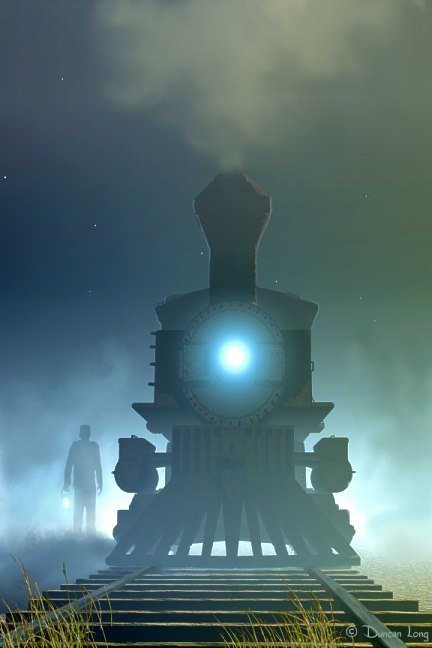
Here’s somewhat of a departure (pun intended – “All aboard!”). This has more emphasis on a mechanical figure rather than the human figure. The picture was pretty bland without the lighting and atmospheric effects; painting in the headlight and fog proved pretty fast and gives it a rather ominous feel, I think. (Horror book cover, perhaps? It will be interesting to see what book or magazine this one eventually finds a home on.)

So far, no takers. But that’s to be expected since it hasn’t been released into the book cover illustration wilds yet.

Ghost Train by book cover artist Duncan Long

Software used in the creation of this picture included Vue and Photo-Paint 8, working with a digital tablet and HP PC.

If you’re interested in purchasing the rights to this picture, have suggestions, or whatever, please contact me.

Tags: , , , , , , ,

Comments Off on Book Cover Work In Progress

How Can Beginning Illustrators Find Work?

I often get questions from new illustrators for tips on how to get started as a book illustrator, or how to find work as an artist in this or that field. Sometimes I even have folks ask for jobs.

So first the bad news: I’m more or less a one-man operation at the moment (though if work continues to pick up, that may change). Right now, I’m not hiring.

One caveat before the good news: I came to book illustration through the back door, by writing and illustrating technical books. Possibly I would never have made it as an illustrator or as a writer without this one-two punch in my moves employed in those early fights to find work. Once I met with success, I gradually branched out into first fiction, and then illustration as stand-alone work. While I do have a Master’s degree, it’s in music composition; I don’t have any formal training in writing or illustration – just a great love and appreciation of both, and some natural inclination toward these endeavors.

And that (perhaps) is the good news. If a person has some talent and persistence, and is willing to hone their skills, they can make a living at it.

Other things I’ve learned:

Having a web site is an important plus. Spend time making it look professional can help attract business to you. You don’t necessarily need a lot of traffic, just the right traffic of potential clients.

Having an up-to-date portfolio with the very best of your work is important. Fewer works that are all good is more important than a larger collection with some marginal work since editors tend to see the least effective piece in a portfolio as the artist’s “normal output.”

Spend time selling yourself. An illustrator, whether online or in person, should be someone special, someone who demands respect. These days it is hard to tell the important from the unimportant, so people tend to do it by how any given person presents himself. Present yourself as a talented artist, and many will assume you must be that. And so will you. And then you’ll discover that when you and others believe in you, you will be deserving of that confidence.

Be ready to jump when opportunity presents itself. Often leaving a potential client waiting for your reply for a few days means someone else gets the job. Be ready and be prepared to burn the midnight oil to tailor a portfolio for a target client or job. Have quality samples to show. Things are moving fast these days and delay or lack of preparation can spell failure to land a job.

Never let yourself get discouraged. For every job an artist gets, he’ll see bunches of offers turned down. Realize this is normal and that it isn’t a reflection on you. Other people how their own (sometimes poor) tastes and you won’t be able to cater to all the various likes and dislikes (bad as well as good). Stick to your style and do your best. Eventually you’ll land some work.

Discover what you like doing and what you do well, then find the markets where people are buying that sort of work.

Branch out. Don’t limit yourself to just one medium or market. If you can do CDs, that’s great — but also consider doing graphic design art, T-shirts, book covers, magazine illustrations, etc., etc.

Contact quality publishers when looking for work. There are a lot of scam artists who’ll try to get you to work for little or nothing. A good first step in looking for work is to consult the latest 2009 Artist’s & Graphic Designer’s Market which will give you leads to publishers wanting work like you’re doing. It also is full of good tips about the right and wrong way to approach publishers, how to find the best market for your work, and markets you may not of thought of that could use illustrations like yours.

I hope this advice is of help. Certainly it would have been of great help to me back when I was starting out, green and ignorant.

–Duncan
=====================
Cover artist for HarperCollins’ Digital Artwork for the 21st Century.
See my book cover illustrations and other artwork at: DuncanLong.com

Tags: , , ,

Comments Off on How Can Beginning Illustrators Find Work?

How to Kill a Book Cover

Nothing is quite as sad as watching a quality book cover illustration be slowly butchered.

As a writer/illustrator, I’ve seen the world from both sides (13 novels with HarperCollins and Avon Books, over a thousand book illustrations). While the process of writing a book and painting an illustration are similar, there are some important differences.

An example of a cover where the cover illustrator was allowded to "do his thing" with quality input from the publisher.

A great cover in large part because of quality input from a thoughtful writer/publisher.

Before continuing, I want to note that not all input on any given piece of artwork is bad. I’ve had art directors, authors, and even family members offer suggestions that have transformed the mediocre into something special. Someone with a quality opinion can be helpful. (A good example of how a publisher/author and a cover illustrator can maximize the effectiveness of a cover can be seen in the cover at the left. Here’s a link for those wanting to find more information about Philip A. Genovese’s crime novel The Grandfather Clause.)

Every illustrator has a few horror stories of cover illustrations gone wrong. And they all have a very similar storyline.

Part of the trouble is that a book cover illustrator normally comes to the “story” after the fact. The novel is more or less set in concrete by the time the artist comes to the scene; he is told exactly what is needed as far as the scene and characters, and thus works within closer restraints than the writer usually does. In effect, the artist often starts his project with one creative hand tied behind his back. As he works, he will be constantly bumping into the creative cage he’s working in. This is just the way it is, but it is important for the writer to realize that the limitations can be frustrating and, on occasion, make the work excruciatingly hard to pull off in a manner that will become an attractive cover.

(As a side note, some of the best covers of the 1950s and 1960s came from artwork purchased by an editor who had no book to pin them on. His solution was just to tack the illustration on the first novel that came close to fitting. Sometimes this led to oddities, the strangest perhaps being a science fiction novel of the 1960s which had a skimpily clad green princess riding a tiger. By the time the reader reached the end of the book, he discovered there was no princess – green or otherwise – and the closest thing to a tiger was a house cat.)

It’s important not to expect too much from a book cover illustration. That’s because it’s more like a snapshot than a story. It can never reach the all-encompassing proportions of a novel. An illustration can generally only capture a moment in time and create the atmosphere that hopefully reflects that of the book. The cover isn’t like a movie: You can’t zoom in on the character, you can’t pan the scene, you wait and discover what happens next. A cover is like the photo of a ball player going for a lay up. Maybe he made it; maybe he won’t. The sports photo, like a good cover illustration, can be full of action, it may even hint at what will happen, but it can only do so much.

But sometimes publishers or a writer in charge wishes to add everything. More warriors, another moon, and on it goes… Some easy to add, some meaning days of work. But the effort isn’t so horrible as the results. As things start to be micromanaged, the layout that the artist has carefully balanced out and honed starts to go south in a hurry.

Now don’t get me wrong. There have been times when a writer has pointed out a glaring wrong, or made a thoughtful suggestion. Most people have the ability to see when something isn’t quite right with a picture. Those suggestions are always appreciated.

But there’s also a certain “death by committee” that can happen to an illustration if care isn’t taken by all involved.

Sadly when it comes to small presses or self-publishing, the writer too often jumps into the fray (or, worse, the writer’s secretary, spouse, friend or — yes – child) to suggest less merited suggestions. It is during such times that one is reminded that a camel has been likened to a horse designed by committee.

Large publishers have learned it’s best to let their artists operate with as little input from the writer as possible. There’s a reason for this. Just as you wouldn’t expect good results if you had the artist dictate changes in a novel, you also can’t expect a writer to be qualified to determine what changes are needed in an illustration. Sure there may be exceptions, but generally the artist is hired because he knows his work, just like the writer knows his.

Invariably an illustration with poor input from various sources ends stiff, muddled, cobbled, and less than worthy. Most artists comply with such butchery because they are under contract and can’t walk away. But the results are horrid as a rule. (And it’s so sad to watch a quality illustration slowly be shifted, tweaked, and altered until is it a weak and spindly ghost of its former self.)

My advice in a nutshell: If you’re a writer, let the artist, art director, and publisher have the freedom to produce a quality illustration for you. If you’re an artist, think long and hard before taking on a job that may deteriorate into torture.

An illustrator should be hired because he can do the work better than the writer or anyone else involved in producing a book. In the end, letting the artist take advantage of his training and skills results in quality work. The picture may not look exactly the way the writer pictured it, it may surprise the art director just a bit. But 99.99 percent of the time it will be a better in illustration in terms of attracting attention and presenting a professional appearance for the book. And ultimately will sell more titles than any reworked-to-death picture ever can.

If you’re a pro interested in becoming rich and famous, then selling your book should be of greater importance than having a cover that’s accurate in minor details of character and scene.

Let me underscore my point: The purpose of a book cover illustration is to help sell a book, not necessarily to tell a wealth of information about what will appear in the story line or to exactly conform to how the author pictured a scene in his mind.

If a book cover illustrator is allowed to “do his thing” without a lot of input, the results will almost always be fresher and more compelling for the potential book buyer.

–Duncan

=====================

Duncan Long was the cover artist for HarperCollins’ Digital Artwork for the 21st Century.

Tags: , , , ,

Comments Off on How to Kill a Book Cover