More About Tedlie’s Isabel’s Tears

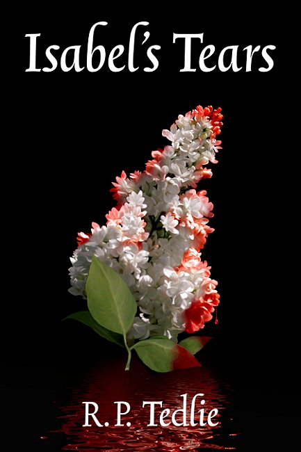
Book cover illustration for R. P. Tedlie - Isabel's Tears

Just got work from R. P. Tedlie’s that Isabel’s Tears is now available for sale online at Amazon.com.

An amazing world we live in when a book cover can be completed one week, and the book available for purchase the next. I can remember a time when getting a book prepared and placed on sale often took a year or more.
=====================
Duncan Long is a freelance book cover illustrator for HarperCollins, PS Publishing, Pocket Books, Solomon Press, Fort Ross, and many other publishers and self-publishing authors. See his cover illustrations at: http://DuncanLong.com/art.html
=====================

Tags: , , , ,

Comments Off on More About Tedlie’s Isabel’s Tears

Book Cover Painting Without a Home

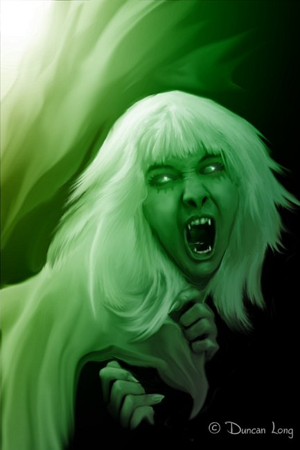
Spiritual Matters - a book cover illustration that has not yet found a publisher to use it

“Spiritual Matters” is a for-fun digital painting that hopefully will one day find a home on a book as a cover illustration.

=====================
Duncan Long is a freelance book cover illustrator for HarperCollins, PS Publishing, Pocket Books, Solomon Press, Fort Ross, and many other publishers and self-publishing authors. See his cover illustrations at: http://DuncanLong.com/art.html
=====================

Tags: , , , , , ,

Comments Off on Book Cover Painting Without a Home

Book Cover: Lawrence P. White’s Spirit of Empire

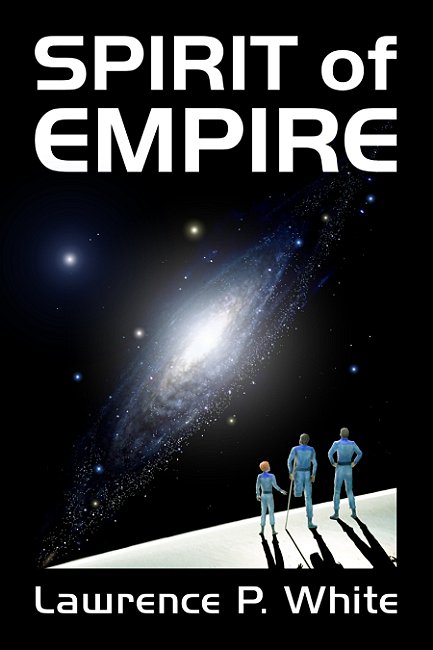
Lawrence P. White - science fiction novel cover illustration

Cover for science fiction novel Spirit of Empire.

The author Lawrence P. White came to this project with an excellent cover concept, and it was a lot of fun bringing it to life for him. Here’s the final version.

=====================
Duncan Long is a freelance book cover illustrator for HarperCollins, PS Publishing, Pocket Books, Solomon Press, Fort Ross, and many other publishers and self-publishing authors. See his cover illustrations at: http://DuncanLong.com/art.html
=====================

Tags: , , , , , ,

Comments Off on Book Cover: Lawrence P. White’s Spirit of Empire

Book Cover Illustration: R. P. Tedlie’s Isabel’s Tears

Book cover illustration and graphic art layout by graphic designer Duncan Long

I completed the book cover illustration and lettering/layout for R. P. Tedlie’s Isabel’s Tears a few days ago. While the initial publication will be in the Kindle format (which is grayscale), we went ahead and created a hi-resolution color version so the author would be ready for traditional printing should he decide to go that route (and/or for a color version of the cover should Kindle market a reader with color capability).

Tedlie had envisioned a beautiful cover concept when he contacted me, so creating the picture was straight forward. However painting all the individual flowers in the lilac twig took a little time than I had expected, but the result was well worth the effort, becoming a cover illustration more beautiful than I thought possible.

=====================
Duncan Long is a freelance book cover illustrator and graphic layout artist for HarperCollins, PS Publishing, Pocket Books, Solomon Press, Fort Ross, and many other publishers and self-publishing authors. See his cover illustrations at: Duncan’s Book Cover Illustrations and Layout
=====================

Tags: , , , , , , , ,

Comments (1)

Sometimes You Can’t Choose Wrong

Book cover illustration for Michael Leo Samuel's The Spiritual Journey of Psalm 23

The picture above was created for the cover of Rabbi Michael Leo Samuel’s book, The Spiritual Journey of Psalm 23. This is the second cover I’ve done for Samuel. Recently he found one of my illustrations at my web site that he liked, and we built on that concept using his choice of colors and slightly different layout. The result was pretty much as shown above – except for the bright star, which in the original illustration was a tad drab and small.

After we decided the star needed to be larger and more colorful, I created a series of star variations and then let Samuel see if one of these might work for his book cover.

Variations on book cover illustration for Samuel's The Spiritual Journey of Psalm 23

Perhaps one of the curses of our digital age is an embarrassment of choices. Almost anything in a picture can be altered, shifted, removed. There are an infinite number of mind-boggling possibilities.

And often when a client is presented with a number of choices, there’s concern about not choosing the very best, and while Samuel made a prompt choice, he did ask if I thought he’d picked the right one.

My answer: There was no wrong choice. By that point in the project, all the choices (I felt) were good and it simply came down to hair-splitting and taste. A guy couldn’t go wrong even if he blindfolded himself and tossed a dart to pick the right variation.

I often ponder why the creative process often ends in this confusion as to which choices should be made for a final version of a picture. I think it comes about because early on the creative process demands a critical eye, and there can be seriously wrong choices to make. This continues for some time with constant choices, with those involved hopefully making the correct choices each step of the way.

And often one wrong choice will derail the project, causing wasted time and perhaps even starting over.

But toward the end of the process, the choices become more and more subjective, and if one isn’t careful, a certain mental gridlock can set in with each choice becoming more and more stressful.

(I’m told that some shoppers suffer intense stress when presented with a wealth of similar products when shopping. Often a consumer may even avoid buying something they need for fear of picking one brand or model that is not quite as good as another.)

When one reaches the point that choices are becoming ever harder make, chances are there’s no longer any wrong choice. In the case of an illustration, the work is as good as it will get. At that point simply choosing the variation that strikes one’s fancy and calling it finished is a wise course to take.

And it saves a lot of stress in an already stressful world.

=====================
Duncan Long is a freelance book cover illustrator whose work has appeared in books offered by HarperCollins, PS Publishing, Pocket Books, Solomon Press, Ilex, Ballistic Publications, Fort Ross, and many other publishers and self-publishing authors. See his cover illustrations at: DuncanLong.com
=====================
Tags: , , , , , , , ,

Comments Off on Sometimes You Can’t Choose Wrong

Are Serifs Really Easier (than Sans) to Read?

Serif typefaces are often recommended for book text because they are “easier to read. ” And for the same reason, it follows that sans serif is only suitable for headlines and such. (And by way of explanation, the expert may then impart a strange theory about how the curves of the serifs “guide the eye” from one letter to the next, as if today’s readers are slowly deciphering words one letter at a time. One might suspect some complex insider joke or hoax, but as far as I can tell, these “explanations” are bandied about in seriousness.)

Now serifs might have been easier for readers to decipher in the early 1900s when many readers never encountered sans type on a regular basis. Or it might be true today if a reader is only recently literate.

But it seems doubtful there’s any truth in this notion today.

What about the research?

While people will often claim there is “research” that proves serifs easier to read, in reality there is none.

Nothing.

Zilch.

There’s been research. But — after throwing out the bogus research often sited by the pro-serif experts – it’s a draw between the two styles of type (for more on this, check out the nice wrap up of research by Alex Poole.

Don’t get me wrong. Serifs are certainly beautiful and therefore look attractive in books and other print materials.

That said, there are modern publications where a nice sans type might actually project more of an image the text deserves. Sans would seem ideal for science fiction, for example, or text that deals with current trends or subjects. It gives a clean, modern feel that’s a perfect fit with many print projects.

So my advice: Choose your typeface to suit your text and subject. Don’t make the mistake of choosing a serif for text just because some “expert” claims it’s “easier on the eyes.”

=====================
Duncan Long is an occasional book designer and more often a freelance book cover illustrator for HarperCollins, PS Publishing, Pocket Books, Solomon Press, Fort Ross, and many other publishers and self-publishing authors. See his cover illustrations at: http://DuncanLong.com/art.html
=====================

Tags: , , , , , , ,

Comments Off on Are Serifs Really Easier (than Sans) to Read?

The Yearn to Kern

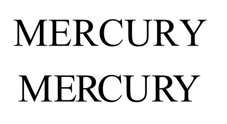
Kerning is becoming a lost art for many segments of the publishing industry. Kerning refers to the adjustment of space between letters so they look balanced and spaced. It’s more art than science, and good kerning often goes unnoticed.

Generally kerning is reserved for titles, mastheads, or other display type. Quality electronic typefaces (fonts) have tables included with them to kern problem letter combinations automatically. These usually work well – though not always. (For example, many versions of Microsoft’s popular Arial font seems to have a tad too little space after the lower-case “r.”) Consequently many presses will actually adjust various letters in a font table ever so slightly so the kerning looks better throughout the text of the publication.

The rule of thumb for kerning is to make each letter appear to have an equal amount of space on either side of it. Of course this is very subjective and I suspect that any two skilled kerners would have slightly different takes on the kerning needed for any given word and typeface.

[Above] The top “Mercury” lacks kerning while the lower “Mercury” has been hand kerned.

The main point is that even moderately good kerning is better than no kerning. And skilled kerning can make letters flow and typefaces seem even more beautiful than they already is. (And most of the classic typefaces are quite beautiful when studied with a fresh, open mind.)

Back in the old days, lead type often had to be tortured into properly kerned spacing. It was a job that took a good eye and a little brute strength with lots of patience thrown in. Thus it seems more than a little ironic that when kerning was horribly hard to execute it was common, and now that digital typesetting allows easy kerning, it’s becoming a lost art.

This latter point was recently brought home when I noticed the masthead of a local newspaper (that will remain nameless). At least two of the letters were in dire need of adjustment, and several more could have been nudged this way or that to great advantage. How much more professional the paper would have appeared. And just a little work one time would pay off day after day since the masthead is most likely reused on a regular basis (or could be once it was properly kerned).

I suppose too many publishers figure that since not everyone knows what kerning is, or even notices when letters are a tad out of whack, lack of kerning makes little difference.

I suspect that’s wrong. I would bet that on a subconscious level it makes a difference. Kerned lettering makes titles and mastheads “look better” even to an untrained eye, even if the reader can’t quite place their finger on the reason why things look better.

And conversely, lack of kerning leaves the reader with the impression that they’re viewing a sloppy, amateurish publication.

My advice for those laying out a publication: Spend a little extra time kerning larger type. This will help make your publication look like it was produced by a pro, rather than handled by the lowest bidder in the cheapest labor market the publisher could find.

=====================
A lover of kerning, Duncan Long works as a book cover designer and illustrator. He’s done work for HarperCollins, PS Publishing, Pocket Books, Solomon Press, Fort Ross, Ilex, and many other publishers and self-publishing authors. See his book cover designs – and kerning – at: http://duncanlong.com/illustration/book_illustration.html
=====================

Comments Off on The Yearn to Kern

2010 DIY Book Festival Call for Entries

From the press release:

The 2010 DIY Book Festival has issued a call for entries for its ninth annual program celebrating the success of independent authors and publishers.

The DIY Book Festival will consider self-published or independent publisher non-fiction, fiction, biography/autobiography, children’s books, teenage, how-to, cookbooks, science fiction, audio/spoken word, photography, art, comics, ’zines, fan fiction, poetry and e-books published on or after Jan. 1, 2007.

All entries must be in English and have been self-published or issued by an independent publishing house.

Please note that print-on-demand (POD) authors are eligible for the competition.

Our grand prize for the 2010 DIYBF Book of the Year is $1500 cash and a flight to the awards ceremony, held in February, 2011 as part of the annual DIY Convention in Los Angeles.

Deadline submissions in each category must be postmarked by the close of business on November 25, 2010.

For entry forms and other information: http://www.diyconvention.com/

=====================
Duncan Long is a freelance book cover illustrator for DIY book publishers and self-publishing authors as well as larger presses including HarperCollins, PS Publishing, Pocket Books, Solomon Press, Fort Ross, and many other established publishers. See Long’s cover illustrations at: http://DuncanLong.com/art.html
=====================

Tags: , , , , , ,

Comments Off on 2010 DIY Book Festival Call for Entries

About Those Authors Who Self-Publish

During my career I’ve worked with and for all sorts of publishers, from the giants like HarperCollins to mid-sized operations like Paladin Press to small presses and self publishers. I even have my own “press” that puts out a title now and then.

I’ve enjoyed all the work and worked with a lot of enjoyable people.

One thing I’ve noticed recently is the explosion of self-publishing that’s going on, in part due to the advent of both the ebook as well as POD (print on demand) services like Lulu, CreateSpace, and Lightning Press.

Self-published authors sometimes suffer put-downs from those who think all self-published books are inferior to those produced by publishing houses. Of course some titles are poorly done, and those give other self-publishers a bad reputation.

But many self-published books are every bit as good (or better) than many of the books being produced by publishing houses. This occurs when the author has talent and also spends some extra time and money to hire an editor to help with his writing, a proof reader to catch errors, and a professional graphics artist to lay things out. Self-publishers may even hire someone like me to create a professional cover illustration for them.

When these extra steps are taken, high quality books are the result.

At that point the author can join the ranks of some other famous writers. Because self-publishing is nothing new and not that long ago, almost everything was self-published (Benjamin Franklin comes to mind as an example of someone who bought a printing press mainly so he could publish and make a name for himself).

Among the ranks of those who first became known to the public through self-publishing are Henry David Thoreau (Walden); Walt Whitman (Leaves of Grass); Mark Twain (Huckleberry Finn); and more recently a whole slew of authors including Richard Bolles (What Color Is Your Parachute?) and James Redfield (The Celestine Prophecy).

Now don’t get me wrong. A book produced by an established press will be consistently well done while self-published books tend to be all over the map, from shoddy to outstanding. But in the end, it’s always wrong to dismiss an author simply because they self publish.

So perhaps we need a new cliche: “Never judge a book by its publisher.”

=====================
Duncan Long is a freelance book cover illustrator for self-publishing authors as well as established presses including HarperCollins, PS Publishing, Pocket Books, Solomon Press, Fort Ross, and many others. See his cover illustrations at: http://DuncanLong.com/art.html
=====================

Tags: , , , , , , , ,

Comments Off on About Those Authors Who Self-Publish

Juli Hustles’ CD Album Cover Artwork

Juli Hustles' CD Album Cover by graphic artist Duncan Long

Here’s a sneak preview of the new Juli Hustles‘ new album cover that I created for the musical artist.

Our goal was a retro-science fiction look with a typeface to bring out that feel.

=====================
Duncan Long is a freelance book and CD cover illustrator for many musical artists and labels. See more of his CD album cover illustrations at: DuncanLong.com
=====================
Comments Off on Juli Hustles’ CD Album Cover Artwork