Sneak Peek: Magazine Cover Illustration

Union-DuncanLong-Asimov'sInsert a-033

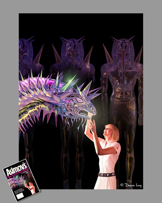
Over the last couple of weeks, I’ve had the pleasure of creating a new illustration for the May 2010 issue of Asimov’s Science Fiction Magazine. I don’t want to spoil the story plot, so suffice to say the illustration is for one of the stories in that issue, and is a pivotal point in the storyline.

Part of the fun in doing this particular cover illustration was creating the various reflections and light within the crystal creature as well as within the dark glass statues behind the two characters in the foreground. Working with “lights” this way can be tricky since sunlight and many environments that we find ourselves in within the real world have a much wider scale of brightness than is possible on a video display — and there’s even less light contrast available when things go to print since ink/paper only reflect available light – and only after subtracting some of that light in the process.

So if an artist isn’t careful, his imagination and colors can bang against the reality of physics with disastrous results. Hopefully I didn’t bump my head on this one.

=====================
In addition to creating magazine cover illustrations for Asimov’s Science Fiction , Duncan Long has a wide range of clients that include HarperCollins, PS Publishing, Pocket Books, American Media, Fort Ross, and other publishers. See more of his book illustrations at DuncanLong.com.

Comments Off on Sneak Peek: Magazine Cover Illustration

One Horrifying Book Cover

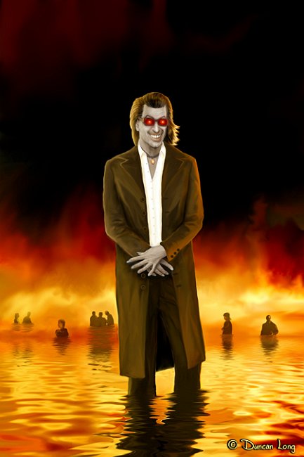
DonMacPhail-Final3m-008

Last week I completed what has been declared by in-house critics as the most horrifying book cover they’d ever seen. Well, perhaps.

And the best part was that we set out to make a horrifying cover (how sad if we had not -ha). So we must have succeeded at some level.

The cover is for Donald MacPhail’s new novel, X-Factor. Coming soon to a bookstore near you.

=====================
Duncan Long is a freelance book illustrator whose clients include HarperCollins, PS Publishing, Solomon Press, Pocket Books, American Media, Fort Ross, Asimov’s Science Fiction Magazine, and other publishers. See more of his book illustrations at DuncanLong.com.

Comments Off on One Horrifying Book Cover

Free Ebook: A Halloween Present

In keeping with the holiday season, I’m offering a free download of the newly illustrated Edgar Allan Poe classic, “The Raven” (which illustrated and laid out this last week).

Careful, the virtual ink’s still wet.

Cover 72dpi

Please note that in addition to the new illustrations, I also created a new typeface for this publication as well as a slight twist on the ending of the poem (hopefully Poe isn’t spinning in his grave).

Also note that I’ll be removing the ebook (PDF format) down before too long. So if you want a copy, snarf it down now while you can. Before long it will be, as the poem says, “Nevermore” available.

So…

Please download it now if you want it.

And, yes, there are hidden messages in the pages (can you can figure out where they are and how to access them?). But, alas, no secret treasure maps to the Lost Ark, however.

For those who like to read online, there’s also a flash version of the book at

Scribd

Here’s hoping you enjoy reading the book as much as I did creating the layout, typeface, and illustrations for it.

=====================
Duncan Long is a freelance illustrator for HarperCollins, PS Publishing, Pocket Books, Ballistic Media, American Media, Fort Ross, Asimov’s Science Fiction, and other publishers. See more of his book illustrations at DuncanLong.com.

Tags: , , , , , , ,

Comments (2)

The Ideal Ebook Reading Device

Even though this is a blog about book cover illustration, the ebook seems to be taking the publishing world by storm (at least in talk if not in sales) and thus it seems appropriate to express my own personal experience with these devices.

Recently the ebook reader market has heated up, with at least three major corporations (Amazon.com, Sony, and Barnes and Noble) having their own readers with more companies waiting to enter stage right.

I’m not happy with many of the features I’m seeing. I don’t really need an ebook reader with a colored screen, and I sure don’t need one that is big and heavy, or that needs to be accessing the Internet day and night (there are computers, mobile phones, etc., etc., for these purposes).

In short, I don’t want a $250-plus gadget with lots of bells and whistles. I don’t want it contacting who knows where over the airwaves, and I don’t want to be carrying a device that a thief might be tempted to snatch from my hand while I’m reading in public. I don’t want to pay a monthly service fee once I buy the gadget.

All I need is a $100 (or less) unit that has a black and white screen – for reading black and white text, and a machine that I can load ebooks into from my home computer.

I have found one such machine that does all this perfectly: The eBookwise reader. I’ve had one for several years and it just the ticket. It has a liquid crystal screen (a battery charge lasts through several books), has a memory card that holds a hundred or so books (why I need to carry more than a couple of books on a reader is a mystery – but it is nice to have the capability).

The eBookwise reader can load retail books off the net via phone line or a computer hooked to the Internet (for the price of each title, of course).

But I’ve found you don’t really have to buy any books to get lots of reading material. In fact, nearly all my ebook reading is from the free samples, royalty free, and public domain material I get for free on the Internet. Coupled with the competitive price of the reader, this makes for a lot of very inexpensive reading (I figure I’ve probably saved several thousand dollars with this reader – when comparing it to what it would cost to buy the print versions of what I’m reading).

About the only downside is that the reader can’t read PDF format; I’ve had to hunt up a program to convert PDFs to the Word, txt, or rtf files that it can read.

I prefer reading books with the eBookwise reader to reading actual print books. Print books are hard to hold, demand good lighting (the eBookwise reader is back-lit for low light reading), and turning pages – and not losing your place – can be a chore in some environments. With the eBookwise reader, I can read in a totally dark room, lying in bed on my back, standing in the bright sunlight (where the liquid crystal screen can be seen just fine), sitting in a car, or just about anywhere, anytime.

Well, anywhere except the bath where a dip in the brine might create problems for the electronics (I have toyed with putting the reader into a Ziploc bag to waterproof it – but have thus far been able to resist the impulse).

Those designing ebook readers could learn a few things from the eBookwise reader. And it’s going to take something pretty compelling before I give my eBookwise reader up for a machine with lots of bells and whistles and a high price tag to match.

Before closing, I should note that I’ve been reading ebooks for about eight years now. First on a PDA (with a color screen and tiny print – fortunately I am near-sighted so removing my glasses yielded a great and very compact way to read ebooks).

Of late I’ve sometimes pressed a tablet computer into service for reading PDF books (especially art books where seeing the pictures in color is an obvious plus). Two discoveries: First, color is nice. But for novels and so forth, it’s a luxury that just isn’t needed. And color (at least in the present) means either greater expense and/or greater battery drain. Until technology outpaces these twin bugaboos, I’ll take my pages in black and white the way Guttenberg intended.

Second, the act of turning pages can become second nature (as with the eBookwise unit) or it can become a continual toothache-like aggravation (as with my tablet). If the mechanism for turning pages is poor, the reading experience becomes dismal. When a buyer gets ready to purchase an ebook reader, the method of turning pages is every bit as important as the screen, expense, and weight of the reader.

Well, there you have it. Everything I know. Now if you’ll excuse me, I’m going to read some electrons from a new novel.

===========
I’m normally a freelance book cover artist rather than electronic gadget critic. You can see my artwork online at DuncanLong.com.
Tags: , , , , , ,

Comments Off on The Ideal Ebook Reading Device

A Tragic Case of Life Imitating Art

I was rather startled to see the news about the possibly tragic story about a small boy in Colorado thought to be in a balloon. Hopefully he will be found alive, but it looks like he might have fallen to earth from some height.

It is so easy to be detached these days. Yet this family faces a staggering experience that likely will never end for them.

Artists look ahead and at the impossible that might become possible. Today a little boy may have flown like Icarus, on wings his father fashioned, and gone a little too close to the sun before falling to the earth.

After turning off the TV I returned to my computer to update a gallery, and was startled when I checked one of my pictures that I finished several weeks ago (and uploaded as a part of the… video at: YouTube).

ColoradoSaucer

One of the scenes in my video (reproduced here) is of silver saucer-like balloons floating over a city. And if you look, there’s a very small figure with a shovel standing on the ground below, somewhat resembling the rescue workers who gathered around the craft when it landed.

It was a shock to see these two iconic figures first on the TV and then remember having crafted similar figures in one of my illustrations.

I know the similarity is all just coincidence, but it was a shock, nevertheless, and for me makes the whole terrifying ordeal the family must be going through a bit more real. My heart and prayers go out to them.

============
See more of my illustrations at DuncanLong.com

UPDATE: Late today the young boy was discovered hiding in his attic. Whether this was a hoax, young boy mischief, or the fear of punishment after accidentally releasing the giant balloon, it is good to know the kid is alive and well. The story could have had a very tragic ending and what a relief that it did not. The world can use a happy ending to a story every day of the week.

Comments (1)

Cover Artwork for Asimov’s December 2009

Mary's Hope-002

I can remember as a kid pouring for what seemed hours (and possibly was for hours) over the cover illustration from a science fiction pulp magazine. I am uncertain now what magazine it was – it had a monstrous cat-like creature, and 1950s-style spaceship, and men in tight silver suits with a moonscape. And for a grade school kid, there was a whole world of adventure captured in that one cover illustration.

Not surprisingly then, one of my long-held dreams has been to see my own artwork on a science fiction magazine like that one I’d seen so long ago. And with the December 2009 issue of Asimov’s Science Fiction Magazine, that dream has finally been realized. (And a big “thank you” to Vicki Green, Asimov’s at director, for making my dream finally come true.)

I’ve posted both the original artwork along with a smaller version of the cover to show how the final illustration and lettering turned out. AsimovDec09

Science fiction cover illustrations are strange things to market. Science fiction stories can take place at any time and anywhere. So what may seem an unlikely subject as science fiction can prove appropriate for a specific story. One illustration might be in deep space, the next might feature a Western scene. Just depends on where and when the author has set the story.

That said, this cover artwork was not created with an eye toward it becoming a science fiction cover. Yet it fit one of the upcoming stories, and thus was chosen for the cover illustration on the December 2009 issue.

And a dream came true for me.

You can see more of my book and magazine cover illustrations at DuncanLong.com

POSTSCRIPT:  It was recently brought to my attention that Nick Wolven, the author of the story I illustrated for Asimov’s, also had a childhood dream: To have one of his stories illustrated by a professional artist. Now I don’t know what the chances are of one illustration bringing about two people’s childhood dreams might be (perhaps not as high as one might think), but this is one such case.

You can read more about Nick Wolven at his site: NickWolven.com.

Comments Off on Cover Artwork for Asimov’s December 2009

Book Cover Costs

Many an old joke is based on the notion that the difference between a professional and an amateur is that the pro says, “First, let’s settle on a price.”

To some extent that’s true. There are any number of scam artists about these days who try to get artwork for free. After an illustrator has been burnt a few times, he knows to first settle on price.

That said, settling on a price can also help out the buyer. Nothing is as frustrating as thinking you have an artist to create the book cover you’ve dreamed of having, only to discover that the asking price is out of the ballpark in terms of your budget.

Sometimes charges will be broken into two parts. The first part will be a fixed price for some sketches to get the basic design in place, plus a final illustration for the book cover. The second tier of charges will be an hourly rate for additional changes in the original, finished illustration, or for additional illustrations should the publisher decide the original concept doesn’t work.

This two tier system protects buyers who have a good notion of what they want going into a project (which gives them the lower fixed price), while allowing for those souls who aren’t so sure to eventually get what they want, albeit at a slightly higher price. (Obviously if a publisher has a good cover concept going into the project, they’re going to save money.)

http://duncanlong.com/portfolio/index.html

The Magical Contact by Duncan Long

The other mark of a pro illustrator is that he’ll use a contract. Contracts protect all parties involved. And remember that contracts are never written in stone; if there’s something you don’t like in a contract, you can always negotiate to have it changed.

The big plus with a contract is that it spells out who gets what and for how much. The publisher knows just what rights he’s getting and for how much.

In the US at least, the creator of art (or other copyrightable work) is in the catbird seat when no contract has been written. In the courtroom, all rights are assumed to belong to the artist. If you’re publishing and the artist you’re hiring doesn’t offer you a contract, ask for it. Otherwise you may find that the rights you thought you purchased are in doubt. That can get expensive in today’s lawsuit-enabling society.

What prices are reasonable?

Well, generally you get what you pay for. And sadly many self-publishers try to cut corners with a cheap cover – and never sell many books because of the cheap appearance of the cover.

If someone is offering cover artwork for very little, chances are it will be stock art or something that will look less than professional on your book cover. And it will hurt your sales.

That said, here are some good ballpark costs when looking for quality illustrators (these numbers are based on the average going rates paid by major publishers in the USA, as of 2009):

Full-color cover illustration: $1,000-$3,000 US
Black and White cover or interior illustration: $1,500-$4,000 US
Illustrations for a children’s book: $3,000-$12,000 US

These prices will generally be flat fees – but with books by established authors, they may sometimes may be paid as an advance on royalties, (that is, the artist will get the fee but may be due additional money should the book become a run-away best seller, the additional money being a percentage of the amount made on the sale of each copy of the title). If the book fails to make enough sales to counter-balance the advance paid to the artist, the illustrator gets to keep the entire advance without returning any money to the publisher.

In my experience, not many book cover projects sink in the harbor. But on occasion a cover just doesn’t work out, the publisher runs out of cash, or other misfortunes occur and the project crumbles apart halfway through. In such a case, the artist will generally keep half the amount he was to be paid as his “kill fee” for the project, and all the rights to the artwork produced will revert back to the artist. Traditionally the kill fee is half the total payment that was to be made to the artist. However it is better to outline the amount in the contract to prevent any misunderstandings.

A professional book cover artist can give a publisher a big edge on the competition. People do judge a book by its cover, and a professional-looking cover can be very important, especially for self publishing authors, or small presses competing against large, established publishing houses.

OK… Now I’m hoping you’ll take a look at my my book cover illustrations portfolio. Then we can talk prices.

Comments (2)

How Do You Create Your Book Cover Art?

People regularly ask what software and hardware I use for creating book cover illustrations and other artwork for magazines, CD covers, and interior illustrations in books. So I will digress in this installment of my blog to answer those questions.

I come from a background of working with pen and ink as a technical writer/illustrator. I started using the computer for digital illustrations some time back, got a Wacom tablet, and have never looked back since, my pens, drafting table, and t-square all collecting dust and going unused since (it seems a little sad to think of those beautiful drawing instruments sitting in a box – but not so tragic when I recall ink smears and the hours of back-breaking labor).

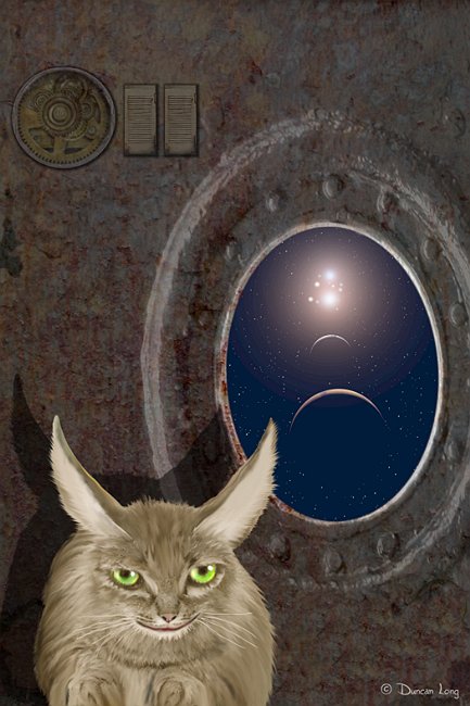
Space Cat by Duncan Long

Space Cat by Duncan Long

For some years I’ve been doing my work with Corel Photo-Paint (version 8, designed for Windows 95 but still working on XP Pro). The plus of sticking with this version of a program for nearly a decade is that I’ve created my own shortcuts and such and am really familiar with the program, its quirks, and what will cause it to glitch.

This means I can concentrate on making art, not worrying about getting the software to do what I want. And it will be a sad day when I have to retire the software and move to a new program or version. (Thus far, nothing has tempted me too much.)

Although PhotoPaint was created with an eye toward photo retouching and such, it is marvelously “deep” and quite capable of producing original artwork, with oil/ink/pencil/water color brushes, swirl brushes (great for clouds and blending), smear brushes (great for pushing pixels around), etc. It can also accommodate most Photoshop plugins. It can export/import JPG, TIF, PNG, and Photoshop formats.

Using PhotoPaint, I don’t run into many problems working with clients. When I need to do graphic design/layout work or produce a PDF for a press, then I trot out PagePlus which is about a tenth the cost of Adobe’s counterpart; PagePlus lacks some bells and whistles, but still is quite capable and can format to a variety of PDF compatibility modes including the more-or-less standard X-1 and X-1a formats.

To create a PDF around a book cover illustration, I simply drag and drop the JPG (or TIF or whatever) produced in PhotoPaint into PagePlus, resize it, and am good to go with the layout work over that.

I seldom work with vector artwork; when I do I either employ DrawPlus or (I know this is strange) FontCreator, the latter accommodating copy and paste of a bitmap picture produced in PhotoPaint into its character creator section; this creates an instant vector in FontCreator that can then be “typed” as a letter once that font is installed.

(And this TTF file also can be given to a client, so a logo or other vector artwork can be installed on the client’s computer as a TrueType Font file.)

Once in a while I’ll render a scene in 3D with Vue. But I am doing that less and less, finding it quicker to just paint what I want to see (the exception are scenes with columns, ships, or other vehicles that have complex shapes and shadows).

I generally mask the rendered picture and paint in new clouds, grass, texturing, and so forth. In the end there’s little of the original render to be seen. I have Poser but use it only rarely these days.

Of course all my software and hardware choices get no respect from my Apple/Adobe-equipped peers (and rightfully so, perhaps). I have even had one art director tell me it was impossible to do what I was doing with what I am using (go figure).

But it seems suitable to me because I can work very quickly with it, and would probably not switch to a more conventional arrangement unless perhaps some kind soul in the Mac and Adobe Universes took pity and offered me the replacements for free.

And even then I might pass.

I hate scanners, so my work is digital from the first sketches to the completion of the project. I am on my second WACOM tablet that is about indispensable for my work.

There. I have revealed all my secrets and given everyone more than they could ever possibly want to know about my work.

And yet you read it all, didn’t you.

You can see more of my book cover illustrations, CD album cover art, and magazine illustrations at my illustration gallery.

Tags: , , , ,

Comments Off on How Do You Create Your Book Cover Art?

A Sneak Peek at New Book Cover Art

Storm Horse z-detail-002

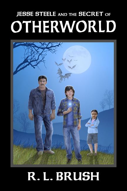
I’ve put the new illustrations I’ve created over the last month (plus some reworked older pieces) online for inspection. A few pictures have cover rights sold (including the new cover for R. L. Brush’s Jesse Steele and the Secret of Otherworld), but most of the other illustrations have all rights still available.

The URL: http://duncanlong.com/preview/

Please don’t link to this URL as it is only temporary… I appreciate do appreciate input on pictures so let me know what you think, which illustrations work and which do not.

Tags: , , , , , ,

Comments Off on A Sneak Peek at New Book Cover Art

The Perfect Book Cover Art

I recently came across an article that claimed a good book cover design could increase sales by a factor of ten. That’s a rather amazing increase (imagine a book selling one hundred thousand copies instead of ten thousand and you’re talking about some real money for a book publisher as well as the author).

Creating a book cover can be easy or hard, and there’s no predicting how it will go entering into a project. Recently I worked on a cover for author Robin Brush, and the project just seemed to click right along. The author knew what he wanted, and he was willing to let me guide the project for the best artistic look I could achieve. The result is a cover that’s beautiful, gives the buyer a good idea of what the book is going to be about, and (I suspect) is likely to sell a lot of books for Robin. Be on the lookout for Jesse Steele and the Secret of Otherworld.

RobinBrush-HardBack-1z-NoBleed72dpi

After trying several different typefaces, we finally settled on a conservative “Celtic” style that didn’t call too much attention to itself, but still gave a magical flavor to the cover. I think it works well and ties into magical aspects of the story.

We actually created two versions of the cover. The one shown here is for the hardback version. For the paperback version, the picture filled the entire front, bleeding off the edge of the page (rather than being framed as I did with the hardback version). The big plus of doing two covers at once is that the author can save some money on the second cover since the artist/cover designer is set up to do both so there’s no time wasted in getting back to speed (as can be the case when one re-starts work on artwork a year or so after it was first created). By using the same artwork and typeface, it was just a matter of framing and resizing things to create the hardback version.

It is always a joy to work on a project like this. Now I’ll cross my fingers and hope future book cover design projects go as well as this one did.

Comments Off on The Perfect Book Cover Art