Thoughtful Review on Amazon.com

Mind Games - book artist's self portrait

Richard Thieme’s Mind Games continues to garner good reviews. I found one posted at Amazon.com by J. M. Arrigo (who is, I am told, a professor familiar with intelligence operations). Here are some excepts:

This extraordinary book of short stories draws the reader into multiple levels of reality and multiple dimensions. The settings are mostly futuristic, as in engineered societies. But the principles of social engineering are laid bare, inducing the reader to reflect on current values, desires, and markers of progress…. The form of the book, consonant with the theme, veers into another dimension of literature….

Artist Duncan Long has also provided a sort of portrait introduction to each story, in which the boundary between line drawing and photograph cannot be discerned — another play on the junctures of different realities. Long concludes the portrait series with mixed-media images of the author, Thieme, and the illustrator, Long himself, as if to render them third-person characters in the book as well as first-person creators of the book.

And, no, neither the author nor I paid the good professor to write his review. I should also note that while the pictures in Mind Games may appear to be pencil and/or ink sketches, they are in fact digital start to finish.

=====================
Duncan Long is a freelance magazine and book artist for HarperCollins, PS Publishing, Pocket Books, Solomon Press, Fort Ross,the Sun, Asimov’s Science Fiction Magazine and many other publishers and self-publishing authors. See his cover illustrations at: http://DuncanLong.com/art.html
=====================

Tags: , , , , , , , ,

Comments Off on Thoughtful Review on Amazon.com

C.A. Dawson: Frozen in Time

Here’s the new book cover illustration I just completed for C.A. Dawson’s Frozen in Time. The final version also has a distant spaceship (missing from this version) and a few other modifications here and there.
=====================
Duncan Long is a freelance book cover illustrator for HarperCollins, PS Publishing, Pocket Books, Solomon Press, Fort Ross, and many other publishers and self-publishing authors. See his cover illustrations at: http://DuncanLong.com/art.html
=====================

Tags: , , , , ,

Comments Off on C.A. Dawson: Frozen in Time

Please, Corel, No More Beta Testing On Customers

I thought perhaps I’d been a little hard on Corel in a previous post. So, having heard nice things about Draw X5 (I’m currently using version 8), I decided to take the newer version for a spin.

OK…

You can probably guess where this story is headed. But just in case…

I plunked down my upgrade money, installed the program, and spent a day getting all the shortcuts and commands lined up so I could operate it quickly (this ability to customize the program is one of the big selling points of Corel products, to my mind). I was pleased to see that the upgrade had lots of new features, some of which worked much faster than with my older version of the program, thanks to tailoring the software to multi-core processors.

By the end of the day, I was set to work fast and smart.

Or so I thought.

The first picture I pulled into Photo Paint went well — until I tried out the smear brush on a layer. Instead of smearing both outward from the edge of the object and inward, the smear brush only worked outward, leaving an ever growing blob wherever I tried to gently coax pixels into place.

I’ll leave out the several minutes of angry cursing. (This may explain why the ears of everyone working for Corel burned during that evening.)

Since about half of my artwork chores are done with a smear brush, this glitch in one of the major tools in PhotoPaint basically made my new investment worthless.

Talk about disappointment and anger.

I did some checking. The program was released early in 2010. I purchased it mid-July 2010. And still this major part of the X5 Suite doesn’t work.

According to a reliable source I contacted, apparently Corel has been aware of the problem for some time (even though a search of the company’s “knowledge base” turned up not even a tiny mention of the fact).

No one knows whether or not it will be addressed in the first Service Pack out at the end of August. Maybe. Maybe not.

So, once again, to those wanting to work smart and fast creating digital illustrations, I recommend Corel Photo-Paint for producing your bitmap art projects. But not the current version.

Instead, buy an older version, download and install the various Service Packs to bring it up to speed the way it should have been when first released, and ask yourself why in the world Corel keeps doing this to its loyal users and potential users. Why would anyone want to upgrade if they knew the truth?

Heck of a way to run a business, Corel.

=====================
When not acting as an unwitting beta tester for Corel, Duncan Long is a freelance book cover illustrator for HarperCollins, PS Publishing, Pocket Books, Solomon Press, Fort Ross, and many other publishers and self-publishing authors. See his cover illustrations at: http://DuncanLong.com/art.html
=====================

Tags: , , , , , ,

Comments Off on Please, Corel, No More Beta Testing On Customers

The Right Typeface for a Book

Finding just the right typeface for a book is tricky. It’s a little like adding a spice during food preparation. You want enough to give things the proper flavor, but you don’t want to add so much of the spice that it draws attention to itself.

Typefaces are like that. Beginning designers, like green cooks, tend to bombard the palette rather than gently tickling it. Rule of thumb: If the first thing a viewer notices is the font you’ve chosen, it’s too heavy handed to be suitable.

There are also legal considerations when selecting typefaces for a publication. Up front: I’m no lawyer. But as I understanding things here in the US, while in theory typefaces can’t be copyrighted, in practice (due to one or more legal decisions over the last decade) fonts are protected as software. While one might argue this is a rather shaky concept and goes against the idea of typefaces being free of copyright, it never-the-less is the rule everyone is operating under at the present time. Unless you want to be the test case to see if the law is valid or not, it’s wise to have all the legal rights secure before using this or that font in a new book design or other publication. (The is doubly true outside the US where typefaces can be protected by copyright.)

That said, downloading fonts from dubious sources can be a dangerous practice. Inadvertently using a font that appears to be free but, in fact, has limited rights, might cause legal snags should the owner of the font challenge your use.

There are sites on the Internet that offer fonts that are free to use as you wish without legal restrictions. Two good sites for discovering such fonts are Abstract Fonts and DaFont. If you search around and pay attention, you can find fonts with the rights spelled out. If the rights are limited or unknown, play it safe and don’t use them in print projects.

Another route to quickly build a font collection that can be used for publications is to buy older versions of programs that have fonts bundled in with them. Corel Draw, Word, and other programs have extensive font collections and you can pick up an old version of these programs for a song (just be sure you buy them new and register them so that the rights are associated with you). Once you own most of these programs, you also own the right to the fonts that come with them.

A typeface can become not only an artistic quagmire but also a legal trap. Be careful which fonts you use and you can save yourself a lot of headaches.

=====================
Duncan Long is a freelance book designer and cover illustrator for HarperCollins, PS Publishing, Pocket Books, Solomon Press, Fort Ross, and many other publishers and self-publishing authors. See his cover illustrations at: http://DuncanLong.com/art.html
=====================

Tags: , , , , ,

Comments Off on The Right Typeface for a Book

Dora Machado’s Stoneweiser III Book Cover Illustration

Book cover illustration for Dora Machado's Stonewiser III - book cover artist Duncan Long

I just completed the book cover illustration for Dora Machado’s Stonewiser III, available from Mermaid Press later this year (or possibly early 2011). Machado’s first two book (which I also had the pleasure of creating book cover illustrations for) have garnered a number of awards, and everyone’s hopeful for this third book in the trilogy.

And the success of the first two books was all the more reason to be happy when the publisher asked me to do this third book cover illustration.

But…

The illustration proved a bear to get right and I nearly threw in the towel a couple of time. It was only thanks to the persistence (and patience) of Mermaid Press head honcho Bryan T. Marshall that the project got completed. Every time things hit a snag, Marshall shepherded the picture along making suggestions and suggesting different routes, feeding me pictures and suggestions along the way. He did just about everything but hold the temperamental artist’s hand.

Thanks to his efforts we eventually got to the finish line with a beautiful book cover illustration that I’m proud to have done.

Most book and magazine illustrations go quickly and smoothly. When snags occur, it’s good to be working for someone like Marshall who understands and pushes forward when a lesser person would quit.

=====================

Duncan Long is a freelance book cover illustrator for HarperCollins, PS Publishing, Pocket Books, Solomon Press, Fort Ross, and many other publishers and self-publishing authors. See his cover illustrations at: http://DuncanLong.com/art.html

=====================

Tags: , , , , , , , , , , , , ,

Comments Off on Dora Machado’s Stoneweiser III Book Cover Illustration

Can I Make Money Self-Publishing My Book?

It is one thing to self-publish. Quite another to make money at it. Many beginners assume that if they right the book about the better mouse trap, the world will beat a path to their door.

Sadly, that seldom happens.

There are three things a title needs to succeed in today’s marketplace: Promotion, promotion, promotion. If you’re not prepared to sell yourself and your book to the world, your title is has little chance of selling.

So the results for a self-published title (or a book printed by major publishers) vary from dismal to successful depending in large part by how aggressively the author promotes his book (and, of course, how well-written it is).

Some authors hope to make it big with just an ebook version of their title. Right now, that won’t work because while ebook sales are growing by the day, print is still where it’s at. So it is wise to go the extra mile and create a POD (print on demand) version as well as an ebook version of a title. POD costs very little to implement, and many services will also handle the shipping to the buyer, freeing you up to do other things than store books in your home and fulfill orders.

Ten years from now when ebooks are the medium of choice, it might make sense to have only an ebook title. Right now, an author is cutting out a big chuck of potential sales if he doesn’t have a print version for sale.

If you want to be really aggressive about promoting and selling your books, creating a web site, doing book signings (for the print versions), etc.., etc., you have a good chance of making some money. But if you want to just write a book and put it into print without going the extra mile to promote it, the results are likely to be disappointing.

I’d also suggest getting your own ISBN for a title so the print version can appear in bookstores. The Amazon/Kindle free numbers are nice, but for sales outside Amazon.com, you need an ISBN (this might change in the future – but not yet).

=====================
Duncan Long has worked in the publishing industry for several decades, and has seen over 100 of his books go into print with established presses. He currently works as a freelance book cover illustrator for HarperCollins, PS Publishing, Pocket Books, Solomon Press, Fort Ross, and many other publishers and self-publishing authors. See his cover illustrations at: http://DuncanLong.com/art.html
=====================

Tags: , , , , , , ,

Comments Off on Can I Make Money Self-Publishing My Book?

No Problem’s Too Big

Over the years I’ve found that sometimes, at least with artistic conundrums, the best solution is to run away.

Let me explain.

Sometimes in writing, illustration, or composing music, the artist manages to paint himself into a corner. The sentence that was going so well suddenly comes to a phrase that doesn’t have a good ending, the music takes a run that can’t be favorably resolved, or the book cover illustration has an element that just doesn’t look right.

And the situation remains no matter how much tinkering is done.

I used to waste untold time trying to fix such things. Now I just cut out the troublesome part and move on. Almost always the illustration (or writing or music) is viable when these tiny cancers are removed.

I’m not saying to abandon whole works – often beginning writers, illustrators, and musicians do just that. They get to the creative stumbling block and abandon their whole work. Rather, I’m suggesting some judicious surgery, cutting out only that part that isn’t working and, if necessary (it often is not) replacing it with something that will work. Doing this will often salvage a work that at first seems irredeemable.

To put it in the vernacular: No problem is too big to run away from.

Find the trouble spot and remove it. Don’t cling to those things that are creating stumbling blocks to the overall effort. Most work will be all the better with a small omission rather than a overworked repair job.

Insanity is trying to do the same thing over and over, even though it never works to the individual’s advantage.

Trying over and over to fix the unfixable problem can also drive you insane.

My advice: Run away to better things.

=====================
Duncan Long is a freelance book cover illustrator for HarperCollins, PS Publishing, Pocket Books, Solomon Press, Fort Ross, and many other publishers and self-publishing authors. See his cover illustrations at: http://DuncanLong.com/art.html
=====================

Tags: , , , , ,

Comments Off on No Problem’s Too Big

Photoshop or Painter for Illustration Work?

From time to time beginning illustrators contact me to ask whether Photoshop or Corel Painter is the better choice for digital illustration work.

I think in fact there’s no wrong choice to make. After an artist gets used to the digital “landscape” of a program and using a tablet (I recommend Wacom tablets, by the way) that the program is not as important as one might think. Basically it is learning how to use the various brushes and effects to obtain the look you want. And that can be done with any of the modern painting programs.

Painter is aimed at more painterly effects and makes the task a bit easier, perhaps. But beautiful work, and very painterly at that, is done by Photoshop artists.

For those considering programs for illustration work, I also suggest considering Corel PhotoPaint, the poor forgotten child of the corporation’s collection of paint programs. I use PhotoPaint almost exclusively for my illustration work and find it considerably faster than either Paint or Photoshop, especially when I take advantage of PhotoPaint’s capability to add keyboard shortcuts.

If you plan on working for a corporation (as opposed to freelancing) then Photoshop is sort of the industry standard and probably worth adopting from the git-go. However it does have a higher “ticket price” than the other two, so you might want to take that into consideration as well.
(One way to save money is student discounts – if you’re a student — or purchasing an older version of the program which generally has nearly all the same capabilities for a much lower price.)

If you go with Paint or PhotoPaint, bear in mind that Corel has a tendency to release programs before thoroughly debugging them. When you buy one of these, be sure to go to the Corel site and download the “updates” and bug fixes and install them before trying to use the program for any length of time. And I would recommend against adopting a just-out-of-the-chute version of any Corel program. Let someone else play the part of beta tester.

Since there are time-limited demos of all three of these programs, perhaps the best route for deciding which is best for you is to download them and try them for yourself. Creating illustrations is a very individualistic thing. Chances are you’ll feel more at home with one or the other of these programs.

Since they all are capable of delivery the same styles of work, discovering which can make the tasks you do regularly can make your work considerably faster and easier. Over time, the speed of your work can be important in making a living.

=====================
Duncan Long is a freelance book cover illustrator for HarperCollins, PS Publishing, Pocket Books, Solomon Press, Fort Ross, and many other publishers and self-publishing authors. See his cover illustrations at: http://DuncanLong.com/art.html
=====================

Tags: , , , , , , , ,

Comments Off on Photoshop or Painter for Illustration Work?

What Are DPI?

Often when working on book illustrations for self-publishing authors, there will be confusion in regard to the DPI (dots per inch) needed for a picture to look good in print.

The confusion comes because web pictures and most artwork designed for viewing on a computer screen will appear at 72 dpi (or, more rarely, at 96 dpi). It looks good on the screen — at least if you don’t zoom in on the view.

The catch comes if such a picture is used for print. That’s because the printed page needs to have 300 dpi to really look sharp. A reader holding a book may bring it up closer to his face to see the finer details in the picture; but even if he does not, the 72 dpi picture is painfully blurred when printed to a book cover or used as an illustration in a book or magazine.

This is why you can’t take a picture that was designed to be viewed on the Internet at 72 dpi and simply slap it onto a cover or into a book and expect it to look good. The result will be a blurry version of the illustration that will be a great disappointment.

What about just increasing the 72 dpi count to 300? That works — if you reduce the size of the picture accordingly. And that will usually be far too small, unless you need to print something the size of a large postage stamp.

You can resample a picture to increase the dpi from 72 to 300 and keep the image’s original size – but the result is again blurry (and, in fact, that’s basically the same process that happens when the picture is used for a print).

There is software that increases the details in a picture allowing you to boost its size/dpi count. But the details are artificial and computer generated. That means sometimes they look fairly realistic, and other times they look rather weird. And there are presently limits to how effective this process can be. So for most pictures, this doesn’t work well, either.

So what’s the solution?

The only viable solution is to start with a much larger version of the picture you need so the proper details are there in the first place. That means your book cover artist creates a large, detailed illustration for you, or (if you’re using a photograph) the photographer gets a hi-resolution snapshot. Right now this is the only way to do things.

As pictures are cropped and reworked to be used in a book, care must be taken to maintain the dpi count. Once in a while I’ll have a client rework a picture and in the process convert it from 300 dpi to 72 — and that will be disastrous when it then goes to print. When you work with material that will go to print, be careful to keep the dpi consistent. Once the dpi count is lowered, the details are lost for that version of it.

Finally, it should be noted that some low-quality printing is done at lower dpi counts (often 150); examples would be newspaper pictures. And some presses work at 350 or higher dpi. But in general, the 300 dpi is what you’ll want to shoot for with most print illustrations used in books and magazines.

=====================
Duncan Long is a freelance book cover illustrator for HarperCollins, PS Publishing, Pocket Books, Solomon Press, Fort Ross, and many other publishers and self-publishing authors. See his cover illustrations at: http://DuncanLong.com/art.html
=====================

Tags: , , , , , , , , , , ,

Comments Off on What Are DPI?

The Future of Publishing?

I’ve become a publishing “old timer.” Over the years, I have played on both sides of the publishing street, starting as a small publisher in the 1980s (using a fine-dot, dot matrix to print up copy for the books, no less) which I marketed by magazine ads. This went well and laid the ground work for my writer/illustration work. (Having zero training, I used two books checked out from the library. One on writing ads and marketing mail order products, and another on how to lay out books and magazines. By following them step-by-step, I was able to make a living from a spare bedroom with a large closet to store the books I had printed at a local offset printing operation.)

I eventually discovered I was not as keen on marketing as I was for writing and illustration work, and started a two-prong writing career, writing and illustrating technical manuals and books for smaller presses (including Paladin Press, Delta Press, Loompanics, and Lyons Press among others – around 80-some to date)) and writing novels (HarperCollins, Avon Books – 13 in all to date). Along the way I did some ghost writing for big-name TV and stage folks (who must remain nameless).

For about two years in the 1990s (I think – not sure on the timeline here) I taught writing with the LongRidge correspondence school; taught one semester of writing at a local college. Discovered there were lots of very talented writers who were having a terrible time getting into print.

Over the late 90s, I watched many writing markets dry up for beginning writers, as well as mid-list writers like myself; the growth of the Internet has been a wonderful thing, but it has been tough on the print industry. So as the new century started, I watched more and more of the writers, editors, and even small presses I had worked with go into “early retirement.”

As the writing markets dried up, I started doing more illustration work, honing my skills to tackle novel covers and magazine illustrations as well as the technical illustrations I’d been doing. Little by little I built up an illustration business and for a time my main customers were large publishers with an occasional self publisher.

But over the last five years I’ve seen that slowly change, and today the majority of my work is for self publishing authors (with a segment of my work still being for large presses as well as smaller established presses).

From time to time I have dabbled in self publishing, tried WOWIO, and other outlets, in part since I had a huge block of ISBNs left over from my early days of mail order publishing. (One of my experiments is now a free download Poe’s The Raven for which I created the layout, typeface, and illustrations (along with the secret messages hidden in it). I had aimed to produce a larger version, but ran out of time and went back to making money instead -ha.

So what I’m getting at in this meandering blog entry, is that I feel the time when small presses and self publishers can make a living — at least without a name or marketing budget and lots of self promotion — isn’t here just yet.

But I feel it is coming. If I put my head to the ground, I can hear the thundering herd off in the distance.

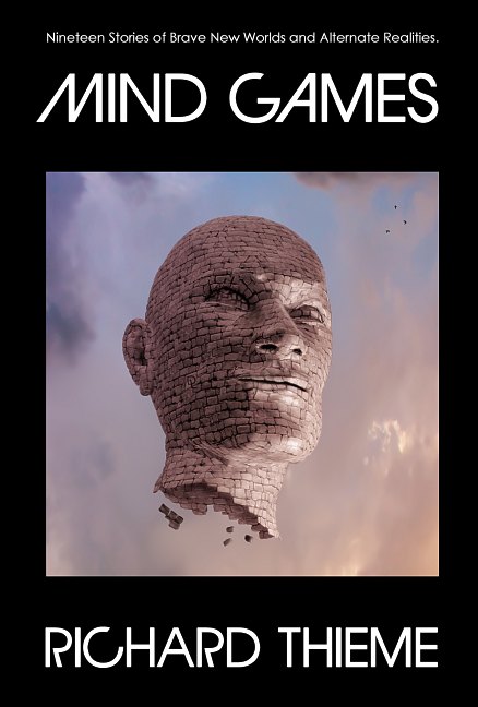
About two months ago I launched my most recent offering from my own press: Richard Thieme’s Mind Games. Thieme wrote the stories, I did the artwork (both the cover and inner B&W illustrations), the layout, and typeface design.

I believe this book is noteworthy since Thieme is a lecturer and a big self promoter. If any self-published book has a chance of making it big, this would be the one. So I’m watching this book with fingers crossed, knowing it will be a good gauge of how viable self-publishing is becoming.

Thieme has also given me some insight into what I think the future of book publishing will be for most authors who perhaps 20 years ago would have been on the mid-list with big presses.

Consider: His book is of cutting-edge science fiction short stories, beautifully written, each a gem. But today, unless you have a big name powering it, the chances of a collection of short science fiction stories being published by a large press is about as great as being hit by a meteor while watching a fireworks display.

Will self-published books and small virtual presses like mine replace the traditional “mid-list authors” that large publishers had in the past? Will marketing through Amazon.com or mail order replace the book store for most buyers sometime in the future? I don’t know, but I suspect we will see the answers to these questions in the next ten years.

So I’m watching Thieme’s efforts because I think he, and other authors like him, are blazing the trail on the path that many writers will (or already are) taking into that wilderness wherein lies the future of publishing.

=====================
When not writing books, Duncan Long is a freelance book cover illustrator for HarperCollins, PS Publishing, Pocket Books, Solomon Press, Fort Ross, and many small presses and self-publishing authors. See his cover illustrations at: http://DuncanLong.com/art.html
=====================

Tags: , , , , , , , , , , , , , , ,

Comments Off on The Future of Publishing?