The Lost Predictions of “NostraDuncan”

NostraDuncan tabloid illustration by Duncan Long

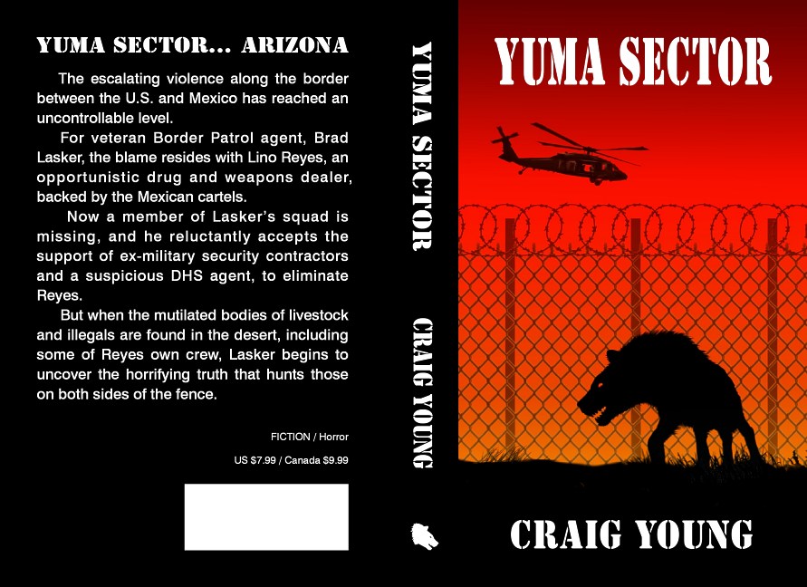
The last ten years have seen a major shift in our business from creating illustrations for larger publishers toward clients who are self-publishing authors or small presses. And ebook covers have become a large part of that work (though generally these are generated from the print version of the covers we create).

One of the clients that supplied us with a lot of work back when was The Sun tabloid, which was usually to be found at the checkout counter of Walmart and most supermarkets throughout the US.

Stories in The Sun were always a little on the Twilight Zone side, and most were totally fabricated, though whenever the art director called in need of an illustration, she talked as if the story was legitimate, and I never disputed that. Hopefully most readers weren’t taken in by these hoaxes, but given what passes as “reality” with reality TV shows, perhaps they were.

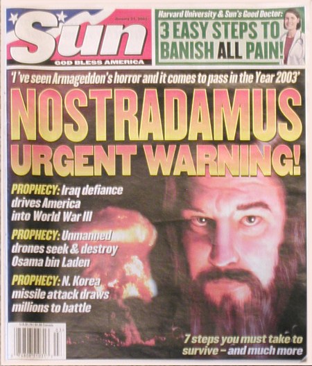
At any rate, among the werewolves, bat boys, and aliens I painted for use in this tabloid was one that gave me my 15 minutes of fame. The paper was running an article on Nostradamus, and given there were few pictures of him (and no cameras back when) they needed a photo-realistic painting for the cover article about the prophet.

Having a beard and looking a bit haggard, I used myself for the model, altering my nose a bit in the painting process to match the one drawing of Nostradamus that I was working from. I sent off a digital copy, got the okay from the art director, and pretty much forgot about the whole thing as I continued with other projects.

Weeks later, the picture appeared not on an inside article but on the cover of the publication. And my friends who I hadn’t bothered to tell about the illustration were thus a bit alarmed to see my face plastered up and down the checkout line counters where they usually saw two-headed girls, ax murderers, and air-brushed photos of Hollywood starlets who had been abducted by aliens.

After their initial double-take, no doubt they were relieved to find I wasn’t a serial killer or such.

Over the years The Sun ran some crazy stories. Ironically, one story the tabloid didn’t cover but which while true still strains credibility was the tragic death of the paper’s photo editor Robert Stevens; in 2001 when a mysterious letter came into the mailroom, he had the misfortune to inhale some of the bluish powder inside. Weeks later, he was dead; the powder was laced with anthrax spores and the letter was one of many that were sent to businesses and politicians throughout the US. A needless death, and due to my connection with the tabloid, one that has brought home the potential dangers of both terrorism and biological warfare.

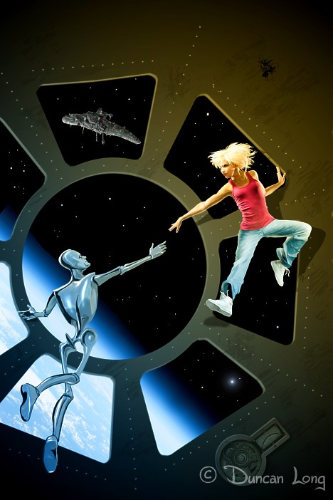
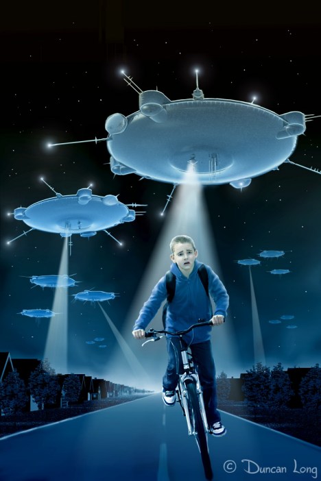
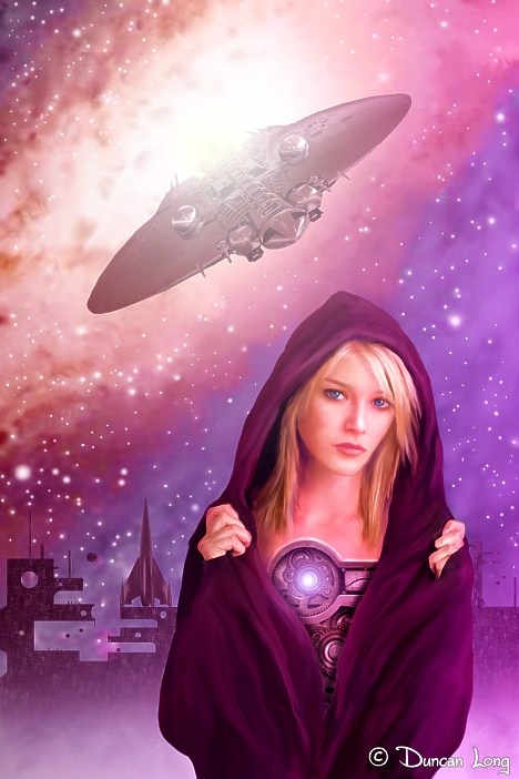
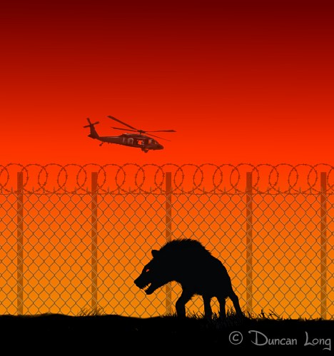
In 2012 The Sun closed its doors. But it had a good run and supplied a string of nice payments for some of my more fanciful illustrations, from UFOs to strange creatures that go bump in the night.

======================
Duncan Long is a sometimes model but mostly works as an illustrator. He’s done artwork for HarperCollins, PS Publishing, Pocket Books — and The Sun. Today he mostly creates book cover pictures for self-publishing authors and small indie presses. You can see many of his book and magazine illustrations in his Portfolio of Book and Magazine Art.

Tags: , , , , , ,

Comments Off on The Lost Predictions of “NostraDuncan”

Four Sci-Fi Book Cover Pictures Looking for a Home

Ballet In Micro G - science fiction book cover picture

I recently took a little time off to create four pictures for the consideration for the editor of a science fiction magazine that hopefully will be taking flight soon. In the meantime, I thought I’d show off my artwork. Please note that while these are under consideration by the editor, nothing is set in stone and the rights have not yet been sold. So if you’re interested in using one for a book or magazine cover project in need of a science fiction illustration, drop me a line and I’ll let you know if it becomes available.

My painting above is “Ballet In Micro-G” — and yes, I consciously mimicked the “Creation of Man” that resides in the Sistine Chapel. (Yes, science fiction artists really do know a little about art history.)

Next (below) is the second picture I created, “An Amazing Takeoff” which employs the old-style science fiction rocket that was popular in 1950s and 1960s novels. Also a small Stanley Kubrick 2001 style space station (partly under construction in this picture).

Amazing Takeoff - a sci-fi book cover picture by Duncan Long

Next…

A salute to Rod Serling’s Twilight Zone story “The Monsters Are Due On Maple Street.” For this one I updated the concept of the flying saucer a bit with additional “stuff” on the hulls, lights, and mysterious projections that one might expect with “alien technology.”

And one lone youngster trying to escape via his trusty bicycle.

As Serling might have said, “Presented for your consideration…”

The Monsters Are Due On Maple Street 2 sci-fi book cover picture by artist Duncan Long

Finally, an illustration that seems to be a repeating theme for me: “The Clockwork Gal.” With talk of robot companions and such, it seems likely that somewhere in the near future such automatons will become functional and perhaps to the casual glance, indistinguishable from real human beings. At least until she pulls open her robe to expose the gear work.

The Amazing Clockwork Woman - science fiction book artwork by Duncan Long

Again, the rights to any or all of these pictures may become available, so let me know if one would work as a cover illustration for your upcoming book or magazine project.

In the meantime, you can see more of my science fiction artwork in my Science Fiction Book Cover Paintings Gallery.

I also have a collection of “ready made” sci-fi pictures in my Premade Science Fiction Book Cover Illustrations Gallery. These have lower price tags — but are sold “as is” with the understanding that I’ll not do further work on them; each is full size for print and can be reduced for use as an ebook cover. (For the secrets of using premade artwork for your book cover, see my how-to article: “The Secrets of Choosing and Using Premade Book Cover Art.”)

=====================
Duncan Long has created over a thousand illustrations used for book and magazine covers as well as inner artwork in publications. Among those who’ve used his work are many self publishers and small presses as well as HarperCollins, PS Publishing, Pocket Books, ILEX, Asimov’s Science Fiction, Moonstone Books, and Enslow Publishers.

Comments Off on Four Sci-Fi Book Cover Pictures Looking for a Home

So You’re a Writer…

I’m a writer / illustrator. These days I’m mostly an illustrator. But a couple of decades back, I was mostly an author, and at one point had the happy experience of putting 13 novels into print with HarperCollins and Avon Press, along with a host of non-fiction books with smaller presses.

During my time as a mostly writer, I discovered there are many people that are simply jealous of authors — and often will do their best to put wordsmiths down (if not outright belittle them).

Such people will often dismiss a writer as doing something anyone can do. Phrases like, “Everyone has a good book or two in them” or “When I get the time, I’m going to write the Great American Novel” may not be conscious putdowns, but nevertheless most authors will recognize them as such.

And most who have worked honing words and polishing manuscripts know that not most people don’t have what it takes to become a successful writer (any more than most people have what it takes to become a successful brain surgeon, sculptor, or other work that requires a lot of learning, creativity, and craftsmanship).

Another sort of putdown can occur during the “what do you do” exchange that often occurs in social interaction. Sadly some will use this social interplay as a way to belittle an author. Years ago when I worked mostly as an author, an occasional exchange would often go something like this after I revealed I was a writer:

Their first attempted putdown was to ask, “Have you published with any press I’ve ever heard of?” The hope here is that you’re with some small press, in which case the question suggested if you weren’t with a big press, your work was less than noteworthy (which anyone who knows anything about the business of writing is not the case).

Fortunately, I could counter with, “Have you ever heard of HarperCollins?” This was a sort of subtle counter putdown since it suggested they might be very unfamiliar with publishers and writing.

Often the conversation went from there with no more attempted putdowns.

But sometimes they’d persist: “What sort of books do you write?”

“Action-adventure and science fiction.”

“Oh,” they’d say with the hint of a smile, as if I’d just admitted to writing Nazi propaganda. “But when are you going to do some serious writing?”

Of course there are all sorts of comebacks to that question. But suffice to say, if you’re a writer, all you need to know is that some folks will never admit you’re a success. They will be jealous of the fact that you’re living your dream and doing what you enjoy. Because of that, they will try to puncture your balloon, to bring you down in order to make themselves feel more important, or simply to spread their misery. Unless you’ve just won the Pulitzer Prize, these folks will find a way to look down their noses at any achievement. And even if you just did win that prestigious prize, they’d likely still manage a putdown of some sort by speculating as to why you hadn’t won it earlier, or whether you’d ever win again.

Today many authors take the self-publishing route, and these folks can really get hammered with hurtful words like “vanity press” or “so you couldn’t find anyone to publish you?” Even as more and more writers are becoming successful in realizing their dreams, there seem to be more and more people who have become jealous of such success.

As a writer, never allow these folks to discourage you. Learn to ignore their verbal barbs. Ideally you’ll even come to understand that these folks should be pitied since they are, after all, very likely dissatisfied with their own lives.

Remember that you’re lucky to be doing the thing you love while many others cannot. You’ve worked hard to get where you are. Don’t let anyone rob you of your joy or sense of achievement.

Comments (2)

Into Every Blog, Some Miscellanea Must Fall

A little news from the publishing world — and design tips and ideas for those who are self-publishing or who have a new book to promote:

Barnes and Noble posted a $119 million loss in Q4 2013, and now B&N is hoping to “partner” with 3rd party for selling/developing future Nook tablets. This latter bit of news might very well slow down sales since no one wants to buy an ebook reader that might soon become obsolete. I suspect the chances of the Nooks being discontinued is actually quite slim. On the other hand, there have been some nifty ebook readers in the past that have fallen to the wayside.

I suppose the real winner in this is Amazon and the Kindle.

If you’re self-publishing, you can never know too much about typefaces (aka “fonts”). Here’s Jill Bell’s useful video: “The Top Ten Things Everyone Should Know About Fonts.

If you’re involved with the process of laying out a book, magazine, or web site, you’ll likely enjoy this very useful typographical checklist from Ilene Strizver: Typographical/Page Design Checklist.

About to launch your new book? Then here are some Useful Tips for Your Book Launch Party.

For real diehard fans of type, typographer Martin Majoor offers some tips on mixing types in books, as well as revealing his experiences designing typeface pairs — and has some insights into what the sans italic should really look like.

Here’s an interesting study of how people view web pages — and I suspect print pages as well. Important for both web page design as well as book cover illustrations: A look at how people read web pages (and books, I suspect) with an eye toward designing to maximize impact: 10 Useful Findings About How People View Websites.

Finally, we’ve all heard that readers (and buyers) judge books by their covers. Well, here’s more evidence Mark Coker, the Founder of Smashwords.

Comments Off on Into Every Blog, Some Miscellanea Must Fall

Cover Picture/Layout for Yuma Sector by Craig Young

Craig-Young-Yuma-Sector book cover picture illustration by graphic artist Duncan Long

I recently had the pleasure of creating the cover illustration and layout for Craig Young’s horror/action novel Yuma Sector, which is now available from Amazon.com and iTunes.

The picture and layout are pretty straightforward; we employed a stencil typeface for the title and back lead to capture a little bit of a “government” feel since the main character is a US Border Agent investigating the mysterious disappearance of illegal aliens coming into the US through the border fence.

Yuma Sector cover layout and picture by Duncan Long

These days most authors create web sites to help promote their books. Craig created one that sort of blew me away the first time I visited: Sound, animation, and a video as well as links to sites selling his book. I think authors would do well to copy this model as I bet it will sell some books.

You can visit the Yuma Sector web page to see if you don’t agree that the site is pretty fantastic.

Comments Off on Cover Picture/Layout for Yuma Sector by Craig Young

Yes, People Do Judge Books by Their Covers

Books are judged by their covers, and according to Mark Coker (founder of Smashwords) there’s a connection between excellent covers and good sales of a title. Here are some of his insights as to what constitutes a quality cover, and why such a cover is important to a publisher and the author: Yes, We Really Do Judge Books by Their Covers.

More and more authors are recognizing this truth, which is what keeps me very busy these days. Speaking of which, if you need a quality picture for the cover of your book, please check out my Book Illustration Portfolio. My clients include award-winning authors and best selling writers, and I’d love to add you to my list of clients.

Comments (1)

When the Honeysuckle Blooms

Well, the honeysuckle is now in bloom beside our house, making it officially summer (at least to my mind).

When I was a child, our home had two honeysuckle vines that grew up the columns of the front porch, wicking the heady odor from the flowers into the house, especially at night. Now the scent takes me back to the summer after I’d completed 4th Grade and was free of studies, able to read for pleasure rather than by dictate. It was that summer that I discovered Edgar Rice Burroughs, read some Robert Heinlein for myself, and found other treasures including Nancy Drew and the Hardy Boys mysteries — all at the Sterling Free Public Library.

I think (according to Google maps) the library no longer housed in the original brick building where it was in my youth (with a WWI “potato digger” machine gun on a war monument out front of the library), though the building still stands and is in good repair. In my mind, that’s where the library remains, populated by those helpful librarians of the past, with an occasional rock collection on display on deep blue velvet, and the smells of ink from new books and the parchment, cloth, and leather of the older treasures. Just stepping into the building was magical because it offered a cool respite from hot summer days and the burning Kansas sun.

Those days were like something from Ray Bradbury’s Dandelion Wine. Kinder, gentler, magical times that I often dream I might return to. And how I wish I might somehow have shared such relaxed, quiet times with my children, rather than the hustle and bustle of modern-day life which they grew up with.

I have a feeling Heaven must have honeysuckle growing along its golden streets.

Comments Off on When the Honeysuckle Blooms

Enduring the Darts and Slings of Critics

No matter which of the arts a creative person works in, there are always “critics” offering their opinions of the artist’s work. Some critics may be well-meaning. Others, however, are simply spiteful little trolls who would destroy if they could, and barring that, are happy to sling their warped notions your way as “friendly advice” or “honest assessments” in the hope of doing damage.

During my years working as a writer / illustrator, I’ve seen all sorts of critics from a high falutin college professor turned critic (who had apparently failed to publish enough to keep his position and therefore felt it his duty to take pot shots at my first novel) to people who offered genuine criticism that helped me improve my work. Those in the latter group are great (though their assessments may still sting); I like to think the former have a place prepared for them on the sixth ring of Hell.

Perhaps the weirdest criticism I’ve had to date came from a preacher who sent a long email, the key point of which was his opinion that my Christian art proved I was the “Spawn of Satan” (exact quote). At the time, his hateful missive really hurt, doubly so since I was trying to help the same community he claimed to be a part of. Fortunately I had been working with a preacher (the ever-wise “Johnny the Baptist”) who offered support and reassurance.

Today the hurt from being branded the Spawn of Satan is no longer there, and I can now laugh at it now. And except for this spawnish blip my experience with Christian groups has been quite good with many continuing to employ my artwork for religious books, presentations, and in one case a large print behind the main pulpit. (I’ll note that sadly there are some bad eggs out there working behind he pulpit; but in my experience, most “men and women of God” do an amazing job, often working for little pay, and generally without much thanks. Where I’ve been slighted this once, they are slighted on a daily basis, and it’s hard for me to imagine they don’t get pretty discouraged because of this.)

This is not to say Christian groups aren’t without fault when it comes to the arts. There’s a tendency of churches to view the arts as propaganda tools, or at least only methods for spreading a message, rather than seeing each beautiful work of art as a glorious gift that reflects the Lord of Creation.

One writer that addresses this issue if Franky Schaeffer in Sham Pearls Before Real Swine and Addicted to Mediocrity: Contemporary Christians and the Arts. While I don’t agree with all of Schaeffer’s views on Christianity, he makes some very valid points about the church and the arts.

Franky Schaeffer writes, “The modern Christian world… is marked in the area of the arts and cultural endeavor by one outstanding feature, and that is its addiction to mediocrity…. Of all people, Christians should be addicted to quality and integrity in every area, not be looking for excuses for second-best…. Art, creative human expression, and the enjoyment of beauty need no justification. The ultimate justification is that they come as a good and gracious gift from God above.”

(I suppose his skewering of the church’s attitude toward art might also be a criticism of some of my own artwork given its use by some Christian groups, but I hope not.)

Of course outside the church the arts have become more or less a religion in and of themselves for many, and that can take some strange twists and turns no religion ever even thought about. Bottles of excrement, piles of cans, or other rubble and trash are declared art by this religion’s high mucky mucks run amuck with their disciples unable to perceive the ridiculous results of their blind faith. In a world where some live in squalor, the prices tacked onto such “art” seems in itself as obscene as some of the subjects portrayed in the artwork. As John Weaver has noted, “When an unmade bed is valued at £150,000 and yet an African child’s life is not valued at a dollar, something is seriously wrong with the values art promotes.”

Robert Hughes nailed the situation when he wrote, “When you have the super-rich paying $104 million for an immature Rose Period Picasso — close to the GNP of some Caribbean or African states — something is very rotten. Such gestures do no honor to art: they debase it by making the desire for it pathological.”

So there are flaws enough to go around.

As for critics, the catch with many is that they aren’t knowledgeable about what they criticize or, if they are, are petty, hateful, and jealous people deep down inside. Such folks can do a lot of damage to the ego of creative people. And in my experience, many creative people are actually more sensitive and emotional than the average person — making them vulnerable to the slings of the jealous.

So hurtful critics often leave wounds of the artist’s heart. Minor hurts, yet they can be very discouraging to an artist, especially those just starting a career. Yet for most, the wounds eventually heal to leave scars not unlike the red badge of courage received in battle. In the long run, these injuries can also make an artist stronger once they are overcome.

But it is wise to limit the damage. Avoid negative people. Never seek out reviews about your work.

Woody Allan never reads reviews of his movies. I think perhaps this is good advice for anyone in the arts. As are the words of Charles Haun: “What did you gather today? Were you in the field of bitterness filling your hearts with an abundance of bitter attitudes because someone hurt or offended you?”

An artist should never wander into fields of bitterness. One way of doing this is to avoid reading what critics write.

Tags: , , , , ,

Comments (2)

Bleed and “Color Space” for Book Cover PDFs

Book illustration art picture by Duncan Long

For self publishers or those starting a small press, the process of creating a print cover PDF can seem pretty daunting the first go around. Fortunately after a time or two it becomes pretty much “old hat” and can be taken in stride (though this isn’t to say that new and varied hiccups don’t occur even for seasoned pros).

The last few corrections and changes to a print project often seem to become increasingly troublesome. Part of the reason is when correcting mistakes discovered during proofing, new mistakes can be created. For example a “z” may appear when the graphic designer fails to do a complete control-z undo command, leaving only a “z” in its place. That can not only leave the error that failed to be undone but also add a new one, too!

The key to keeping such mistakes from going into print is to proof the ENTIRE cover after each correction. Yes, this is time consuming, but it can save some real headaches when the book is in print. Nothing is quite as discouraging as seeing a “z” in the middle of a book title, right?

For those being introduced to the printing process, the concept of “bleed” can be a little confusing. “Bleed” is the extra amount of picture or inked area around the outside of a cover (or page) that goes beyond the trim points on the sheet. The purpose of the bleed is to allow extra area so that any minor calibration errors of the trim blades won’t leave white at the edge of a cover or page. As equipment becomes more precise, the necessary bleed has shrunk over the last few years from a quarter inch to 0.125 inch.

With the PDF that will go to a press, the bleed trim marks are shown with black embashes at the corners of the cover. If you imagine extending lines from one emdash to that opposite it, you’ll have the location of where the trim should occur.

One of the odd things with cover layouts is that while there are calibration marks for trim (and colors as well as black ink in some cases), there’s only a “pie chart” looking mark to show the center of the spine. The areas where the spine folds aren’t shown. The reason for this is that the folding process that creates the spine is more or less “automatic.” So while your graphic designer may center the spine down to a thousandth of an inch, the viewer of the PDF is left more or less clueless as to where the spine should be (outside of perhaps printing the PDF and measuring the width of the cover from each bleed trim point).

That said, if you’re really concerned about the spine fold points, you can ask your cover designer to place some white lines at the fold points for you to see — just don’t get that file mixed up with your print PDF or you’ll have those lines on your cover!

Some presses like to have color calibration marks on the PDF. Others don’t require these as they work from the sRGB color space (which is nearly identical to what is seen on a properly calibrated monitor, making it very convenient to work with). So some designers creating a cover for CreateSpace or other presses calibrating to sRGB will leave the color specs out of these PDFs (with the theory that this makes it a bit less apt to cause confusion with the company’s automated process).

As the “finish line” of submitting a cover PDF to a press approaches, it seems like the last few inches are made in baby steps. But it’s always better to be thorough and cautious in order to prevent errors from going to print. When your “baby” go to press, it’s comforting to know you’ve done your best to make a perfect offering for your readers to enjoy.

======================
Duncan Long is an illustrator who often also does the layout for book covers for small presses and self-publishing “indie” authors. You can find examples of his work in Duncan Long’s Portfolio.

Tags: , , , ,

Comments (3)

Art Software

art software used for this painting - Corel PhotoPaint

I often receive questions about what software I use (or recommend) for artwork (along with that ever-common,”Do you use software or only brush and oils?”). So I thought a post on all this might be in order.

First, my artwork is digital from beginning to end. I seldom sketch on paper except to make “notes” on a project when I’m on the phone. And I almost never paint with actual media these days (though I do have pen-and-ink as well as painting experience in my background).

Most of my illustration work via the paint and blend features in Corel PhotoPaint, one of the programs in the company’s Draw Suite. I still use an old version from Draw 8. I upgraded and tried several of the later versions — but have found Corel’s updates and new versions of this program are so bug riddled that I returned to 8. And until Corel gets its act together and offers stable programs, I can’t presently recommend any of the company’s software (which is a shame — as Corel’s Painter has a lot of potential).

I do have Photoshop — and almost never use it. It’s a quality program, but just too clumsy for my tastes (and over-priced, I think). Adobe’s recent decision to make its programs subscription services seems a dubious plus as well, given that like a pusher, once they have the user hooked, prices can be raised according to whim (yes, I am cynical about how big corporations treat their customers).

What programs do I recommend?

I know this may be heresy, but I don’t think Inkscape (for vector drawings) and the unfortunately named Gimp (for bitmap) lack the polish most pros need. I know some love and swear by these two programs, and they’re free so by all means try one or both out if you’re looking for art software. If they fit your needs go with them — free is hard to beat.

Another free paint program with promise is Paint.net; this is the software I’m currently watching for that sad day I have to retire PhotoPaint. Again, Paint.net lacks some features you might need, but it has a lot of good qualities. And did I mention it was free?

MS is also working on a free paint program Fresh Paint which is currently available but lacking some of the features it will eventually have for a full range of oil, watercolor, etc., effects. Unlike some of MS’s previous art offerings, this one looks promising.

Artrage is another simple paint program with a low price tag. It is also another that tries to mimic actual art media (a concept I have mixed emotions about); ArtRage has an easy learning curve, too.

Autodesk’s Sketchbook Pro is pretty slick IF you wish to draw in a cartoon/illustrator style with heavy outlines. Pretty affordable, too. If you’re interested in cartooning, graphic novels, etc., this is one to consider. (If you are totally into cartooning, then Manga Studio might be of interest as well.)

For vector work, Serif’s DrawPlus is slick and affordable. And I love this program. I don’t do a lot of vector work, but when I do, DrawPlus is what I pull out of the digital toolbox. All of Serif’s software is rock stable, and the software recovers well on the rare occasions it freezes or fails. Its programs are very affordable, and Serif offers older versions for free as demos. (To my mind, Serif is the way all software companies and programs should be — but too often are not.)

I do on occasion create logos and typefaces. Often this pairs DrawPlus or PhotoPaint (for the creation of the design) with HighLogic’s MainType. Among other things, MainType has an amazing engine for importing graphics — in most cases I can just copy and paste a bitmap into it and instantly have the vector icon or letter I want ready to be manipulated and eventually ported as a TrueType font. Very nice for typography work.

There are a lot of other minor art programs I use from time to time. But the above will serve a digital artist well and about 98 percent of all my work is done on one or more of the software listed above.

Tags: , , , , , , , ,

Comments (3)