The Amazing Kreskin and Witches and Fish

The Amazing Kreskin - Reader of Witches and Fish

I about fell out of my chair today when this email came from The Amazing Kreskin himself — written after he’d finished reading my graphic novel Witches and Fish:

I just had the most remarkable experience of reading and viewing your book… This is the first time I have ever read a graphic novel and it will remain memorable that the novel was yours. A most intriguing mystical story and I have to tell you your artistry is absolutely brilliant. There were a number of scenes that I found myself moving back over perhaps 4 or 5 times. I compliment you on your gift…. I wish you continued success in your work.

ESPecially,
Kreskin

Wow!

All I can say is a big “THANK YOU” to Kreskin for reading my graphic novel and taking the time to write. He’s a very kind and generous entertainer, and it’s always a pleasure to see him perform on TV. And it’s a special treat when he takes the time from his extremely busy schedule to get in touch like this.

You can learn more about The Amazing Kreskin at AmazingKreskin.com.

And you can still (but not much longer) read Witches and Fish for free online at Scribd – Witches and Fish or you can order a print copy (with three times the detail as the web version) at Amazon.com.

Witches and Fish Graphic Novel Cover by illustrator Duncan Long
===============================
Duncan Long is a writer/illustrator who created the graphic novel Witches and Fish as well as the illustrations for the graphic novel The Werewolves of New Idria (written by John Chadwell). You can see more of Long’s artwork for free at Duncan Long’s Illustration Gallery.

Tags: , , , , , ,

Comments (3)

K. Rowe’s Sci-Fi Adventure Space Available Now Available

K Rowe science fiction novel picture by book cover artist Duncan Long

K. Rowe’s Sci-Fi Adventure Space Available in a Kindle version as well as print.

As I prepared to create this book cover illustration, it presented a rather odd problem; one of the central elements for the cover (and one of the running jokes in the plot line) is an alien artifact that looks like a giant tin can. One might think having a common thing like that to illustrate would be a breeze. And in some ways it was. But the catch is that it is supposed to be bus-sized. So if care isn’t taken, the results can either look like the perspective is horribly wrong or that a human-sized character is the proverbial knee-high to a grasshopper.

Worse, during the first draft of the cover artwork, the artist (me) didn’t realize the “can” was huge rather than a regular-sized tin can. So my first stab at the book cover produced an alien artifact that was out of scale by about a factor of about 100.

Ooopsss moment with a book cover picture

After this ooopppsss moment (which likely either rewarded my client with screams of fear or laughter upon seeing the results — hopefully the latter), I went back to the drawing board and put the “can” into the distance so its size would allow it to be seen in its totality, and also allow for the landscape to give a feel that it was distant (rather than close with a tiny ant-sized guy in the foreground). To give the eye another clue to size, I added some tracks in the sand leading off toward it. At this point the character was also turned slightly to offer more of a profile view. Additionally his leather jacket was painted in at this point, with the design having a subtle “sci-fi” look to it.

Kathy Rowe book cover artwork for science fiction novel

Now we were in the ballpark with the cover layout and character, though things weren’t quite there just yet.

To give the idea that the distant object was more than just some alien Quonset hut, we decided to add a “power surge” glow (which occurs in the story) at the base of the artifact and also reduce the size of the sand dune around it. Additionally, I moved the guy to the front right of the illustration to put him in the spot where the eye tends to settle when looking at the picture.

The trick here was flipping the background but keeping the character in the same orientation and moving him to the right so his injured droopy ear could remain facing the viewer (his other ear according to the story being upright like a Vulcan’s). I also made the footprints more noticeable to further cue the eye to the size of the distant artifact.

The result was what became the final cover illustration:

Kathy Rowe final book cover picture

Adding the tracks also told a little “story”: The character had been visiting the artifact, and now was walking away. The sky with twin moons helps complete the science fiction feel so a reader can instantly identify the genre of the story when glancing at the book cover illustration.

The only other hurtle in this project was matching the character’s face to pictures of him in the previous novels in the series, as well as making him conform to the text descriptions in this and previous books in the series. So during the process of creating the cover, the original character sketch I made (shown below on the left) was gradually modified into its final configuration (on the right). Fortunately such work is pretty straightforward with digital paintings like this where the character is in a layer by himself so he could be easily modified without changing the sky or other features around him.

Science fiction character sketch and final version

And that’s the cover illustration. The client cropped the illustration slightly, added lettering, and the cover was good to go.

The story is pretty amazing and most science fiction fans will love this book.

Here’s the “blurb” about it:

Book Three of Dar’s Adventures in Space. Captain Dar Meltom sets his sights on a mission of utmost importance. With the stolen Plexus in the cargo bay of the Marsuian, he heads to Satiris, the planet of his ancestors. Once there, he encounters dangerous creatures, and Lukxia, the last purebred Satiren female on the planet. Dar deploys the Plexus, hoping it will bring Satiris back to life. Rather than keeping Lukxia as a second mate, he presents this most precious gift to Krodus, his long-time worst enemy, now friend. But that’s not enough adventure for Dar.

Lurking not far from Erotis is a wormhole. It’s the very one that brought his father Edward Meltom, Earthling astronaut, to the Ontarrin Galaxy. The explorer in Dar wants to find his father. So together with his mate, Parnela, and Schmuff his Nouian engineer, they tempt fate and enter the wormhole.

What awaits them is anything but a warm Earthling welcome.

If you’re a science fiction fan wanting a “good read,” check out Rowe’s novel. You can read a couple of chapters for free with the “look inside” feature at Amazon. Just be forewarned: Once you start reading, you’re going to be hooked — and entertained for the next few hours as you read the rest of the story.

———————————
Duncan Long is a book cover artist who sometimes has trouble deciding what the apparent size of alien artifacts should be. You can find more of his science fiction book cover illustrations at Duncan Long’s Online Portfolio.

Tags: , , , , ,

Comments (2)

Stuart Jaffe’s Southern Belle In Print (& Electrons)

Final book cover illustration and layout for paranormal mystery novel Southern Belle

The third book in Stuart Jaffe’s Max Porter paranormal mystery series is now out. The mystery Southern Belle can be found at Amazon in both Kindle and print formats.

There were several interesting challenges in creating this book cover illustration. Foremost was the need to make it appear similar to the previous two book illustrations in the series. In this case, that meant keeping most if not all of the picture on the left side of the front cover and making the color and main character consistent with the previous covers, yet making it all enough different so that a casual observer wouldn’t mistake this new book as one of the previous titles.

3 book cover illustrations by artist Duncan Long

So basically, we had the design equivalent of walking a tight rope. Only with a delete key in case we fell into the lions’ cage below.

Fortunately keeping things different was fairly simple this go around because there would be a ghostly lady to go with the detective specter who had appeared on the previous two books. That proved true — except for the “fairly simple” part.

Here was the first stab at the task:

Jaffe Southern Belle early cover layout with character's legs in the frame

Our first idea was a “Hello, Mrs. Robinson” shot (for those who remember The Graduate movie poster). It was a good idea, but didn’t work perfectly for two reasons: First, a bright glow was needed to make the legs stand out, and that drew too much attention away from the detective. And without the glow and because of the “everything on the left” layout limitation, the legs looked as if they might be growing from the detective in some horrible resurrection gone wrong — not the look we were aiming for.

Back to the drawing board.

Next came:

Jaffe Southern Belle book cover illustration

While the gal in this sketch had too much color for the palette we were working with, this experiment suggested the idea would work. The only catch was that there was no real interaction between the characters. So…

Jaffe-Southern Belle with flipped gal doing some business

As can be seen, I flipped the picture over and then painted in a hand/arm to reach up toward the detective. Originally she held his tie, but space limitations proved too small for her to grasp his tie. Fortunately the painting was digital, so it was a snap to move the gal over a tad to play with the detectives right coat collar instead of his tie. By adjusting the gal’s apparent height, we were able to put her elbow into the space in the lettering — almost as if that had been the plan from book one. One of those happy little coincidences that one is sometimes blessed with during layout. The interplay of her holding his collar not only brought the characters together but also hinted at the intimacy that would be part of the storyline.

A little comparison between the two versions of the gal also shows how I revamped her jewelry, hair, and dress for a closer match to the story (which had her based in the 1940s).

At this point we were almost finished. The author felt our lady needed to look a bit more decayed on the left side of her face (the viewer’s right) as well as having her hair on that side appear like she’d been in the grave for some time.

These last changes led to the final version of the Southern Belle cover illustration:

Jaffe-SouthernBelle FINAL version of the book cover illustration

As this illustration suggests, Jaffe’s Southern Belle is a very different story.

Here’s a quote to give you a feel for just how strange (and intriguing) the story concept is:

Max thought he had enough trouble dealing with one witch in Winston-Salem. But a new case brings to light an entire coven of witches.

Angry, cursed, dead witches.

Lucky for Max he has the aid of his partner, the ghost of 1940s detective Marshall Drummond, and his sharp-witted wife, Sandra. Together, they’ll face enemies at every turn, and things only get worse when the mysterious Hull family and the FBI start poking into Max’s life. He’ll need all his team can give with a case that involves the theft of a cursed bell, dark magic, spirit possession, and ghastly murders.

All in all, just another day at the office for Max Porter.

You can read more from Southern Belle with the “look inside” feature at Amazon.

Or, better yet, take a look and buy the book. It’s a good read and if you want a mystery with a twist, this is it.

======================
Duncan Long is a writer/illustrator who loves the challenge of creating book cover artwork to match the plots of novels. You can see more of his artwork and illustrations at Duncan Long’s Portfolio.

Tags: , , , , , , , ,

Comments (4)

A Win/Win Solution to Ebook Piracy

Duncan Long suggests a new way to help authors by transforming ebooks and piracy.

For many authors, piracy is killing their careers. This is especially true with some genres like science fiction and horror where an author may see 10,000 downloads of a pirated title with only a few hundred sales (and sadly I’m not exaggerating with these numbers). While all those pirated copies don’t translate into lost sales, some of them do.

What if there were a way to transform those pirated copy downloads into “sales” that put money into an author’s pocket?

If that were to happen, the piracy issue would be stood on its head. Authors, instead of issuing take-down notices, making threats, and generally cursing the theft, would encourage folks to “steal my book.” Abruptly there’d be a shift of publishers, authors, and even government agencies from attempting to limit the downloading of free ebooks to encouraging such downloads and file sharing.

This isn’t pie in the sky.

There are several models that could do this.

One has already been used. A few years back, WOWIO offered all the ebooks at its site for FREE — with the authors of each book getting paid for each free download. While this sounds impossible, it was made practical by placing a few pages of ads in each book. Advertisers basically paid for the cost of distribution and royalties. WOWIO pocketed a bit for its services and the readers got a free ebook to read.

Everyone was happy.

Sadly WOWIO was a bit ahead of its time and also used the PDF format when Kindle and others employed other ebook files for their books. Thus WOWIO failed to get enough readers and sponsors to make its project viable. Since then the company has gone back to selling ebooks, with only a very few promo books available for free.

But the model has the potential to negate the “theft” aspects of piracy through free ebooks, and as such is worth considering.

To make this model work over the entire ebook industry, all that’s needed is a mechanism to “count” eyeballs viewing an ad. Then the stage will be set for authors/publishers to get paid for their work and readers to get free or low-cost ebooks.

Such a system wouldn’t require rocket science to put in place. It would be much more than an afterthought with today’s technology.

But such a tracking system isn’t essential. The tracking could even be “low tech” with just a slightly different payment model. Advertisers could employ an old trick used by mail-order businesses for almost a century now. When someone buys a product, they supply the advertiser with a code keyed to the ebook the ad appears in. The minute the advertiser gets an order, he would know what ad/ebook generated the order.

With mail order this is done with the old “Department” so and so added to the advertiser’s address. The “Department” actually is a code telling what issue of a magazine or newspaper the ad appeared in. For example, “Dept. 6SW” might be used to designate the June issue of Short Wave magazine — thus when the guy at the ad desk saw “Dept. 6SW” he knew where the ad that generated the order had come from. A slightly more complex system used with ebooks could generate a “per sale” royalty to be paid to the author and publisher.

To be sure advertisers didn’t cheat, the ads could be sent first to the publisher to record and then on to the advertiser so the order could be filled. Again, the more ebooks/ads the author gets out there, the greater the chance of orders being made, and the greater the earnings potential of each free ebook that is downloaded.

Of course for display ads for big-ticket items like cars, TVs, or what-have-you, this system wouldn’t work. In such cases the models used today with magazine and TV ads would be used; basically the publisher would keep track of how many ebooks were downloaded from the various torrent and file-sharing sites (or perhaps these numbers would even be sent via these sites in exchange for the publisher releasing new titles directly to the sites). These display numbers would then be presented to advertisers as “circulation numbers” with payments figured according to how many eyeballs the ad had reached.

So even a hundred-year-old tracking system or the current system used by TV and magazines could make the free ebook work for authors/publishers and advertisers.

What’s the downside?

Well, not much if at all once the system is up and running.

Sure, there are a few readers (I won’t call them “snobs” but…) who might object to ads in books. However ads regularly appeared in paperbacks in the 1950s and 1960s and no one objected. People are used to seeing ads everywhere and readers will soon become accustomed to a few pages of ads in their ebooks.

Don’t think so?

Well, I’d bet those who object the loudest to the notion of ads in ebooks right now most likely thumb through magazines or read newspapers (all loaded with more ads than articles) without complaint. Basically it just depends on what we’re used to.

Additionally, once readers understand that a “free” ebook is paid for by advertising, they won’t think twice about a few ads in a free book (and if they do, authors can sell ad-free ebooks to them with a price tag that reflects the difference to such customers). I suspect a few “this page of ads made your book free” public service notices could easily win most readers over.

Now, consider the transformation the free-with-ads-ebook model could make: If ebooks become free with ads that can be tracked and counted, each copy that’s read would make the author and publisher money (and the advertiser as well through more sales of their product) — even if it is distributed on what are now pirate sites.

Overnight torrents and other pirate sites would be helping authors rather than hurting them.

And the pirate sites — also ad supported — likely would make more money as well since the traffic to the sites would increase as folks realized they could download free ebooks without guilt. No longer would there be any stigma attached to free downloads and file sharing. No more government threats to close the sites and jail the owners. Piracy would be transformed into a way to actually help authors who are offering the reading entertainment we have grown to love and want.

Additionally, the poor could have also have access to just as many books as the rich now do. The system would be a great economic leveler, placing ebooks into the hands of people all around the world for free — while still helping authors and publishers.

This system would basically be a win/win/win/win/win situation (I may have left out some win’s, but you get the idea).

My only question is this: Will enough readers, publishers, authors, and advertisers be brave enough to make this work?

Stay tuned….

============================
Duncan Long is a writer/illustrator whose worked in the publishing industry for decades, with nearly 100 of his books published including 12 novels with HarperCollins. Often vexed by the piracy of his books, he currently makes his living mostly as a book cover illustrator for publishers and indie authors. See his book cover pictures at Duncan Long’s Portfolio of Book Cover Artwork.

Tags: , ,

Comments (4)

About the Emotions In a Pretty Face

Great Hexe nightfall z book cover art by illustrator Duncan Long

I often have folks tell me that I’ve captured the emotions of a character created for a book cover perfectly. Or that I’ve created a really pretty face on a character. There are a few tricks to make such things happen. And they aren’t quite what you might think they’d be. In fact, there’s a bit counter intuitive.

I’ve found that often people “see” the features different actors in my illustrations. Sometimes that makes sense because there is a resemblance. But often different viewers actually see very different “faces” in the pictures. For example, when I get finished with a character, I may think, “Man, I hope that doesn’t look too much like” so-and-so. And then a client who sees it will say, “That’s great — I see you made her a little like” some other actor. And then my wife will come into my studio, look at the monitor, and says, “Does that look too much like” a third actor. Same face. Three different “looks” according to which person is studying it.

So often there’s to be a tendency to see what we expect or perhaps want to see sometimes.

With women’s faces, there’s another oddity: The less defined the face, the more “beautiful” it will be perceived by most people (I’m not sure if this is true with the male face — the only study I’ve seen on this used women’s faces). For example, the “prettiest” face an artist can create is just two eyes/eyebrows, nostrils, and lips. Now when you think about encountering such a person in real life, that minimum of features would be terrifying!

But most people “see” a beautiful face instead.

Hollywood took advantage of this for years by putting gauze or Vaseline on lens to “soften” female faces. (More recently the high definition has taken female actresses in a disastrous direction, showing all their skin imperfections when the camera closes in. One movie is said to cause gasps in the audience when a closeup of a gal’s face shows nose hairs. Too much detail is sometimes detrimental.)

A third psychological “mind trick” I often work with is that when people are presented with photos and look at them for an extended time, they tend to see the expression change on a face. It doesn’t change of course. But the mind perceives the face as making subtle changes. My contention (and I have no proof for this) is that the mind also tends to “shift” expressions in the direction it wants to see them go. For this reason I often make my faces as expressionless as possible so people will tend to “read” the expressions they’re wanting to see in them. I think this works — but have no proof.

For the same reason, I try to make facial expressions subtle so they can easily be “dragged” by the viewer’s mind into the configuration they want to see. At least that’s my theory.

Well… I’ll quit now before giving away all my trade secrets.

======================
Duncan Long is a professional book cover illustrator who likes to play with people’s minds. See more of his book cover artwork — including faces with strange emotions and beauty — at: Duncan Long’s Portfolio

Tags: , ,

Comments Off on About the Emotions In a Pretty Face

Reworking Eleanor of Aquitaine

Eleanor of Aquitaine book cover illustration by Duncan Long for a book by Robert Fripp

One of this week’s illustration projects was to rework and update my illustration of Eleanor of Aquitaine that I did seven years ago for a historic book written by Robert Fripp.

The original book cover project was tricky because the only recorded “picture” of Eleanor of Aquitaine was a medieval statue along with some contemporary written descriptions of her (which mentioned her riveting blue eyes).

So no little thought had to be given as to how much was “her” and how much the style of the times. Then she had to look like an actual human being AND ideally attractive — but no cheating to make her look more attractive than she likely was. So lots of hair splitting and “cultural archeology” to determine what she must have looked like. (Hopefully the results were close. But I guess we’ll not know until we all get to Heaven as the old hymn goes.)

Since I did the original picture, I’ve got a bit better at creating realistic faces, so this week’s work mostly had to do with enhancing her skin tone and texture as well as reworking some of her crown — and a bunch of time getting the folds on her scarf under the crown more realistic.

Hopefully it will meet with the art director’s approval.

You can find out more about Robert Fripp’s book here: Power of a Woman. Memoirs of a turbulent life: Eleanor of Aquitaine

======================
Duncan Long is a professional book cover artist and graphic designer. See more of his book cover pictures at: DuncanLong.com

Tags: , , , , , ,

Comments (1)

Creating the Cover for Patricia Little’s The Blue Between

I got word today that Patricia Little’s fantasy novel is now in print. Creating the cover for The Blue Between went through a number of steps — with several false starts — before arrived at the final illustration for the book.

First, here’s a short blurb about the story:

Sixteen-year-old Heather Lucas is the freak girl who got hit by lightning, and she has a scar on her palm to prove it. Since then, everything has gotten weird. Her mother left them, which makes no sense. Her Dad thinks she’s a liar, because she won’t explain why she keeps running away.The thing is, she can’t explain it. She just disappears and then reappears miles away, with the scar on her palm tingling. In between, she drifts in a sparkling blue void outside of time and space, where indistinct forms of people float by, lost in the blue. Is she going crazy?

Odd things are even happening at school. Why would the new boy, Alex, be interested in her? He shows her a paper he’s written about a place called Alanar. The make-believe city from Mom’s old bedtime stories? What does he know about her mother? Heather is determined to find out, especially after she sees the scar on his palm, identical to her own.

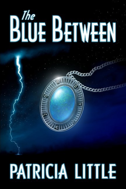
There are several key elements for the novel that we wanted on the cover: The lightning, the magic pendant that figures in the plot, and the character Heather.

That was the plan.

So the first task was to create Heather. I created several sketches, with these coming closest to what Patricia thought the character in her book should look like:

Heather 2e2 character sketch for the fantasy book cover

book cover artwork for fantasy novel

While these seemed to be coming close to what had been envisioned for the character, as Patricia and I talked it became more and more apparent that the emphasis in the story might better be placed on the pendant the character wore rather than on the character. Since Patricia had seen some of the other “jewelry” covers I’d created for other fantasy novels, we decided to drop having the character on the cover and instead go with a large version of the pendant (which originally we’d planned on having the character wear, but which would have been very small on the cover).

This was one of several early pendant designs.

Cover 1h-reflection jewelry design for fantasy book cover

As you can see, I tried placing the character’s reflection over the jewel (sort of the gem wearing the gal rather than the character wearing the pendant). While this seemed a great idea on paper, it proved less viable than had be hoped so we abandoned the idea of having the gal’s reflection on the cover picture.

The pendant design also seemed a little too angular and masculine, so I set about creating a new design and drawing in a chain that was a bit more dynamic and capable of counterbalancing the lightning strike that would go down one side of the front cover of the book.

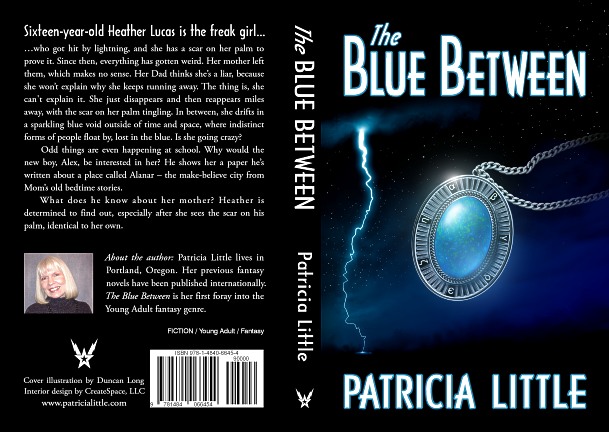
Eventually it all came together for an attractive book cover. To help unite the various elements, I used a color gradient over the entire picture and then painted in reflections that corresponded (more or less) to the lightning flash, with the curve of the pendant being duplicated by part of the lightning bolt. Finally, the chain was arranged so that it appeared the pendant had been thrown or was flying toward the lightning strike.

Here’s the final layout for the wrap-around cover:

Patricia Little Print Cover for fantasy book

You can learn more about The Blue Between and read sample chapters from the novel at Amazon.com; the book is available in both Kindle and print formats.

===========================
Artist Duncan Long illustrates book covers on fantasy, science fiction, and other genre novels. You can see more of his book cover designs and illustrations at Duncan Long’s Book Cover Art Portfolio.

Tags: , , , ,

Comments (1)

Graphic Novel Witches and Fish — now available in print

Witches and Fish Graphic Novel Cover by fantasy book cover illustrator

I’m happy to announce that my fantasy graphic novel Witches and Fish is now available in both print and Kindle versions at Amazon.com.

It’s basically… well, I don’t know exactly what it is.

A graphic novel? Somewhat. Surreal and Jungian? Very much so. And it’s full of original, fanciful artwork (100-plus illustrations) that I created for this book over several years time. If you like my fantasy artwork, you’re going to love this book.

The print version’s pictures have about three times the detail of the ebook versions of the pictures, so this is one of those times when print has a bit of an edge.

Here are a few other pictures taken from Witches and Fish (and, as you can see, the storyline is quite fanciful with an Alice In Wonderland feel to it:

Witches and Fish- serpent by fantasy book artist Duncan Long

Great Hexe nightfall by fantasy book artist Duncan Long

Dragon Castle Witches and Fish by fantasy book artist Duncan Long

The Creation of Lilith by Duncan Long fantasy book cover artist

If you want a mind-boggling ride, I’m hoping you’ll buy a copy of my Witches and Fish.

======================
Fantasy artist Duncan Long has created over a thousand book cover illustrations for many indie authors as well as large presses including HarperCollins, PS Publishing, Pocket Books, Paladin Press, Enslow Publishers, and many others. To see more of his amazing artwork, visit his Fantasy Book Cover Artwork Portfolio.

Comments (1)

A book cover artist’s thoughts and odds and ends…

Princess and the Cat book cover art by fantasy artist Duncan Long

Into every blog about the publishing industry and book cover designing, a little miscellanea must fall — and this is that post.

Kobo continues to try to capture more of the e-reader market. Here’s its latest new ebook reader.

I suspect that in the future, the ebook and printed book will diverge as much as, say, newspapers and magazines have from books. That said this may be one route taken by those publishing print books: The handmade book.

The Internet allows for many new and amazing things. But possibly this is in the “just because you can do it doesn’t mean you should” category. But it is an amazing book nonetheless: The Frankenfont Project.

A bit superficial in its coverage, but here’s an interesting overview from Atlantic Magazine of how science fiction book cover pictures / artwork have changed over the years: Space Cartoons to Space Psychedelia: How Sci-Fi Book Covers Evolved

Here’s an interesting interview with the artist who created the retro look (and why) resulting in a 1950s-style “pulp” book cover illustration for Stephen King’s Joyland.

OK… this isn’t really book cover related. But many artists are Irish and some of those do have drinking problems, so I thought I’d sneak this bit of history into this post — with a solute to my ancestors known and unknown: The Irish Ether Drinking Craze.

Finally, as schools around the nation are gearing up for a new school year, I want to note that the best 9 years of my life were in high school.

======================
Duncan Long is a science fiction and fantasy book cover illustrator who has created covers for HarperCollins, PS Publishing, Pocket Books, ILEX, Moonstone Books, Enslow Publishers, and many other presses and indie authors. Visit his illustration portfolio.

Comments (1)

What Elements Make the Best Cover Illustrations?

Book illustration art picture by Duncan Long

Although eventually used as an inner book illustration, this painting would have been an ideal book cover picture since it has the character making eye contract with the viewer.

How do you decide what the front illustration should be on your book cover?

There’s a tendency for the writer to want to have “everything but the kitchen sink” on the front of the book. Every important plot element and every character… But that’s a mistake. Such attempts just become a jumble of “stuff” to the eye. Effective cover designs are almost always simple.

Remember: The text tells the story. You’re not making a movie. You’re just using the cover illustration to set the tone. The real purpose of the illustration is to “lure” the reader to the book. To do that, you must keep the cover illustration simple. It must create an element of mystery. It must make a reader say, “That looks interesting” and want to learn more.

For fiction, having the main character on the cover is a generally a good idea. People connect with people on a subconscious level, so there’s an “instant connection” if you have a human being on the cover. An even more powerful way to use a character on a cover is to have a “close up” on the face, with your character looking out of the cover at the viewer (as is often done with portraits). People make an emotional connection with such a cover, and that connection pays off with more readers.

While a non-fiction books can have a the main character on it, there’s currently a tendency to have objects on the cover: A compass, jewelry, or something else that’s key to the subject matter (and this even carriers over to some fiction these days, especially fantasy books). Again, keeping the cover illustration simple is key, especially with the reduced resolution of ebook covers as well as catalog and book review cover reproductions.

Dragonfly book cover illustration

For non-fiction and some fiction, an object of some sort often proves effective for a cover illustration. This dragonfly with an ancient-looking background is simple yet eye-catching.

Wrap around cover pictures are often recommended, but I think these tend to create more expense for the buyer than is necessary. For starters, readers generally go to the back of the book not to see more cover but rather to read what the book is about. And lettering over a picture is often hard to read (less legible at best) which can dictate “boxing” the text — basically covering up the picture and putting text in the box. Worse the picture covering the spine REALLY can degrade reading the text. Given that some books will be displayed on bookstore and library shelves with only the spine showing, the harder to read title and author name can really hurt the lettering’s potential to attract readers to the book. Finally, ebooks currently only display the front of a book cover, so the work done on the spine and back are basically wasted effort and expense with this book format.

WÆLCYRIE MURDERS wrap-around book cover painting

The wrap around cover (for the Wælcyrie Murders by Anthony Pacheco) works because the subject matter is simple, and the light colors allow for effective lettering on the spine and back.

While I wouldn’t say, “Never have a wrap around cover,” you do need to give careful thought before going to the added expense of buying a wrap around. Often a front illustration will be more effective and will better use the money you’ve budgeted for your book cover.

Tags: ,

Comments (7)