Werewolves of New Idria: The Matriarch Brasilia

illustration for John Chadwell's Werewolves of New Idria graphic novel

Another portion of an illustration for John Chadwell’s Werewolves of New Idria graphic novel (which I’m doing the cover and interior illustrations for).

This is the Brasilia, matriarch of the wolf clan of New Idria. This character has had a long evolution, going through several different “looks” before I finally settled on modeled her after one of my favorite flesh-and-blood models “Bobbiestock.”

Here’s the original study I did of Bobbiestock.

illustration for John Chadwell's Werewolves of New Idria graphic novel

This colored portrait was “ported” to a black and white format, with elements of the wheel chair and other characters (highly blurred) added behind her.

Werewolves of New Idria is slated to be published by Moonstone Books March 2011, and is based on the movie script by John Chadwell and Ron Shusett.

=====================
Duncan Long is a freelance book cover illustrator for HarperCollins, PS Publishing, Pocket Books, Solomon Press, Fort Ross, and many other publishers and self-publishing authors. See his cover illustrations at: http://DuncanLong.com/art.html
=====================

Tags: , , , , , ,

Comments Off on Werewolves of New Idria: The Matriarch Brasilia

Polishing a Book for Self Publishing

Detail from book cover illustration by Duncan Long

So you’ve written your great American novel. And despite its merits, you can’t get it edged past the glut of manuscripts now flooding every major publishing house.

You’re convinced your book has merit. You decide to publish.

Now what?

First you need to understand that you face an uphill battle when it comes to marketing and distribution. The big presses have things pretty sewn up. However if you’re willing to self promote your book and have a little patience, you may be able to break into the big time by self-publishing.

One plus of the self-published book is that it can stay in print virtually forever (unlike many large press books which, especially with fiction, can be out of print in a matter of months). So if you can glean a few sales now and then, over time the money can mount up. This ability to keep things in print over time should never be underestimated because a book make “catch on” after initially not selling well, or through the efforts of the author to slowly build up a following.

Ebooks are the route that many authors take when self publishing. However it’s a mistake to stop there.

With just a little expense(we’re talking under $20 in many cases) and effort, a book that’s suitable for ebook release can also go to print with a POD (print on demand) system like CreateSpace, Lulu, and/or Lightning. And since some of the POD systems are also connected to distribution systems such as Amazon.com and Barnes & Noble, your book has a chance of catching on there for added sales (though, of course, a lot depends on the quality of the book and how well the author promotes it for this to work).

The key in selling your book through self-publishing is to do a professional job. That means lots of proofing, lots of editing, and some professional layout of text and cover. This translates into some big outlays, but if you want your book to have a chance to succeed, they are essential expenses.

Since I regularly have self-publishing authors ask who I recommend for such work, let me save a few steps and make my recommendations here:

1) For your editing/proofing Editing-Writing.com/ offers a network of very talented editors and writers who could help you.

2) For book cover illustrations, I (of course) recommend myself (ha).

3) For layout and book design, you should consider Bookwrights (434.263.4818 Bookwrights.com/). (Bookwrights is headed by Mayapriya Long — who despite her last name is no relative of mine, but who I have worked together with a number of projects in the past and so know she does beautiful work.)

Self-publishing can be a daunting task. But for many authors, it’s just about the only way to get into print these days. My advice: Go for it!
=====================
Duncan Long is a freelance book cover illustrator who has created book covers for many self-publishing authors as well as for HarperCollins, PS Publishing, Pocket Books, Solomon Press, Fort Ross, and many other publishers. See samples of Long’s book cover illustrations at: http://DuncanLong.com/art.html
=====================

Tags: , , , , , , ,

Comments Off on Polishing a Book for Self Publishing

The Book Cover Illustration’s Job

Sometimes authors (or, more rarely, publishers) ask a book cover illustration to do the wrong thing. They expect it to tell the story of the book. Sometimes they’ll even go off the deep end, trying to capture all of the key elements of the story in just one picture.

Even if this can be done (and generally it can not), those designing a book cover should always remember that the potential buyer only scans a book cover for as little as 3-6 seconds before either deciding to learn more about it — or going on to another book.

This short period doesn’t allow a complex cover to present its message. It comes across as a garbled communication whose content is lost to the potential buyer. Such a cover serves the book poorly, and the book sales reflect this fact.

A cover must capture a potential buyer’s attention almost immediately. And that’s why the simple “portrait” cover (with one or two characters making eye contact with the potential buyer) is so popular with books as well as movie posters. This style can set the stage quickly, making an emotional connection with the viewer through apparent eye contact, and also telling the viewer through clothing style, background environment, and so forth what the genre is.

In just a second or two, this style of cover can compel the viewer to want to learn more. Such a cover helps to sell the book.

It has been my (often sad) experience that when a book cover tries to tell a big chunk of the story of the book, or even just a scene, it invariably leads to disaster. One picture can’t convey much of a storyline without becoming very convoluted. Worse, when it’s reduced for a catalog, web site, or book review, the subject matter becomes lost in incomprehensible details.

So ideally a book cover should set the stage, showing the main character and the genre of the book, and try to do no more. The cover’s job is to get the potential reader to pause to learn more about the story, to read the blurb and other text about the book. If this material works well in conjunction with the cover, a potential buyer is compelled to pick up the book and buy it.

The cover illustration should tell a tiny story, but it can never tell THE story. That’s the job of the author of the book. A good cover illustration captures a potential reader’s attention, and then the other tools (blurb, reviews, back cover, etc.) take up the job from there.
=====================
Duncan Long is a freelance book cover illustrator for HarperCollins, PS Publishing, Pocket Books, Solomon Press, Fort Ross, and many other publishers and self-publishing authors. See his cover illustrations at: http://DuncanLong.com/art.html
=====================

Tags: , , , ,

Comments Off on The Book Cover Illustration’s Job

A Book Illustration Trend?

black and white book illustration by book illustrator Duncan Long

Recently a few publishers have started adding black and white illustrations to their novels and short story collections. In the past when type was still being set for printing, the use of such illustrations was generally saved for key points within a book, such as the title page. Otherwise, fictional books were pretty much free of illustrations. (About the only exception to this were children’s books that sometimes had beautiful color “plates” bound into the text pages.)

With modern printing techniques and digital layout of pages, there’s no longer any reason to avoid sprinkling pictures throughout a novel.

And with today’s reader being pulled between movies on one side of the entertainment arena and graphic novels on the other, it isn’t surprising that publishers are trying to add a little visual interest to their novels with the insertion of illustrations.

This is a logical next step; a few years ago (and totally unaware that other publishers might be considering doing the same), I started adding black and white illustrations to the text of several of my self-published novels and a short story collection.

Later I did much the same thing (in large part as a “layout exercise”) creating an illustrated version of Poe’s The Raven (which is still available as a free download). Of course this latter example may not count since Poe’s story has drawn publishers and editors to create illustrated versions of it almost from the time Poe penned it.

So with all this going on, it came as no big surprise to me when TOR started sprinkling black and white illustrations in some of its titles. Nor was I taken of guard when two of own my customers wanted some black and white illustrations for their books (Richard Thieme’s Mind Games and Victor Thorn’s upcoming Reality Bomb.

Where will this trend end?

For me at least, half the fun is finding out, creating black and white illustrations of my own along the way.

If this practice catches on, it may be that the novel 20 years from now will be something like a cross between a graphic novel and a novel.

The question is whether it will catch on. Because those extra illustrations cost a publisher money, and too often presses are forced to cut down on their expenses to make their books more competitive. If black and white illustrations aren’t drawing readers and increasing sales, you can bet they’ll be the first thing to go when pennies start getting pinched.

Interesting times.

=====================
Duncan Long is a freelance book cover illustrator for HarperCollins, PS Publishing, Pocket Books, Solomon Press, Fort Ross, and many other publishers and self-publishing authors. See his cover illustrations at: http://DuncanLong.com/art.html
=====================

Tags: , , , , , , , , , , ,

Comments Off on A Book Illustration Trend?

Choosing the Right Typeface for a Graphic Design

Sample of Critica Grafica typeface designed by graphic designer Duncan Long

Choosing the right typeface (aka “font”) for a book cover or other publication is not as easy as it may seem. Part of the problem is the huge wealth of choices most of us have today.

Back just a few decades ago, a designer might have access to a dozen typefaces on a good day. Today, tens of thousands. (Like many other illustrators and graphic designers, I have a collection of thousands of typefaces on my hard drive — something that would have been impossible to own just a few decades ago.)

On occasion I will design a typeface for a project – though these tend to be more vanity (on my part) work that necessary. But on occasion they prove worthwhile (the typeface used for the masthead of many of my web pages being a prime example — “the” is shown above).

All that said, like the graphic designers of old, my work tends to employ a handful of favorite/classic types for the majority of my work.

The exception to this rule comes with genre books which tend to use typefaces to convey the genre itself; horror books tend toward sharp points and grunge; science fiction toward futuristic appearance; and fantasy toward a Medieval look; at such times, all those typefaces I have squirreled away, ready for searching through, can pay off.

My collection can also prove useful when a client specifies a typeface they want to use on a project. I can usually find the type in my collection and then can see how good the kerning is and so forth is. If found wanting, I can then suggest a better alternative.

There are two mistake many beginners make in picking typefaces for a project. One is placing too many different fonts in a layout (ideally one or, at the most, two contrasting typefaces is a good rule of thumb).

The other mistake is selecting a weird typeface that distracts from, rather than helping, a layout. It’s important that a typeface is nearly invisible to the casual viewer. Like a fine seasoning, it should add flavor without calling attention to itself.

Generally, if the first thing you notice on a book cover or other layout is the typeface, then the type isn’t working for that project.
=====================
Duncan Long is a graphic designer and illustrator whose work has appeared with HarperCollins, PS Publishing, Pocket Books, Solomon Press, Fort Ross, and many other publishers and self-publishing authors. See his graphic design and illustrations at: http://DuncanLong.com/art.html
=====================

Tags: , , , , , , , , , , , , , , , , , , , , ,

Comments Off on Choosing the Right Typeface for a Graphic Design

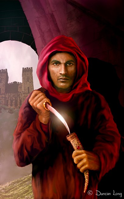
Book Cover Illustration for Steven Barnes’ Assassin

Book cover illustration for Steven Barnes' Assassin - artwork by Duncan Long

Here’s a sneak peek a the new book cover illustration I did a few days ago for Steven Barnes’ novel Assassin. The book comes out in November (2010) from ISFiC Press.

I won’t give the plot away, but the story basically deals with the class of cultures during the Middle Ages. With that in mind, I “built” a Crusader’s castle in the background while having the central character, an assassin preparing for a surprise attack, lurking in the shadows in the foreground.

=====================
Duncan Long is a freelance book cover illustrator for HarperCollins, PS Publishing, Pocket Books, Solomon Press, Fort Ross, and many other publishers and self-publishing authors. See his cover illustrations at: http://DuncanLong.com/art.html
=====================
Tags: , , , , , , ,

Comments Off on Book Cover Illustration for Steven Barnes’ Assassin

Two New Book Cover Illustrations Waiting for Adoption

Book cover illustration waiting for adoption - Summer Storm

OK. I just did these for fun. But I’m hoping sometime each of these illustrations will find its way onto a book cover. Until then, hopefully they’ll bring a little amusement to readers of this blog as well as those who visit my online galleries. Above is “Summer Storm” and below is “Lisajen’s Top Hat.”

Book cover illustration waiting for adoption - Lisagen Top Hat
=====================
Duncan Long is a freelance book cover illustrator for HarperCollins, PS Publishing, Pocket Books, Solomon Press, Fort Ross, and many other publishers and self-publishing authors. See his cover illustrations at: http://DuncanLong.com/art.html
=====================

Tags: , , , , , , , , , , ,

Comments Off on Two New Book Cover Illustrations Waiting for Adoption

The Tipping Point for Ebooks?

Manufacturers and publishers have been jockeying for the best positions in the steadily growing ebook market. Most publishers are now selling ebook versions of their titles, and some are selling in serious numbers.

Amazon.com has expanded its reader/client base by offering aps that allow reading Kindle-format ebooks on iPhone, Blackberry, iPad, Android, and PCs/Macs — or the Kindle reader. The aps are free and I suspect this is a good way to sell books.

Meanwhile the price of ebook readers continues to drop. I’ve always maintained that ebooks would take off when you could go to Walmart and buy a reader for under $100. That day is approaching with Target and others offering ebook readers with price tags hovering around $120.

We’re almost to my Walmart/$100 price line of demarcation.

It will be interesting to see if my theory is right. If so, we may see a sudden boom in the publishing industry, with a wealth of out-of-print titles as well as many new titles made available to those reading titles on one or another type of ebook reader.
=====================
Duncan Long is a freelance book cover illustrator for HarperCollins, PS Publishing, Pocket Books, Solomon Press, Fort Ross, and many other publishers and self-publishing authors. See his cover illustrations at: http://DuncanLong.com/art.html
=====================

Tags: , , , , , ,

Comments Off on The Tipping Point for Ebooks?

Spirit of Empire now available online.

detail from Spirit of Empire - book illustration by Duncan Long

Got word today from Lawrence P. White that the web page for his novel Spirit of Empire is now online. In addition to being able to order the book, visitors can also read a sample chapter.

I still have trouble getting used to the notion that I can finish a book cover illustration (and layout, in this case), send it to the publisher almost instantly via the web, and have the book available for sale a week later.

We live in amazing times.

=====================
Duncan Long is a freelance book cover illustrator for HarperCollins, PS Publishing, Pocket Books, Solomon Press, Fort Ross, and many other publishers and self-publishing authors. See his cover illustrations at: http://DuncanLong.com/art.html
=====================

Tags: , , ,

Comments Off on Spirit of Empire now available online.

Paul M. Strickler Purchases Rights to “Magical Contact”

The Magical Contact - a book cover illustration by illustrator Duncan Long

Paul M. Strickler has purchased the book cover rights to “The Magical Contact” for the cover of his new novel The Spiritar.

This illustration has become a favorite for many viewers (and is a favorite of mine as well). It’s nice it has found a home on Strickler’s novel.
=====================
Duncan Long is a freelance book cover illustrator for HarperCollins, PS Publishing, Pocket Books, Solomon Press, Fort Ross, and many other publishers and self-publishing authors. See his cover illustrations at: http://DuncanLong.com/art.html
=====================

Tags: , , , , , , ,

Comments Off on Paul M. Strickler Purchases Rights to “Magical Contact”