The Right Typeface for a Book Cover

Period piece book cover illustration and graphic design by Duncan Long

Picking the right typeface for the lettering on a book cover can be key in getting sales as well as presenting a professional appearance to potential buyers.

One of the mistakes many cover designers make (and especially self-publishing authors) is to select type that calls attention to itself. At first blush this seems a good choice. Often it’s not because instead of drawing the reader’s attention to the title or author’s name, such type becomes its own center of attention.

For most cover work, the best typeface is “invisible” to the viewer, presenting the words without getting in the way of the message. That means pretty much standard sans and serif fonts are generally first choices as typefaces for a book.

That said, there will be occasions when a special type may work. Genre fiction and historic novels can both accommodate more ornate type to advantage. For example science fiction, horror, or fantasy titles might all use appropriate fonts rather than the tried and true sans and serifs. And an old grungy typewriter font for a novel set in World War II or a mystery set in the 1950s can be the perfect choice.

But generally it’s best to go with an “invisible” font. If you look at the catalog of most large publishers, you’ll see that’s what they do. And they do that with good reason. It works. It sells books.

If you do need a special typeface, two good sources are :

http://www.abstractfonts.com/
and http://www.dafont.com/

The plus of these sites is that they are constantly updating and also give you a pretty good idea of whether the typefaces have restrictions on their use or not — an important consideration if you’ll be using the types for commercial purposes. Very important, in fact. Because if you don’t have the rights secured for the typeface you use, the press printing your title may not go through with the work and/or you might be taken to task by the typeface designer for using the font without permission. While lawsuits over typeface use are relatively rare, they can occur. And you don’t want to be one of those rare cases, right?

So pay attention to the rights associated with any font you might be using on the cover or inside a book you’re publishing.

And when in doubt, go with a tried and true standard typeface that doesn’t call attention to itself.

Here are some tried and true typefaces often employed in the publishing industry: Giovanni, Meta, Stone, Giovanni, Garamond, Bembo, Granjon, Garamond, Poynter, Franklin Gothic, Helvetica, Utopia, Times, Nimrod, Century Old Style, and Interstate.

These may not be perfect for the book cover you’re designing. But for about 98 percent of the time, a designer will be safe choosing one of these types for a book cover.

=====================
Duncan Long is a freelance illustrator and sometimes book cover designer. Among those using his work are HarperCollins, PS Publishing, Pocket Books, Solomon Press, Fort Ross, Asimov’s Science Fiction Magazine, and many other publishers and self-publishing authors. See his magazine and book cover illustrations at: http://DuncanLong.com/art.html
=====================

Tags: , , , , , , , , , ,

Comments Off on The Right Typeface for a Book Cover

A Fun Illustration

I’m often asked how in the world I can produce so many illustrations — and one questioner recently suggested perhaps I started my career at age three.

That may not be far off the mark. My parents can attest that I did start at about three, but it was more caveman sketching on my poor parent’s walls. And I would also suggest that one secret for producing lots of artwork is to not have a life.

But seriously now folks….

I simply love to write and draw. If you do what you love doing, over time you have a lot to show for your efforts. And being a writer/illustrator is a dream come true; it is my entertainment, at least until my brain is worn frantic and my body no longer able to “stay in the saddle” to create more work. The time I have to spend doing other things is just generally not nearly as much fun or satisfying.

So I gravitate to the computer and digital tablet, and my entertainment there translates into more production, plain and simple, with or without a client to immediately purchase what I’ve done.

That said, the picture above is one of my recent “for fun” creations: “Midday Dream.”

–Duncan
=====================
Freelance illustrator Duncan Long loves his work. He often creates illustrations and cover layouts for self-publishing authors using CreateSpace, Lightning Source, or other presses and POD services. See more of his book cover illustrations and graphic design work at: http://DuncanLong.com/art.html
=====================

Tags: , , , , , ,

Comments Off on A Fun Illustration

CD and DVD Illustrations

CD Album Cover Illustration by Illustrator Duncan Long

While the majority of my work these days entails the creation of book cover illustrations, I do on occasion create an illustration (and sometimes the lettering) for CD and DVD covers.

With this work in mind, Unified Packaging gave me a very nice interview as their “Designer of the Week” in their Let Me See Your Package blog.
======================
Duncan Long is a freelance illustrator who occasionally creates illustrations for CD and DVD covers. You can see examples of his CD cover illustrations at Duncan Long.com.
======================

Tags: , , , , , , , , ,

Comments Off on CD and DVD Illustrations

The Secret of Getting Into Print

The Siren - Book Cover Illustration by Book Illustrator Duncan Long

If you’re in any business long enough you become aware of the various cycles things go through. Fads come and go, business is frantic for a few years and then it slows. Booms are followed by busts. That’s how business works, and publishing is no exception.

Recently publishing has taken a nose dive along with much of the world’s economy. And publishing has been hit doubly hard this go around due to the advent of ebooks (and the piracy digital media can bring) as well as the gradual decline in the percentage of the population that actually takes the time to read a book or magazine rather than graze through web articles.

One way presses cut back during economic slow downs is to buy less work from relative unknowns. That makes a downturn especially tough for those trying to break into publishing whether writer, editor, or illustrator.

Yet in good times and bad, people get their work published. Even relatively unknown artists and writers. And whether the economy is racing ahead or swirling down the toilet, the trick for breaking into print is pretty much the same: Just keep beating the bushes for a press that wants the work you do.

So that that brings me to the secret for getting into print, observed after a couple of decades in the publishing business. It is painfully obvious, yet I find those new to publishing do their best to ignore it: It isn’t how talented you are that gets you into print as much as it is how persistent you are. If you keep trying, that makes all the difference.

Sure, talent helps. Starting with modest work in smaller publications and working your way to the top is always wise. But there’s a point where talent falls off and persistence becomes the virtue you need. And for every talented writer or artist who gave up never to be published, I can show you bunches of less talented men and women who ignored one rejection letter after another, until finally they got into print.

These eventually successful folks send their portfolios and manuscripts to publishers and, when an editor or art director leaves a publishing house, these persistent writers and artists send the very same work (previously rejected) right back to the same publisher knowing new eyes will see it.

The folks that eventually get into print try all sorts of presses. They find out when a new publisher is starting out and looking for new material. No stone goes unturned.

And sooner or later, these persistent folks meet with success.

So if you want to get into print and you’ve taken the time to hone your talent, the system is simple. You just keep on keeping on until someone finally says, “Okay, we’ll print that.”

Want to get into print? Ignore all the no’s and keep trying until you hear a yes. Each rejection slip just takes you one step closer to that final press that will decide to print what you’ve submitted. All you have to do is find it.

=====================
When not revealing the deep, dark secrets of publishing, Duncan Long is a freelance writer/illustrator who has created book cover illustrations for HarperCollins, PS Publishing, Pocket Books, Solomon Press, Fort Ross, and many other publishers and self-publishing authors. See his book cover illustrations at: http://DuncanLong.com/art.html
=====================

Comments Off on The Secret of Getting Into Print

One Last Variation

Binary Suns Variation 2 - BW illustration for inner pages of book

A B&W variation of the illustration from two posts ago — and the last of this group for those who are getting bored. Often adapting color illustrations to B&W makes it possible to illustrate the inner pages of a novel or other book without the added expense involved in producing colored pictures.

I find that B&W often adds a very different feel from color versions of an illustration as well.

=====================
When he’s not creating black and white illustrations for use as artwork on the inner pages of books, Duncan Long is a freelance book cover illustrator for both major publishers as well as self-publishing authors. You can see more of his book cover illustrations at: http://DuncanLong.com/art.html
=====================

Tags: , , , , , , , , , ,

Comments Off on One Last Variation

Because It Was There (In My Mind)

Escape perhaps a book cover illustration by Duncan Long

Another “for entertainment only” illustration.

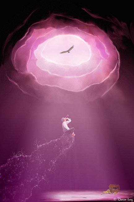
Why is the pirate sitting on a pile of electronic parts with roots growing from the mechanisms?

Why is he drinking wine (and ignoring that treasure chest in the shadows at the lower right)? And why has the rock opened overhead and a buzzard appeared, floating in the sky?

Answer: Because that’s how they were in my mind. Sometimes that’s just the only reason for painting what I paint. Just because.

I have named this painting “Escape.” Read into that name what you will.

For all those art critics out there, I know that this hole with the sunlight streaming in over a huge cavern isn’t overly original (though hopefully the colors and pirate make it unique). However it proved a good exercise in painting in streams of light, dark/shadow contrast, and so forth.

Now go and make up your own story to explain the painting.
====================
When he’s not creating artwork because it is there, Duncan Long is a freelance book cover artist and book and magazine illustrator. You can see more of his book cover illustrations at: http://DuncanLong.com/art.html
====================

Tags: , , , , , , , , ,

Comments Off on Because It Was There (In My Mind)

Young Lords of Siyah Chan

Book cover artwork for Joan C Wrenn - Mayan book

I got word a few days ago that Joan C. Wrenn’s Young Lords of Siyah Chan: A Novel of the Ancient Maya is now in print (and available from Amazon).

I painted the cover illustration for this book, and it was a unique challenge. The author wanted a picture that reflected a Mayan mythological story, and that part of the project was pretty straight forward. The challenge came in capturing the look of ancient Mayan art while giving it some depth and realism.

The author supplied me with a photo of the depiction of the original mythological story in a Mayan hieroglyphic/relief sculpture from Yaxchilan. It showed a stylized scene of a woman burning blood-soaked bark with the smoke rising from the flame to form first a serpent and then an ancestor who appears from the mouth of the creature.

Yes, it took a number of tries for me to get this to work to everyone’s satisfaction.

The final cover version has (to me at least) sort of an Art Deco feel coupled with the colors that were likely used in Mayan artwork (sadly most of the examples of this people’s art has lost its bright paint so the colors often have to be guessed at).

I was waiting to see what sort of lettering would be used on the book. It is often tempting to choose a typeface that mimics ancient script with a historic novel. Sometimes that works — but often it does not. Fortunately a sans type was chosen and I think it works perfectly by being “invisible” and not calling attention to itself, allowing the reader to quickly grasp the title and also the book cover with any distractions from the typeface itself.
=====================
Duncan Long is a freelance illustrator who has done book cover illustrations for HarperCollins, PS Publishing, Pocket Books, Solomon Press, Fort Ross, and many other publishers — and self-publishing authors. See his book cover illustrations at: http://DuncanLong.com/art.html
=====================

Tags: , , , , , , , , , , , ,

Comments Off on Young Lords of Siyah Chan

Reworking Illustrations

Binary Suns - Book cover illustration by book cover artist Duncan Long

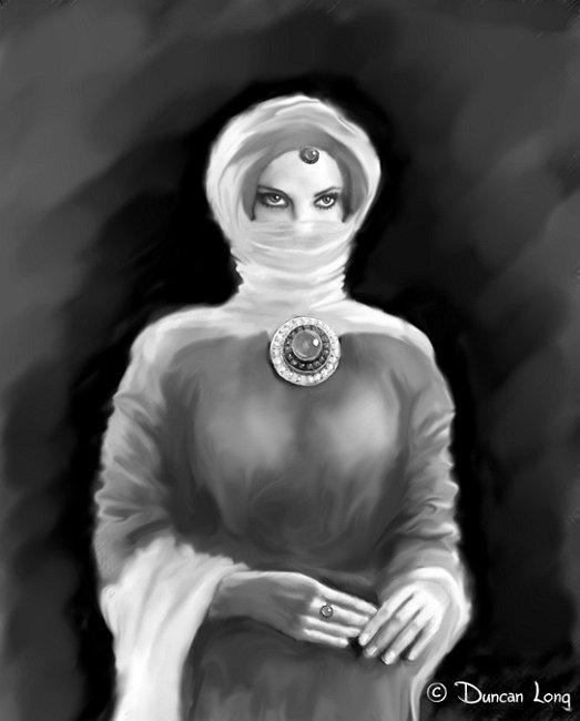
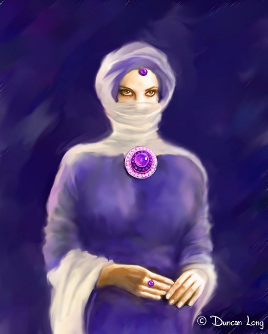
Digital painting presents almost unlimited possibilities for variations on a theme. The picture above is one such variation, a more painterly version/portrait of the figure from yesterday’s post.

=====================
When he’s not creating artwork for his own enjoyment, Duncan Long is a freelance book cover illustrator. You can see more of his book cover illustrations at: http://DuncanLong.com/art.html
=====================

Tags: , , , , , , , , , ,

Comments Off on Reworking Illustrations

Today’s Book Cover Without a Home

Binary Suns - Book cover illustration by book cover artist Duncan Long

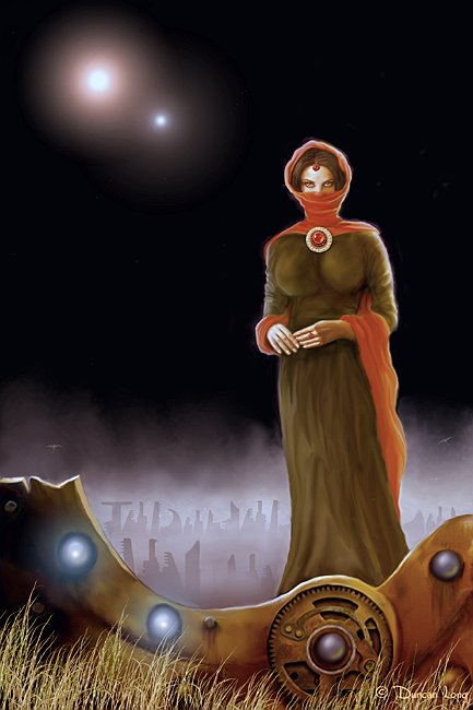
Sometimes an artist just has to create what’s rattling around in his brain. This is such artwork… An illustration without a home (as of yet).

Binary suns. The suns are mirrored in the glowing globes in the forgotten mechanism at the base of the painting, and in the broach and forehead jewelry of the heroine.

Other elements in the painting simply appeared, painted in because they seemed to belong. These include the distant buildings (or are those tombstones?) and the spray of grass across the front of the mechanism that has been torn apart by some ancient force.

What is the story here? Your guess is as good as the artist’s. Let your mind create the story to explain what you see.

I am never quite sure whether such artwork is done for fun or because of an unnatural compulsion that forces the artist work, throwing other projects to the wind (and letting the lawn care slide). There is a drive that must be realized, pushing ahead reproduce the picture that has sprung full-grown in the mind. (In this case, the mind’s eye view was initiated by a rejected sketch for a character on an actual book cover.)

This suggests that at least sometimes creativity is perhaps more illness than good mental health.

Yet what other compulsion leaves behind pleasing results? Perhaps then some mental illness is creativity derailed.

At any rate, it seems that artwork is often an enigma as mysterious to the viewer and the muse as it is to the artist who created it.

Now it’s time to get busy doing some real work to pay the bills.

=====================
When he’s not creating artwork for his own enjoyment, Duncan Long is a freelance book cover illustrator. You can see more of his book cover illustrations at: http://DuncanLong.com/art.html
=====================

Tags: , , , , , , , , , , , , ,

Comments Off on Today’s Book Cover Without a Home

Advice to Authors: When to Ignore Book Reviews

Time to Mourn - book illustration by book illustrator Duncan Long

I recently read an interesting blog posted by Jo-Anne Vandermeulen (here). Vandermeulen was a bit taken aback by a “reviewer” on Amazon.com who suggested the author tooted her horn too much in her book Promotional Tips for Authors.

What an odd criticism. If ever there was a books in which an author should “toot her horn,” this would be it.

Just between you, me and the lamp post, I’ve been in the book business for several decades now, and if there’s anything that too often is true, it is that, “Those who can’t write, write harsh reviews.”

My advice? Pay the same respect to their criticism that you might extend toward your pet poodle after it had an accident in the front room.

Now don’t get me wrong. There are good, professional reviewers who offer fair and sometimes even helpful advice. Sometimes what they offer in way of criticism is helpful and should be taken to heart. And it never hurts to re-consider what you’ve done and how you might do better.

Likewise, there are books that that really are a waste of ink and deserve the slings and arrows of the critic.

But all that said, there really are too many reviewers (especially those who can only get “published” in the product review sections of Amazon.com) who are simply mean-spirited, jealous twits who get their jollies by tearing others down. (I suspect many of these people are so immature in their social/psychological development as to have trouble distinguishing authors as being real people, instead objectifying them as something rather that as a sensitive person of flesh-and-bone. Thus they will say just about anything with little thought to the damage they may cause.)

The second point is that authors today have to promote their own books in order for that title to succeed. Today even major publishers budget little or nothing to promote titles that aren’t expected to be best sellers (thereby creating a self-fulfilling prophecy). This leaves authors on their own when it comes to promoting their book.

They either toot their own horn or more than likely the book will suffer poor sales.

As Vandermeulen noted, “There’s no music if you don’t toot your own horn…. Toot your own horn, if others don’t like your music, they can always wear earplugs.”

Good advice for any author wanting their book to succeed.

As a kid, I once read a biography of P. T. Barnum. After that, whenever I feel a loss of nerve or need to promote myself but feel self-conscious about doing so, I try to put myself in Barnum’s shoes and consider how he would have handled the situation.

“What would Barnum have done” can serve an author or other person engaged in self promotion well, I think.

Of course P. T. Barnum had his critics who derided him for pandering to the masses, exaggerating what he was offering to entertain the public and so forth. Sort of like what this critic of Vandermeulen did.

Barnum did his best to ignore the critics and, in the end, he enjoyed that greatest of revenge, laughing all the way to the bank.

May the good Lord spare any author from those crazed, self-appointed Amazon.com “reviewers” who too often write with little knowledge punctuated with flourishes of poor spelling, spew their unfounded hyper-critical comments, and then deliver a quick blow below the belt with a one-star rating.

Anyone who has gone to the work of creating a book deserves better.

Until we can line these miscreants up before a firing squad, an author is well advised ignore these critics.

Unless, of course, they say something positive along the way. Then pull the quote from the mess of words and treat it as the Gospel truth. Maybe even use the quote to advertise your book.

That’s what P.T. Barnum would have done.

=====================
Duncan Long is a freelance book cover illustrator and sometimes author. In addition to teaching a college writing course and also teaching at the Long Ridge Writers Group, Long has written 13 novels for HarperCollins and Avon Books, all maligned by jealous critics who he has learned to ignore. You can see more of his book cover illustrations at: http://DuncanLong.com/art.html
=====================

Tags: , , , , , , , , , , ,

Comments (3)