Free Ebook: R. S. Guthrie’s Black Beast

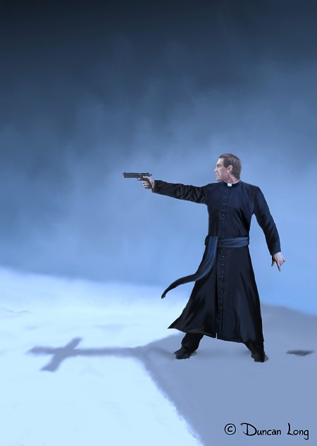
R S Guthrie Black Beast book cover illlustration by book illustrator Duncan Long

For a very limited time, author R.S. Guthrie is giving away free ebook copies novel Black Beast as a way of promoting his title. (And, yes, I painted the cover illustration for the book — shown above.)

You can receive a copy by sending him an email request for Black Beast. Here’s his email: rsguthrie@gmail.com.

Or…

You can enter the coupon code UC76X at the book page at Smashwords and dlownload the book in a variety of formats from Kindle to PDF to RTF — and about everything in between.

Free is nice.

But remember — this will only be available for a limited time. If you want a copy, ask for it right now.
====================
Duncan Long is the book cover artist who created the illustration show above. Over 1,000 of his illustrations have appeared on covers or in books from HarperCollins, PS Publishing, Pocket Books, ILEX, Asimov’s Science Fiction, Moonstone Books, and many other presses and self-publishing authors. See more of Long’s book illustrations at: Duncan’s Book Illustration Portfolio

=====================


=====================

Tags: , , , ,

Comments (1)

3 Book Cover Proposals for The Brightworking

3 book cover illustrations for Star Stone by book illustrator Duncan Long

I recently landed a contract to do the book cover illustrations for a YA trilogy from Enslow Publishers, Inc. Written by Paul B. Thompson, the series is “The Brightstone Saga,” with the first book titled The Brightworking.

The final cover is shown above.

But it took three stabs before we arrived at it.

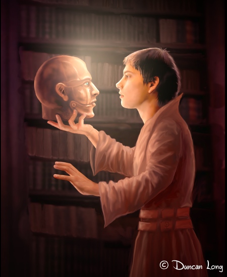
The basic elements were set: The young hero of the story was to be in a dark library where he discovers a bronze magical/robotic head with ivory and jeweled eyes and a hinged jaw. The two would be bathed in light to create a high contrast with the background.

My first try at the picture placed the head on a shelf with the young man reaching toward it:

First book cover artwork by illustrator Duncan Long.

The catch here was that this arrangement placed the “focus” of the illustration in the center of the book cover — and that center was basically empty space.

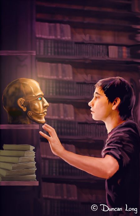
The solution was to bring them together (in what struck me as a “Hamlet Pose” — “Alas, poor robot…”):

Second book cover illustration by artist Duncan Long for Star Stone.

Now we were in the ballpark. About the only problem with that the story is set in a sort of Middle Ages type environment and the kid’s clothing looked like a contemporary t-shirt. So the final task was to paint a heavy robe over his arms and torso, yielding the final cover (at the top of this post). Also, the archway would get into the way of the title lettering, so it was decided we should drop that (it did get used for another project, as those with a keen eye will notice in the Joan of Arc blog post).

The publisher wanted to use the library background for the back cover; fortunately I was working with layers, so it was relatively easy to remove the characters from the foreground and add a color gradient to the books so they matched the final front cover illustration. That yielded the darkened books that would serve as a background for the blurb lettering on the back cover.

Once again it is easy to see the pluses of digital painting; moving the arms and heads about the composition, or removing the foreground from the background, is relatively easy with a digital painting. With actual paint, it would dictate a complete repainting of the work. And of course “shipping” the digital file to the publisher as an email attachment beats packing and shipping it any day of the week.

So pushing electrons is much easier than pushing pigments when it comes to book illustrations.

But I do miss the smell of linseed oil.

====================
Duncan Long is a book cover artist who paints with electrons. See more of his book cover artwork at: Duncan’s Book Illustration Portfolio
=====================


Tags: , , , , , , , , , , , ,

Comments (4)

8 Book Cover Illustrations for Joan of Arc

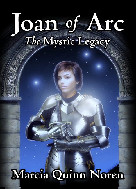
Joan of Arc by Marcia Quinn Noren Book Cover Illustration Final Version

Over the last week one of my book cover projects has been creating the cover for Joan of Arc: The Mystic Legacy by Marcia Quinn Noren. This carefully documented non-fiction book takes a new look at some of the history and experiences behind Joan of Arc.

As such, it was important to take pains in getting the sword and armor as accurate as possible for the cover. The other consideration was to capture the almost magical feel that some of the historic stories about Joan contain.

In an effort to give if a bit of a supernatural feel as well as connect it to her Christian roots, I boosted the outlining in the picture just a tad and used a black outline around the lettering to give things (I hope) somewhat of a stained glass window look that can often be seen in older European church windows.

(Here’s close up of a stained glass window in the Chappel of Eyneburg, Belgium that shows the “black outline” of the leading. |Photo by Lusitana].)

Chappel of Eyneburg Belgium Photo by Lusitana Eyneburg

I choose the typeface for the cover with an eye toward making it close to the historic period as possible while also being easily read by a modern audience. I also wanted a typeface that wasn’t too obtrusive, capable of giving a flavor but then “vanishing” as the viewer read the text. The best choice proved to be the “Centaur” typeface, modeled after Venetian typefaces from the late 1400s.

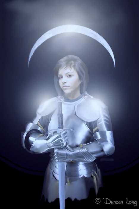
My first attempt at the book cover illustration created the face and armor that would eventually find its way to the final version. I used blue “night view” coloring plus some blur/glowing to make it appear as if her armor glistens in the moonlight.

Joan of Arc in the moonlight - book cover artwork by illustrator Duncan Long

One problem. As anyone with a little physics or astronomy under their belt can see, unless Joan is standing on her head, or is dwelling on a large satellite circling our Moon, I painted the Lunar landscape upside down. Flipping the image of the moon didn’t work, looking quite awkward.

And a full moon hinted at a vampire or werewolf story. So the moon had to go.

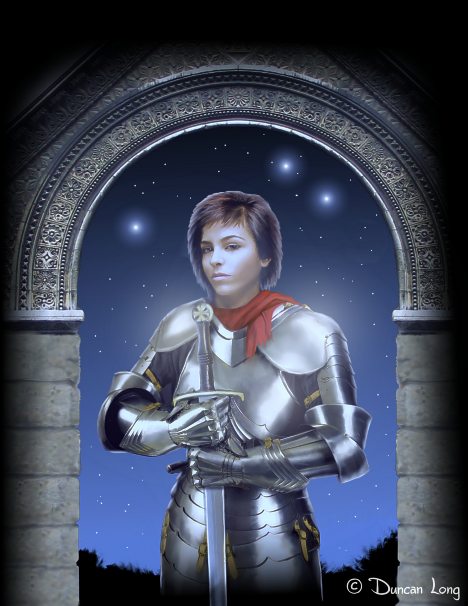
But the arch idea worked, so I replaced the moon with a stone archway, making it very ornate to offset the plain finish of her “White Armor.”

Joan in an archway with a red scarf -- book cover illustration by Duncan Long

The archway worked. The scarf (despite the notion that a splash of red should work) did not. It would vanish from here on during the next few updates.

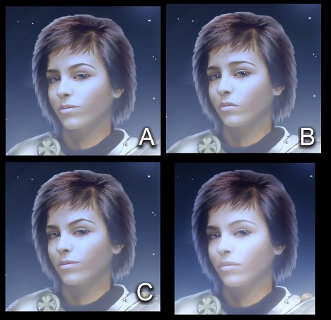
At this point the expression on the face needed to be modified. Fortunately a digital painting allows for a wide range of expressions so I created f few possibilities — the picture on the lower right was the final version (however we may still make some changes with the lips and hair as there’s some concern she’s looks too contemporary).

Book cover artwork - Faces for Joan of Arc

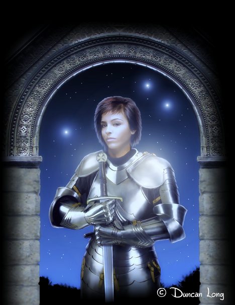
Once the facial expression was settled on, I put things together, painted in the stars, and added the metallic “moon glow” that seems to capture the spirit of the book so well. Additionally everything was shifted toward the blue end of the spectrum for a moonlight effect, even though the moon is no longer in sight.

We may still make more changes. But for now, this is the final version of the illustration:

Book Cover Artwork - the final version for Joan of Arc

=====================
When he’s not fussing with historic typefaces and armor for his book covers, or posing as Joan of Arc’s horse, Duncan Long generally can be found painting book illustrations for presses and self-publishing authors. You can see more of his book cover designs and illustrations at Duncan’s Portfolio
=====================


Tags: , , , , , , ,

Comments (16)

1001 Tips for Creating a Perfect Book Cover Illustration (Give or Take 991)

Lead Me Not book cover by book cover illustator Duncan Long

Working with an illustrator or artist for your book cover is a big deal! From my own experience, a book’s cover is a buy or not-buy scenario. Book covers attract buyers or give off a ho-hum vibe. The book cover is the first thing a reader sees — and can be the last if it is a poor cover.

Here’s an article that gives the scoop on creating a kick-butt book cover illustration.

Comments Off on 1001 Tips for Creating a Perfect Book Cover Illustration (Give or Take 991)

Book Cover Artwork: Angel Unawares, A Novel

Book cover artwork for Carol Jackson's Angel Unawares novel.

Here’s the book cover for Carol Jackson’s Angel Unawares, A Novel. Carol works in a TV studio, and part of her story takes place in a studio, giving the reader some behind-the-scenes insights into the workings and politics of a station.

The story is based in 1983, so with Carol’s guidance and excellent suggestions, I created the book cover artwork with an eye toward the dress and equipment of that day. And I’m proud to say that the 1970s camera on the cover is a very precise painting of the real thing (which was marketed by RCA and quite popular during its day).

An appropriate typeface and layout (which I also handled) completed the book which is now available in a variety of ebook formats from SmashWords and promises hours of great reading.

====================
Duncan Long is a book cover illustrator who loves his work. You can view more of his artwork at Duncan Long’s Book Cover Portfolio
=====================


Tags: , , , , , ,

Comments (4)

3 Book Cover Illustrations for Knights of the Chosen

Knights of the Chosen book cover illustration.

Knights of the Chosen -- final book cover illustration.

The illustration above is for one of the projects we’ve been working this week. As you can see, this is the book cover artwork (with lettering) created for Lawrence P. White’s Spirit of Empire. series, this one titled Knights of the Chosen..

Here’s one of the early sketches which established the sky/ground pattern that would become a part of the picture — but which had a figure that proved a little too Art Deco to work. And the picture also failed to convey the idea of a science fiction novel.

Early sketch for Knights of the Chosen book cover.

Early sketch for Knights of the Chosen book cover.

This progressed to this picture (below) — which would become the basic idea. However the dress of the character a bit too glamorous, and the character also didn’t wear jewelry in the book. So we lost the earrings and put her in a tank top with the logo for this series stenciled on it’s front. Then I added a gun to her side. And we pretty well had the cover wrapped up.

Knights book cover illustration version 5

Book cover illustration version 5.

The last hitch was the spaceship which was needed to establish the science fiction feel (along with the typeface which helped considerably). Fortunately the author was willing to be flexible on this design so we finally ended with a spaceship that is interesting and different albeit not exactly like those in the book. Artistic license.

Put it all together and what have you got?

In this case the illustration at the top of this post. It was a wild ride getting to the finished cover, but a whole lot of fun as well, and doubly so given the pleasing result.

====================
Duncan Long is a book cover illustrator who loves his work. You can view more of his artwork at Duncan Long’s Book Cover Portfolio
=====================


Tags: , , , , , , , ,

Comments Off on 3 Book Cover Illustrations for Knights of the Chosen

3 Questions and More Answers Than You’ll Want to Read

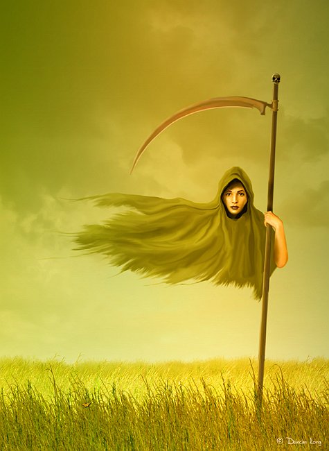
Book cover illustration: Death Wore a Minishroud by Duncan Long

Book cover illustration: Death Wore a Mini-Shroud by Duncan Long

Questions: How on earth do you get the intricacy of detail in your artwork? I understand how you could manage it with a fine brush or in pen-and-ink but how do you manipulate lines and curves? How do you get the gradations of color? I’m astonished, impressed, and intrigued simultaneously.

Answers: All my illustrations are done on a computer workstation (current an HP), inputting my “painting” by working with a Wacom digital tablet. My software is mostly Corel Photo Paint, using the oil and watercolor modes. I’ve found I can work much, much faster by cutting out the actual physical drawing or painting and going directly to pushing pixels on my PC. This also makes sending sketches as well as the final book cover illustrations to clients much easier (generally as email attachments).

Some of the gradations of color in my artwork are simple gradients where the computer does most of the work after I’ve chosen the color extremes for it to work from (I often to into the picture afterward and add some fog-like swirls to keep things interesting). But most of my color blending is done by hand, painting with virtual brushes that add just a little color with each stroke. I then use a blending “brush” to average out, shade, and adjust elements in the painting.

(I should note that these are virtual brushes within Photo-Paint; the digital tablet stylus is basically like an ink pen; the software transfers the actions to something similar to a spray can or paint brush depending on what I select. I use an old version of the Photo-Paint (version 8 — current version is 15); it doesn’t have a lot of brushes, but it has a handful that work well and those serve all my needs for the most part as I create my book illustrations.

The computer can create very straight lines — but generally I avoid those for more natural-looking hand drawn lines. Often I have to go in and roughen lines to keep them looking like a part of a painting.

Some of the detail in my illustrations (in grass, trees, stars, or other repeated patterns needing a more or less random effect) is achieved by creating the basic picture of blades of grass or trees and then converting them into a series of “spray” images that can be randomized to make for a more natural appearance as they are laid down over the painting.

With hair, I often employ a wide-bristle “brush” as well as a wide bristle blend “brush.” These take a lot of adjusting to get right, and I have come to think the ideal portrait would be of a bald subject.

Finally there is a whole lot of grunt work in painting my artwork (ha). But the computer makes all of it a lot faster and more precise than would be the case with actual paints.

Oh… Almost forgot. My most important tool. It often proves to be the undo key (control-z).

====================
Duncan Long creates book cover illustrations from electrons — though many people mistake them for oil paintings or the like. You can view more of his artwork at Duncan Long’s Illustration Portfolio
=====================


Tags: , , , ,

Comments (3)

7 Variations on a Book Cover Illustration – Sneak Peek

Nearly final book cover illustration for Wired by Douglas E. Richards.

Nearly final book cover illustration for Wired by Douglas E. Richards.

Generally book covers result from a sketch or two, one of which strikes the publisher’s fancy, and from there the illustrator starts polishing the idea, working his magic to create the final book cover artwork.

But there are projects where an seemingly endless number of ideas get tossed around before finally reaching the finish line. And the work toward creating the cover for Douglas E. Richards’ techno-thriller Wired proved to be such a project.

Going into the project, we were pretty sure we wanted a pattern of neurons (and Douglas had secured a reference photo of these which we used throughout the project). And a figure. We started with a somewhat garish blue version of the neurons with faces or figures weaved into them. None of these were too great, so I changed course with a series of gray/black pictures with the neurons having an embossed look to them. Here’s one of the better of those efforts:

Book cover artwork with embossed neurons.

A proposed cover having embossed neurons in the background and an armed man in the foreground.

After a whole series of these (with a man, woman, man and woman, and helicopters) we decided to scrap the gray/black idea and turned to the idea of a woman rather than a man on the cover.

Studies have found that while men tend to look more closely at a book having a woman on the cover, women tend to divide their attention equally between a male and female figure. So while ideally you might have one of each on a cover, when working with an ebook format where there’s less room and ideally one figure, it’s often best to go with a female rather than a male (in theory at least).

Since Douglas’ book has both a strong male and a strong female character, we opted to put a woman on the cover.

Here’s one of those. And she’s sadly buried inside the neurons in this version:

A female character book cover illlustration.

A female character -- buried in neurons -- in this book cover illlustration.

So next I created several illustrations where the female was brought to the forefront of the cover:

Book cover illustration with single female charter in the foreground.

Version of the book cover illustration with the female charter in the foreground and a helicopter in the distance.

Another version with the female character in the book cover artwork.

Another version of the book cover, this time with the neurons in the titling text.

These seemed to be a little generic, so we returned to the figure in the thicket of neurons which everyone giving us input on the illustrations had seemed to like at least a little.

Book cover illustration with female in a thicket of neurons.

Another book cover illustration with female character, this time in a thicket of neurons.

The blue seemed a bit garish in this version, so we returned to the earlier greenish blue version of the neurons but this time exposed more of our female character. This would eventually become the final cover (and I should note that the quote over the title in this version is just a placeholder for the final quote).

The final version of the book cover artwork for Wired.

The final version of the book cover artwork for Wired.

Throw in the 20 or so sketches I haven’t shown here, and that’s all there was to it (ha). But that said, I don’t regret all the extra work on this project because I learned a lot, and we also ended with a beautiful cover (in my humble opinion) which always makes all the blood, sweat, and tears that go into creating such a cover illustration seem more than worthwhile.

====================
When he’s not creating endless variations on a book cover illustration theme, Duncan Long can still be found at his computer creating other artwork of one sort or another. See more of his book cover artwork: Duncan’s Portfolio
=====================

Tags: , , , , , , ,

Comments (1)

Rainbow In the Flames Is Now Available

A book cover illustration and artwork by Duncan Long.

I received word that Linda Franklin’s Rainbow In the Flames is now available at the author’s web site.

Rainbow in the Flames is not only the touching survival story of young Jed Franklin’s courageous uphill battle, physically and emotionally, from a severe burn injury, but it also includes the struggle of his parents to relate to their life-altering reality. Laugh and cry with the Franklin Family as they take their first steps toward healing.

It’s always a joy to create a the book cover illustration and layout for an inspirational title like this. And it’s even better when it gets into print.

(You can read more about the creation of this book cover illustration and other graphic elements that went into the cover design in my previous blog post.)

====================
Duncan Long designs book covers and also creates book cover artwork. You can see more of his book cover artwork at his Portfolio
=====================


Tags: , , , , ,

Comments (2)

The Adventures of Dod Book Cover

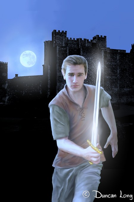
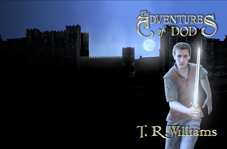
The cover illustration for the YA novel Adventures of Dod by T R Williams.

Here’s the book cover illustration I recently finished for The Adventures of Dod by Thomas R. Williams. One of the key features we aimed for from the start was to have a sword glistening in the moonlight. Toward that end the positioning of the castle, figure, sword, and moon became very critical, especially if the moon were to show without being covered by the rather long title.

Our other important goal was to create a YA book cover that hopefully will attract both boy and girl readers, while also hinting at the genre (in this case, fantasy). Girls are generally more apt to read a book with a boy on it than are guys to read a book with a gal, so we opted for a cute-looking fellow that female readers in this age group will hopefully find attractive. And of course running with a sharp object will always appeal to anyone having a Y chromosome.

To compliment the stark appearance of the cover we used a rather flowery typeface that hopefully reinforced the genre while not making the cover too difficult to read. (I am always a little worried about using anything other that a simple sans because potential buyers often give a book only a glance — so it has to convey its message quickly and easily to get a sale). But with genre novels it’s sometimes necessary to convey the feel of the book with the typeface. And this seems to be such a case.

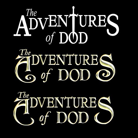
Here’s the progression of the title from an early white lettering design (that while interesting as a graphic design experiment, didn’t work as well as hoped), to a version that worked but was a bit too flowery (the client felt) for boy readers, and on to the final version which had the A and S de-looped a bit.

Early book cover title artwork to better to best and final illustration for the cover.

The final “typeface” is actually comprised of three different faces, one for the A and S of “adventures” and the T, R, and W of the author’s name, another for the other text within these, and then an italic from a third typeface for “The” and “of.”

Normally this sort of mash-up would be a big no-no, but it seems to work well with this title and the fantasy genre.

The Book cover artwork in the final wray-around form with title lettering.

Finally, after the front cover was in hand, I painted the castle on around the spine and the back of the cover for a “wrap-around” design. One trick here was that since the publisher didn’t have the page count yet making the spine width unknown, I extended the illustration an extra inch or so off the left of the picture thereby giving the cover designer enough extra to trim it to the proper dimensions during layout.

And there you have it.

UPDATE: The typefaces on the final version of this cover will be changed. I’ll post the updated cover later.

====================
When he’s not fussing with typefaces and fretting over conveying the genre through his book cover illustration, Duncan Long can be found during most of his waking hours slaving over a hot digital tablet with a crazed grin on his face. More of his book cover illustrations can be found in Duncan’s Portfolio
=====================


Comments Off on The Adventures of Dod Book Cover