Some time ago my author friend Karen S. Elliott had some questions that led to some answers that might be of help to other writers needing a book cover.
She asked, “What could writers do to make your job easier? Better description of what they want? Do they even know what they want? What’s the worst problem you ever had with a writer?”
I’ll answer these questions as if the illustrator you’re working with is a guy. This is not to say guys are better artists or that you don’t want to hire a gal to do a book cover for you. It’s just easier for me to write with one or the other, and so I’ll use “him” and “he” with that caveat to the reader.
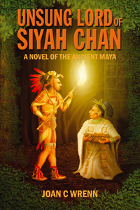
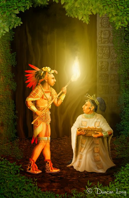
That said, I think the main thing for writers to understand is that the illustration’s job is basically just to get someone interested in the book so they pick it up (or read a catalog entry) and get interested in buying that title. The cover has to be simple so it can convey its “read me” message with just a glance. That means maybe a character or two can be there with the proper color, lighting, and lettering to set the stage of mood and genre the book falls into.
So the cover needs to stay pretty simple.
Consider: A book is like a movie; it can have a cast of thousands; it can span centuries. The book cover is like one frame of that movie. It is just a tiny part, a brief flicker. It can’t tell the whole story of the book, and trying to make it do so is a study in frustration..
That seems obvious, yet too often writers want all the story elements in the book on the cover, and it quickly becomes a hodgepodge. And nothing causes folks to pass on a book instead of picking it up, than a confusing cover that can’t be understood at a glance. The cover can hint at what’s in the book; it can’t tell the viewer that the character is going to do for the first 100 pages.
I know that sounds simple. But sadly writers often miss this obvious thing (and part of my job is to try to educate them about this — often I don’t do this as well as I should).
When an art director, publisher, or writer approaches the illustrator about doing a cover, it’s generally best to have a scene in mind. Don’t say, “Well, you’re the artist. Read my book and just do your thing.” Unfortunately illustrators are on tight deadlines and don’t have time to read an entire book. But worse, invariably the artist’s key scene will be at odds with the publisher’s. So almost always (at least in my experience) this seems to waste a lot of time and get us all back at the starting line when the dust clears.
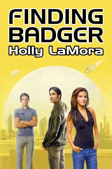
Consequently, it’s best to have an idea of what sort of mood you need to establish, what the main “scenery” of the story might be, and what your character looks like. Usually (especially with smaller ebook covers these days) you just will want one or two characters at the most on a cover, and ideally a “close shot” that shows their faces and upper torso rather than their whole bodies. Otherwise you lose a lot of details and don’t really get a good feel for the characters.
You might tell your illustrator, “The main character needs to look like he lives in the European Middle Ages, he should be wearing rusty armor, and his hair is long and stringy. He’s tired and sitting down looking depressed. And maybe there’s a dragon flying off in the distance.” That would give you illustrator something to go on and from there he’ll ask you questions to learn what he needs to know to get started on the first sketches he’ll present to you.
Also be sure you tell the artist how old the character is, ethnic type, hair color and length, and any other key details. Your artist is not going to be happy if he’s spent hours on a painting of a blond Nordic warrior only to discover your hero is from Morocco with short black hair and an eye patch, and just happens to be hanging out with Vikings. The sooner your artist can zero in on things, the happier he’ll be and the sooner you’ll have your cover you need.
Sometimes writers have a “picture” of who the character is in their mind. If you’ve been writing and picturing a well-know actor as playing the part (in your mind’s eye), tell your artist that it would be nice if the character looked a little like that person. He can’t give you a perfect portrait of the actor (due to copyright considerations), but it will get the artwork into the right neighborhood.
On the flip side of that, remember that when the artist creates their version of the picture, it isn’t going to jive perfectly with how you’ve pictured it in your mind. But unless it really goes against the storyline, try not to dictate unnecessary changes. If you don’t write in the book that the guy’s eyes are blue, don’t be upset if they’re green. Or if he has more or fewer muscles than in your mind. Or his armor is bluish steel instead of silver. Or the distant dragon has horns when you didn’t picture it that way.
If something in the picture is different from how you pictured it, but it doesn’t make a difference to the story, then go with the flow. You and everyone will be a lot happier in the end.
In the digital age it’s possible to change all sorts of things: Colors, layout, you name it. But that doesn’t mean changing things will always be for the better. Remember that your illustrator has given a lot of thought to the layout before you even see they first sketch. He’s working to make the picture the best he can and also working to make it show off his best skills and minimize the things he’s not so good at painting.
That means you should never ask for changes unless you’re really sure they might improve things. Sometimes client’s make great suggestions for changes, so if you feel strongly, the artist will appreciate it if speak up. But also be prepared to listen to your artist if he says, “I don’t think that would work, because…” You’re paying him big bucks to do the work; you need to do your best to let him do his best. Micromanaging artwork is a quick way to drain the life from it.
Just as (hopefully) you don’t tell your plumber how best to tighten a pipe or fix a leak, you also need to stand back and let your artist do his thing in the most efficient way he knows how. He’s spent a lot of years honing his skills; let him give you his best. You’re paying big bucks to your illustrator; let him be free to deliver his best.
There’s a point where you need to delegate the work and let your illustrator do it with as little intervention as possible. I know that’s easier said than done, and you do need to give some direction and be sure the picture is turning out the way you want. But try not to micromanage.
Sometimes near the end of a project there will be choices to make: Is this typeface or that lettering better? Would the picture be better if it was flipped horizontally? Should the character be a little closer or a little more distant?
When you get to this point — there’s really no bad choice. You’re choosing between good choices because you’ve reached a point where all the possibilities are going to work. In other words, you can’t make a wrong choice. Just to go with what looks best or let your artist decide. Just be careful you don’t get caught in that endless loop of endless adjustments and changes that do little to improve things but can waste a lot of time all the way around.
I’d say that it’s always a good idea to have an illustrator do the work for you with a contract that has spelled out the amount of pay, whether there will be royalties (generally illustrators get a flat fee and no royalties, by the way), and what rights you’re getting. If there’s no contract, US courts generally assume that the rights the buyer gets are minimal.
If an artist offers you a contract, take it because it will likely be protecting you more than it does him. And have a lawyer look the contract over if you have even a tiny doubt about things; contracts aren’t written in stone and almost always the details can be hashed out to leave everyone happy with things. (One caveat with lawyers: Occasionally one will try to tip everything into their client’s favor, leaving the artist with no safety net if things go wrong. An artist will resent such a one-sided contract and will likely assume you’re going to be a pain to work with. So if you don’t want to loose him as a partner in producing your book, but sure your lawyer doesn’t try to steamroller him with unreasonable clauses within the contract.)
Finally, remember that under the copyright laws in most nations, the artist owns the artwork. You only buy certain rights to use that artwork from him. You don’t own the picture. You likely will only own the right to use the picture on one book cover. But if you want mouse pad rights, t-shirts, or even the right to use the picture on a series of books rather than just one, then be sure that’s all spelled out in your contract. Otherwise there can be some expensive confusion and hurt feelings all the way around due to misunderstandings.
I’ve probably made this process of creating a cover sound a lot harder than it is or maybe even terrifying. Fortunately most illustrators have had lots of experience in these things and will be happy to answer your questions and shepherd you through the process. And once you get started, you’ll find it’s a whole lot of fun seeing your cover come alive, and later a real joy to see the book sitting there on a bookshelf or in a catalog.
That’s when it will definitely seem more than worth the little trouble you went through in getting it just the way it needed to be to help sell your book.
====================
Duncan Long designs book covers and also creates book cover artwork. You can see more of his illustrations at his Portfolio
=====================
