3 Artificial Constructs

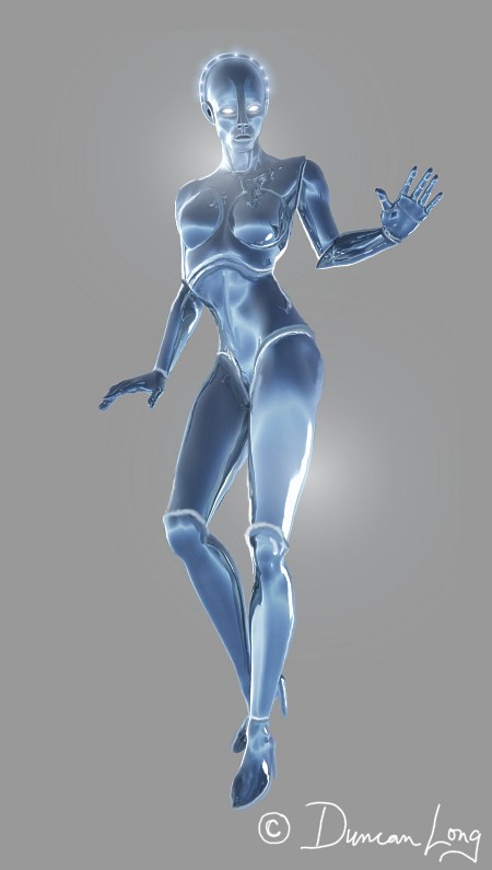
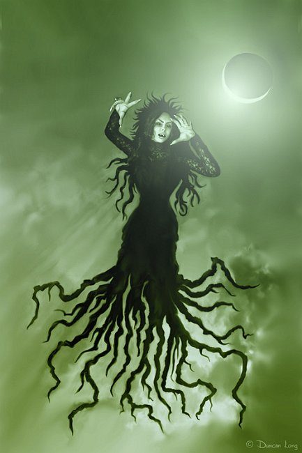
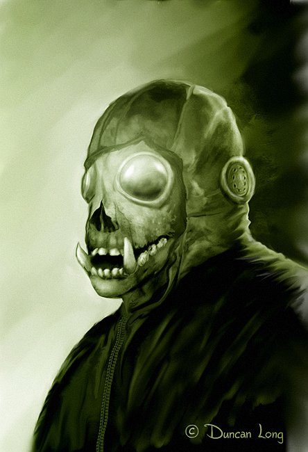
Alien construct book cover illustration artwork by Duncan Long 3b

"Alien Construct 3b" - a visual experiment by illustrator Duncan Long

Alien construct book cover illustration artwork by Duncan Long

"Alien Construct 2" - a visual experiment by book illustrator Duncan Long

Alien construct book cover illustration by Duncan Long

"Alien Construct 1" - a visual experiment by book illustrator Duncan Long

I recently suggested that rather than plotting growth of the S-curve on graphs, they might possibly be better explored by plotting them through 3D. Sadly the only response (other than humorous) mentally pictured the rotation on one axis.

Things become more interesting when an object is rotated on more than one axis and moved through space (time) as well. Being an artist, I was compelled to add some dramatic lightning, materials, and environments as well.

That said, I may be exploring these further as they would appear to have the potential for use as science fiction and “alien” constructs.

====================
When not contemplating the rotation of S curves through time and space, Duncan Long works as a magazine and book cover illustrator. You can see more of his illustrations at Duncan Long’s Magazine and Book Cover Portfolio
=====================


Tags: , , ,

Comments (3)

Look, Mom, No Paint

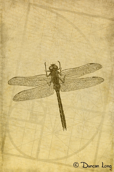
Dragonfly on Ancient Paper - a book cover illustration artwork by Duncan Long

Dragonfly on Ancient Paper - a book cover illustration by Duncan Long

Folks often ask if I use paints (or ink) to produce my book and magazine illustrations.

Short answer: No.

But I started as an actual painter and later as a pen-and-ink illustrator. But digital is so much cleaner and faster (plus there’s that undo key), that there’s just no contest between it and real paint.

And the results are also much, much easier to get to a publisher. No insurance, FedEx forms, or worry about damage to the work; just fire it into the ether and wait for it to arrive at the publisher’s computer a few seconds later.

That said, I do try to maintain a “painterly” look to my digital illustrations, and hence a little confusion with clients and viewers from time to time who mistake the artwork for something created with real paint and brush or pen and ink.

I work on a PC workstation with a Wacom digital tablet. Software varies greatly, but the lion’s share of the work is done on an old (Windows 95!!!!) copy of Corel PhotoPaint which has the paint brushes, smear tools, and plugins that I’ve become accustomed to using. I’ve worked on the PC for a long while now, in part because some of the key art software I use in creating my pictures is only available for the PC.

I dread the day I have to change to some other software. At that point I may be forced to change my name and pursue a life of crime.

Until that day, the world remains safe from me and the flying monkeys that work here in my studio.

====================
When not planning for his life of crime, Duncan Long works as a magazine and book cover illustrator. You can see more of his illustrations at Duncan Long’s Magazine and Book Cover Portfolio
=====================


Tags: , , , , , , , ,

Comments (4)

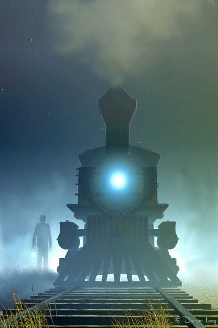
The “Ghost Train” Rides Again

Book cover illustration by book cover illustrator Duncan Long

The “Ghost Train” illustration (shown above) will be featured in the upcoming “Nightmare on Maniac Station” presented by the Railway Museum (in the Netherlands). This will be part of the Museum Night 2011 in which seven museums in Utrecht will participate. According to the organizers, my illustration “captures the mood perfectly” for the Railway Museum’s plans.

The “Ghost Train” will be employed for promotional purposes in the museum’s press release and program leaflet.

Perhaps the irony here is that my artwork will thus first appear in a railway museum rather than an art museum.

One might hope that one day, an art museum.

In the meantime, this situation perhaps reflects the low esteem the art community has for those in the illustration business. Those overseeing art museums want only “serious artwork” to enter hallowed halls. (Of course some critics might argue that perhaps artwork comprised of an unmade bed, stacked cans, or chunks of animals in formaldehyde jars aren’t all that “serious” as artwork.)

Perhaps my chances would improve if only I were more into building statues from swine entrails — but that’s another story.

=====================
Duncan Long has been black listed by many museums around the world, with one art dealer having placed a price on his head. Long has more success creating book cover illustrations, with his work appearing on covers from HarperCollins, PS Publishing, Pocket Books, Solomon Press, Fort Ross, and many other publishers and self-publishing authors. See his book cover illustrations at: http://DuncanLong.com/art.html
=====================


Comments Off on The “Ghost Train” Rides Again

3 Book Cover Illustrations Up for Adoption

By the Moons' Alignment -  Duncan Long book cover illustration artwork

By the Moons' Alignment - Illustration by Duncan Long

Another three illustrations my flying monkeys and I created during our leisure time this weekend. As usual, these were all three created for my own enjoyment, but with the hope of eventually selling them as well as to round out my portfolio with a few new pieces of artwork.

Interplanetary Travelers book cover illustration by Duncan Long

Interplanetary Travelers an illustration by Duncan Long

Originally I was going to place a star cluster in each of these three pictures, along with one or more crescent moons. However it was becoming a little much by the third picture, so the star cluster became a magical Luna moth. Or at least it looks magical to me. If it pulls a rabbit from a hat, we’ll know.

The Luna Moth - Duncan Long book cover artowrk illustration

The Luna Moth - an illustration by Duncan Long

As this is written, all three of these illustrations has all rights available including book and magazine cover rights. It will be interesting to see who will give these nice puppies a home.

In the meantime, it’s time to get back to working on book covers that I’m actually under contract to produce.

====================
Duncan Long illustrates magazines and books. You can see more of his artwork at Duncan Long’s Magazine and Book Cover Portfolio
=====================


Tags: , , , , , , , , ,

Comments Off on 3 Book Cover Illustrations Up for Adoption

Wired Rises to #7 Techno-Thriller on Amazon.com

final book cover illustration for Wired by Douglas E Richards.

Douglas E. Richards informs me that his book Wired (which I did the cover illustration for) is now a best seller, climbing to seventh position at Amazon.com in the techno-thriller division.

While there’s always an element of luck to publishing, I’m sure the success of this title reflects the author’s hard work in self promoting the book — and (I’d like to think) due to the cover illustration I created for the book (I write this in all modesty, of course).

Wired - best seller book cover illustrations

The price on the Kindle version of the book is still only 99 cents, so now’s the time to head on over to Amazon.com to pick up the Kindle edition of the book before it returns to its original price.

For those unfamiliar with Douglas E. Richards, I should note that his books have garnered rave reviews in Asimov’s Science Fiction magazine, Kirkus, School Library Journal, Odyssey Magazine, and other publicationss. In 2010 he was selected to be a “special guest” at San Diego Comic-Con International, along with such icons as Stan Lee, Ray Bradbury, and Rick Riordan. On the non-fiction side of things, Douglas (who has a master’s degree in molecular biology) has authored popular science pieces for National Geographic, the BBC, the Australian Broadcasting Corporation, Earth and Sky, Today’s Parent, and many other publications.

Now, I’ll go back to gloating over having created the book cover illustration for another best seller.
====================
Illustrator Duncan Long has created over a thousand illustrations that have appeared in books and magazines — including the cover illustration for the best seller Wired. See more of his book cover artwork in Duncan’s Portfolio.
=====================


Tags: , , , , , , , ,

Comments (2)

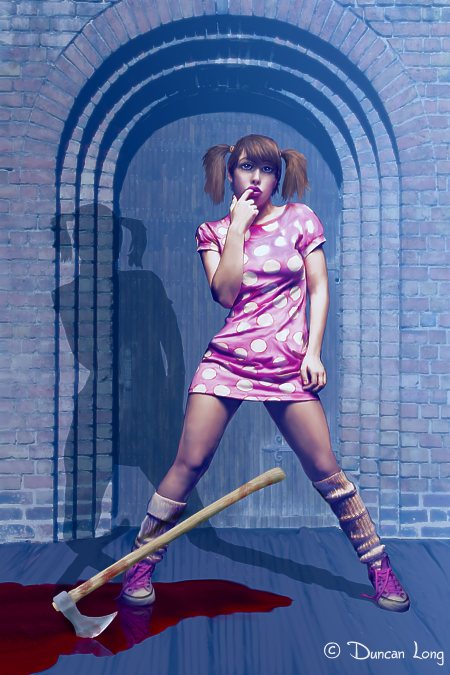
3 Bad Girls and One Self Portrait

Innocence In a Short Skirt-book-artwork-illustration-Duncan-Long

"Innocence In a Short Skirt, With Ax" - an illustration by Duncan-Long

As I am often want to do on the weekend, I take time off from doing illustration work to do (drum roll please) — more illustration work. However, if my time permits, these weekend illustrations are for my own enjoyment initially, with an eye toward their eventually being sold to publishers or at the very least as a method to freshen up my portfolio.

This weekend, for some reason I got on a jag of “bad girls.” I’ve always been horrified at how men seem attracted to dangerous women, and good women, toward bad boys. I think there’s a basic law of human nature here, likely going back to the Garden of Eden. Something in human genetics too often leaves the good guy (or gal) finishing last in the game of love.

Anyway, enough philosophy.

Here’s the next picture:

Random Violence a book illustration artwork by Duncan Long

"Random Violence" a potential book illustration by Duncan Long.

In regard to the above, my good friend Phil Hunter tells me he had a date like this once. I didn’t inquire further, but understand it involved a trip to the emergency room.

Of course the outcome of being bad:

Victimless Crimes - another book cover illustration by Duncan Long

"Victimless Crimes" - another book cover illustration looking for a home.

About the above, it came about because I maintain that there’s no such thing as a victimless crime. If nothing else, the criminal justice system is inclined to extract a price for crime. And often many, many more of those who know and care about the criminal and/or those touched by the crime in one way or another also suffer. Like a stone dropped into a pond, a victimless crime causes ripples that expand past the criminal to touch those far away from the crime.

Finally, a self-portrait that’s a little outside my normal style. This one created for a book I’m working on about the publishing business. It may or may not go into print as I can’t decide whether it’s worth the time and effort.

Self Portrai by book-illustrator DuncanLong

Self Portrai by book-illustrator DuncanLong

Except for this last picture, all are looking for a home with a publisher or self-publishing author. Anyone need a bad girl to take home and introduce to Mom?

Wishing everyone a great week!

====================
Duncan Long is a magazine and book cover illustrator. View more of his illustrations at Duncan Long’s Magazine and Book Cover Portfolio
=====================


Tags: , , , , , , , , , , ,

Comments (5)

Tips for Creating a Graphic Novel from a Script or Book.

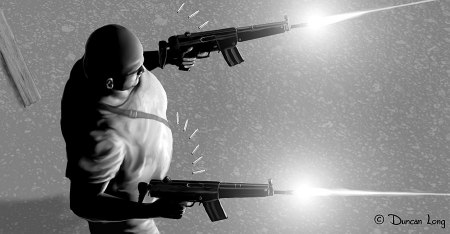
Graphic novel artist Duncan Long's illustration for Werewolves of New Idria

Sometimes I’m contacted by writers having questions about how to translate a script or novel into a format that would allow an artist to create a graphic novel of the story. The process is not as straight-forward as one might imagine.

Many writers make the mistake of trying to put too much into each page and panel of a graphic novel. In theory a picture is worth a thousand words; in practice it is frozen in time. It becomes only a single snapshot incapable of covering more than one instant. It can’t convey time transitions that are easily covered in just a few words of text, and it will be lost completely when it comes to conveying abstract ideas.

One solution to this, and one the graphic novel is suited to, is having a large text panel cover the wider time spread. For example, “It had taken 300 years for the Glaxians to transform their economy from one of agriculture to industry, and finally into high technology. Now with the invention of the star drive, they were finally ready to venture into deep space.” This brief block of print would allow a panel showing a farm scene, one of early industry, and finally a large panel of a spaceship gleaming on its platform. It basically sets up the story that will follow, and tells us it will likely be science fiction about some culture unlike any on Earth (or possibly far in our future). The text gives a wide view of history and then the pictures three snapshots within that spread.

But the three illustrations by themselves would fail to tell a clear story. They might be interpreted as three different places on the planet, three different worlds, or three times in history — any reader’s guess without the carefully crafted pair of sentences (and don’t kid yourself, carefully crafted short sentences can be harder to write than several pages of text).

So what should a graphic novel script look like? What does an illustrator need to create the right pictures for the storyline?

Here are some good panel layout scripts (probably you’d need to add some word panels to the mix for a graphic novel — these scripts are for conventional comics): The Souls of Cyber Folk, The Man In The Machine and Icon 13.

These panel scripts may be expanded into a fuller script like this to give the writer more complete control over his story: Overture.

Such scripts are the most ideal way to go. However, there are other possibilities. You might, for example, lean more toward the novel and less toward the graphics side of the graphic novel. This was the basic solution that John Chadwell and I employed for our upcoming The Werewolves of New Idria (Moonstone Books). We had one page of text from his story, and one illustration for the key scene within that page of text. That worked quite well for his story and allowed for very expansive, almost cinemagraphic look for the illustrations. It isn’t the solution for every story, but it worked well for the one John had written.

A book or script needs to be very carefully plotted out, edited, and perhaps simplified to yield the type of scenes that would work in a graphic novel. It’s a tricky business and likely the reason more scripts don’t make an easy transition into graphic novels (while graphic novels are more easily made into movies).

Many writers also wonder about the costs of hiring an illustrator to do the artwork for a graphic novel. The key thing to remember is that the artist will generally spend a lot more time in creating a page of the graphic novel than the writer will in writing it; additionally he’s invested a good part of his life honing skills, generally with little or no pay during that time. All this means he will expect to earn a little more than the writer does when he signs on to do a graphic novel.

For this reason, when a graphic novel is published by a press, the royalties paid to the artist will normally be twice as much as for the writer (or if there’s a penciler and an inker doing the artwork, they will each get the same amount as does the writer).

If a writer wishes to hire an illustrator to do the illustrations for a graphic novel that will be self publish, the payment for his work will of course depend a lot on his experience. For quality work, $450 to $1,000 per page of black and white (or grayscale) artwork and a bit more for color pages is typical. The cover for a graphic novel will cost around $1,300 for a quality illustration.

When a writer hires an illustrator up front, generally no royalties are paid when the graphic novel goes into print. That’s good for the writer if lots of sales are made; good for the artist if sales are meager. (Of course any arrangement for payments can be made, from all royalties, to all payment for the work and no royalties, to some sort of split between the two. Generally it is best not to enter an agreement that involves giving away the firstborn of the writer.)

Often a professional artist will ask for half the payment up front before starting his work, with the balance upon completion. That protects him from fly-by-night operators but also means a writer or publisher needs to choose an illustrator that’s trustworthy and has the talent to do a good job with the work. Otherwise a lot of money may be spent without much to show for it.

Because graphic novels can make a lot of money, especially if the story later becomes a movie, it’s wise to have a contract that spells out who does what and how payments will be made, who gets royalties and what they get them for, etc., etc. A contract can save a lot of headaches, hurt feelings, and even lawsuits. Don’t work without one, and never work with someone who refuses to do so.

====================
Duncan Long created the illustrations for John Chadwell’s story The Werewolves of New Idria. You can view more illustrations from this graphic novel at the The Werewolves of New Idria gallery.

You can also view other artwork by the artist at Duncan Long’s Book Cover Portfolio.
=====================


Tags: , , , , , , , ,

Comments (9)

7 Illustrations Looking for a Book or Magazine Cover

The Angel of Death  Book Cover Illustration

I recently created several new illustrations each of which I hope will soon find a home on a magazine or book cover. It seems that I’m often able to spread my wings a little extra bit on these do-it-yourself digital paintings, allowing my imagination to wander where it happens to lead, with some often happily surprising results. Fortunately such artwork still is marketable for the most part, in large part thanks to the wide range of viewers that arrive via the Internet.

I also plucked a few “golden oldies” from my files, tweaked them a bit here and there, and am re-posting these here as well (and adding them to my online galleries) with the hope that these orphans will be adopted by a buyer through this added exposure.

That preamble out of the way, the illustration at the top of this column is “The Angel of Death” which I created this weekend. It’s an update of the biblical story, with a nod toward the original account’s Egyptian setting.

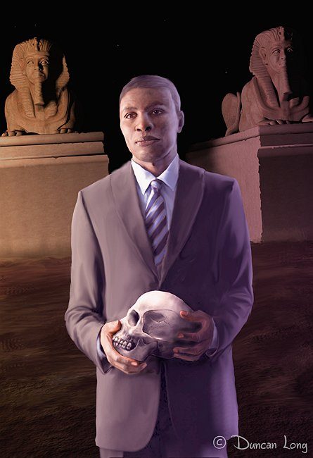
“The Scholar” (below) was originally created for use in a Christmas edition of Poe’s “The Raven” which I put together with a set of my original illustrations a few years ago (still available for free download at Scribd). This painting never made it into the book and therefore remains available for purchase.

The Scholar - unsold book cover illustration

“The Killer Bride” (below) is a rather terrifying nightmare of a picture. An alternate title: “Move, and the Doll Gets It.” I suppose such macabre illustrations have a humor to them — provided they’re happening to someone other than you.

The Killer Bride Book cover artwork

“Wrath of a Demon Scorned” (below) is one of the golden oldies…

Wrath of a demon scorned book cover

And… “A Higher Form of Killing” (below). Don’t ask me what it’s about. I don’t know..

Higher form of killing - book cover artwork - DuncanLong

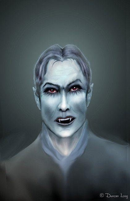
“Vampire Stories” (below)…

Vampire Stories book cover artwork

And finally, “The Hooded Monk” which is another recently painted illustration:

Hooded Monk i book cover artwork

And there you have them: Seven illustrations looking for a home on the cover of a book, magazine, or perhaps even the cover of a CD album.

====================
Duncan Long is a magazine and book cover illustrator. View more of his illustrations at Duncan Long’s Magazine and Book Cover Portfolio
=====================


Tags: , , , , , , , ,

Comments (10)

Sneak Peek: Robot for Asimov’s Science Fiction Magazine

Asimov's magazine cover illustration robot by artist and illustrator Duncan Long

First sketch for the robot design that I’m working on for an upcoming cover illustration for Asimov’s Science Fiction magazine.
=====================
In addition to creating cover illustrations for Asimov’s Science Fiction magazine, Duncan Long has created artwork for a number of other presses including HarperCollins, PS Publishing, Pocket Books, Moonstone Books, Enslow Publishers, and many other publishers as well as self-publishing authors. You can see more of his book and magazine cover illustrations at Duncan’s Illustration Portfolio
=====================


Tags: , , , , , , , ,

Comments (2)

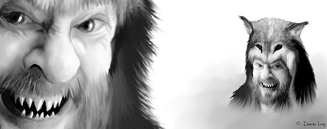
Artist Hides Himself In The Werewolves of New Idria

Self portrait of book illustrator Duncan Long for Werewolve of New Idria from Moonstone Books.

I was recently asked if I had hidden a self-portrait anywhere in Moonstone Books’ upcoming The Werewolves of New Idria.

The answer (as you can see above) is yes. I did smuggle a picture of myself into the graphic novel (the picture above is low-resolution; the print version should have about 4 times as much hideous detail).

While folks who know me well will recognize my noggin as the basis for these two head shots, I must stress that it is not precise in every detail as a self portrait.

But it is pretty accurate with the teeth.

Spoiler Alert: Obviously the police will have little trouble with the ID of my corpse if they go with my dental records.

=====================
Duncan Long is the graphic novel illustrator for Moonstone Books’ The Werewolves of New Idria. Duncan has also illustrated book covers for PS Publishing, Pocket Books, HarperCollins, and many self-published authors. See more of Duncan’s book cover artwork and graphic novel illustrations at: Duncan’s Book Cover Illustrations and Graphic Novel Artwork
=====================


Tags: , , , , , , , ,

Comments (15)