3 Sneak Peeks: Book Cover Artwork/Layout

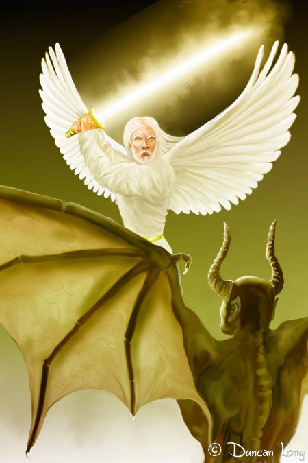
Book cover illustration for Angel Wars

I’m slowly wrapping up what proved to be a huge book project: Illustrating and laying out Steve Quayle’s Angel Wars. Rather than creating only the cover illustration for the book (as is my normal assignment with book projects), I also did the graphic design and layout of the cover and all the inner pages as well.

The publisher gave me a free hand in my design work, so I found myself agonizing over typeface combinations, creating the logo that would appear in gray at the top of each chapter, and devising the best column arrangement for the target page count the publisher was wanting. I also regularly tweaked old photos and created a few inner illustrations, too.

It was one hairy project.

Lots of work — but oh, so much fun as well. Few things are as magical as being able to shepherd the progress of a edited manuscript to the final PDFs that go to press.

I adopted a sort of Art Deco feel for the cover illustration. In part this was to duplicate the logo that appeared through the book (a sword with wings on either side of it). The trick was to keep the layout of the illustration formal yet interesting and dynamic. Hopefully cover artwork achieved this. (In the layout I also flanked the artwork with some gray “angel text” similar to what’s sometime’s seen in ancient inscriptions; these were repeated on the back cover to compliment the front.)

Cover artwork for the book Angel Wars

So after a little over a month, we’re finally near the finish line (just one last round of corrections). The page count is 444 and the footnotes are over 600 (I think — without taking the time to check right now). The footnotes proved to be the trickiest part since they often had to be “done by hand” to get the columns to look their best. Likewise I fussed with adding hyphens here and there to keep the “white rivers” from flowing down columns, tinkered with column widths, and re-kerned two of the fonts (one had no kerning at all at the start — fortunately some of the kerning can be done automatically using FontCreator).

Yes, wild and wooly.
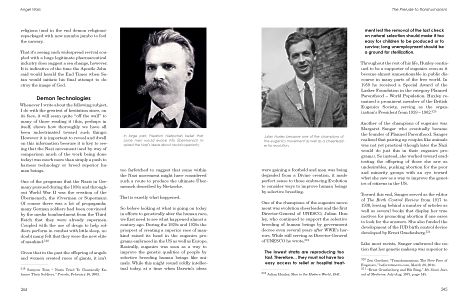
The illustration and graphic design and layout for the book Angel Wars

But now we’re near the finish line. Hopefully next week at this time we will have finished the course — and I’ll start to get caught up with my other projects.

=====================
When he’s not fussing with typefaces and column widths, Duncan Long generally can be found creating book illustrations and artwork for presses and self-publishing authors. You can see more of his graphic design work and book illustrations and artwork at Duncan’s Portfolio
=====================



Tags: , , , , , , , ,

Comments (6)

5 Book Cover Illustrations — Getting There from Here

This is the final Stephen Biro book cover artwork.

The picture above is the final book cover illustration I created last week for movie-maker Stephen Biro’s upcoming horror novel Hellucination. (And, yes, I am finally getting work finished and hope to get back to my schedule this week — thankfully most of my customers are patient people.)

This series of pictures below shows the weird progression made toward the final book cover artwork. The vast difference between the illustration above and the steps below resulted because I was working toward the wrong target. That is, while Stephen told me the right title of the picture he wanted to use as the starting place for the final book cover illustration, I thought he meant a different piece of artwork I’d done.

So I started with a painting from a picture he’d sent:

A painting of Biro for the book cover illustration.

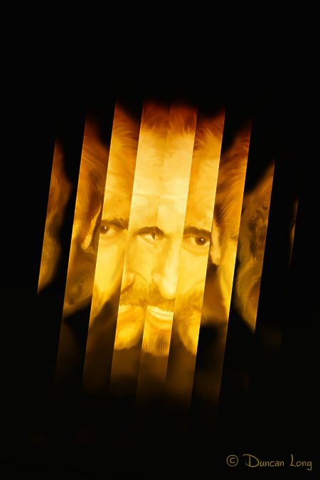
Good enough start. But from there, I headed in the wrong direction. My first step was “splintering” the picture in several ways:

The splintered version of the book cover painting

And…

Another variation of the Stephen Biro book cover illustration.

And…

4th Stephen Biro book cover illustration from the original painting.

I then sent Biro pictures for consideration — all very unlike the book cover illustration he had in mind. Fortunately for me, Biro is a patient man (and perhaps used to dealing with the criminally insane, judging from the movies he makes). He called time and again, very patiently explaining what to change. And I kept wondering why in the world he wanted something totally different from what the original had (I thought) looked like.

Finally I realized the mix-up, explained what had happened (giving him a good laugh), and started over. Knowing where I was headed made it possible to finally deliver the cover artwork Biro wanted (memo to self).

A few changes in style and layout and he had the monstrous face wanted for his book cover.

By way of peace offering, I gave Stephen the extra — and totally unrelated — versions I’d created (he’s currently using one on his FaceBook page), so hopefully his patience with an artist that was clueless about what was needed for the book cover illustration paid off for him.

Me? I learned an important lesson about not spinning my wheels before I know what direction I was headed.

Oh… And sorry about the numbers thing in the title (I hate that technique) but I’m told it helps positioning with search engines. So ever mindful of bringing more book cover illustration work my way — with most new customers coming to me via my web site — I’ve succumbed to the number-in-the-title temptation of many bloggers. Hopefully a few more people wanting book cover illustrations will be heading my way now.

=====================
When not busily painting a book cover illustration unlike what his client wants, Duncan Long works to create the book cover artwork his clients do want. More of his book illustrations can be viewed at Duncan’s Book Cover Artwork Portfolio
=====================


Tags: , , , , , ,

Comments (5)

Book Artwork and Design: What the Cyclops Saw

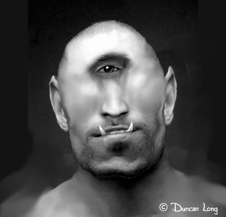
Duncan Long's Cyclops illustration for book layout project.

The last few weeks I’ve been struggling with a book layout project that’s proved to be a lot of fun. The publisher has given me pretty much free rein: I’ve been free to choose/create a typeface family, devise the two-column layout, and pick the photos and illustrations to go into it. In short, it’s been a blast.

And also a major undertaking as it’s the mother of massive titles and has taken on… well… mythic proportions and pretty much shredded my schedule (and I extend apologies to my patient clients for this).

Part of the fun is that this book has a large section dealing with mythology. There are a lot of public domain pictures out there about the various myths, so filling this book with quality illustrations has been easier than I (and the publisher) thought it might be.

But occasionally there’s a lack of good artwork and then I put on my book illustrator hat and create a small piece of artwork to fill the gap.

Hence this illustration of the Cyclops. Hopefully it does the creature justice. Certainly I wouldn’t want to get on his bad side — though arguably a cyclops has no good side.

In creating an illustration like this, the tough part is finding the model.

Yes, I’m kidding.

In studying the work of past masters, I found most tended to create a human face, cover over the normal eye sockets with skin, and then jam an eye in the middle of the forehead. Which works. But for this illustration I decided to create a skull structure that looked as if the single eye was a natural part of the whole. Hopefully I succeeded.
=====================
When not creating monsters for the mythology book he’s laying out and illustrating, Duncan Long works as a book cover artist and sometimes writer. You’ll find more of his book illustrations (and CD album cover and magazine artwork) at Duncan’s Book Cover Illustration Portfolio
=====================


Tags: , , , , , , , ,

Comments Off on Book Artwork and Design: What the Cyclops Saw

Duncan Long’s Book Cover Artwork Featured On “Art of Day”

Book cover artist Duncan Long's illustrations chosen for Art of Day

I received an email from James Day saying that some of my book cover artwork and magazine illustrations would be appearing at his Art of Day site. Day’s pages have turned into a promotional website for artists and illustrators with gallery owners (often checking it to discovered talented new artists to exhibit), as well as by art buyers & collectors interested in buying art from today’s emerging artists.

And, as Day notes, “It’s also for everyone who loves art as much as I do.”

So far over 300 great artists have been featured on Art of Day. And today I can add my name to that growing list.

Quoting from the site,

Art of Day actually began as a fan page on Facebook created to promote the art of James Day, the founder of Art of Day. As James expanded the number of artists he networked with on line from hundreds to thousands, he started featuring a multitude of other artist’s work on his fan page in addition to his own. After more than half a year he decided to expand the concept from being just a fan page on Facebook, to a larger platform of promoting the arts through a website, blog, and lots of social media sites.

All of the artists he connected with on line were there to do the same thing, get their artwork seen by a larger audience. So it made perfect sense to feature a lot of artists instead of just one. James believed that together the combination of hundreds of artists might be a large enough draw to bring in the numbers of visitors all of the artists deserved. Since by day he co operated a software & web development company, it was fairly easy to setup a custom website, blog, and tie in social networking.

The Art of Day website was launched on July 12th 2010. In the partial month of July the website received a modest 1,879 visits, most of which were from Facebook. Month after month the numbers continued to go up. In September Art of Day received 3,824 visitors, by December it was 10,469. 2011 started off great for Art of Day having received 26,586 visitors and the next month February 70,299. Several artist features added to Stumbleupon went viral which certainly impacted the numbers for February.

And there you have it.

=====================
As a book cover artist, Duncan Long has garnered praise and support from a very diverse group of art lovers. You can see more of his illustrations and book cover artwork at the Duncan’s Book Cover Artwork Portfolio
=====================


Tags: , , , , , ,

Comments (2)

A Crime Novel Cover Illustration Looking for a Story

Crime novel cover artwork or a action adventure cover illustration looking for a book to call home.

I had a client call with an emergency need for a cover, so quickly got several sketches together today. One turned out so well that I went ahead and finished it, even though (I suspect) it’s likely low on the client’s choices. However I liked it, and so went ahead and finished it.

The only down side is that it put me a little behind with my other work, so I’ll need to work extra hard tomorrow to get caught up. Sometimes working with a little pressure isn’t all bad, though.

Hopefully this illustration will eventually find a home either as part of a science fiction book cover or — I’m betting — as the artwork for a crime or mystery novel. Or perhaps as the cover artwork for an action/adventure novel.

Half the fun of this business is seeing which publisher or self-publishing author will choose which illustration, and what type of book they decide it would be perfect for.

Illustrating book covers is a fun business, and often full of pleasant surprises.

=====================
Often tempted to finish an orphaned sketch into a full-fledged book cover illustration, Duncan Long loves the business of illustrating books. You can see more of his science fiction, action adventure, fantasy, and mystery book cover artwork at Duncan’s Illustration Portfolio
=====================


Tags: , , , , , , ,

Comments (2)

Clutter, Destroyer of Make Believe

Science fiction novel cover Illustration -- City at Empires End

Over the weekend I had a short discussion with a friend about how very often a movie, article, or book can be improved by lopping off the first few paragraphs, pages, or minutes of film (depending on the medium). This is an old trick professional editors often employ to jump start an otherwise worthy creation.

At the time of my discussion, I was a bit perplexed as to how this might apply to non-linear art like the illustration business. Then upon awaking this morning and looking at the progression of a piece I’d created yesterday, I realized how this idea of lopping off excess baggage applies to an illustration or other artwork.

The difference is in the number of features appearing within the single frame of the picture. Each element in a painting competes for the eye, and like the too-long introduction to a story, too many elements tire the brain so that the focus no longer goes as easily to where it needs to be.

In a painting, the sum of the parts can be far less than the whole one wants to see. All the little elements detract rather than add to the “gee whiz” factor of the book illustration.

I think this is why book covers being created by committee often become derailed. Everyone has a pet element they want in the final product, and the result too often is a hideous clutter of an illustration that an artist with any talent wishes he’d never been involved in.

Much the same thing can happen with a self-publishing author; he wants all sorts of key elements to appear in the book cover illustration and the result can be a terrible clutter that might sound good on paper, but just doesn’t work as an illustration. Fortunately most authors will listen to their cover artist and allow the clutter to be cleared away with the resulting book cover illustration helping sell the book rather than being an eyesore on the bookstore shelf (and apt to be displayed with only its spine showing).

Now my example.

“Eve at Empire’s End” started with the picture above. It works pretty well by itself (and eventually may be sold as a book or magazine cover illustration as such). However it proved too busy when the foreground figure was added:

Original book cover illustration of sci-fi story Eve at Empire’s End.

I rearranged the distant flying city or starship (take your pick) and fiddled with the stars and buildings. But there were too many elements. But no matter how things were arranged, the picture was cluttered and somewhat claustrophobic even though it was a space scene. Furthermore, the focus wasn’t on the gal and apple for the most part.

My solution?

Get rid of the hi-rise with the two guys and robot, simplify the distant buildings, and redo the stars. The flying city was reduced and made more of a background element.

I also wanted a more exotic look for the gal so she got a new hairdo — which then shifted the focus toward the red apple in her hand.

I generally work “oversize” so I could enlarge the picture a bit as well, bringing the gal to the forefront instead of having her dwelling in one corner of the painting.

The result:

Science fiction novel illustration by book cover artist Duncan Long

Hopefully the reduction of needless clutter has made it a better illustration.

Perhaps a good motto to have when creating a short story, movie, or book cover illustration is “When in doubt, throw it out.”

=====================
When not contemplating the clutter in his studio, Duncan Long often improves his book cover artwork by removing needless material in them. See more of his book cover illustrations (including science fiction, horror, fantasy, mystery and other categories) at his Duncan’s Book Cover Illustration Portfolio
=====================


Tags: , , , , , , , , , , , , , ,

Comments (1)

A Weekend Painting – and Hopefully Soon a Book Cover

Eve At Empires End - a science fiction book cover artwork by illustrator Duncan Long

On weekends I sometimes paint a “just for fun” piece that hopefully will be sold down the road. Here’s one of these, this one with a science fiction flavor with a nod toward the Garden of Eden.

I’ve titled this illustration “Eve at Empire’s End.”

=====================
Duncan Long loves to create book illustrations and even on his time off he can often be found painting a new picture or two. You can enjoy more of his illustrations including many that have appeared on the covers of novels and science fiction stories at Duncan Long’s Illustration Portfolio and Galleries
=====================


Tags: , , , , , , ,

Comments (2)

“Lost Temple” on April’s Salon Futura Cover

Salon Futura magazine cover illustration by illustrator and artist Duncan Long

Editor Cheryl Morgan chose my illustration “Forgotten Temple on a Lost Planet” for the April cover of Salon Futura, an online (and free) science fiction magazine.

Here’s the original illustration which was (obviously) too wide for the magazine cover:

Science Fiction Magazine cover Illustration Forgotten Temple by artist Duncan Long

The star field of this illustration was originally created for another project but never used; on a whim, I painted the “lost temple” on it, some two-headed creatures flying from it, and a group of explorers coming through the dark jungle with some sort of bright flares to guide their way (please picture a futuristic Indiana Jones in a spacesuit carrying an electric torch that drips hot sparks of molten metal — hey, it’s my picture, I can have Indiana Jones in the jungle with a weird torch if I want to).

In addition to being cropped, the original illustration had to be flipped and re-painted along the top so the magazine’s masthead could be easily read. Not too tough with a digital picture – quite a job with real painting. And I guess that’s why today I push electrons around when creating artwork for magazine and book covers instead of painting with oils or acrylics.

But I do miss the heady smells of paints, inks, and turpentine.
=====================
Duncan Long has pushed electrons that created magazine cover artwork and illustrations for Salon Futura, Asimov’s Science Fiction Magazine, The Sun, and other magazines as well as a host of book cover illustrations for major presses, small publishers, and self-publishing authors. You can enjoy more of his illustrations in Duncan’s Portfolio of Magazine and Book Illustrations
=====================


Tags: , , , , , , ,

Comments (5)

Completed Book Cover for Stonewiser III

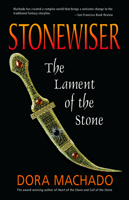
Book Cover Artwork for Stonewiser III  illustration by Duncan Long

I received an autographed copy of Dora Machado’s Stonewiser III: The Lament of the Stone, now available from Mermaid Press. This is the third book in the series (and I also had the honor of creating the book cover illustrations for those as well). The first two books garnered several publishing awards, and I suspect this one will, too.

I did the illustration. The beautiful layout and cover design was created by Mayapriya Long at Bookwrights.

This book illustration proved an ordeal for the publisher and author; I submitted a bunch of ideas and none worked very well. Fortunately we all stuck with it and now, seeing the results, the troubles seem (to me at least) minor in retrospect. Most book and magazine illustrations go quickly and smoothly. When snags occur, it’s good to be working with folks who understand and patiently encourage and offer suggestions.

Detailing the knife hilt and sheath was a little lengthy. In order to avoid a “computer generated” look, I digitally hand painted and shadowed each wire inlay so it appeared handmade (working on Corel Photo-Paint). At the suggestion of the publisher, I also used the reddish jewels from the necklace of the second cover and the black stone/silver inlay of the first novel cover to tie all three book cover illustrations together.
=====================
In addition to working for Mermaid Press, Duncan Long has created cover illustrations for Asimov’s Science Fiction Magazine, Pocket Books, and other presses and self publishing book authors. See more of his illustrations for novels and magazines at: Duncan’s Illustration Portfolio
=====================



Tags: , , , , , , , , ,

Comments (2)

Searching for America: Final Book Cover Layout

Final book cover layout and illustration for R Thomas Roe's action adventure novel.

Here’s the final book cover layout for R. Thomas Roe’s upcoming action-adventure novel Searching for America. (You can check my previous two blog posts for more about the book cover illustration.)

I added an AK-47 icon for the spine and basically to fill space in the layout above the book publisher’s address. (And, yes, fellow gun lovers, I know that’s an M4 Carbine he’s carrying.) That said, I do appreciate the suggestions and input from various folks across the country who helped out with the development of this book cover concept.

The color of the illustration was shifted just a tad toward the warmer/yellow end of the spectrum to help it match the bright yellow lettering used on the cover. And a stencil typeface chosen together with a no-nonsense Swiss typeface for the lettering.

Folks can find more of my book cover illustrations and layout designs at: Duncan’s Illustration Portfolio
=====================


Tags: , , , , , , , ,

Comments Off on Searching for America: Final Book Cover Layout